There are many concerns surrounding single-page websites, but we’re here to tell you that they can be extremely useful for big and small businesses alike. In this post, we’re going to discuss the crucial components of a winning one-page website and how to build one.
What is a one-page website?
This is the way to present your content — you create one scrolling page divided into sections. One-page websites are usually simple, speedy, and responsive. They are dedicated solely to one specific offer, and the whole purpose of a single-page website is to be a highly-efficient conversion machine.
So, what does it take to make one? First, you choose a specific audience and target their needs. Then, you craft your unique and concise offer with a powerful CTA. Lastly, you shape your offer using effective copy, killer content, and relevant design. A one-page website is a place where all of these elements come together in the form of, well, one HTML page.
Here are some basic rules to follow:
- Use contrasting, eye-catching headlines.
- Accentuate the value of your offer.
- Use active verbs and simple sentences in your copy.
- Address customers’ fears and anxieties.
- Choose a minimalist and clean design.
- Integrate engaging, high-quality content that stands out.
- Create urgency and softly push the visitor towards making a purchasing decision here and now.
With a single-page website, you certainly have fewer SEO optimization strategies available to you, and it’s harder to make your way to the top of Google search results. But it shouldn’t be a problem when you have other reliable sources of traffic, such as banner ads or ads on social media.
Why are single-page websites good for businesses?
Think of it this way. If multi-page websites are heavy lifters, one-page websites are lightweight athletes. It’s easy to scroll through them on the go. There are no bulky elements or distracting links. They have one single mission: to deliver your offer in the most convincing way possible. For the user, it means having a more continuous and fluid experience.
Having a one-page website allows you to:
- Explain the benefits of your product without confusing visitors with information scattered across dozens of pages and hidden in different sections.
- Give your users an opportunity to convert right away and skip some stages of their customer journey.
- Smooth the learning curve and help new visitors understand your product faster.
- Reduce website maintenance costs and save some resources.
- Focus on capturing high-quality sales-ready leads.
You can deliver all this information in easily digestible chunks using a single page. Give our articles about lead generation landing pages and product landing pages a read, and you’ll get to know exactly which elements will help you tell your story and convert better. And don’t forget to get some inspiration from the best one-page websites on Awwwards or One Page Love before you begin your own project.
How far can you go with a one-page website builder?
With a variety of code-free intuitive one-page website builders, it’s easy to create your commercial or personal page even if you’re a newbie. The site builders we’ve gathered for you all offer drag-and-drop editors and templates to create mobile-optimized, fast, and stunning websites. Here is what you need to know to make the magic happen.
Wix
Wix offers over 500 designer-made templates. You can make your website come to life with video backgrounds, scroll effects, and animations, like zoom in, reveal, and fade. What’s interesting is that you can use Wix to create your entire online store, not just a personal website or a product page.
You can pick a custom domain and even create your own logo with the help of Wix. The platform provides free, reliable web hosting, top security, advanced SEO options, and a dedicated support team. There is also a mind-blowing option called Wix ADI (Artificial Design Intelligence) that will instantly build a personalized website for you using custom text and images.
Browsing through Wix’s ready-to-go templates can be a source of inspiration in itself:
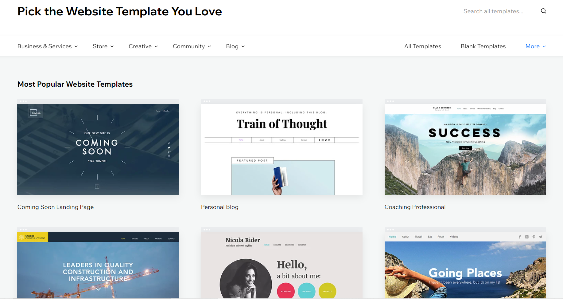 Wix has hundreds of professional-looking pre-made templates to choose from
You can create a website for free, but a Premium plan allows you to connect your own domain, remove Wix ads from your site, and much more. With most Premium Plans, you’ll receive a one-year-free domain voucher and vouchers for advertising on Google and Bing.
You can try any Wix Premium Plan and cancel within 14 days for a full refund. The cheapest plan for personal use will cost you $14 a month. There are also many options for eCommerce, starting at $23 a month. Custom options for enterprises are also available and start at $500 a month. A Premium Plan cannot be used for multiple sites; each site must have its own Premium Plan.
Carrd
With Carrd, you can create simple, free, fully responsive one-page websites. Easily make a personal profile or a landing page to capture leads. The platform offers 80 partially pre-designed templates, and you can choose one of them as your starting point. You can also start with a blank canvas and build something unique.
Carrd supports the use of custom domains and allows you to embed your own custom code and widgets from third-party services. You can add a Google Analytics tracking ID to your one-page website to track and analyze your audience. Also, with Carrd, it’s easy to create and integrate a contact, signup, or payment form into your page.
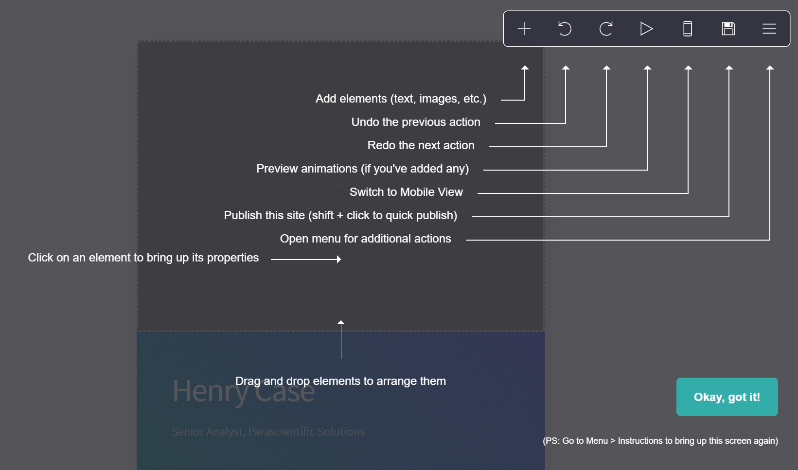 Carrd gives you the basic tools for creating and instantly publishing a simple website
Carrd has some free options, but they are very limited. You can try a Pro account for free for 7 days and then pay $9 a year or more, depending on how many features you need and how many websites you want to create. The recommended Pro Standard plan costs $19 a year and allows you to set up ten websites.
Elementor
Elementor is an all-in-one solution for building one-page websites with perfect design and clean code. Elementor Page Builder is a WordPress-based website builder and requires an active WordPress website to work. If you don’t have one yet, Elementor will help you choose a hosting provider and create your website in minutes using their Theme builder.
It has numerous widgets that can make your page more appealing and easy to navigate. The platform also gives you tools to design lead-capturing forms and integrate them with different marketing tools.
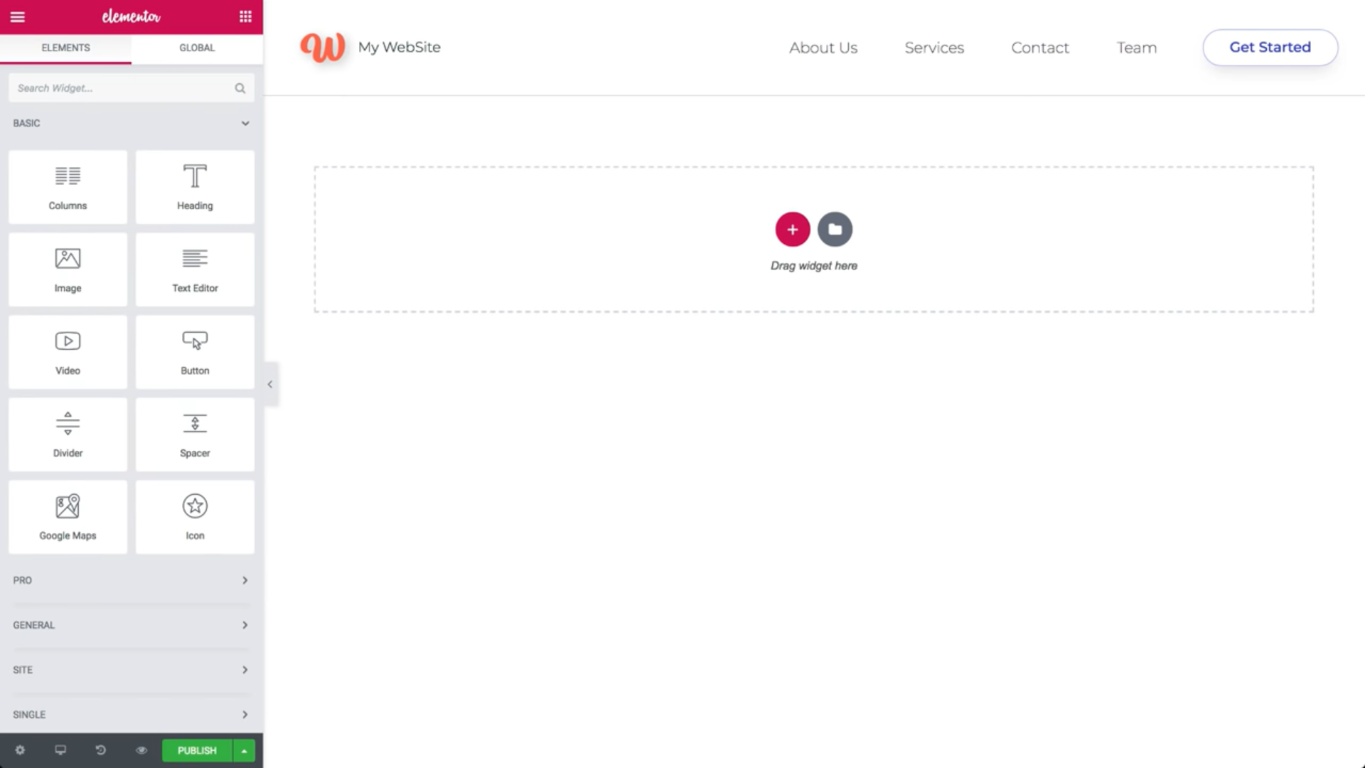 Elementor gives you all the tools you need to create new one-page websites from your WordPress dashboard
You can access 40+ basic widgets and 30+ basic templates for free, but you’ll need the Pro version to get your hands on advanced options, such as motion effects for your website, the WooCommerce builder, and a pop-up builder.
The cheapest plan costs $49 a year for one website and $99 a year for three websites. You can cancel your purchase and get a refund any time during the first 30 days. There is an Expert plan that costs $199 a year and can potentially be used for companies, but Elementor mostly targets designers, developers, marketers, and entrepreneurs.
Five best one-page website examples in detail
We all prefer to learn new skills from the best, and creating a single-page website is no exception. Let’s take a look at some smart solutions and find some details you can use on your own page.
Greenlight
What’s this one-page website for? Greenlight is an extension for Chrome that allows users to receive, resolve, and act on comments to HTML elements faster. It improves communication between developers, designers, managers, and product owners.
On their single-page website, you’ll find a beautiful explanation of why this tool is special:
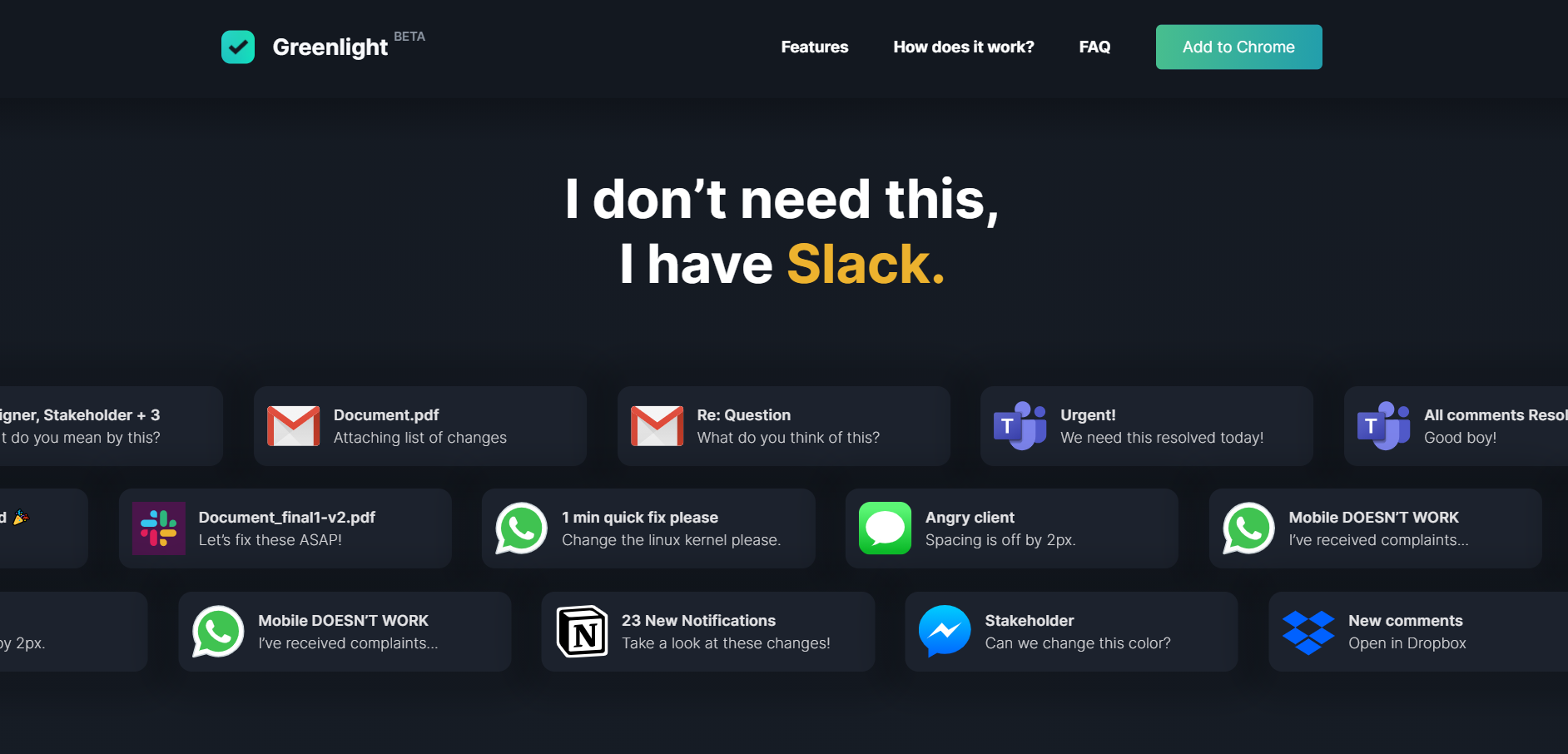 Greenlight shows their users how to replace endless messy notifications with a single tool
What’s so cool about it? This example shows us a fantastic way to work with common customer objections. By demonstrating the typical chaos of notifications we usually receive every day, Greenlight proves that there is a need for a better tool. Who doesn’t want to simplify their work communications? This approach does the trick — it is relatable, persuasive, and memorable.
Naboso
What’s this one-page website for? Naboso Duo is a new brand of silicone insoles made to increase performance and improve movement.
Their landing page perfectly explains why their product is more than just another pair of insoles:
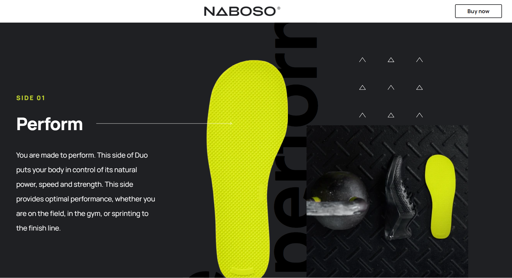 Naboso vividly highlights the benefits of their product and the purpose behind it
What’s so cool about it? What we see here is strong, high-quality visuals paired with a convincing copy. Instead of reading about the fancy materials Naboso uses, users learn how these new insoles will improve their training process and progress. The company also has a full multi-page website, but this particular one-page website focuses on one innovative product.
Think with Google
What’s this one-page website for? Google raises the problem of data bias and starts a conversation about fairness in machine learning.
On their page, you will find out what data bias is and what it is important to prevent flawed data from being used in learning algorithms:
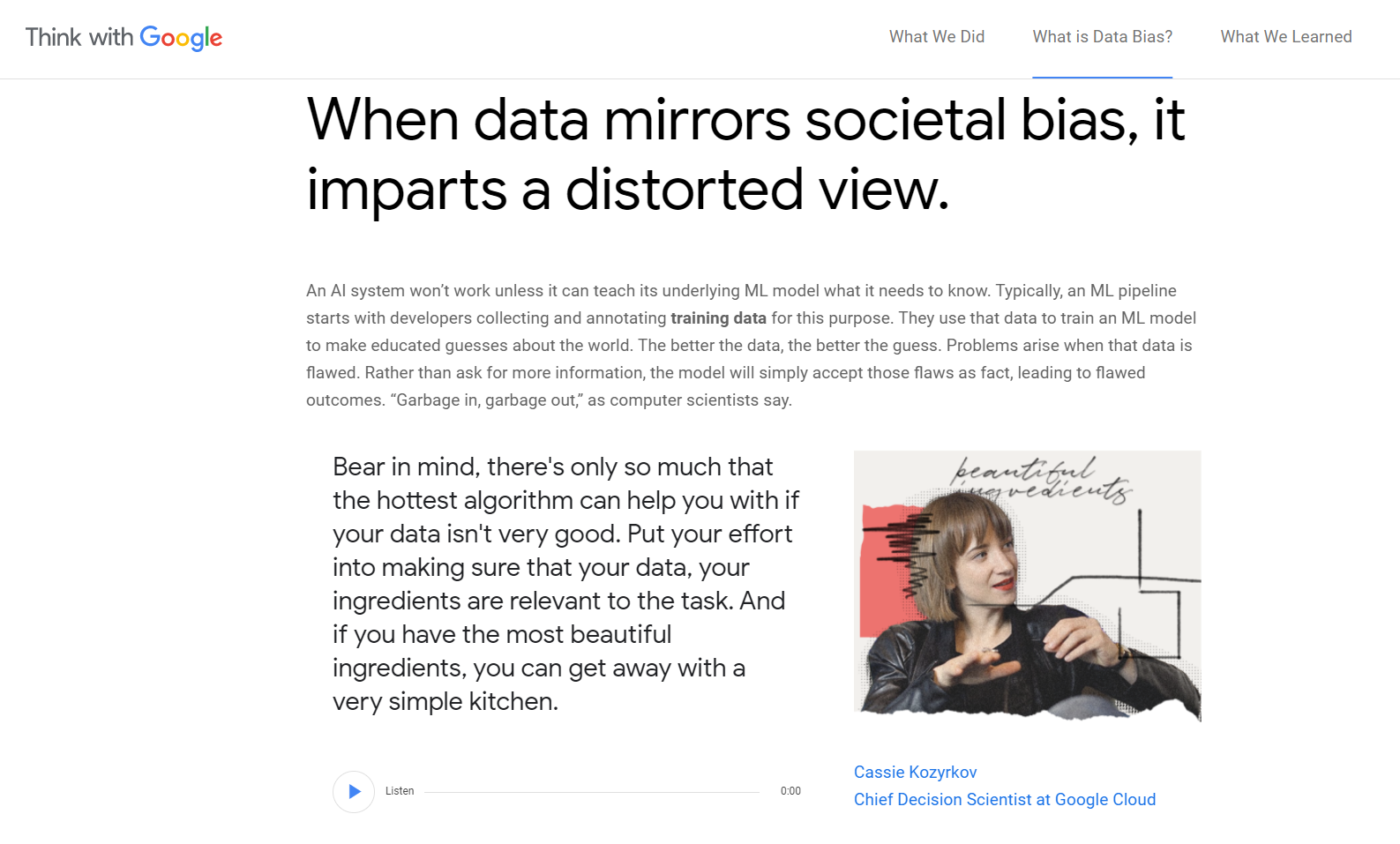 Google makes even a lengthy one-page website simple and easy to read
What’s so cool about it? Instead of bulky videos, Google uses an audio clip where an expert goes into more detail. It makes the whole user experience smoother because the page’s load time remains short, but the page itself becomes more engaging. That’s the way to go if you want to explain some difficult or technical details on your single-page website and give your product a human voice.
Order
What’s this one-page website for? Order is a cloud storage and collaboration solution. It’s a fast, smart, and productive way to secure and share ideas and files.
What you will notice right away is that some features of the product are integrated into its landing page:
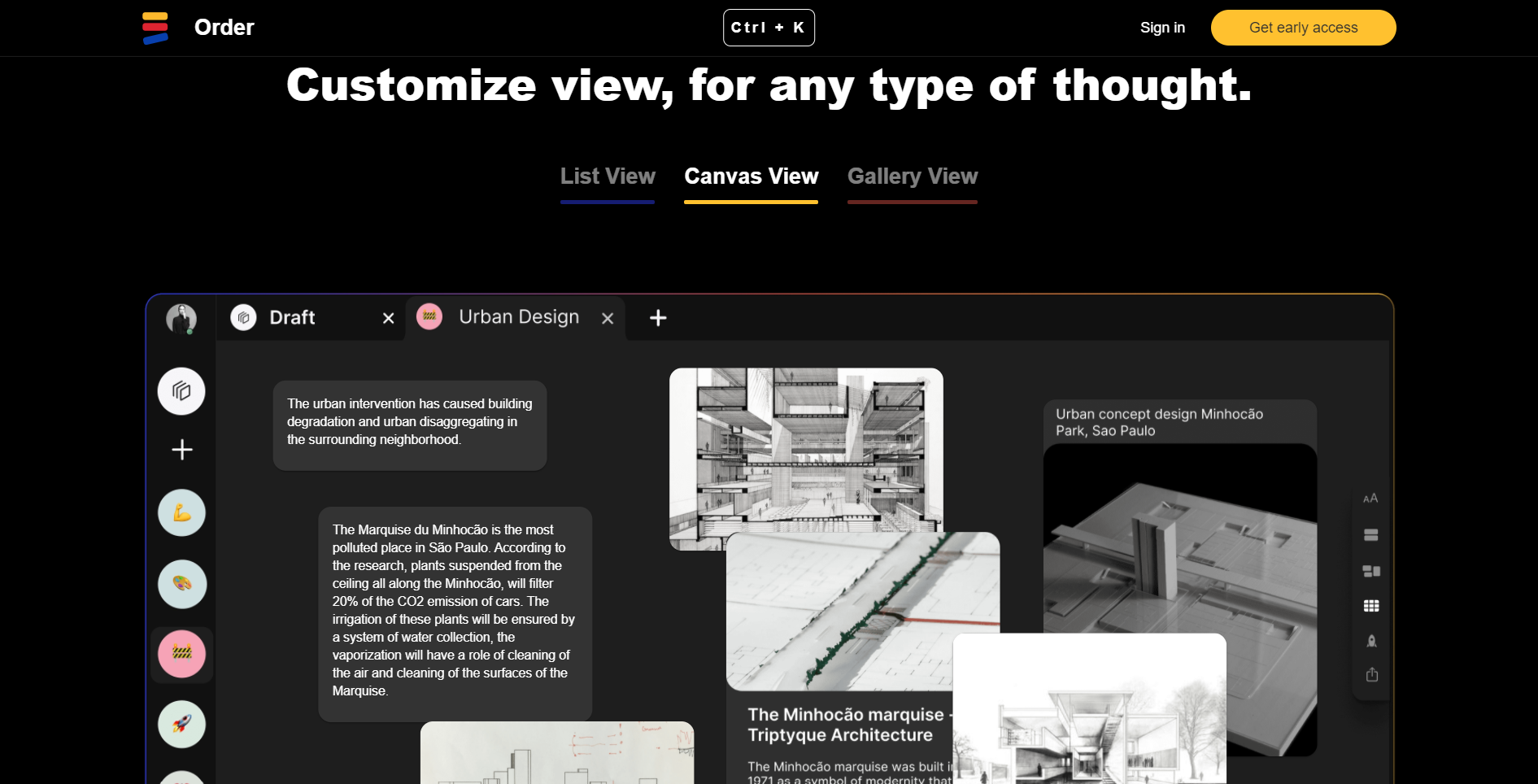 Order offers their visitors to try out their product features without ever leaving their website
What’s so cool about it? You can actually click on the buttons and switch between different modes, getting a taste of the product before even signing up and paying for it. This is an efficient way of showing how simple and user-friendly your solution is. You can adopt this practice and integrate similar interactive features into your own one-page website.
Honk
What’s this one-page website for? Honk is a real-time messaging app that stands out from the competition. Their one-page website is unapologetically informal, bright, and refreshing:
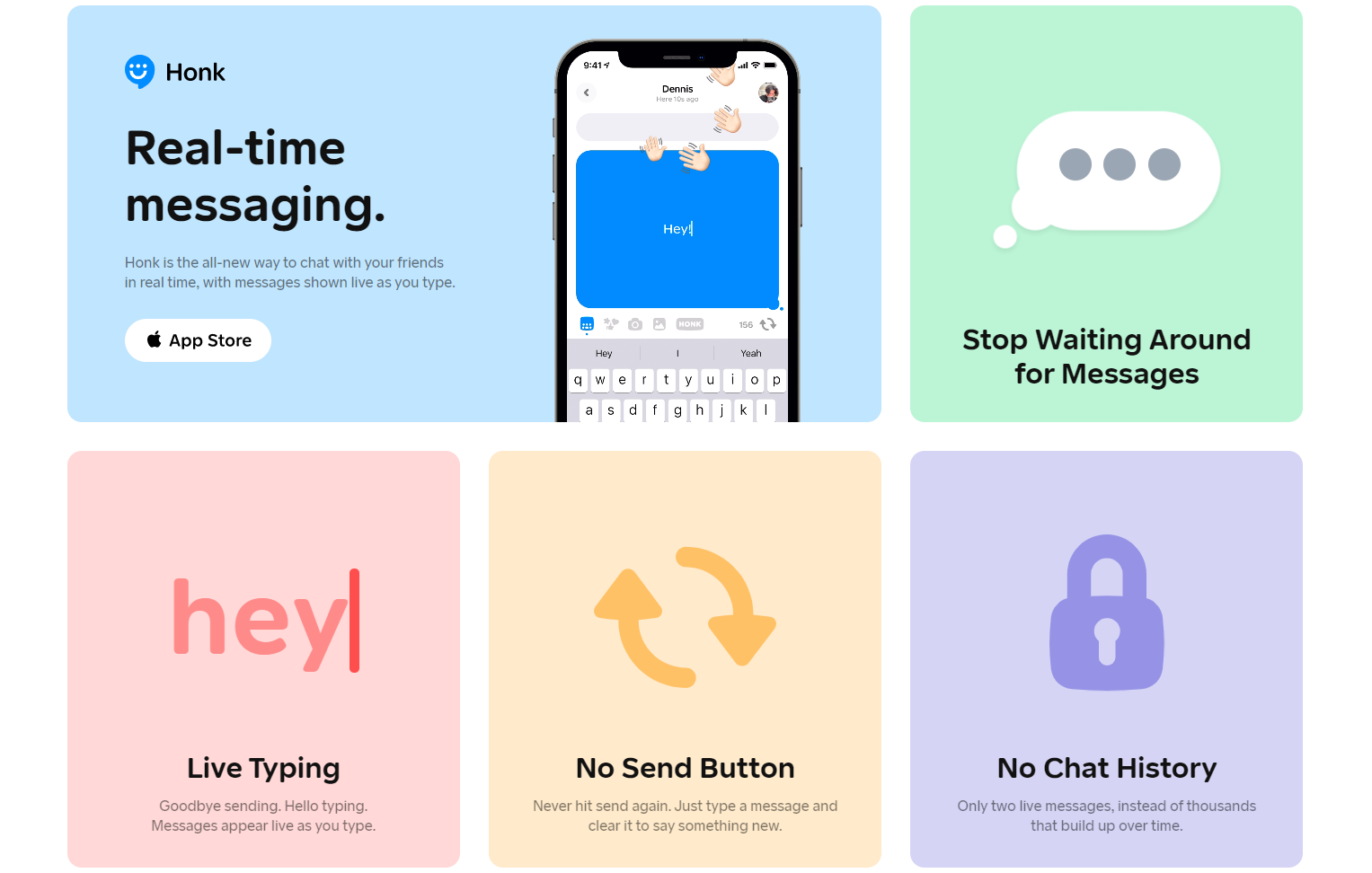 Honk has an extremely simple but entertaining landing page
What’s so cool about it? This is a good example of how you can go minimal and still bombard your visitors with the benefits and cool features of your product. There is not a single paragraph of text — just cool features listed one by one. You can do the same if your product is easy to understand and fun to use. Skip lengthy descriptions and use simple animations, bold typography, and icons instead.
To summarize
We hope you’re now less hazy on whether you need to create a one-page website for your business. This structure works especially well for landing pages, portfolios, event announcements, and limited offers.
If you want to put your new landing page to work, create a lead-capture form, and collect information from your users to be able to initiate a conversation with them. Then, start nurturing your leads using SendPulse marketing automation. You can deliver personalized promotional campaigns via email, SMS, and messengers. Give it a try!