At SendPulse, we have always paid extra attention to the interface usability and design, but the foundation of its visual part has never been changed globally and remained the way it was four years ago, when we launched the service.
Since then, we have expanded the range of marketing channels and added web push notifications, SMS, and Viber. We have updated the drag-and-drop editor and subscription form builder and added triggered emails as a part of the automated email flow. We have also added an option to invite multiple users to a single account, changed the mailing list workflow, improved segmentation, and many other functions.
These improvements often came with the need to create new designs and visuals. As a result, there were different element styles across the service: buttons, input fields, navigation bar colors, and styles for text and graphics. Our new design is aimed at solving this problem and building a consistent visual system in our service.
Here is what we have changed to improve your user experience:
Important elements are easy to find
We have highlighted one key action on each page so that every user can focus on what’s important.
 Accents on the main actions
All elements are in the same style
Now, the design of the service is in line with our new brand styles and the latest trends in user interface design. We have implemented the new brand color and font across the service — cyan and Nunito Sans respectively.
We have also reconsidered our accent colors and brought all functional elements of the service to a common design.
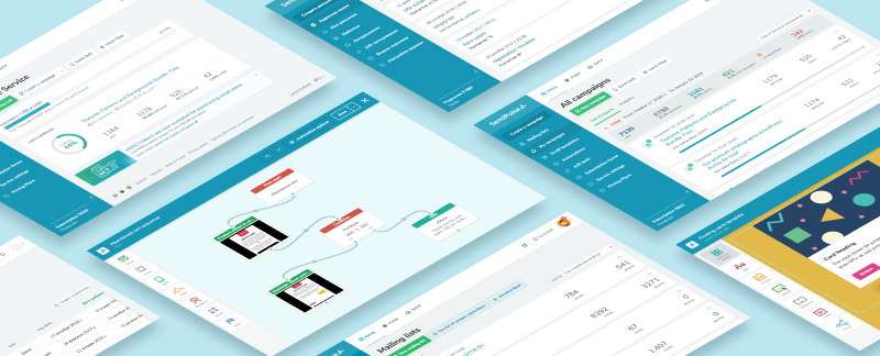 A uniform style of the service
The sidebar menu is more accessible — it remains fixed while scrolling. Also, the top navigation panel is now free from any extra information so that the users can stay focused.
We have also updated the illustrations and got rid of stock visuals.
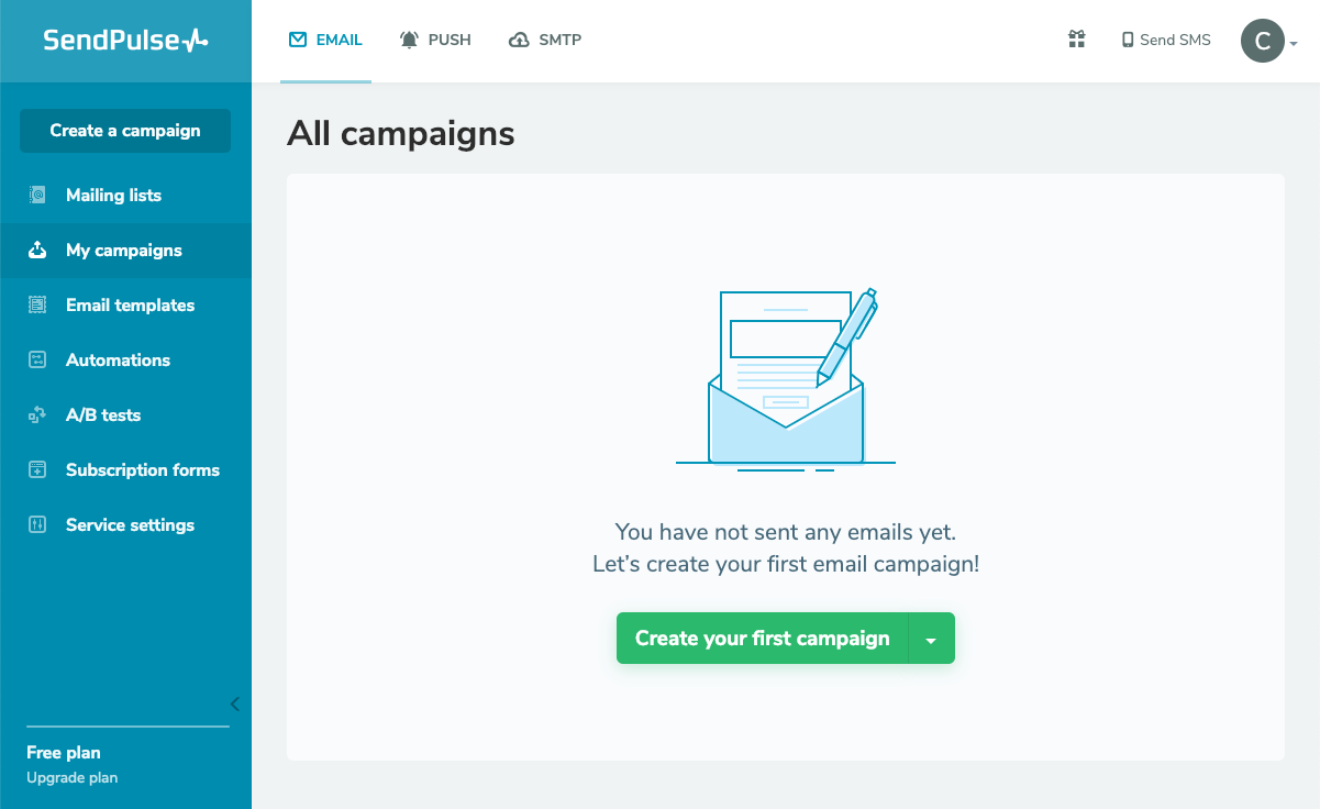 The sidebar menu and updated illustrations
“Reports” navigation is improved
“My campaigns” section is now combined with “Reports” and “Analytics.” We have added a visual horizontal bar for statistics on each email campaign so that it’s easier to compare the results of different campaigns at a glance.
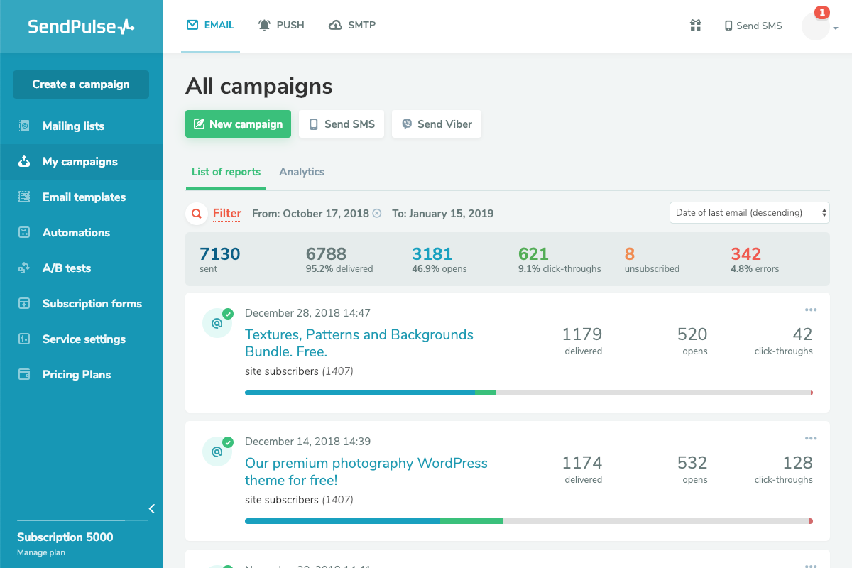 Visual bar for statistics on every email campaign
In addition to the visible part of the service, we have also fixed several code and layout mistakes.
Next, we are going to improve the campaign creation steps and transactional email service! For now, test the updated SendPulse design, leave your comments and tell us what you like or dislike. We will upgrade the tools further with your feedback in mind, as our main goal is to offer you the most convenient and comfortable service possible.At SendPulse, we have always paid extra attention to the interface usability and design, but the foundation of its visual part has never been changed globally and remained the way it was four years ago, when we launched the service.
Since then, we have expanded the range of marketing channels and added web push notifications, SMS, and Viber. We have updated the drag-and-drop editor and subscription form builder and added triggered emails as a part of the automated email flow. We have also added an option to invite multiple users to a single account, changed the mailing list workflow, improved segmentation, and many other functions.
These improvements often came with the need to create new designs and visuals. As a result, there were different element styles across the service: buttons, input fields, navigation bar colors, and styles for text and graphics. Our new design is aimed at solving this problem and building a consistent visual system in our service.
Here is what we have changed to improve your user experience:
Important elements are easy to find
We have highlighted one key action on each page so that every user can focus on what’s important.
 Accents on the main actions
All elements are in the same style
Now, the design of the service is in line with our new brand styles and the latest trends in user interface design. We have implemented the new brand color and font across the service — cyan and Nunito Sans respectively.
We have also reconsidered our accent colors and brought all functional elements of the service to a common design.
 A uniform style of the service
The sidebar menu is more accessible — it remains fixed while scrolling. Also, the top navigation panel is now free from any extra information so that the users can stay focused.
We have also updated the illustrations and got rid of stock visuals.
 The sidebar menu and updated illustrations
“Reports” navigation is improved
“My campaigns” section is now combined with “Reports” and “Analytics.” We have added a visual horizontal bar for statistics on each email campaign so that it’s easier to compare the results of different campaigns at a glance.
 Visual bar for statistics on every email campaign
In addition to the visible part of the service, we have also fixed several code and layout mistakes.
Next, we are going to improve the campaign creation steps and transactional email service! For now, test the updated SendPulse design, leave your comments and tell us what you like or dislike. We will upgrade the tools further with your feedback in mind, as our main goal is to offer you the most convenient and comfortable service possible.