While there are many ways to generate leads, the best choice is to combine and test different options not to miss a chance. In this article, we’ll introduce one of these options — a lead generation landing page.
You’ll learn how a lead generation landing page can help your business attract more prospects, see what elements will make it more effective, and get inspired by some lead generation landing page examples. Off we go!
What is a lead generation landing page
A landing page is a web page users are redirected to after they’ve followed a link, saw an ad, or searched for something online. There are two main types of landing pages:
- Product landing pages are meant to present one product or one category of similar products in an appealing way, which will eventually convert visitors into buyers.
- Lead generation landing pages are meant to gather visitors’ personal details to establish contact points with them and push them further within their customer journey, bringing them closer to your brand. Lead generation landing pages are also called squeeze pages as they are literally designed to squeeze users into sharing their personal data.
According to Unbounce, average landing page conversions vary from 2.6% to 6.1% for different industries.
Average landing page conversion rates by industry
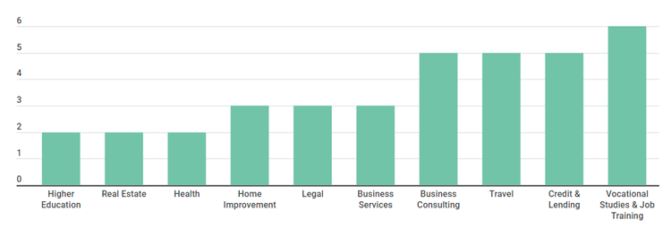 Source: Unbounce
Keep in mind that the more landing pages you have, the higher your chances are for getting new leads. HubSpot found that a company that has from 31 to 40 unique landing pages generates 7 times more leads than the one with only 1 to 5 landing pages. What is even more impressive, companies with over 40 landing pages can increase lead conversion rates by 12 times!
How to make a lead generation landing page
Every lead generation landing page is different, but all of them share three common elements:
- Value proposition. A lead generation landing page should offer some kind of a value proposition, i.e. an explanation of your offer and its benefits for the users. This is where you should include a lead magnet — a free webinar, an eBook, infographics, or any other meaningful downloadable content — that can motivate users to share their email with you.
- Call to action. You should place a clear call to action several times throughout the entire page, you have infinite options to choose from, like “Subscribe,” “Get a free eBook,” and so on depending on what lead magnet you offer.
- Lead form. When it comes to lead generation pages, the form is the very point where users turn to leads. To create a form that converts, make it stand out from the rest elements of your page and use clear and simple language for its title.
Overall, increasing the number of leads is not an easy task, but A/B testing can double your chances. For example, the Obama 2008 analytics team tested 24 different variations of buttons, images, videos, and call to actions to define the very combination that raised their sign-up rate by 40.6%.
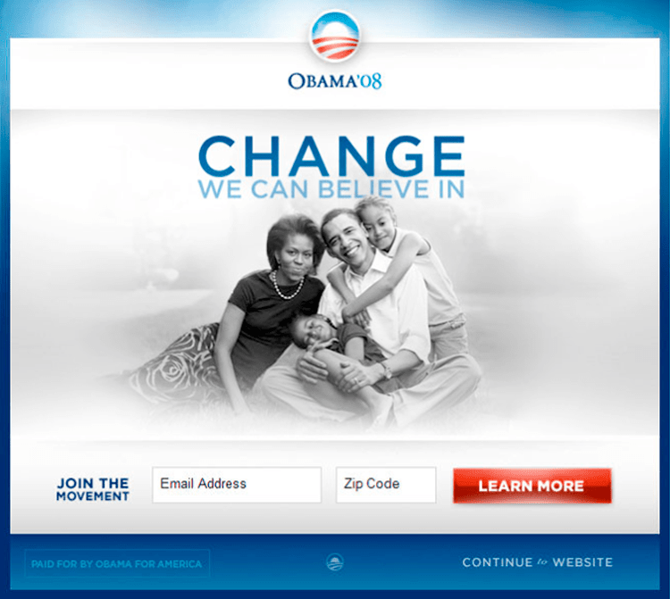 The variation of the Obama 2008 campaign that brought the most sign-ups
Lead generation landing page best practices
To create a lead generation landing page, you can use any convenient website builder. Let’s go over ten design and copy tips that would inspire you to create your own landing page which will capture as many leads as possible.
Five lead generation landing page design tips
High conversions of a lead generation landing page lie within the details. Once you have chosen the offer and highlighted its benefits for your prospects, consider a few lead generation landing page design tips:
- Try not to bombard visitors with a bunch of animations, colors, and design elements as the sole purpose of a lead generation landing page is to deliver the message and get the lead.
- Balance out the color scheme: figure out your main colors and accent the ones which you will use to drag attention to CTA buttons and other important elements.
- Provide enough white space for a clean-feel design and readability.
- Care about the structure of your landing page and navigation. Divide your page into blocks using different colors and make sure your headings, titles, and call to actions are bold and loud as it will make the navigation easier.
- Locate call to actions in different parts of your landing page: at the beginning to make a point, at the end to lead to the conclusion, and a few times in between as a reminder.
Five tips for your lead generation landing page copy
Lead generation landing page should contain meaningful copy to explain your offer and motivate prospects to sign up. Here is a quick recap of some essential tips for your copy:
- Dedicate each landing page to a single-focused CTA.
- Focus on the needs and problems of your prospects while writing your value proposition. Make sure your content is relevant and you provide a working solution to a real problem or request your prospects might have.
- Care about clarity of your call to action buttons. Use active verbs like “subscribe,” “learn,” “contact,” which will make your CTA a catalyst for action.
- Divide your text into clear logical parts; write a bold title and a clear description for your offer; add illustrations or some other visual guides.
- Organize your lead forms reasonably. The optimal number of fields used for lead generation will depend on the “prize” which you will offer to your users. According to the BJ Fogg’s behavior model, the higher the motivation, the higher the users’ ability to complete the action. It means if something you offer is indeed worth filling out a 12-fields form (motivation), users will do it and won’t get scared away by the number of fields (ability).
Examples of lead generation landing pages
The best way to improve your landing pages is to learn from real-life examples. We’ll walk you through five lead generation landing page examples and explain the principles behind their navigation, design, and copy.
The first example is a simple page from FabFitFun:
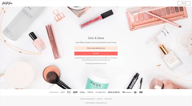 FabFitFun lead generation landing page
It’s a splash type of a lead generation landing page, which means that it appears every time a user wants to open a homepage of your website. As you can see, there’s an option “No thanks, just take me to the site” that allows you to close this splash page. FabFitFun ask users to share their email in return for some advantageous offers and deals.
Another type of a lead generation landing page is a pop-up. Take a look at an example from GQ:
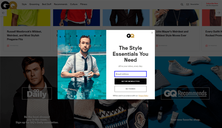 A pop-up lead generation landing page from GQ
When the pop-up appears, all background images get darkened, the full focus being on the pop-up. GQ offers an email digest about style essentials for people who decide to share their email address with the magazine.
Smart Insights offer an actual digital product — free planning templates. But notice how they do it: they’ve provided logos of different brands who are using their service, listed three clear benefits, and then supported their statement with social proof — 150,000 members from 100 countries are already using Smart Insights.
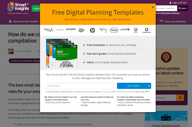 A pop-up lead generation landing page from Smart Insights
The CTA button has a strong message “Get access” which lets users know that after they enter their email address, many useful features and tools will become available to them. Customer feedback quoted below only helps to prove that the product is valuable to new users.
Take a look at another lead generation landing page example from Fisher Investments:
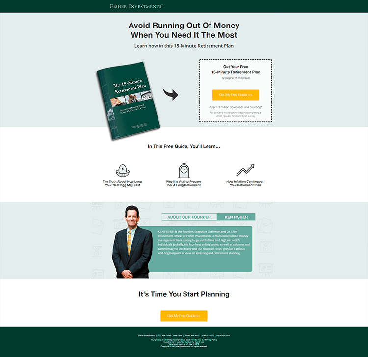 A lead generation landing page from Fisher Investments
The company dedicated an entire page to their free guide called 15-Minute Retirement Plan. The page begins with a call-to-action “Avoid running out of money…” strengthened by the prominent CTA button which is surrounded by a mention that 1.3 million people have already downloaded the guide. The next block highlights the main benefits of this free guide. The CTA button repeats at the end of the page.
Pay attention to the colors — the entire page is designed in dark and light green shades mixed with white, while the CTA buttons are bright yellow, which makes them more salient.
Another example of a lead generation landing page from Neil Patel includes an element of gamification.
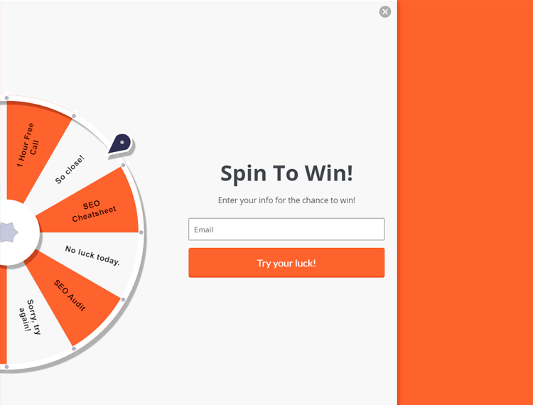 A lead generation landing page from Neil Patel
Neil Patel added some fun into the sign up process and welcome their visitors with a spinning wheel where users can win various prizes like 1 hour free call, SEO Cheatsheet, SEO audit, and so on.
Lead generation landing page for your business
Your business can benefit from lead generation landing pages, especially if you focus on
- presenting a value proposition that addresses real problems of your audience;
- dedicating one page to one offer;
- writing a clear copy and accompanying it with bold design;
- creating bright call to actions and repeating them a few times throughout the page;
- investing in valuable freebies and downloadables.
And once your landing page has bought you a plenty of warm leads, remember to use SendPulse to communicate with them.