Many businesses struggle to boost conversions with their landing pages during Instagram campaigns. One possible problem might be that they don’t know how to create a high-converting landing page.
With their great copy and appealing visuals and graphics, high-converting Instagram landing pages can affect your campaigns positively. They can help you maximize your social media marketing and advertising efforts.
In this post, you’ll learn five best practices for creating high-converting Instagram landing pages and examples you can follow.
What is an Instagram landing page?
An Instagram landing page is a standalone page that users can access through clickable links in your social media profile. You typically fill it with testimonials, reviews, and other elements that persuade profile visitors to take your desired step in their customer journey.
In essence, you may use Instagram landing pages to:
Overall, Instagram landing pages can be a versatile tool. You can have one or more goals for your Instagram landing pages.
How to build a high-converting Instagram landing page
Now that you know the basics, here are five strategies for building Instagram landing pages for your next marketing campaign.
Create clear landing page copy that aligns with Instagram ad or post message
Your message is an important element of Instagram landing pages. It should be clear, persuasive, and concise to get your audience to take the desired action.
So, the first step to ensure you create a good copy is to determine what you want to achieve with your social media landing page. Do you want users to subscribe to your mailing list? Or maybe you want them to buy from you? Or both?
Once you’ve defined your goal, determine your audience’s pain points, which they can resolve by taking your desired action. Touch upon these audience pain points with your headlines. This can persuade your users to take the action you want them to take.
For instance, if you want to grow your SEO tips mailing list, your headline could be “Still not ranking in SERPs? Boost your rankings with my tips.” The headline is a good one because it can prompt users to click on the “Subscribe” button.
Your Instagram landing page copy shouldn’t just consider your audience’s pain points. It should also align with your message on your Instagram posts or ads. For example, if you mention exclusive offers and promos on your social network, mention them on the landing page, too.
Check out one of our good Instagram landing page examples. Syracuse University is promoting its MBA online course in this Instagram ad.
 A Syracuse University Instagram ad; source: Instapage
After you click, you get to this regular landing page ad that tells you more about the online course and how you can sign up.
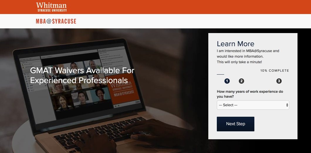 An Instagram landing page after you click on the Syracuse University ad; source: Instapage
In other words, the messaging on the Instagram ad and the landing page aligns. The ad and the landing page follow a logical order.
Use high-quality visuals
Ever seen a cluttered website design? It’s off-putting.
Technically, the average Instagram landing page is a one-page website. It only makes sense that you treat its design as you’ll do a website. That means you need to give it a nice touch with high-quality visual elements.
According to Beanstack, landing page images should have a width of 1572 px. They should be at least 786 px wide to prevent distortion. For videos, Wistia recommends a width of between 401 px and 600 px.
When designing your Instagram landing page, understand the purpose of each visual you want to include. Is it meant to help users understand your products and services better? Or is it meant to add aesthetic appeal? Answering these questions will inform you about what types of visuals to include and where to put them.
Photographs are great for showing real people and places that tell a relatable story. Videos are perfect for depicting movement.
Let’s say your custom landing page offers a specific product bundle for a limited time. You can include impactful images that show each product included in the bundle in detail. Here’s a great example from Skullcandy.
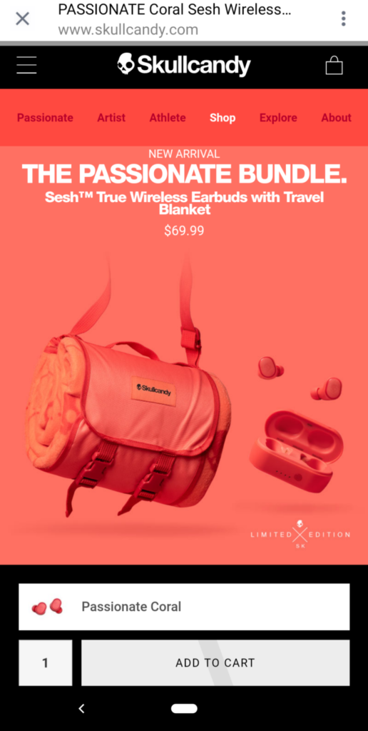 Skullcandy’s Instagram landing page with images that shows product details; source: SproutSocial
You could also opt for high-quality videos to explain how your product or service works. If you want a playful tone on your Instagram landing page, you can even use illustrations.
Use a clear call to action
A clear call to action helps your audience take action after getting on your Instagram landing page. But you need to experiment with your CTA to find the right one.
Short and simple words clearly convey the next step to visitors. For example, if you run an eCommerce store, you may use CTAs like “Add to Cart” and “Shop Now.” Meanwhile, in SaaS marketing, CTAs like “Start Free,” “Sign Up For Free,” “Create Free Account,” and “Get A Demo” are more common.
Whatever you choose, ensure the CTA button stands out from the background of your dedicated landing page. You should also place it right under the main description or headline.
Check out this Wall Street Journal Instagram landing page, which promotes some of the publication’s articles. The CTA is right under the main headline, “The Wall Street Journal.”
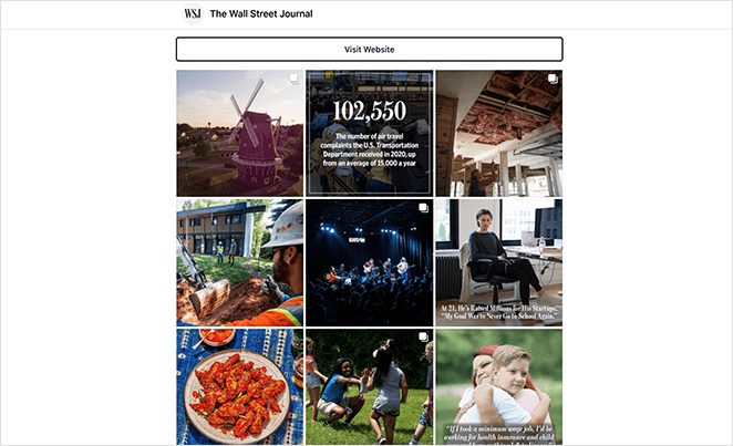 The Wall Street Journal Instagram landing page promoting some of its articles; source: Seedprod
It stands out, too, since the CTA button is white, as opposed to the rest of the landing page, which is full of color.
But if you want to display blog posts on your Instagram landing page just like Wall Street Journal did, don’t just bank on what your Instagram landing page can do for promotion. Make sure you also optimize the content of your blog posts so they can appear in search engine results pages when someone makes a relevant search query.
Incorporate social proof elements
Consider the last time you bought something online. Once you saw the product’s benefits, you checked the reviews and testimonials to see if others had the same experience.
That’s social proof at work. That’s also the reason having social proof elements on your Instagram landing page is important. Social proof on your Instagram landing page assures potential customers that your products are worth buying. Besides, social proof on your social media platforms could also get you more followers on Instagram, shares on Facebook, retweets, and other types of engagement.
To get social proof, search through Instagram posts about your brand or products. Search hashtags related to your brand to find positive feedback. Then just reshare these testimonials after getting your customers’ permission to use them.
Sephora, a beauty company, included testimonials on their dedicated Instagram landing page.
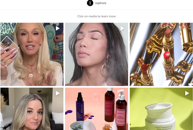 Video testimonials on a Sephora Instagram landing page
These videos let Sephora’s customers know how their products work and the results they can expect, which could increase patronage.
You can also include case studies about your products or brand in this type of landing page. This will give prospects real-life stories and examples on a larger scale, further reinforcing that your products are effective.
Optimize for mobile viewing
If your website is responsive on mobile devices, visitors can navigate it conveniently and have no problems converting.
That’s why it’s crucial to consider mobile screen sizes when designing Instagram landing pages. You generally have limited screen estate to capture users’ attention compared to desktops.
While specific guidelines differ based on device and screen size, here are general recommendations for optimal mobile viewing:
- Headline length. Form headlines that are concise. Aim for around 5-7 words or 20-30 characters to ensure it’s easily readable on mobile devices without getting cut off or wrapping onto multiple lines.
- Font size. Ensure the font size is legible on smaller screens. For body text, a minimum size of 16 px is usually recommended, while headlines should be 24-30 px. However, you may alter font size based on the font’s readability, style, and overall landing page design.
- Button size. Ideally, your CTA button should be approximately 45-57 px in height and width, allowing users to interact comfortably without accidentally tapping adjacent elements.
Bring the most impactful and relevant information up front, as that’s what visitors will see first. Cut out unnecessary elements, and go straight to the point. If users don’t see anything relevant, they could move on quickly.
Use an effective landing page creator like SendPulse to create a page that can adapt to any screen size and improve user experience. SendPulse has tons of templates and customization options.
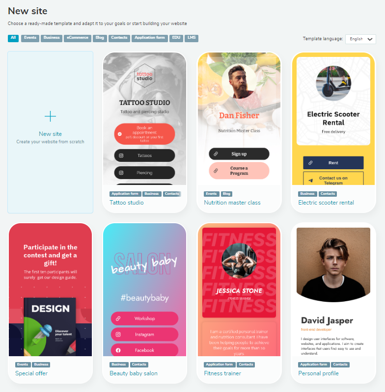 Ready-made templates in SendPulse
Test different fonts and advanced and simple color schemes. Use design elements and colors that point users to important content to get them to take action.
Mobile users tend to be less patient with slow-loading pages. Try to optimize your images and minimize server requests to improve page load speed. Aim for an ideal mobile landing page loading time of 1-3 seconds. To analyze your page’s loading performance, use tools such as Google PageSpeed Insights or GTmetrix.
In closing
Instagram is a fantastic place for marketing and ad campaigns. But to ensure conversion, your Instagram landing page design must meet specific criteria.
It should have a clear landing page copy that aligns with your Instagram post or ad messaging. It should also have high-quality visuals and a clear CTA. Don’t forget to include social proof elements and optimize the page for mobile viewing.
Follow these tips and your Instagram advertising and marketing efforts won’t be in vain. Good luck!