Millions of people surf the web every day. Think for a moment: this is a huge pool of your potential subscribers! We are going to discuss how to draw more people to your mailing list using an opt-in form, and show you the best practices to follow.
Where do I place the opt-in?
Home Page
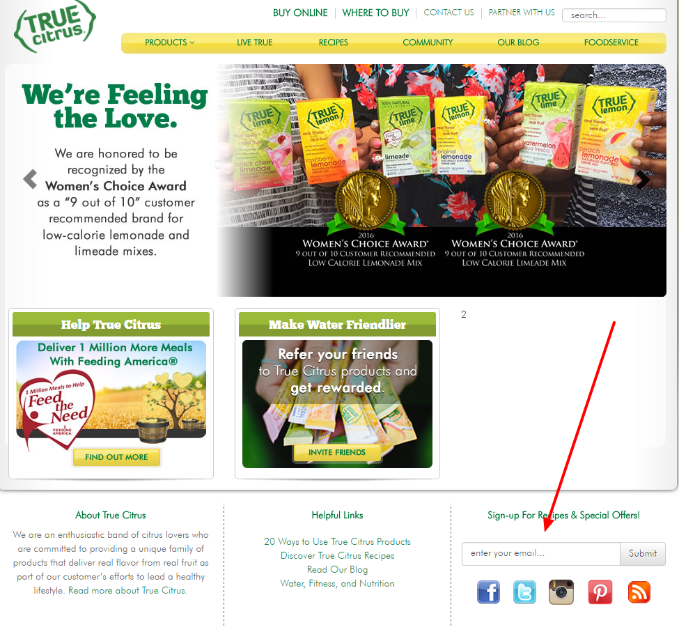
The opt-in must be easy to spot on your page. You don’t want people to be roaming the pages of your website in search of a way to give you their email address. It’s a sure way of losing them. See the example of an opt-in on the home page by True Citrus.
 Pop-up
No matter how many complaints we receive from users about pop-ups, statistics show that they work! However, remember that a pop-up should appear before your eyes as soon as possible after you open the website. If a pop-up appears after the person has already spent some time on your website, then it may get in the way of an important action, such as a purchase.
See below for another True Citrus example: an opt-in pop-up offering a 20% discount for the next order. Nice teaser, isn’t it?
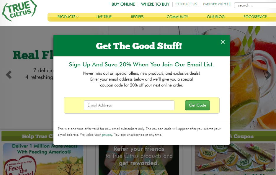
Remember that the pop-up should not be aggressive. Give people an opportunity to close it or postpone registration. It will be better if the site stores cookies.
Facebook Page
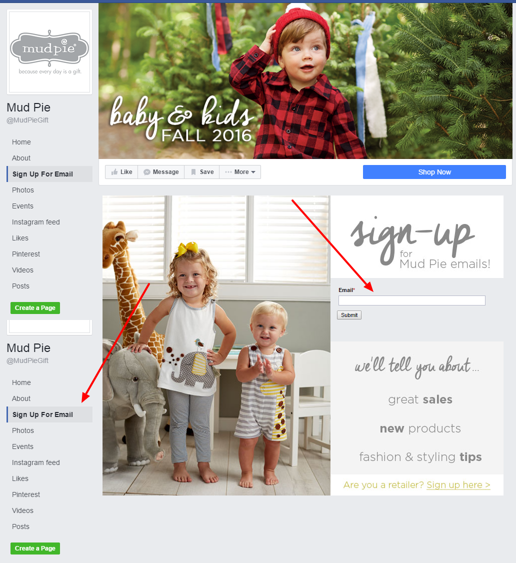
Do you have lots of Facebook fans? Send them newsletters and special offers by adding a sign-up option to your Facebook page. This tactic allows you to expand your mailing list so you can proceed further, nurturing your leads.
Take a look at how online store Mud Pie used this idea!
Landing Page
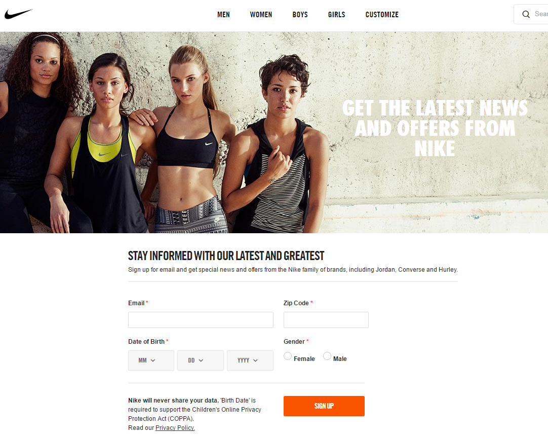
Create a dedicated landing page for your newsletters.
Nike built a specialized landing page for subscription, which you can reach straight from the home page.
Allow people to customize the content and set the email frequency
Give your subscribers an option to choose the content, which is relevant to them (newsletters, special offers, promotions, etc.). If the subscriber is only interested in receiving promotional offers, why would you cram them with newsletters?
Add a light, humorous touch
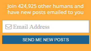
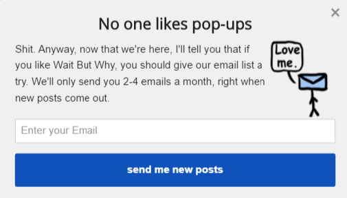
Try to be funny and to provoke positive emotions. People like that. Only, make sure you are not crossing the line with your humor, because you do not want to offend anyone. Take a look at Tim Urban’s ‘Wait But Why’ blog.
Below is the ‘Wait But Why’ opt-in form on the home page:
And here is their amusing pop-up, which sets the expectation of email frequency as well:
Offer discounts and bonuses
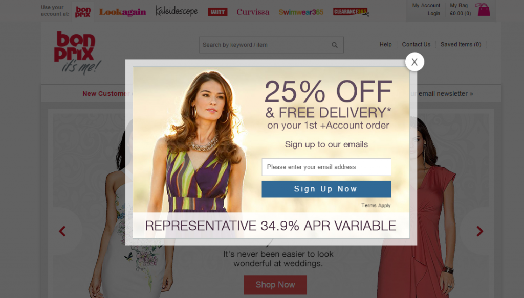
Offer a good first purchase discount, free shipping, or other bonuses. Your potential subscribers need an incentive to sign up for your campaigns.
Launch lotteries to gain traction
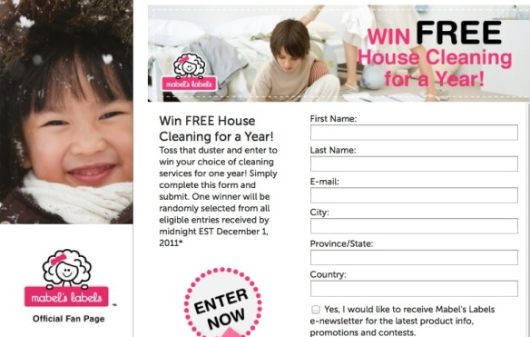
Knowing that you have a chance to win something can be a great incentive to opt in. Most importantly, the idea of a lottery has to be clear and simple, with minimum steps for participation.
Use double opt-in
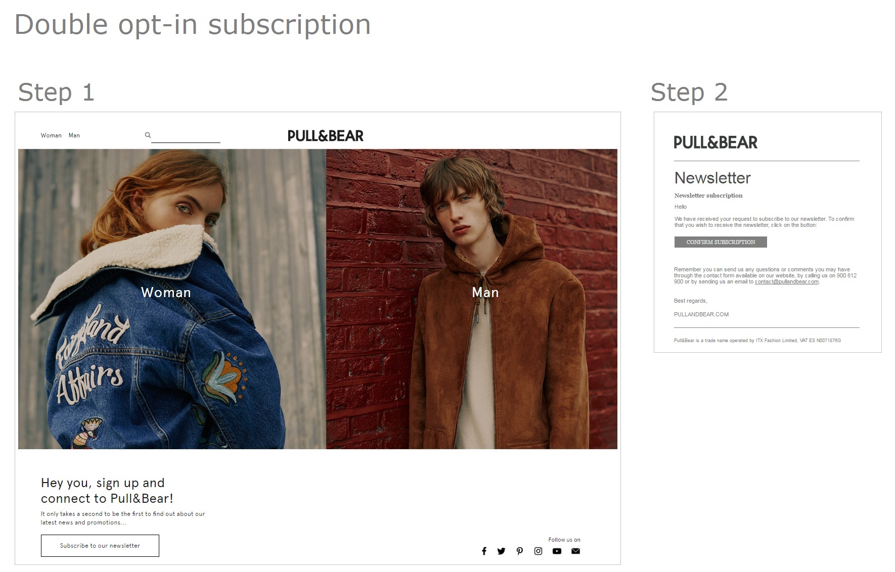
To maintain the quality and cleanness of your mailing list, try the double opt-in form. Double opt-in implies that users are required to enter their email address twice during subscription or confirm their registration by the email. This way, you will reduce the number of invalid email addresses in your mailing list.
Below is an example of a two-step Pull&Bear subscription.
Yoga Journal Opt-in Strategy
Yoga Journal rocks when it comes to attracting more subscribers! And you can rock with yours if you learn from them. Their strategy is a combination of the techniques we’ve mentioned. It is hard to miss their opt-ins because they are like covering you with a warm blanket, with space to move. Just enjoy…
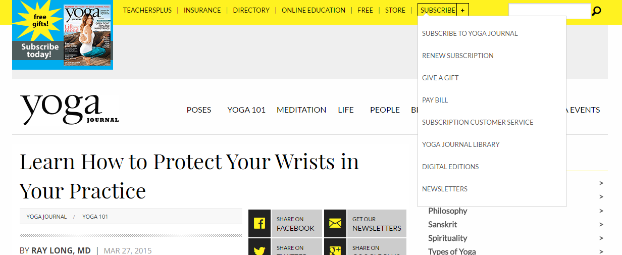
A subscription drop-down on the home page…
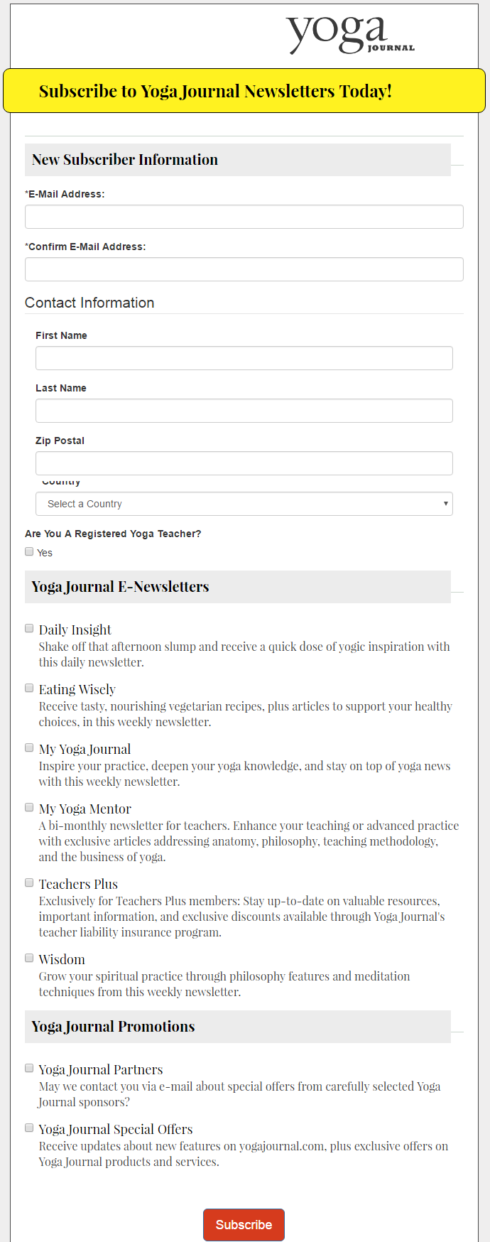
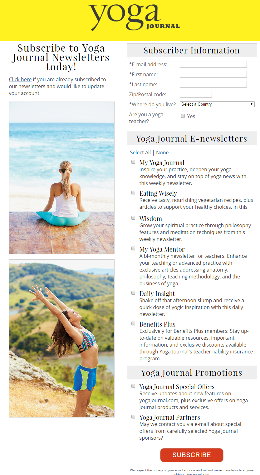
…which leads to the dedicated landing page with the subscription form and email preferences settings…
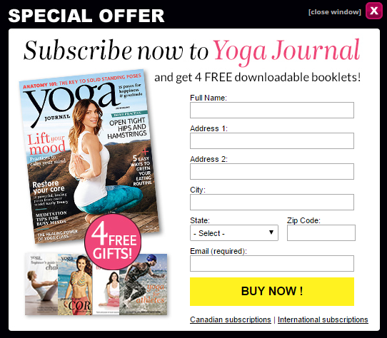
…complemented with a pop-up on the main page, offering free downloadable booklets as a teaser, with the requirement to insert your email address.
Their Facebook page has a sign-up option…
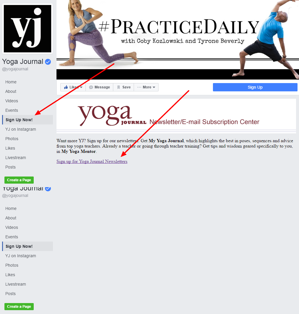
…taking you to another wonderful subscription landing page, with the option to set email preferences.
In order to expand your mailing list effectively, you need to engage all possible communication channels and combine them together depending on your context and specifics. Then, after a while, analyze the results and see which channels and combinations work best for you.