Every email you send should include a Call-to-Action. Its purpose is to help the subscribers come to the final aim: to make a purchase. After reading the CTA, the user should understand what to do next. Each email must contain only one CTA. There is no universal Сall-to-Action, because every email is unique and requires a different CTA.
The CTA’s role in newsletters:
-
- Attracts attention
- Motivates and directs potential buyers to the next stage of the sales funnel
- Reduces the number of subscriber’s clicks
- Indicates a sale target
- Subconsciously pushes the client to make a purchase
- Helps to obtain additional information about subscribers (if they are required to fill out a form)
- Helps to segment subscribers (for example, gender-based type etc.)
If you are at various stages of the relationship with different segments of your audience, think about what stage is best to make an offer to subscribe, to buy a product, to join the community, to share with friends, to fill out a form or to leave a review. Understanding your audience is the key to improving the efficiency of your CTA. Segment, group, and look for new features and characteristics of the audience.
The rules of CTA creation
Make it clear.
An effective CTA includes 2-5 words.
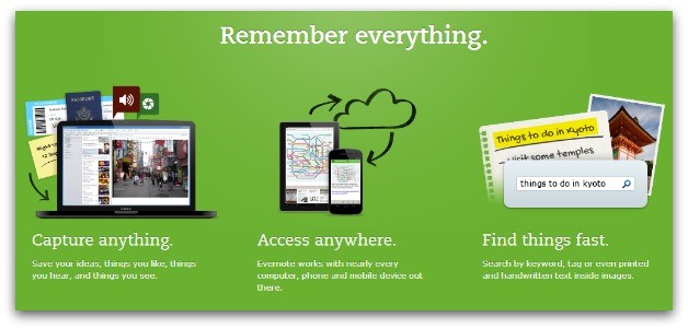
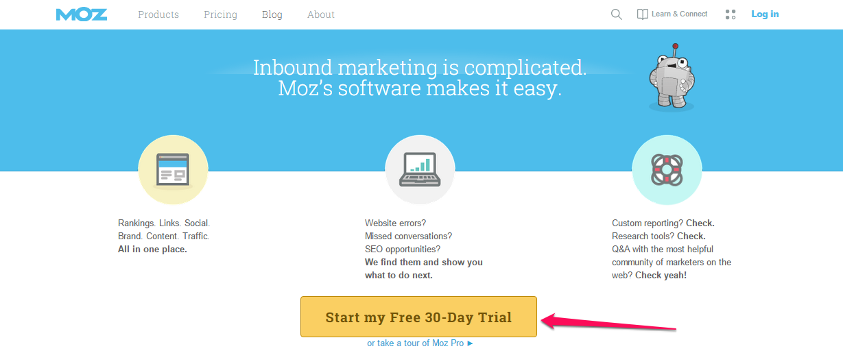
Make it action-oriented.
Start your CTA with «Download» or «Start My Free Trial Now».
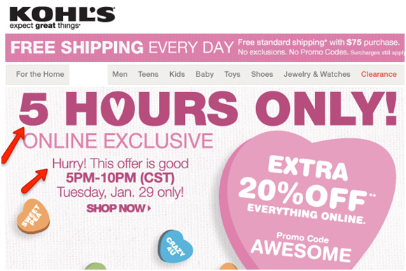
Encourage your subscriber to make a purchase. Use such phrases as «For five hours only!», «Buy right now», etc. This is an ideal variant for selling designer clothes or any other limited products.
Make it stand out.
Make the CTA button contrast with the rest of the email because the color plays an important role. Strong, contrasting colors generally outperform colors that blend in with the theme of your landing page. For example, Carelogger increased its conversions by 34% by changing their red button to a green one. The size of the button matters too. It mustn’t be huge, but if you make it too small, it will be ignored.

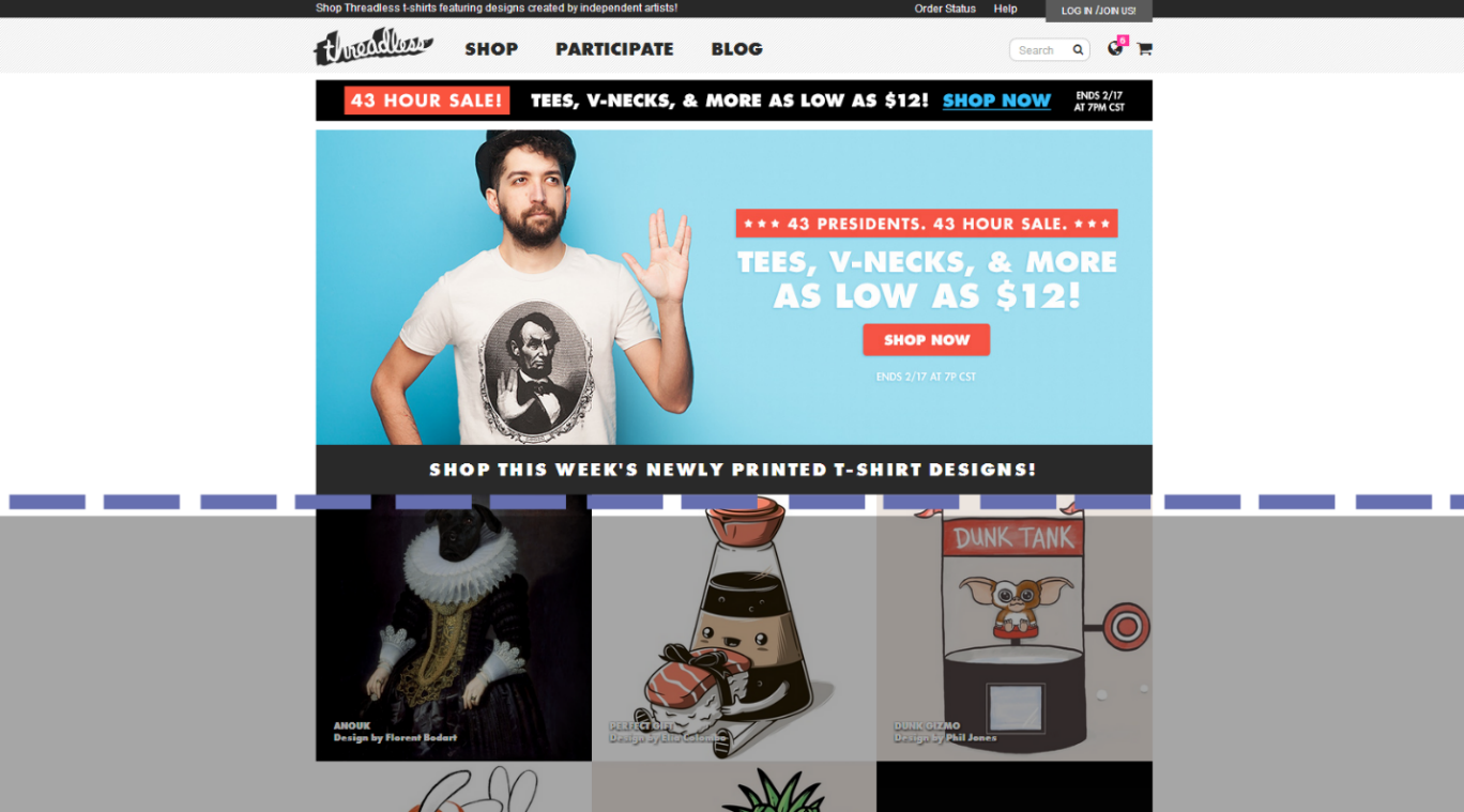
Keep the CTA above the fold
Allow your visitors to see your CTA without scrolling down the page. It will increase click-through rates. Think about the flow of the page when deciding where to put the button.
Types of Call-to-Action
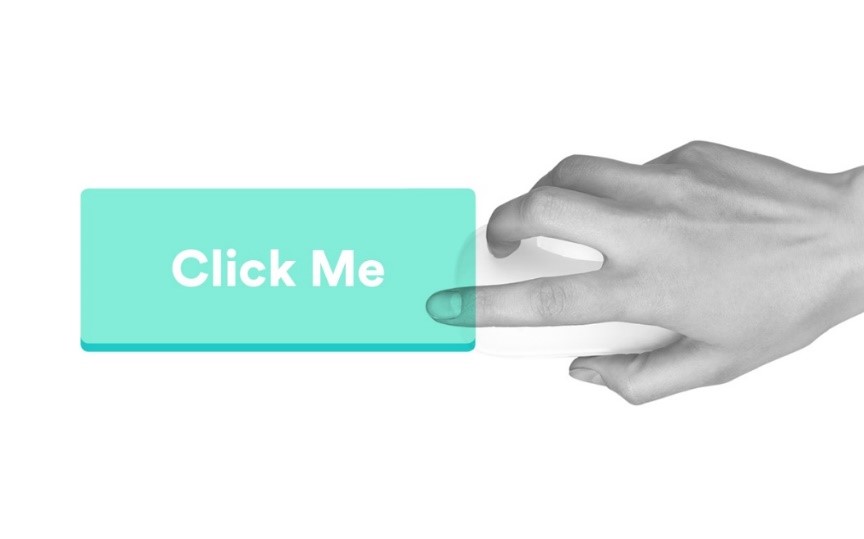
Button.
This is the most common type for promoting different products.
Call-to-Actions that create a sense of movement.
The most successful CTAs were made with the help of arrows. They are an important graphic that directs visitors to the most efficient elements on the page.
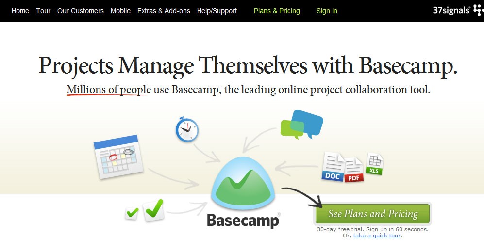
It’s hard not to pay attention to the element that four arrows point to. It will be a good variant if you want to grab all subscribers’ attention to focus on one action.
Subscription form as a Call-to-Action.
This type of Call-to-Action is also suitable for promoting training, webinars, and social action, etc.

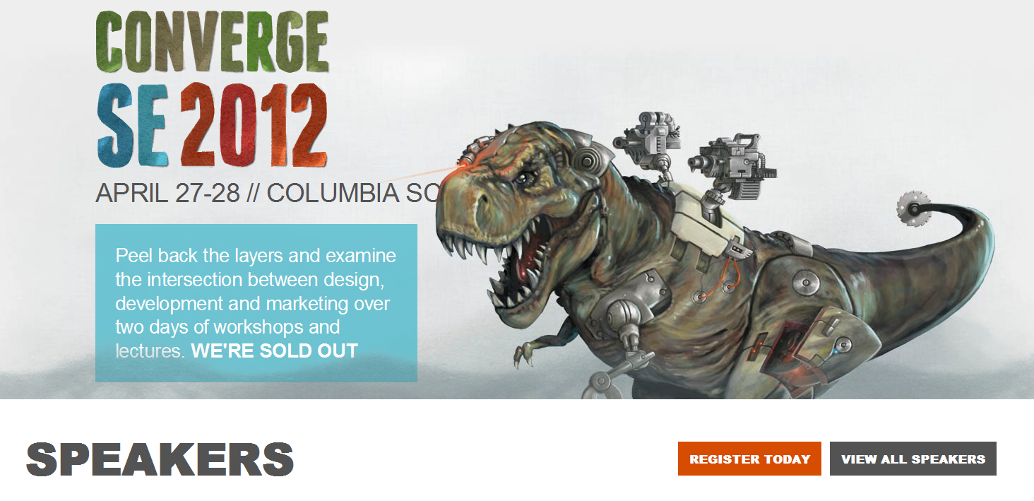
Calls-to-Action offering primary and secondary options
This is suitable for promoting different events, for example concerts and exhibitions. It is also useful for purchasing or pre-ordering some products (computer games, software, etc.).
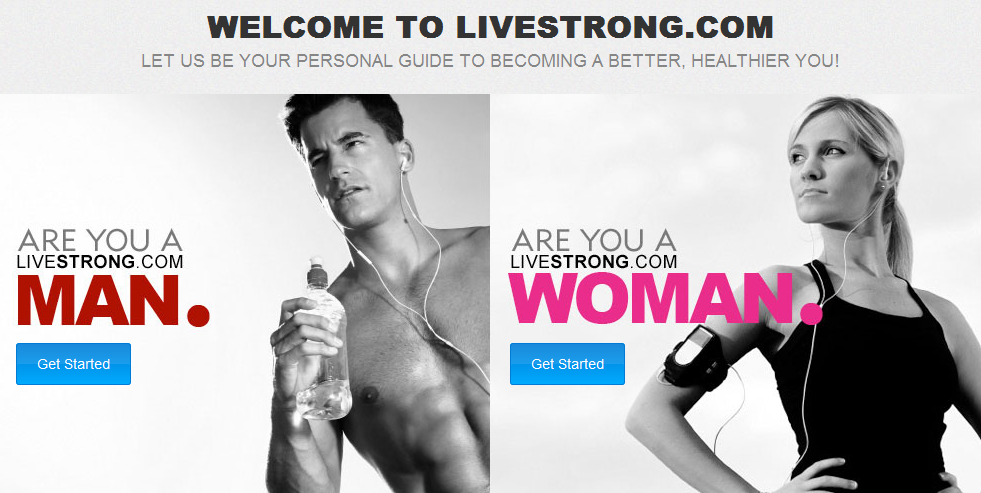
Segmenting CTA.
It’s easy to make your visitors segment themselves. This way you can identify your target audience and you can use it in order to sell men’s and women’s products such as clothing, perfumes, jewellery, etc.
Video.
If you have a mono-product, this option is ideal for you. It will be suitable for promoting an event, too.

CTA that assures customers.
If you want visitors to make a purchase, they must trust you unconditionally. The best way to win confidence is demonstrating that you comply with security and privacy policies.
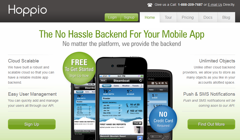
The company «Hoppio» placed the Call-to-Action next to the notice that it is not required to report your credit card number if you want to download a trial version of the product.
Hero Image.
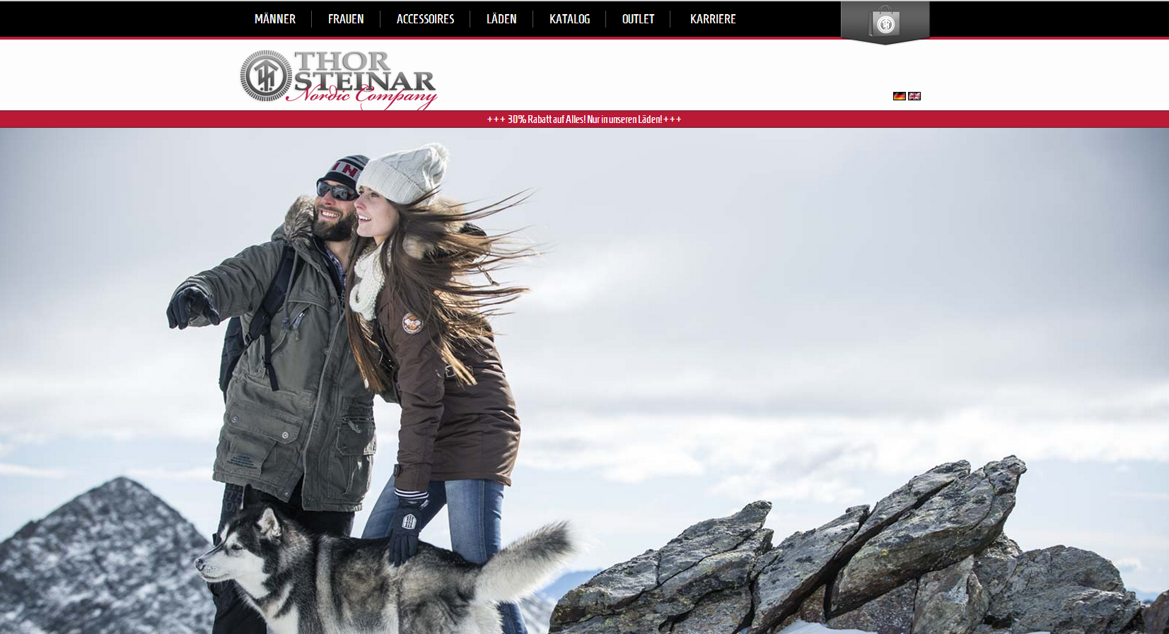
A hero image is a large fashion banner that is placed at the foreground of the web page. It can be used as a mass Call-to-Action to allocate a separate product, collection or key brand message. This variant would be ideal for promoting a new brand because the visitor immediately understands what kind of product is in front of them, its appearance and where it is necessary to click to go to the next step.
Don’t think that if you put a huge red button displaying «Buy all sizes immediately» it will somehow increase the conversion and affect the financial results.
Your business interest should concur with the interests of the buyer. If your marketing mix (product, price, channel, attraction) does not correspond to a competitive market and customer needs, the Call-to-Action will be as absurd as the annoying sales representative who does not think about the needs of the client, and tries his best to sell the product.