Are you looking to encourage your website visitors to complete a desired action? Incorporating a hello bar can be a great solution. In this comprehensive guide, we’ll cover different tips and tricks on how to use floating bars effectively. We’ll also showcase how to create one of your own that you can immediately use on your website.
What is a hello bar?
A hello bar, also called a floating bar, sticky bar, or announcement bar, is a banner that remains fixed to the top of your website and can be set to appear on any or specific pages. Its purpose is to deliver a concise message, announce a new feature, or direct visitors to a particular area of your site. Its primary goal is to increase conversions and drive more engagement from website visitors.
Using a hello bar as any other type of pop-up is always a great choice. However, the risks of overwhelming your website visitors with floating bars are minimal, as they prove to be less disruptive. Unlike pop-up windows, announcement bars do not obstruct the content and remain in a fixed position as users scroll through the page. This allows for a better user experience.
What are hello bars used for?
Sticky bars are a versatile tool to help you achieve your marketing goals. They can be used in a number of ways, for example:
- to make company announcements;
- promote flash sales;
- offer lead magnets to boost lead generation;
- encourage registrations for webinars or other events;
- provide purchase incentives;
- educate your website visitors, etc.
As you can see, incorporating a floating bar into your marketing strategy is definitely worth considering. Now that we have established what a hello bar is and what it is used for, let’s get your creative juices flowing and explore some creating and copywriting tips.
Hello bar design and copywriting tips
So, you’ve decided to add a sticky bar to your website. But how to make it stand out and, most importantly, drive action? Here are some tips and tricks to get you started:
- Keep it short and sweet. Announcement bars are typically limited in space, so keep your message short and to the point. Your goal is to grab the user’s attention and communicate the most important information quickly.
- Write in clear and concise language. Try to omit wordy statements and avoid using jargon or complex words that may confuse the user.
- Focus on the value. Highlight the value proposition of your floating bar. What’s in it for the visitor? Will they receive a discount or get early access to a new product? Make it clear and compelling.
- Use a strong call to action. Your announcement bar should have a prominent CTA that directs users to take a specific action, such as clicking a button or visiting a landing page.
- Create urgency. Another working practice is to create a sense of urgency by adding a countdown timer, for example. This might encourage your website visitors to take action quickly.
- Put an emphasis on consistency. Your hello bar should reflect your brand’s style and tone of voice. Use fonts, colors, and design elements that are consistent with your website’s overall branding.
- Test and iterate. Make sure you run A/B tests to experiment with different copies and designs to see what resonates with your audience. Adjust details based on user feedback and actions.
The goal of any hello bar is to grab the user’s attention and drive action. Keep the primary goal of your pop-up in mind while crafting a message and designing the widget. If your message is crystal-clear and valuable to the user, the conversions won’t keep you waiting.
Hello bar examples that convert
The theory is good, but real-life examples are always better. A huge variety of companies make use of hello bars for different purposes. Let’s have a look at some of them.
Asos
Adhering to EU cookie regulations is crucial to avoid hefty fines for breaching e-privacy rules. Requesting visitors’ permission before using cookies is also a more ethical approach that fosters trust.
Sticky bars are frequently used for this purpose, as you can see from the example of the hello bar used by Asos, which seeks visitor consent for cookies in a straightforward manner. Asos decided to place it at the bottom and make it really visible. You can play with designs and see how it looks best on your website.
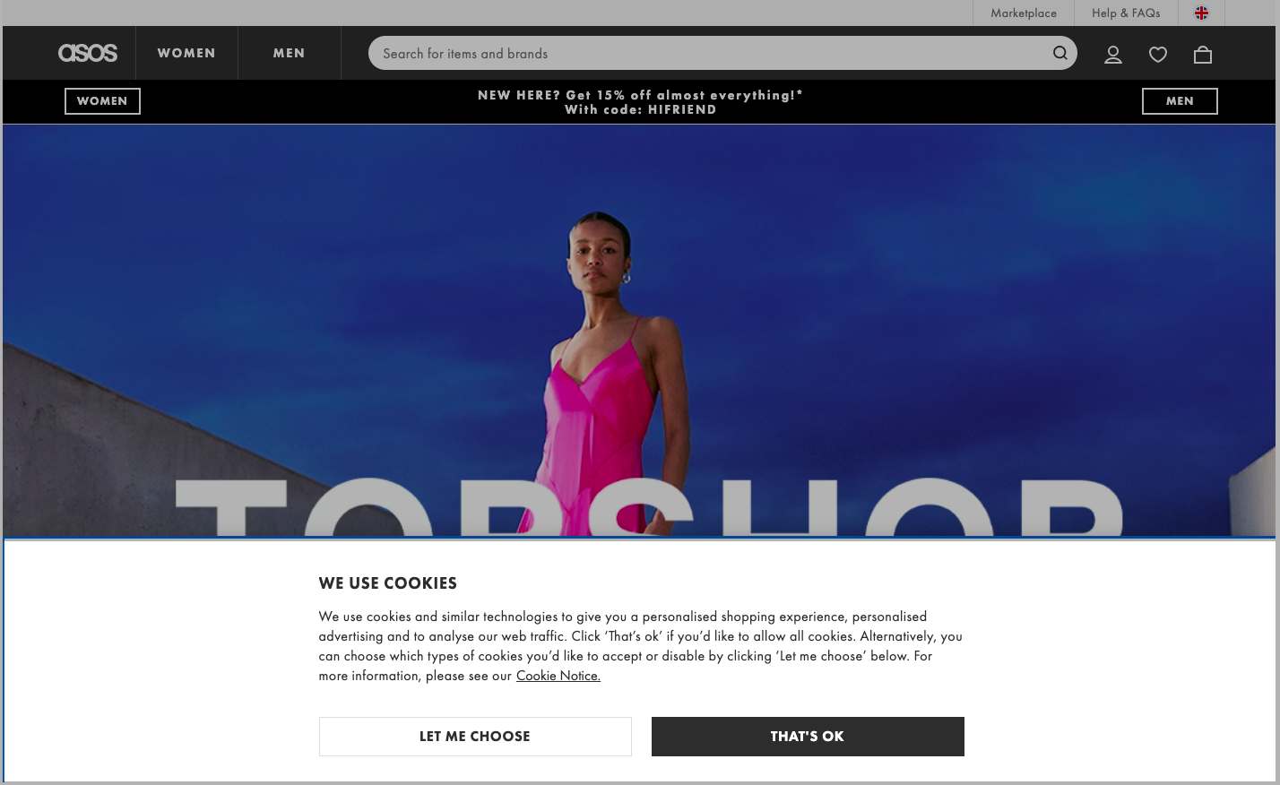 A sticky bar from Asos for a cookie policy consent
Kylie Cosmetics
Sometimes, newly added features or products are not recognized due to insufficient marketing efforts. It’s important to promote the launch, encourage more users to try it out, and spread the word. How can you effectively announce a new product feature? By utilizing hello bars!
As demonstrated by the Kylie Cosmetics example below, a floating bar can be integrated into the website canvas to alert users about a new release. Despite blending in with the website’s design and color palette, the icon effectively captures users’ attention and provides a CTA with a direct link to complete the action.
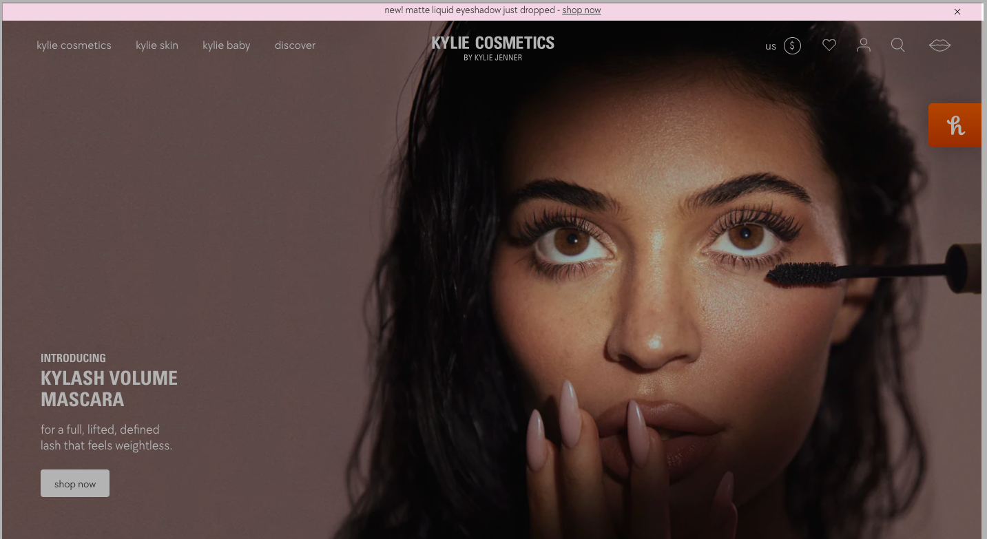 Announcing a new product by using a hello bar
Apple
Hello bars are perfect for different kinds of announcements. They convey important information to website visitors in a way that is both eye-catching and unobtrusive. By using a hello bar in this way, Apple can quickly and effectively promote their new deal for credits without disrupting their customers’ browsing experience. Also, just like in the previous announcement bar example, Apple added a CTA for more efficient conversion.
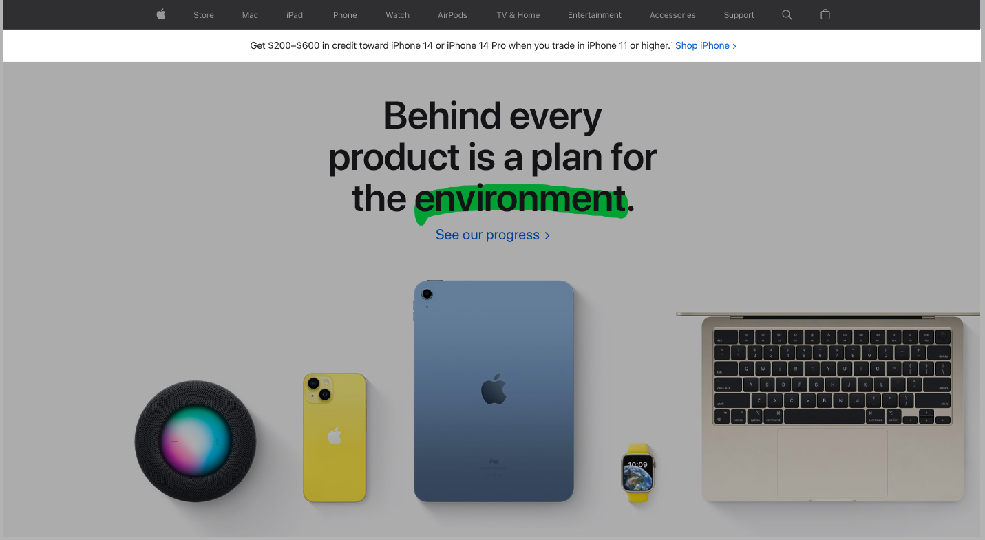 Informing website visitors about a new deal by using a sticky bar
Talkspace
Talkspace effectively puts a simple floating bar that offers a discount code visible to anyone visiting their homepage. Such an approach is an excellent way to drive sales. You can actually make this experience even more pleasant by personalizing it. Talkspace adjusts the currency of the discount based on the visitor’s location. This personalized targeting ensures that each visitor is presented with an offer that is most likely to interest them rather than a generic announcement that only appeals to a few visitors.
 A sticky bar with a discount code on the Talkspace website
Barnes & Noble
Numerous eCommerce brands are utilizing hello bars to create a list of engaged subscribers who are likely to purchase. One such brand is the book retailer Barnes & Noble, which has effectively implemented a widget to expand its mailing list.
Requesting information on age, gender, and preferences will help you send personalized product recommendations or relevant offers later. Floating bars are useful for collecting new data and ensuring an unobtrusive browsing experience.
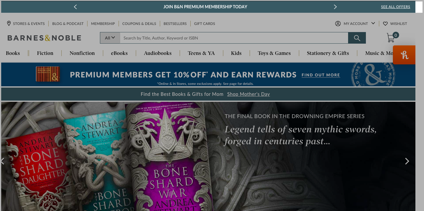 Using a floating bar to grow a mailing list
Morphe
The option to buy now and pay later (BNPL) has become popular for many online retailers, benefiting both merchants and customers. Cosmetic and beauty brand Morphe offers BNPL and promotes it in its hello bar. Morphe customizes its payment provider based on the visitor’s location, such as Klarna for EU visitors and Afterpay for the US store.
Promoting such services right on the homepage will ultimately lead to higher conversion rates. As in this announcement bar example, your customers will instantly know that it’s possible to break down their payments into installments and purchase items that they may not have been able to afford upfront.
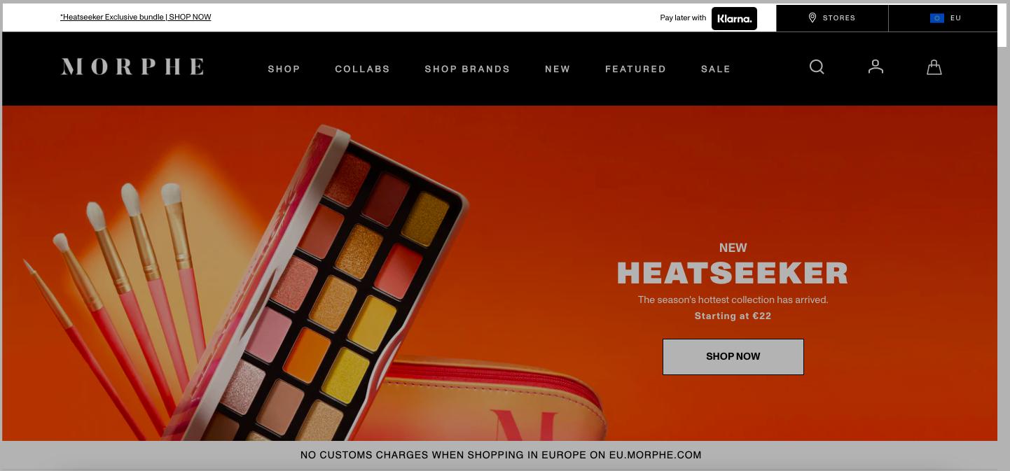 A floating bar for BNPL service promotion
MyMuesli
MyMuesli’s website features a prominent sticky bar that promotes an opportunity to obtain a gift because of their 16th anniversary. Different freebies catch attention and encourage customers to place an order. The hello bar informs website visitors right away to provide an incentive, even for those who were just browsing. This approach motivates visitors to take action while on the website instead of putting it off until later and potentially forgetting.
 Using hello bars to inform website visitors about a gift option
Adobe
With attention spans dwindling, conveying essential information to website visitors within seconds is crucial. Brands like Adobe leverage hello bars to provide necessary details about their services, in this case, a CTA to subscribe or try out the software for free. With the catchy slogan, this hello bar offers an effective and non-intrusive way to keep visitors informed and motivated to complete a desired action.
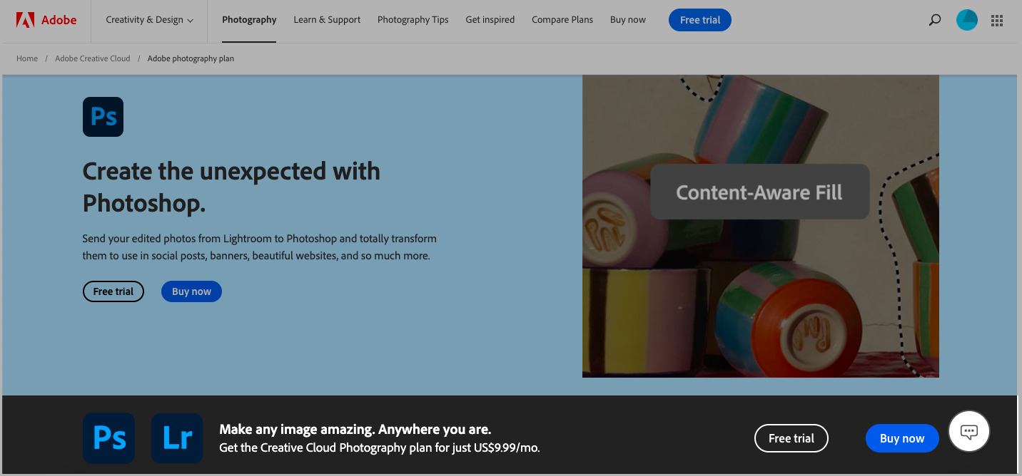 Implementing hello bars to promote subscription plans
How to create hello bars in SendPulse from scratch
As you can see, hello bars are a pretty effective way to communicate with website visitors. They are unobtrusive yet attention-grabbing, making them a powerful tool for increasing conversions, whether you want visitors to purchase, sign up for your mailing list, or explore a product category.
If you’re interested in creating a hello bar for your website, SendPulse offers a variety of sticky bar templates that can be fully customized to fit your message. The best part is that they can be easily embedded on your website without any coding. You’ll also get a lot of freedom in terms of personalization. There are 22 scenarios available, which you can also combine to engage as many prospects as possible. In addition, it’s possible to set a specific action, for example, email subscription, cookie request, redirect to the main page, and so on.
Creating sticky bars in SendPulse is pretty easy and intuitive, which means you can create your new widget literally in no time. Without further ado, let’s have a look at each step in more detail.
Step 1. Add a pop-up
To get started, access your SendPulse account and navigate to the “Pop-ups” tab. From there, create a project. During the setup process, you’ll be prompted to link your website to SendPulse and receive an installation code. For SendPulse-based websites, simply enter the URL to establish the connection automatically.
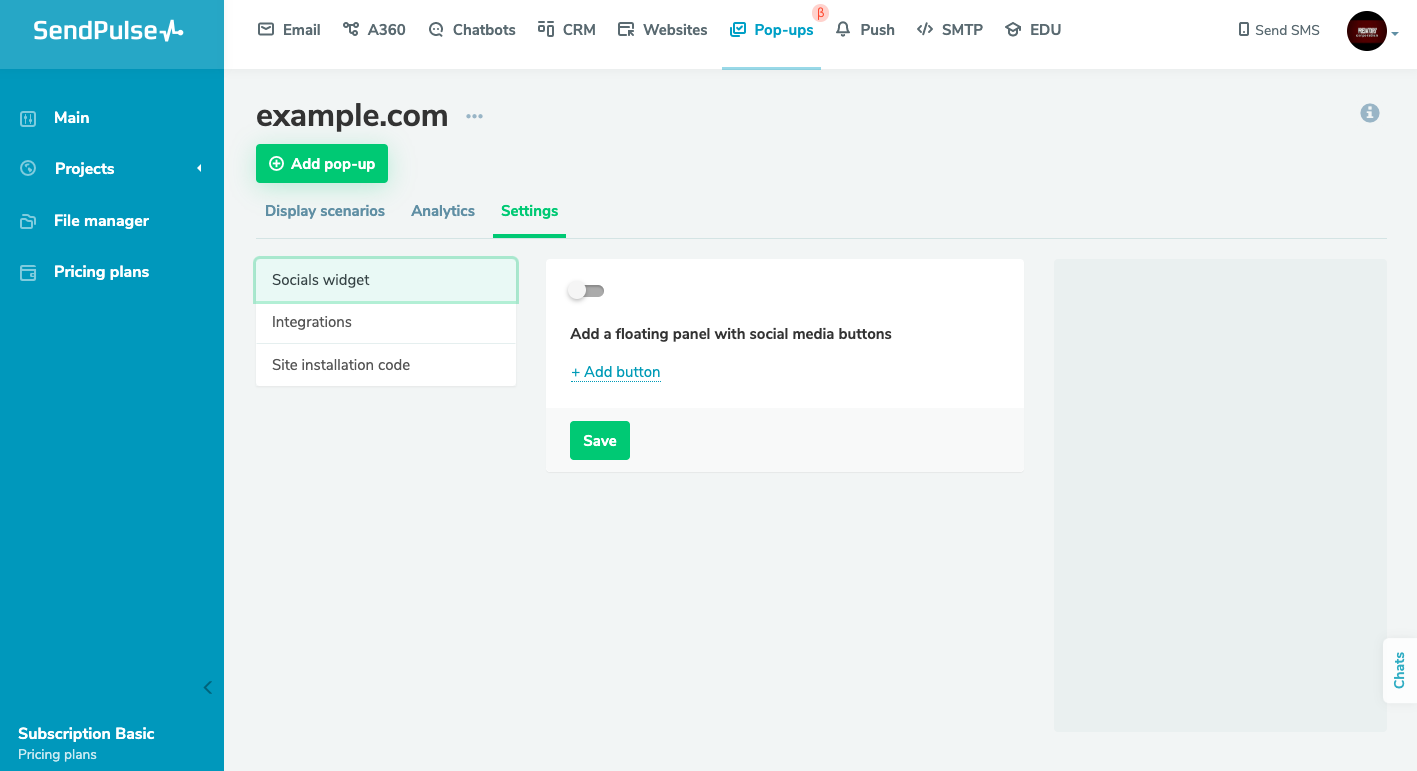 Getting started with pop-ups in SendPulse
Step 2. Customize a template
Open your project. You’ll be presented with a range of blank and pre-designed pop-up templates. Browse the available options and click on the preferred template to enter editing mode. In this case, we’ll choose a horizontal bar.
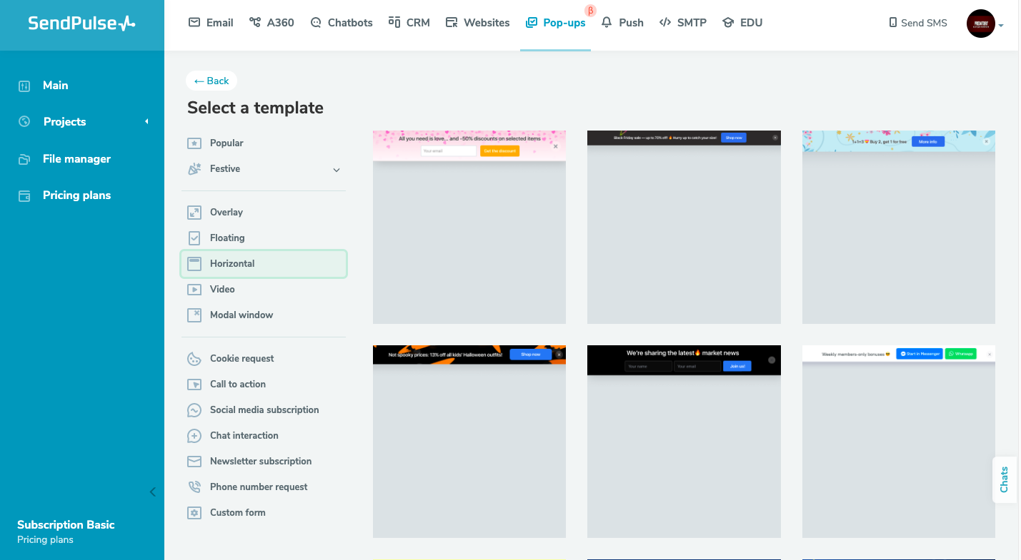 SendPulse’s template library
Once you’re there, modify the pop-up’s style, positioning, and text as desired. You can even upload an image if necessary. There you can set a targeted action, such as an email subscription, social media subscription, or phone number request. It’s also possible to leave it without action, should you just want to share an update with your website visitors.
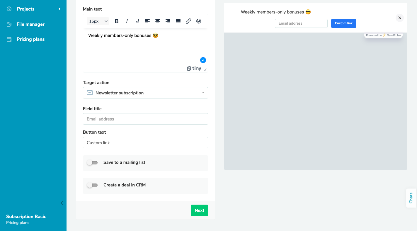 Customizing a hello bar in the SendPulse builder
Step 3. Set display conditions
After finishing the editing process of your hello bar, proceed to the “Next” button and select the display conditions. Here, you can specify when you want your widget to appear after fulfilling a certain condition or show it all the time.
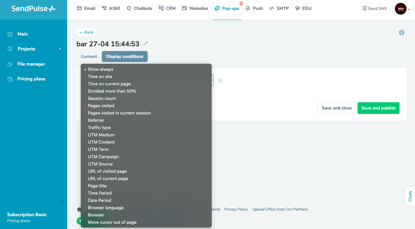 Choosing a display condition for a hello bar
Once you’ve completed the setup, you can either publish your pop-up or save it for later. To evaluate the performance of your pop-up widget, navigate to the “Statistics” or “Analytics” tab. This section displays the number of views, clicks, and leads that the form has generated. You can also review how your announcement bar appears on your website by locating the relevant URL at the bottom of the project page.
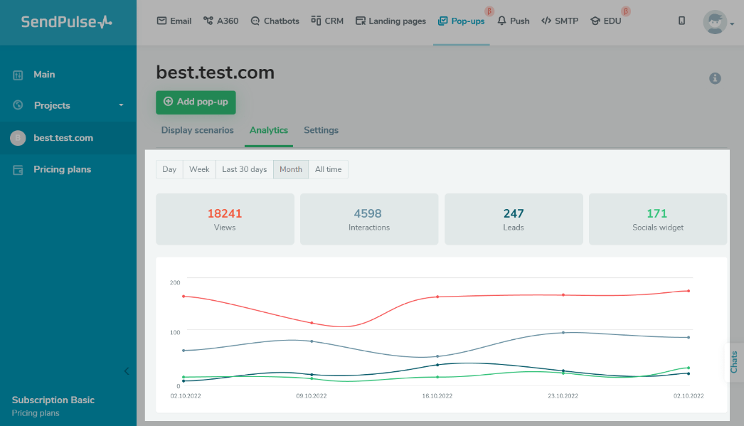 Viewing project statistics
And that’s it. With the proper tools, crafting a hello bar that matches your vision can be achieved in a few minutes. You can enhance your business even further by combining pop-ups with other tools available in SendPulse.
The bottom line
Hello bars are a popular tool used by businesses of all sizes to draw attention to campaigns, products, and more. These bars effectively promote content without interfering with the user experience. If you haven’t already, it may be a good idea to consider implementing a sticky bar on your website and testing the results. Consider SendPulse as your trusted partner and create a perfect hello bar that your customers will love.