The email newsletter is one of the most effective tools for promoting your product or service. It allows you to communicate simultaneously with thousands of subscribers. The effectiveness of this method has been confirmed by the practice of various promotion companies. But, its popularity is also its major shortcoming — email newsletters have become too much, and that’s why many subscribers ignore them. In such circumstances, the value of each opened email is increased. It’s very important to pay attention to the design of the email in order for it not to be closed or deleted after it has been opened.
The main design requirements of email newsletters:
-
- The content should not be a whole picture. Firstly, because it can be displayed incorrectly due to browser configuration or different devices that users use (smartphones, tablets etc.). Secondly, because the user can’t copy the information.
- Use font size 14, and 1.5 line spacing. These parameters allow the recipient to read all the information comfortably. If subscribers have to strain to read the email, it evokes negative emotions, which are automatically projected onto the content of the email.
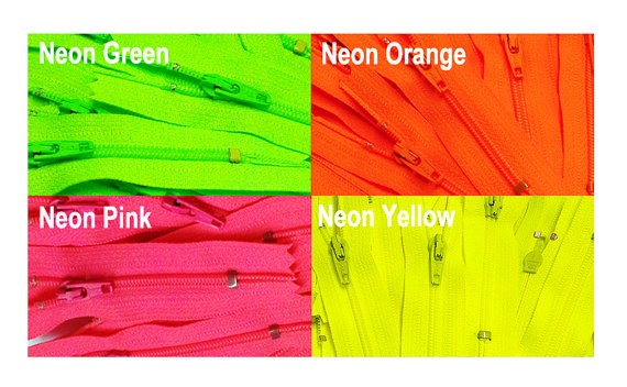
- Don’t use the “poisonous” colors. Even if they allow you to achieve excellent contrast between text and background, it will be difficult to read the email. It will cause a backlash, and many of the subscribers will leave the email unread.
-
- Don’t use different shadows, gradients and glow of graphics. This will distract the recipient from the aim – to get the advertising message across.
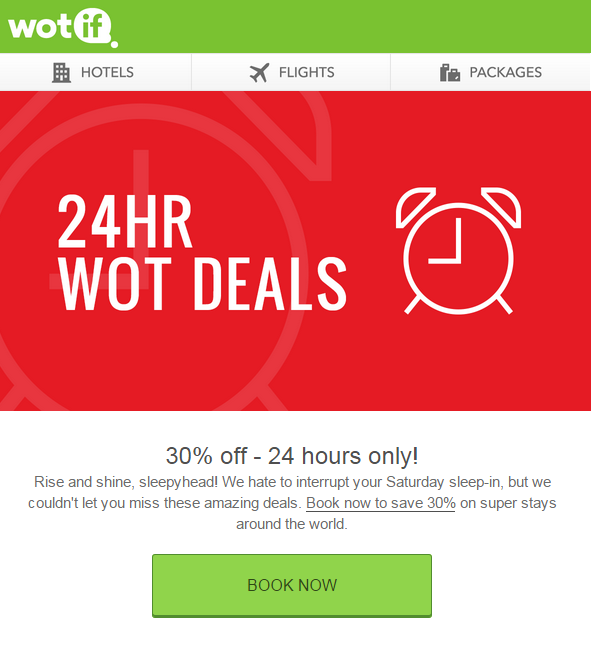
- Use an attractive and bright header. It will create an emotional response that will make the subscriber feel as if they are getting a well-designed present.
-
- The main information is in the form of text. It is necessary to use one of the standard fonts. Do not use italics or the stroke and shadow — this will complicate the perception of the text.
- Use the minimum of pictures. If you use any graphic elements, the informative value of the email should not be affected, even if one of the pictures won’t be displayed
-
- Make the main elements bigger.
-
- Identify the key functions of every page of the site and make it very clear. Use only one Call-to-Action.
-
- Mobile optimization. When creating an email design, always imagine how it will look on your mobile device. For example, don’t use small pictures as active elements — they will be hard to tap with a finger.
- Test your email newsletter. Your emails should be completely tested on different devices and mobile clients. You can start testing the models at the beginning, but don’t forget to keep checking them throughout the development process to ensure that they still don’t contain errors.
Here are some examples of great email designs from different companies.
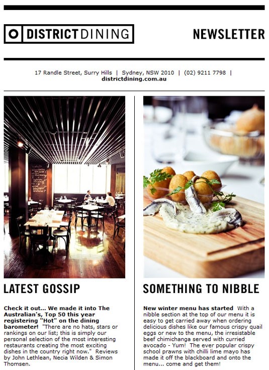
A «District Dining» restaurants email has a simple design with black and white colors and fantastic photographs of their food. Their footer also includes opening times, which is rare in restaurant emails.
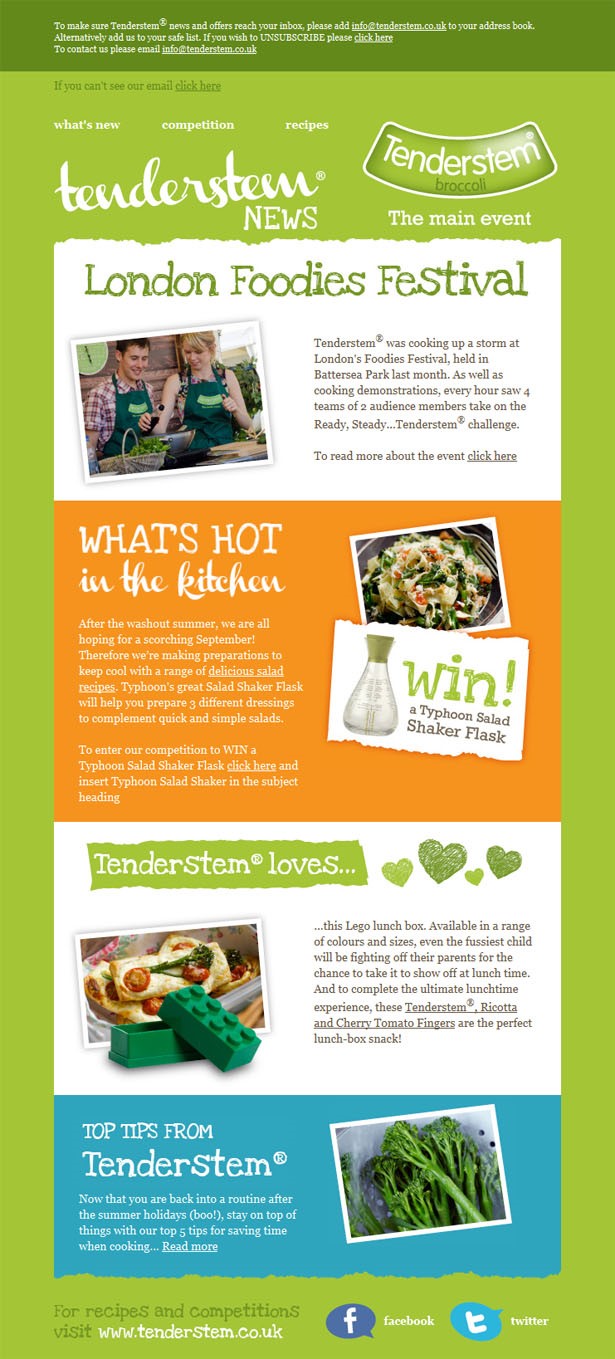
The newsletter from «Tenderstem» about broccoli has a bright and fresh design, as expected, but also brings in a bit of personality and nature with the loose font and rough edges. The overall design is really lovely.
A unique design of email newsletters will help to establish an effective communication channel with customers. The subscribers will enjoy exploring such messages and read them again. The design of email newsletters plays an important role: it not only increases the sale of goods or services, but it also increases brand recognition.
For more inspiration and ideas, check this great post with a list of best tech email examples.