You’ve probably been in a situation when you were about to leave the supermarket, but then something caught your eye and made you stay. That something could be a discount rack, a compelling limited-time offer, or a new collection. The main thing is, that item made you change your mind and consider a purchase.
Now, imagine the same situation taking place online, on your website. Your visitor is about to leave — is there something you can do to make them stay? Meet exit intent pop-ups, little messages that go a long way when it comes to retaining website visitors.
Let’s find out what exit intent pop-ups are and how to use them to spark customers’ interest without annoying them. We’ll show you some examples and give useful tips on how to design your exit pop-up.
What are exit intent pop-ups?
Exit intent pop-ups are widgets that pop up when leaving a website. They always include a headline and a CTA button. Sometimes, there’s also a supporting text, an image, and a lead capture form, as well as some sort of incentive to make the user stick around or even share their email address.
Here, you see a typical exit intent pop-up.
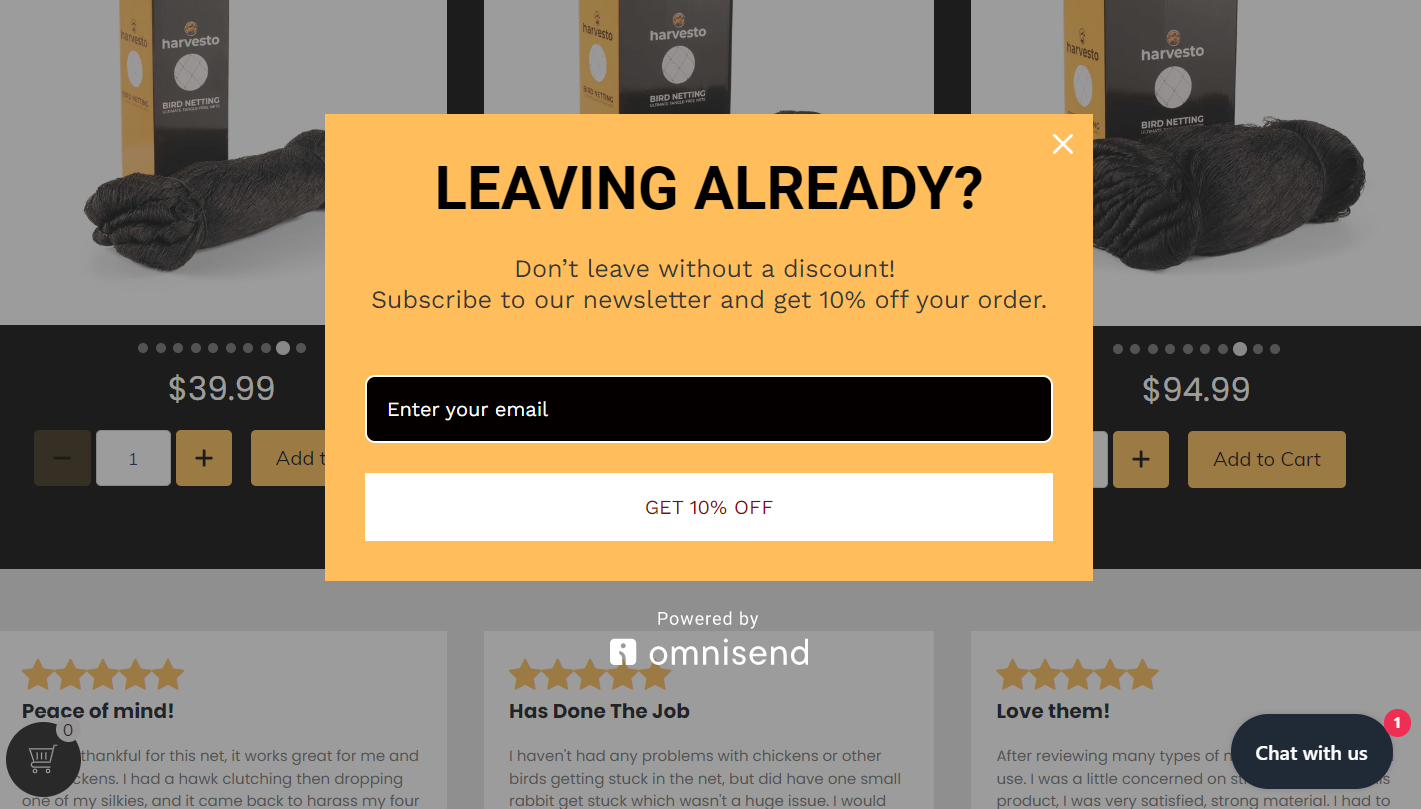 An exit intent pop-up example
These pop-ups are considered an effective marketing tool for maximizing conversions and reducing website abandonment. When used properly, exit intent pop-ups can be very powerful in boosting email sign-up rates and sales for any online business.
Think of exit intent pop-ups as a form of a last-minute call to action — it appears right before your visitor closes the tab. The point is that you get one final chance to capture them before they move on to something else.
How do exit intent pop-ups work?
If you’ve ever gone to a website and had a pop-up immediately overlay the page, then you’ve seen the pop-up technology in action. Exit intent pop-ups are no different. They use technology that monitors user behavior in real-time, their mouse movements in particular, and creates targeted messages.
Here’s what you need to know about exit intent pop-up technology:
- As soon as a user behaves in a way that suggests they may be about to leave the page, an exit intent message appears on the screen. This typically takes the form of a small dialog box that sits on top of the page content, often with an enticing offer designed to keep the user from leaving.
- Exit intent pop-ups appear at just the right moment before someone leaves the page, giving them one last chance to take advantage of whatever promotion it offers. This makes them extremely effective at getting users to convert or take another desired action before they leave your website. Because these messages only appear when someone is about to abandon your site, they don’t detract from their experience or overwhelm them, unlike welcome pop-ups.
- Most exit intent pop-ups are integrated with analytics software, so you can track how your campaigns are performing over time. You can measure clicks and conversions to get a better idea of how people are interacting with your widget. You can also use A/B testing to measure which version of your message performs better with your target audience.
To sum up, exit intent pop-ups are less intrusive than some other types of pop-ups, and they’re designed in a very conversion-oriented way. They target users exactly when they need a little motivation boost to stay, and they’re less likely to be a nuisance.
Why should you be using exit intent pop-ups?
Generally speaking, if the goal of your website is to convert visitors into leads or customers, there’s no reason to not use exit pop-ups.
Let’s go through some of the most common exit pop-up use cases:
- Online store — offer your visitors to take advantage of a one-off discount.
- Personal website — invite your visitors to subscribe to your expert newsletter.
- Online service — ask your visitors if they want to receive a free guide or eBook from you.
- Informational resource — encourage your visitors to subscribe and receive insider tips in their inbox.
- Online community — invite your visitors to join your group for free and get professional advice from other members.
However, you may want to avoid using exit intent pop-ups if your website is already packed with various widgets. Imagine, first, you ask your visitors to set their cookie preferences, then, you hit them with a welcome pop-up asking to choose their country. After that, a push notification appears along with a chatbot window. Exhausted, your user attempts to switch to another tab just to face your exit intent pop-up. Chances are, it’ll only make them frustrated, so the “less is more” principle certainly applies here.
Exit intent pop-up best practices
Here are some recommendations to help you make your exit pop-up more attractive and convincing.
Tip #1 Offer something real and valuable
You won’t retain your users by simply asking them to hang out on your website a little longer, and that’d be unfair to distract them without offering anything of value. So, you may want to use one of the following incentives:
- a freebie like a eBook, whitepaper, webinar, manual, etc.;
- a discount;
- access to an exclusive offer;
- a free discovery call;
- a free consultation;
- a personalized program.
You can come up with your own unique incentive based on the specifics of your business.
Tip #2. Put your pop-up front and center to be noticed
With exit intent pop-ups, you shouldn’t be too modest — make sure yours actually pop and grab attention, otherwise, the user will proceed to another tab without even noticing it. If you’re creating your pop-up with SendPulse, use the overlay mode, which darkens the main content of the page.
Tip #3. Choose relevant engagement elements
When designing an exit intent pop-up, keep in mind user experience and choose elements that make sense for your specific page or user journey. Choose relevant freebies and copy to match user intent. When using a pre-designed template, check if everything makes sense and spend an extra minute customizing it if needed.
Tip #4. Set reasonable display conditions to avoid annoyance
No one likes being bombarded with intrusive messages within seconds, so set appropriate pauses between various pop-ups or notifications. For example, if your customer has just closed another promotional widget, there’s no need to bother them with an exit intent pop-up.
Tip #5. Optimize your layout from time to time
The goal here is to avoid showing the same exit pop-up to the same people over and over again. You need to either serve them different versions or make sure that it’s only shown once.
Tip #6. Make sure your layout is responsive
You want your pop-up to look good on PC as well as on tablets and mobile devices. The easiest way to achieve that is by using a pop-up builder that offers responsive customizable templates. In SendPulse, there are over 30 mobile-friendly templates and an option to preview your widget on different screen sizes.
Tip #7. Track how your pop-up is performing
It’s imperative that marketing teams track metrics related to their efforts, and pop-ups are no exception. Our platform allows you to get a quick overview of how many clicks, views, and leads your pop-up has gathered, so you won’t have to do any guesswork.
11 effective exit intent pop-up examples
Let’s take a look at some of the best exit intent pop-ups in terms of design and creativity.
Exit pop-up example #1 Dose Juice
To start off with a bang, let’s enjoy this clever and playful pop-up. It works perfectly as an exit intent pop-up, but also could easily be used for regular lead generation campaigns.
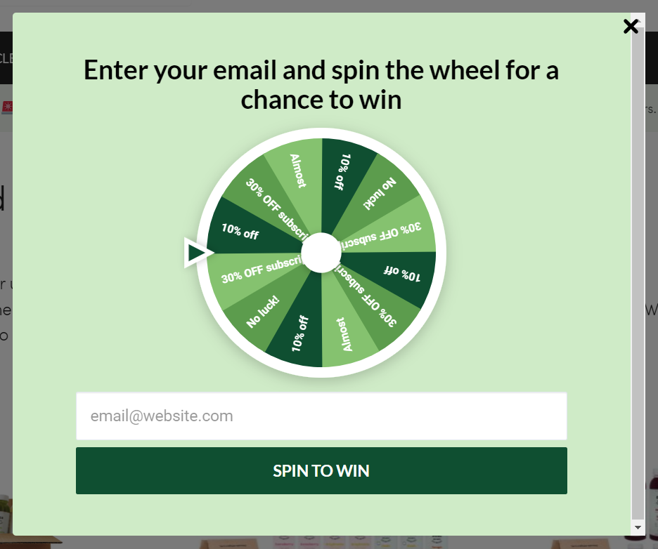 An exit pop-up example from Dose Juice
This is an effective way to get users to share their contact info by tapping into their playful and competitive side. Instead of simply offering them a discount, invite them to “fight” for it to increase its value in their eyes.
Exit pop-up example #2 Hootsuite
This example proves that even a serious company like Hootsuite can afford to tease their visitors a bit and softly push them to take action. This witty pop-up certainly stands out from the competition.
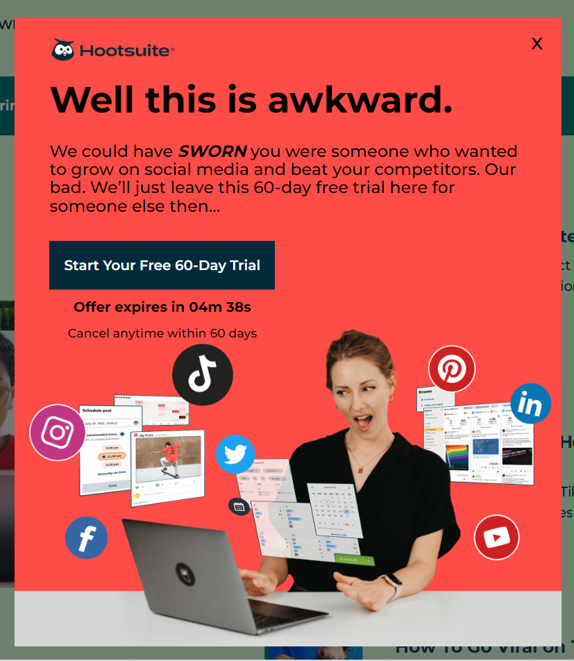 An exit pop-up example from Hootsuite
Hootsuite also skillfully uses scarcity marketing techniques — the countdown timer drives urgency and leaves the user no choice but to sign up.
Exit pop-up example #3 Michael Kors
You can go a bit more classy route and attract the user’s attention by using breathtaking, chic images and gentle copy instead of puns or crazy collages.
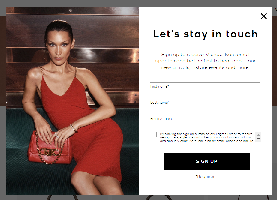 An exit pop-up example from Michael Kors
This pop-up still does give the user a convincing reason to stay on the website despite not offering a discount or any other freebie. Michael Kors is more of a jet set luxury brand, and that’s why they avoid using tricks that could cheapen the perception of their brand.
Exit pop-up example #4 Brafton
Sometimes, a catchy headline is all it takes to make a pop-up cut through the noise. What we love about this message is how lightweight and skimmable it is.
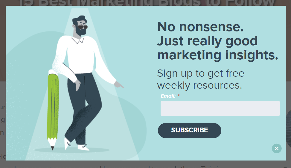 An exit pop-up example from Brafton
Custom illustrations like this one can be quite useful when you need to give your pop-up a less formal look.
Exit pop-up example #5 Dockers
This brand goes all in trying to stop its website visitors from leaving. This incentive is a generous one, but it’s sure to boost conversions. Also, we shouldn’t ignore this dreamy image that certainly adds up to the appeal.
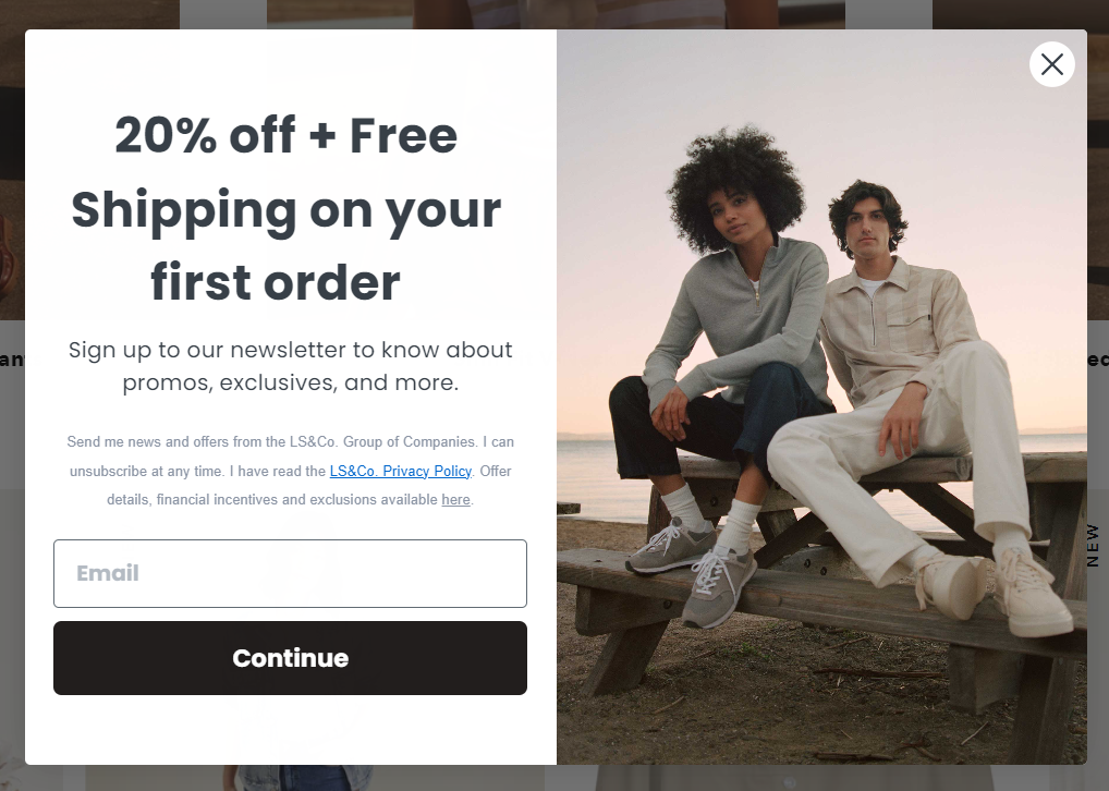 An exit pop-up example from Dockers
If your shipping rates are already affordable to begin with, consider offering free shipping to your new customers to make your offer absolutely irresistible and eradicate any doubt they might have.
Exit pop-up example #6 Bright Cellars
Here’s another gorgeous exit intent pop-up example. The brand successfully uses a colorful background image to put more focus on the high-quality product with quirky wine label designs.
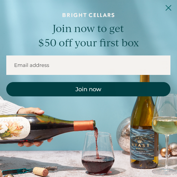 An exit pop-up example from Bright Cellars
This pop-up is extremely simple yet it contains everything necessary to bring a doubtful user back on track.
Exit pop-up example #7 Digital Marketing Institute
This exit pop-up is an absolute eye-catcher, thanks to its vibrant colors and bold headline. The positive photo also plays a huge role in making this message more prominent and trustworthy.
 An exit pop-up example from Digital Marketing Institute
You can use the same technique when designing your widget. Make it multistep to “hide” the email capture form and shift the focus to your call to action. In terms of a color palette, it’s better to pick just two or three complementary colors to avoid creating visual chaos.
Exit pop-up example #8 Fila
If you don’t want to lose money by drastically reducing your prices for newcomers, you don’t have to. A humble discount will still be a nice addition to your pop-up.
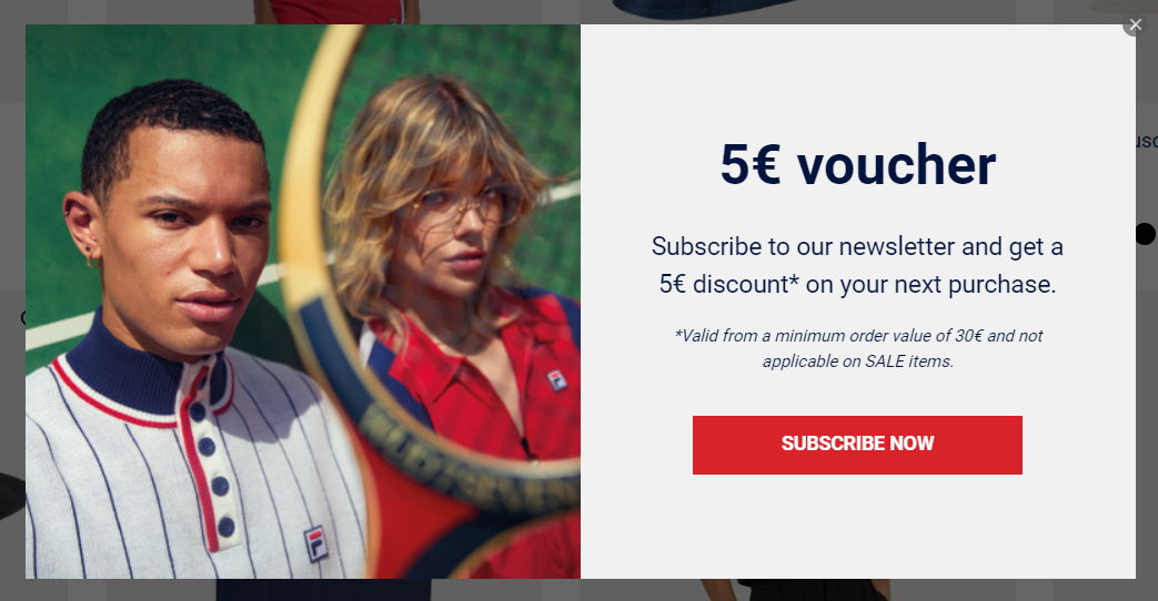 An exit pop-up example from Fila
What we like about this pop-up is the fact that Fila clearly describes the offer conditions to avoid confusion and misunderstandings. This small detail can prevent customer frustration while also encouraging them to purchase something more substantial than a pair of socks.
Exit pop-up example #9 Athleta
One more atmospheric and nicely designed pop-up from a sports apparel brand. The discount combined with other perks makes this offer all more compelling.
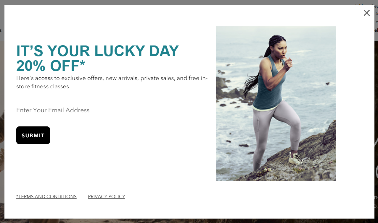 An exit pop-up example from Athleta
It’s worth noting that lifestyle images like this one typically work better in pop-ups than simple product photos. By reminding your potential customer of what they can achieve, you’re more likely to win them over.
Exit pop-up example #10 Banana Republic
Let’s wrap it up with another elegant and tasteful example that proves that pop-ups don’t have to look spammy to be effective.
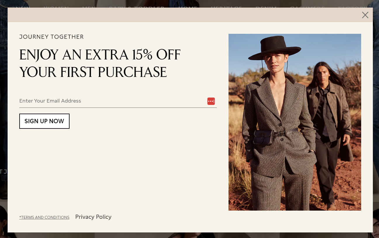 An exit pop-up example from Banana Republic
Exit pop-up example #11 Help Scout
Help Scout uses social proof to do the heavy lifting here. Instead of a discount or a freebie, the brand simply shows how many people are already subscribed — 72,558 at the time — and invites the visitor to join them for two articles a week. The copy is disarmingly honest: no sales pitches, no games, and one-click unsubscribe.
It’s a great example of how transparency can be just as persuasive as an incentive. By telling visitors exactly what they’re signing up for and making the exit terms crystal clear, Help Scout lowers the barrier to conversion without offering anything beyond the content itself.
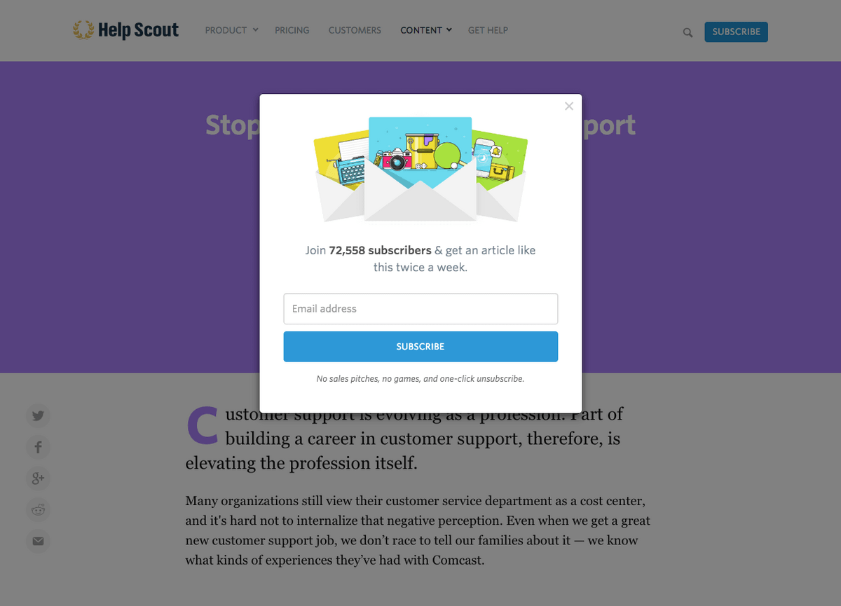 Help Scout combines social proof with a transparent subscription offer to convert leaving visitors into newsletter readers
The beige color palette and the stylish images make this form look more like a postcard than a typical pop-up. The brand takes extra care of its visitors by linking to its privacy policy.
How to create an exit intent pop-up with SendPulse
Our intuitive pop-up builder is finally live — check it out if you want to be able to create elegant pop-ups in minutes. With our Basic plan, you get to create up to 30 pop-ups for free, so make sure to give it a try.
Step 1. Create your project
Log in to your SendPulse account and switch to the Pop-ups tab. Click “Create project” to create your workspace — this is where your website (or multiple sites) will be.
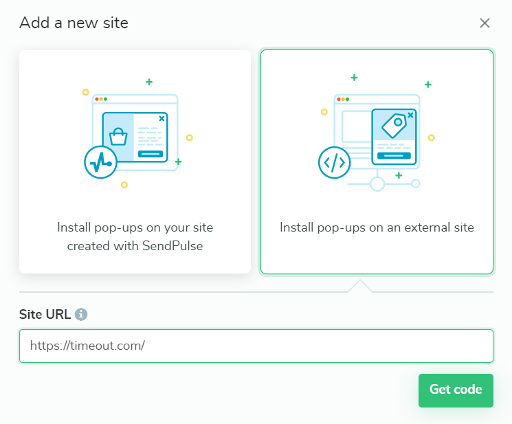 Adding a new website in SendPulse
You’ll need to connect your website to SendPulse by generating an installation code. If you want to add a SendPulse-hosted site, you can just paste in the URL, and it’ll be connected automatically.
For an external website, insert your installation code before the closing /head tag. Then, check the installation to make sure everything went smoothly.
Step 2. Choose a template and customize it
Open your new project and click “Create pop-up.” You’ll see a template library with 30+ options, all of which are customizable.
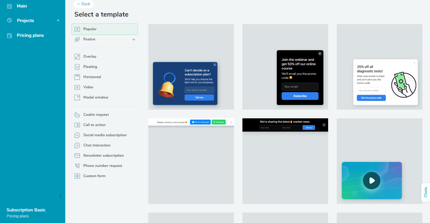 SendPulse’s pop-up template collection
In our case, we need an overlay pop-up. Click on the template of your choice to start editing.
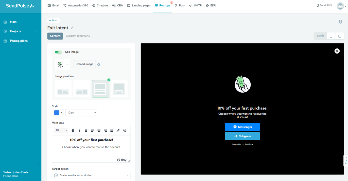 Customizing a pop-up template in SendPulse
Alter the template’s appearance, placement, and copy to your liking and replace the image if needed.
Step 3. Set conditions
Done with editing? Click “Next” and set the display conditions for your widget. You can combine them and choose to display your pop-up when one or all of them are performed. For our exit pop-up, we need the “Move cursor out of page” condition.
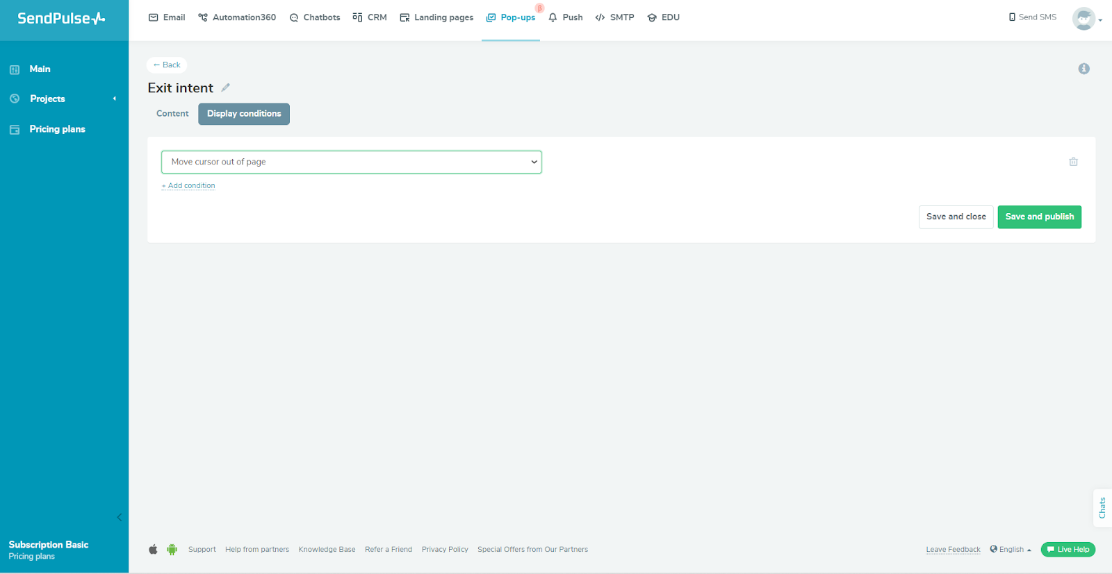 Setting pop-up display conditions in SendPulse
You can also specify the required session count if you don’t want your pop-up to be shown to repeat visitors. The next step is to publish your pop-up or save it as a draft for later.
Summing up
In conclusion, using exit intent pop-ups can help increase leads or sales for any online business. Make sure you understand how this tool works and when it’s appropriate to deploy it, so you don’t miss out on potential customers before they leave your site.
With SendPulse, you can effortlessly create pop-ups, automate email campaigns, track sales, create chatbots, build landing pages, and more. Create your account now and try it for free!