Have you ever come across 404 errors? We bet you have since they are one of the most common issues with the website. When you click a link, you expect it to load fast. Or at least open. But in case of a 404 error page, the browser returns only the “Page Not Found” message. This issue arises when a user can’t access the page. There may be several reasons for having such problems on an eCommerce website, including:
- the website has changed its address;
- the website admin has moved or deleted the page;
- the page is undergoing improvements at this time and is unavailable.
Whatever the reason, a 404 error page may spoil the user experience (UX). As the user experience is one of the decisive factors for conversions and website positioning in search, these issues may damage the brand’s reputation and sales. This post will provide actionable tips on creating a helpful 404 error page. Even though encountering such links is unpleasant, following these recommendations may enhance a person’s perception of a brand.
Introduction to 404 errors and how they occur
What happens when you click a link? The browser sends a request for a server to process and return the needed result. It receives many replies from the server throughout the operation that entail successful, redirected, or terminated statuses. These are three-digit HTTP status codes. They fall into several classes according to the first number. For example, 2XX codes mean successful responses, while 4XX codes imply client errors.
Everyone has probably encountered the well-known 404 Page Not Found error. A 404 error is one of the HTTP status codes, indicating a problem during the browser and server communication. After establishing a connection, the browser requests something from the web server that is unable to locate the needed resource. The browser can’t load the website, giving a 404 error.
404 errors may arise due to various reasons, with the most popular ones being as follows:
- the page content has been moved or deleted without the broken link being fixed;
- the address bar of the browser has the wrong page link entered; in other words, you’re trying to reach the page using the incorrect URL;
- DNS configuration issue;
- caching issues, when the browser caches the 404 error page rather than the functioning page;
- missing assets, such as an image, CSS, or JavaScript file.
Mistakes are unavoidable. Your task is to minimize their consequences, forward potential customers to the needed page, and follow eCommerce UX best practices.
How a Page Not Found issue affects the eCommerce website
Imagine arriving at a dead end after looking for the needed item. The only feeling you will have is irritation and a desire to close the page. So while you may spend money on your marketing initiatives, landing on the 404 error page will spoil the user experience and decrease the chances of buying.
Ideally, prospects should open the page and navigate the website smoothly. That’s because 88% of online buyers won’t revisit a website after a negative user experience. So only 12% will try to find other goods in your store after the first unsuccessful attempt.
However, mistakes will happen. Your website grows, and older pages become unneeded. We may surprise you by saying that it’s crucial to have dedicated error pages rather than loading a home or category page instead. Why? Because 404 messages inform people about an issue with finding the needed page. An absence of such an indication may create even more misunderstanding.
To illustrate our point, here is a screenshot from Bamford Watch Department. We deliberately mistyped the URL, but the page updated and opened the same content. All you need is not to remove Page Not Found errors but to organize them properly.
 The official Bamford Watch Department website
Error pages affect a company’s bounce rate, page ranks, and revenue, in addition to being frustrating for customers. Can they harm the website’s position in search results? Although they don’t impact search engine optimization (SEO), they can spoil the website’s metrics. How?
Users won’t understand what to do or click next without an optimized 404 error page. So they will close the store, leading to high bounce rates, decreased time spent on the page, etc. These indicators will signal search engines to downgrade the website in search results. And that’s the connection between a Page Not Found issue and SEO.
Five tips on 404 error page optimization to improve the shopping experience
404 pages belong to your online store, no matter how they occur. If a visitor finds their way to that page, it signifies their interest in you and that particular page on your website. What should a 404 error page include? Let’s consider some best optimization strategies to turn a generic page into a sales leverage.
Ensure easy navigation
The navigation menu is the first thing on the 404 error page essentials list. Why do you need it at all? Good navigation equals positive UX. And an improved UX leads to a higher conversion rate, increased sales, and revenue growth. On the other hand, poor navigation irritates visitors and amplifies bounce rates.
You may have a horizontal or a vertical bar on all website pages, so why not add them to the error one? It’s necessary as people need to know about possible ways to continue their purchase journey apart from the “Exit” button. Another handy function is a search bar. It lets users type in the request and find related items without returning to Google search.
Here is an example from Kendra Scott. The error page contains the menu with specific product categories, helping visitors explore the website. Plus, you can look for the desired thing via search.
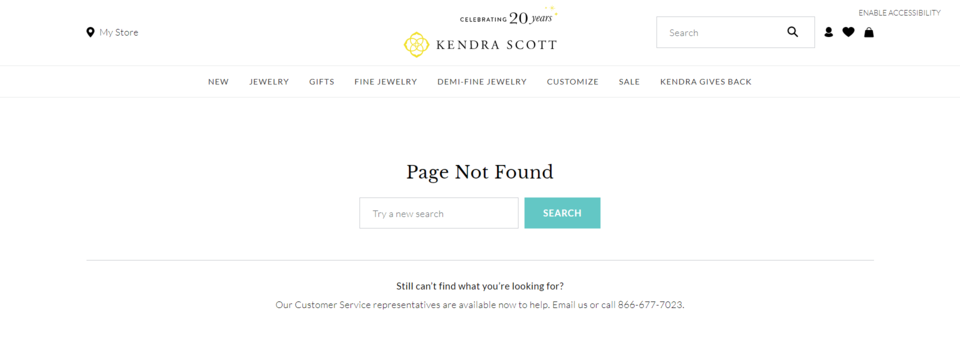 Kendra Scott 404 error page
Display products and hot deals
One of the most popular reasons for an error page on an eCommerce website is the product being no longer available. It may have gone out of stock, or you decided not to sell it anymore. However, the link may still exist and attract visitors. Such people arrive on the page with high purchase intent. But they get dissatisfied with the inability to see and get the product.
What can you do to make them feel better (and earn back their interest)? Present an alternative. While it’s challenging to show targeted recommendations on 404 pages, promote the most popular items or hot deals.
Below are such picks from the American Girl store. Prospects can choose a doll from the list on the 404 page and add it to the shopping bag without proceeding to the catalog or product page. A click on the “Quick shop” button triggers a pop-up with more product photos. It also contains several buttons, such as “Add a review,” “Add to bag,” and “View full product details.”
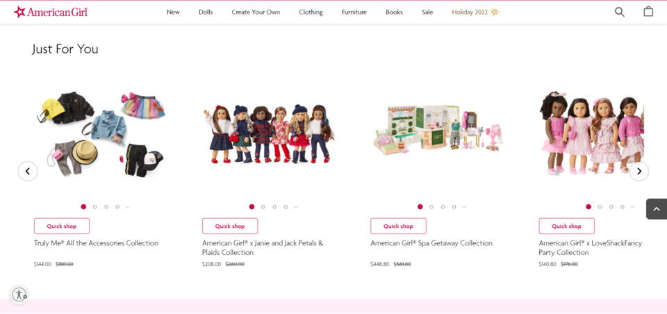 American Girl 404 error page
Apologize and create a light atmosphere
As we’ve discussed, irritation and frustration lower the likelihood of making a purchase and returning to the store. That’s where a friendly or lighthearted tone may help. While it doesn’t directly impact sales, it can create a bond between the brand and visitors. Use funny videos, GIFs, images, and texts to reduce the stress of finding the wrong page. Making people smile is the first step towards encouraging them to shop.
That’s what Maybelline New York does on its 404 error page. First, it replaces a 0 in 404 with an image of lips. It helps the company stay consistent and shows the store’s main purpose, which is selling cosmetics. Then, we see an inspiring phrase, “When in doubt, put on some red lipstick and… Try, try again.” It may sound empowering for users not only to search on the website but in general.
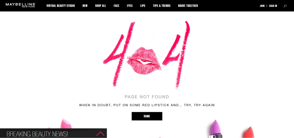 Maybelline New York 404 error page
Another way to entertain visitors on the 404 error page is using gamification. It may entail interactive elements, games, or lucky wheels with the ability to win discounts. Gamification retains people on the page longer and gives you the needed minutes to encourage them to continue shopping. The old-school game on Wendy’s website is a vivid example of an effective 404 error page.
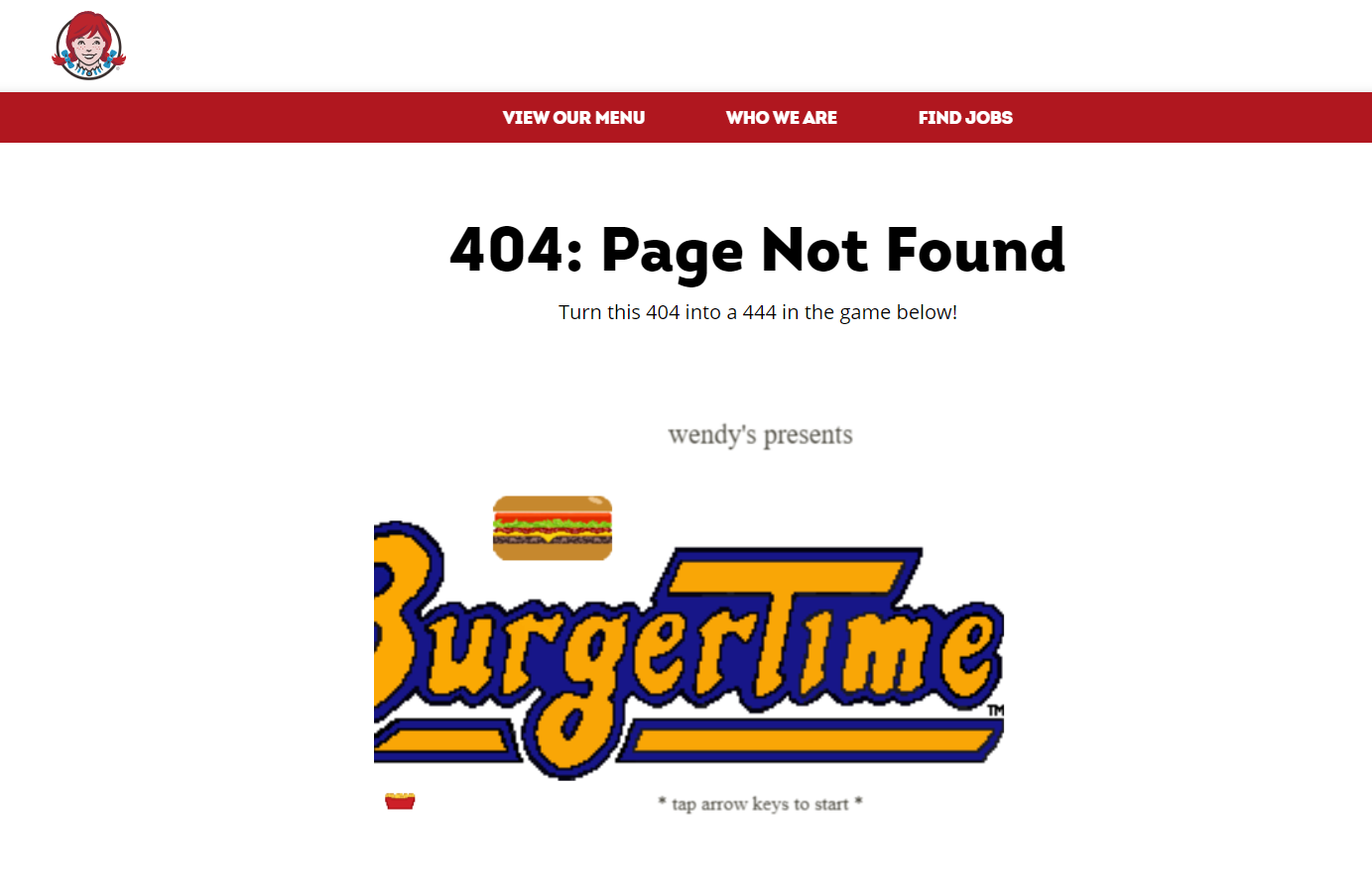 Wendy’s 404 error page
Include a CTA
How should people find a way out? Incorporate a call to action into the 404 error page. It can be a button or a link indicating a path from the dead-end to other pages. A CTA should involve users in taking further actions on the store, such as:
- proceeding to a product catalog;
- returning to the home page;
- downloading a helpful file, such as a book, checklist, guide, etc.;
- agreeing to receive emails;
- opening business’s social media;
- leaving feedback;
- reporting on the issue with the website, and so on.
However, be moderate with using such buttons. Choose only the most important ones and give prominence to some of them. For example, primary buttons will be bright, bold, and highlighted, unlike the rest.
The Wolf Gang has a minimalistic error page with two CTA buttons: to continue shopping and to subscribe. Below it outlines the benefits of shopping here and provides links to social networks.
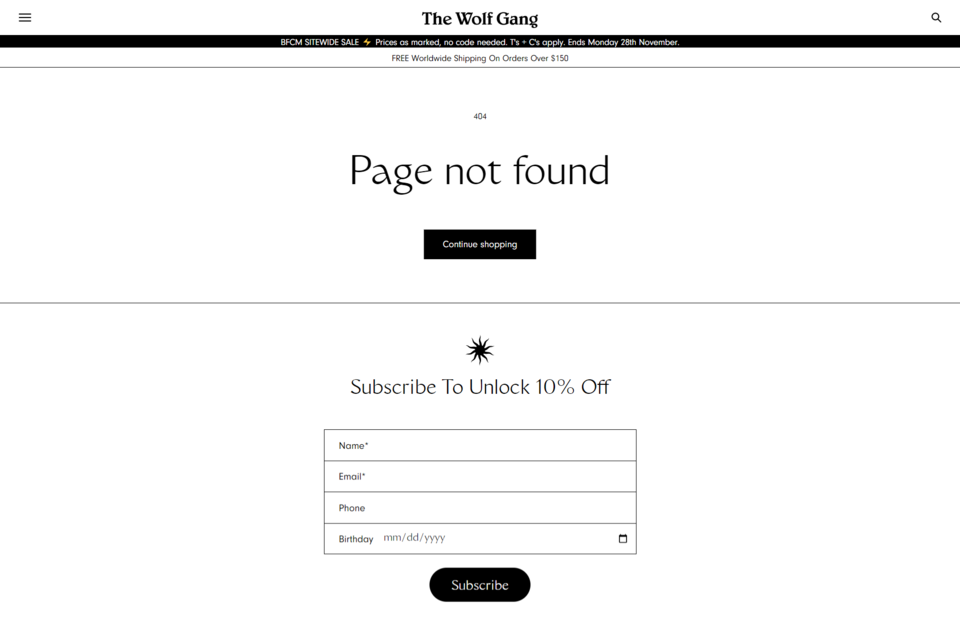 The Wolf Gang 404 error page
Show customer reviews
The last piece of advice is one of the most rarely found on the web. We talk about displaying customer reviews on the 404 error page. A broken link may spoil your reputation and indicate a lack of attention to the website. But customer reviews are perfect for eliminating prospects’ doubts.
They serve as social proof, showing the store’s popularity and reliability. So consider adding them to the error page. According to statistics curated by FinancesOnline, client feedback has the following power:
- 97% of consumers read reviews on local companies before making a purchase, and 12% of them do so every day;
- 83% of customers think a company is reliable if it has a user-generated review on its landing page;
- 74% of shoppers claim that reviews boost their trust in a business.
Here are more insights from the company:
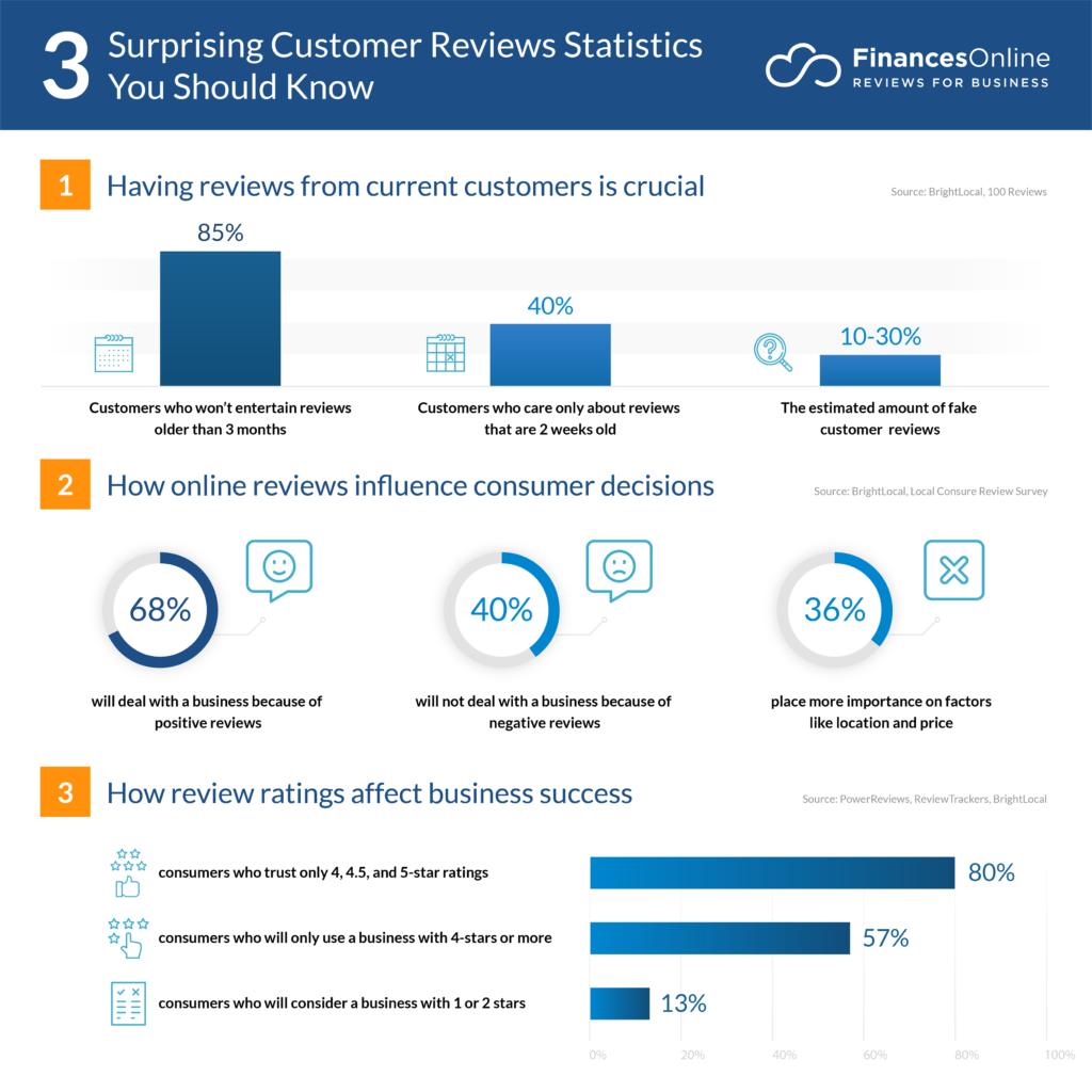 Customer review statistics
The statistics above show that including user reviews on your 404 error pages can increase the conversion rate. So try them.
Conclusion
Page Not Found issues may happen to any website, be it an online store, a SaaS vendor, or a blog. The reasons for having them vary, but the bottom line is the same. They can spoil the user experience due to the inability to show the desired content. But 404 error pages can be an opportunity to retain visitors.
First and foremost, you may constantly revise existing pages and create redirects. Second, optimizing the error pages helps customers get from a potential dead end to other interesting pages, which may inspire them to buy.
Add interactive elements and create a light atmosphere. Guide users through the website, lead them to the appropriate information, or display additional options to persuade them to purchase. As a result, even the unavoidable issues will become your ally in converting visitors into clients.