New email marketing solutions and tools keep coming up, so it gets harder to navigate in the dynamic marketing world and easier to make mistakes, even for experienced professionals. But don’t sweat it; we will sort it out. We’ve prepared a list of 12 common email marketing mistakes as well as hot tips for avoiding them.
If there is no subscription form on your website or blog, users won’t be able to sign up even if they want to. There are four options to choose from: embedded, pop-up, fixed and floating forms.
On the example below, you can see a pop-up form from Expo Yoga, which appears after you’ve spent a few seconds on their website. The form contains only three fields to fill in and attracts attention with its inspiring image.
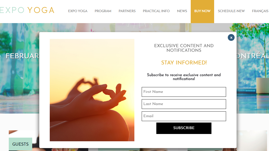
Make sure sign-up forms are visible and easy to find both for desktop and mobile users. You wouldn’t want to lose subscribers just because they couldn’t find the subscription form, would you?. It is also important to make the form well-designed, which would fit the screen width. Test your website in multiple browsers and on different devices to make sure the subscription forms look good on each of them.
392.5 billion emails are projected to be sent and received daily by 2026. Among all this mickle, users should find yours, so your goal is to reassure potential subscribers in quality and relevancy of your content. Offer your prospects exclusive access to updates, include a lead magnet — eBook, useful checklist or a free webinar — to your subscription form, promise to send valuable messages, and, what’s even more important, stick to your promises.
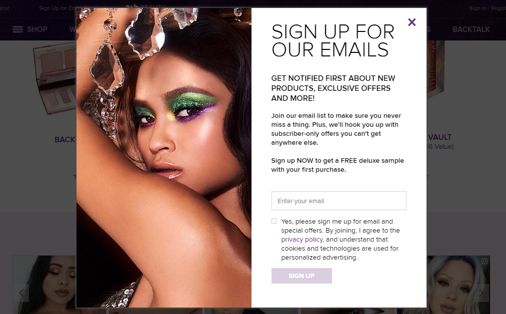
For example, in their subscription form, Urban Decay mention new product notifications and exclusive offers, which is exactly what they send out in their emails.
Outdated mailing list
Mailbox providers use complex algorithms to decide whether to sort an incoming email to the inbox or spam folder. One of the algorithms is engagement-based: it includes such users’ actions as forwards, replies, and other important metrics, for instance, how many emails were moved to another folder, how many of them were deleted without reading, and so on. If a mailbox provider tracks no user’s interactions with emails, the message is more likely to be seen as unsolicited one and filtered directly to spam. Moreover, inactive subscribers can cause hard bounces and become spam traps, which altogether affects sender reputation and deliverability.
So, the number solution to this email marketing mistake is to keep your mailing list clean, delete any mistyped and invalid email addresses, as well as those users who have been inactive for more than six months.
No segmentation
Segmentation is all about dividing your mailing list into smaller, more focused groups of subscribers who receive different content based on the data which you gather about them. Before starting an email campaign, you should always think: “Is my email relevant to this particular person?”
If you are based in the U.S. only and don’t provide international shipping, should you share special offers to users from France? What if an average check of a customer is no more than $100, should you promote exclusive $500 products to them? In the age of big data, it’s vital to care about your customers by sharing content relevant to each separate segment.
Sending from “Noreply” address
Such impersonal email address provides no opportunity for a subscriber to interact with a sender, making them feel that their opinion doesn’t matter. Moreover, it negatively impacts deliverability: first of all, many users set up their email clients to filter all incoming emails from noreply@ directly to spam; secondly, if subscribers can’t interact with emails, they are more likely to mark it as spam raising a red flag to mailbox providers.
Be available to users; give them an opportunity to get in touch with your company and encourage them to reply if they have any questions. Touch of Modern, for example, shows its friendly attitude by using hello@ in its From name.

Boring subject line
You need to catch the viewer’s eye and welcome a person to your email, which is never going to happen if you don’t elaborate on a subject line. As an option, you can use emojis or create urgency to motivate the subscribers to open your email. You can also personalize your subject lines — another good solution that can increase your open rates.
“View in browser”
If you haven’t guessed, we are referring to email preview lines, or preheaders. This bit of text is usually limited to 100 characters, which can be critical for a busy person’s mailbox. Ideally, it should be a one-line summary of your email content, which, together with the subject line, entices subscribers to get your email noticed and opened.
On the example below, Mark’s is being short and concise about its message. The brand treats its preheader as an extension of the subject line giving subscribers a better insight into what is inside.

Wrong timing and frequency
It takes a lot of testing to figure out what time will hit it big with your target audience. However, there are several recommendations you can follow to avoid this type of email marketing mistake: if, for instance, you want engagement, try sending emails on Fridays, but if you are aiming at higher conversions, it’s better to choose Saturdays.
When it comes to frequency, you should know that 43% of subscribers prefer to receive emails from brands less often. Your primary goal as a sender is to respect your subscribers’ personal space and set their expectations in advance — inform how often and what content you are going to send. Invite your subscribers to set up their preferences and tailor your sending schedule and email content to meet their expectations.
For example, Huffington Post send emails every morning. It’s as plain as daylight for the subscribers when to expect emails thanks to the unambiguous sender name — HuffPost Morning Emails.

No mobile optimization
In fact, 55% of emails are opened on mobile, and this number is obviously going to grow with every coming year. So, if you want to avoid such an expensive email marketing mistake, ensure your audience can easily read and interact with your messages from their phones and tablets. A responsive email template is your go-to solution in this case. Remember that design of your mobile-friendly template should be simple, with readable text and images, and tappable calls to action. However, don’t ride blind — test how your email looks on different screens and devices every time you introduce some changes to your template and before you launch your campaign.
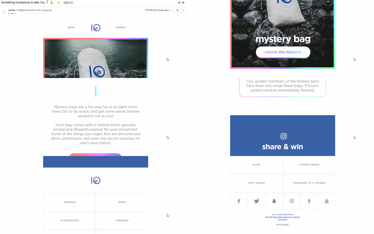
Have a look at how an email from Tentree looks on desktops:
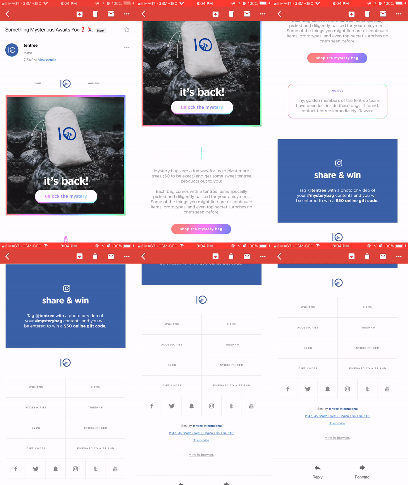
And now look at the optimized mobile version— GIF works just fine, the font is readable, and images don’t take too long to load.
Inconsistency across marketing channels
When you work on your promotional campaigns, you should join efforts and spread your message across all marketing platforms. One important thing here: you should customize your content for each audience and platform but in such a way that it still represents your brand. All channels should work together to provide the clear picture of you and your product.
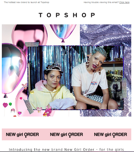
Take a look at Topshop marketing strategy. The company launched a new brand and broadcasted it through all their channels. Here is their announcing email:
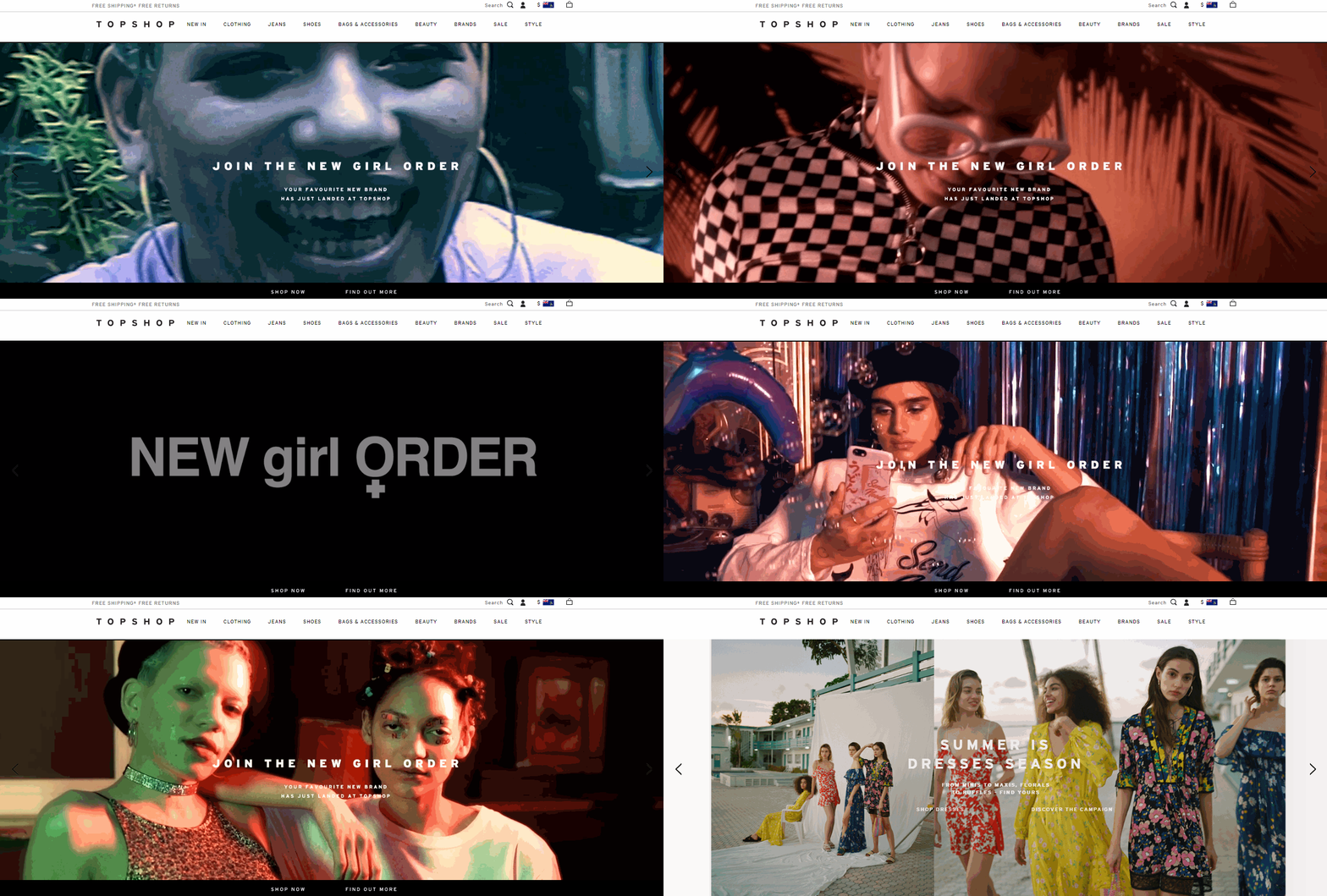
Below is the announcement on their website that meets the campaign design and general idea:
Finally, their post on Instagram:

Each part of the promotional campaign looks a bit different from one another, yet each perfectly suits the platform where it is placed, so that the message is consistent across all three channels.
No value to customers
Explore your target audience — values, interests, problems, goals — to create customers’ profiles and make your emails more relevant to them. Use that data to build a unique and consistent tone of your marketing campaign, that is a copy style, word choice, and general impression.
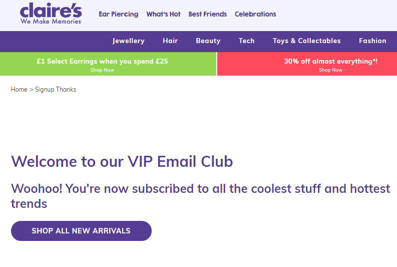
Consider an example from Claire’s, the company which mainly targets teenagers. In their opt-in confirmation email, they use the language of their target audience to be on the same side with teens and thus seem more friendly.
In its turn, Mark’s use a powerful copy that addresses their audience’s core values — being a strong man and a great father.

The bottom line
If, among these email marketing mistakes you have found at least one which pertains to you, start improving right now. Here’s a short reminder on how to avoid them:
- Always place a subscription form on your website. Design the form so that it will transmit the right message: “These emails will bring you value, and here’s why.” Remember to test its variations on mobile, desktop and tablet to see which one brings more subscribers and looks better.
- Keep your mailing list clean: delete all inactive, invalid, or non-existent email addresses. Remember about your sender reputation, and do your best to keep it at its highest.
- Work hard on segmenting your mailing lists and being relevant.
- Make the right first impression with a clear and friendly sender name, engaging subject line and informative preview, so that your audience will be curious enough to click.
- Figure out what timing and frequency are comfortable for your subscribers and don’t overwhelm them with too frequent emails.
- Optimize fonts, images, text and CTAs in your email template for mobile and test it on different devices to make sure it is responsive.
- Keep it consistent with your messages across all marketing channels and bring value to each of your emails. Explore interests, problems and goals of your target audience to create relevant and personalized content.