Email digests help companies support their brand image and increase customer trust by sharing valuable content. In this article, we’ll demonstrate three types of email digest designs, explain their benefits, and share some best practices.
What is an email digest?
An email digest is a regular roundup email that summarizes significant news or articles. The purpose of a digest depends on your business. You can include it in your email marketing strategy if you want to
- nurture relationships with customers and subscribers;
- increase traffic to your website, and, of course;
- encourage sales.
Depending on the amount of information such email stores, it can be daily, monthly, or weekly.
Best practices for email digest design
Email digests often provide a large amount of information, which requires a clear structure and content. The main principles of a well-designed digests are as follows:
- Create a content hierarchy to make your layout easy on the eyes. Divide your information into primary and secondary. Use color, contrast, alignment, position, size to put more weight on the primary points.
- Use enough white space to give breathing room between the elements of an email — columns, images, text, CTA buttons, margins. Although this space is called white, it does not necessarily have to be exactly white. It can be any color that echos with your brand.
- Maintain a balance between text and images. The images you choose should compliment your copy and help recipients understand the sense of it. It’s better to create specific illustrations for your emails as stock images may take your recipients out of the message.
There are many ways to design your email digest. Let’s discuss and see the benefits of three of them: single-column, two- or three-column, and text-based.
Single-column email digest
A single-column layout allows you to use large images for every piece of information. It stores enough space to write full descriptions and place them accordingly one after another. This makes single-column layouts a great decision for tablets and mobile phones as they are usually easy to navigate.
The only problem you may face is the length of a digest, which requires patience to scroll it till the end. That’s why you should try not to overload subscribers with massive flow of news — and choose a perfect number of blocks by looking at email marketing metrics, including click maps, to learn where most of the users stop scrolling and clicking.
Here’s a standard single-column email digest from VSCO:
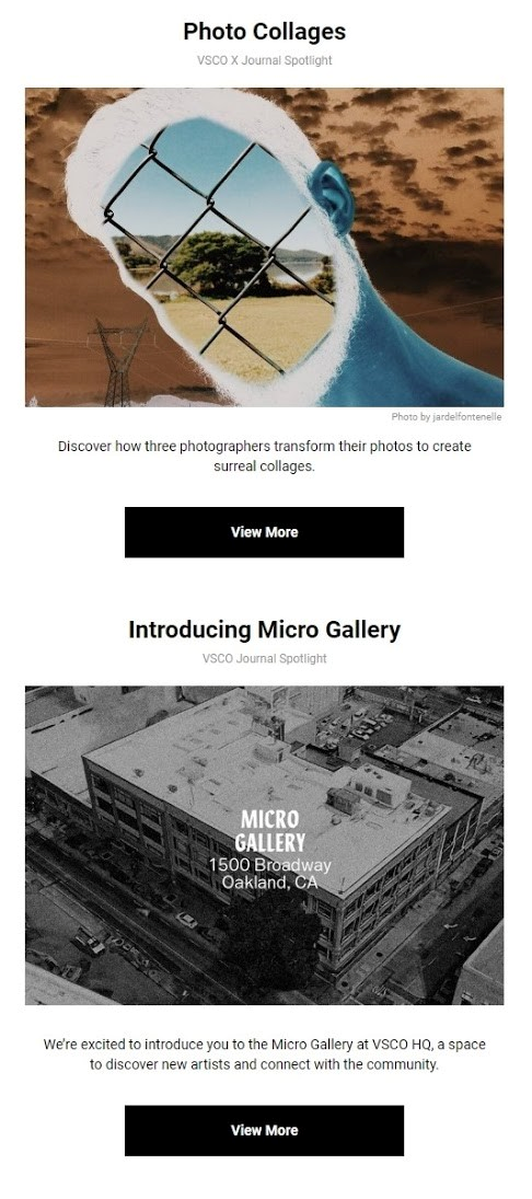 Single-column email digest from VSCO
Each heading is followed by an image, a one-sentence description, and a call-to-action button. It works because it’s simple: users don’t feel frustrated or overwhelmed with too much content.
However, bright images are not always a must. Litmus, for example, refrain from using photos in their digest; instead, they use icons and a different colors for each article to organize the visual hierarchy of the content flow:
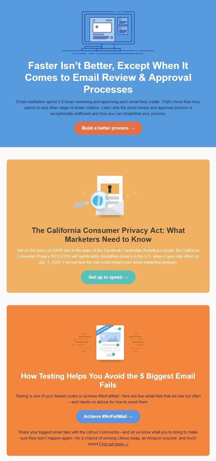 Single-column email digest from Litmus
Two- or three-column email digest
You can also organize your content in two or three columns to save space and make it easy to scan your email. The only pitfall with using this email layout is responsiveness. You should pay attention to how your email is displayed on mobile devices.
Many brands often resort to mixing: they use one-column for their most important information and a two- or three-column layout for other articles. Planoly, for example, apply a two-column layout and alternate with the alignment of the images and description with CTA. Still, the hero-article at the beginning of the digest remains large and takes up the whole width of the email.
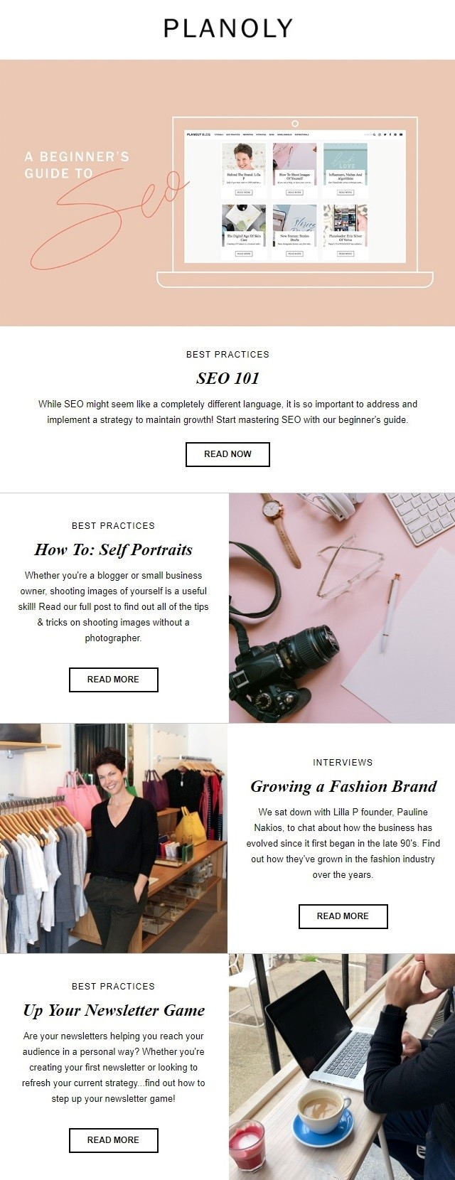 Two-column email digest from Planoly
The same design approach is used by Content Standard. All their digests have the same corporate header and welcome copy. The main article is supported by a large image, while the secondary ones are divided into two columns with smaller images.
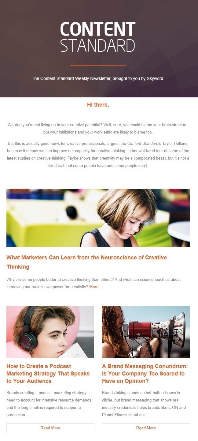 Two-column email digest from Content Standard
Text-based digest
Text-based emails are exactly what they sound like. The important advantage of such layout is that it always looks great on any device. It can also be used as an imitation of a face-to-face dialogue. Just keep in mind the preferences of your audience: Are they willing to read long emails? Do they have enough time to do it? If yes, you may use text-based email digests, but make them easy to comprehend: work on their structure, divide the text into short paragraphs with headings, use lists with bullets and attention-grabbing elements to highlight the main points.
Emails from theSkimm usually have a standard header image with a CTA button to invite a friend to join the mailing list. They also include a “Quote of the day” section, which is basically a quote based on some news that you can share on social media and read by clicking on the hyperlinked text. Each article has a title underlined and is divided into several logical parts crowned with laconic headings; thus, you don’t have to be an expert to fully understand what the news is about and why it’s important. Every part has cross-links and social sharing buttons.
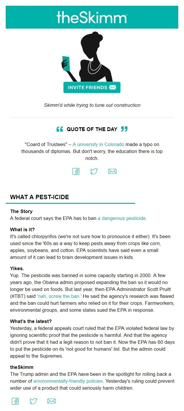 Text-based digest from theSkimm
Things to remember
While designing your email digest, remember the following best practices:
- A single-column layout has enough space for your article to be supported by images or placed in separate blocks. This format does not need a responsive email layout as it is displayed the same way on any device. The point is to limit the amount of news you want to provide to your recipients as a too long copy may be annoying to scroll.
- A two- or three-column layout is suitable for presenting content in a more compact way. It gives you more options for experimenting with the placement of your blocks, and makes it easy for recipients to scan your email. A responsive template is obligatory in this case.
- A text-based layout is the easiest to design. Yet, while creating such an email, try not to stack it with tons of information. Structure it well using headings, bulleted lists, and other elements that will help you make your email digest ‘easy to digest.’
So, always search for a common thread among everything you want to share and see how you can arrange it in a logical way with a simple navigation and balance. And remember to use SendPulse to send your digest emails.