Email Marketing

The Most Common Email Coding Mistakes and How to Avoid Them

The Most Common Email Coding Mistakes and How to Avoid Them

Despite all the bells and whistles of your email, coding mistakes can ruin it completely. Only one incorrectly shortened link or wrong color format — and your email will look wretched, especially if a user decides to check it via a smartphone instead of a web email client or switches to a gadget with a different screen resolution.

In this post, we’ll talk about common HTML email coding mistakes and share some advice on avoiding them.

Where do email display issues come from?

To put it simply, there are two possible reasons a user sees your email outside of the way you’ve planned. The first one is related to the technical characteristics of your user’s device. The second one is the email client, to be more precise — its rendering engine.

Technical characteristics of a user’s device

There are at least two technical characteristics of any device that you should take into account:

  1. Screen resolution — the size of the screen, given in pixels. For example, the iPhone X has a screen resolution of 1125×2436 pixels. If your email contains two columns of text, 600 pixels each column, it won’t be displayed correctly.
  2. PPI, or pixels per inch — the number of pixels in one inch of the screen. The iPhone X’s PPI is 458. Imagine: you need to add an action button into your email. If the button is less than 44 points, which for iPhone X means 132×132 pixels, it will take less than one-third of a square inch of the screen space, and the user will hardly be able to tap it.

One more thing to keep in mind: users often rotate their mobile devices, so your email should look neat and have full functionality in both portrait and landscape view.

To prevent problems associated with the technical characteristics of the user’s device, you should use a responsive email design.

First, you should add media queries into the head of your email. For example, the @media screen and (max-width: 600px) query means that the email design will be optimized if the screen’s width is less than 600 pixels. If the screen’s width is more than 600 pixels, the user will see the fixed-width version of this email.

Second, you should create an email in the form of a table with cells in it:

 
  <table>
   <tr>
    <td>...</td>
   </tr>
  </table>
 

Then, you add style for each cell, for example:

 
  <td style="padding-bottom:30px;">
   <img src="http://somewebsite.com/someimage.jpg" width="600" alt="" style="width:100%;max-width:600px;height:auto;">
  </td>
 

However, even having taken these measures, you can still have problems with displaying your emails. The source of the problem is the email client’s rendering engine.

An email client

The second source of possible display problems is the email client your recipients use to open your campaigns. The core part of an email client is a rendering engine. It receives an email as a long script of code, processes it, and outputs in the way we’re used to receiving emails: comprehensible, structured, and formatted text with images, links, and other media.

Take a look at the example below. It’s a piece of code from a promotional email — as the rendering engine of Gmail sees it. If this email was displayed like that to a potential customer, they will hardly cut through the code and understand that there is a promo code for 40% off.
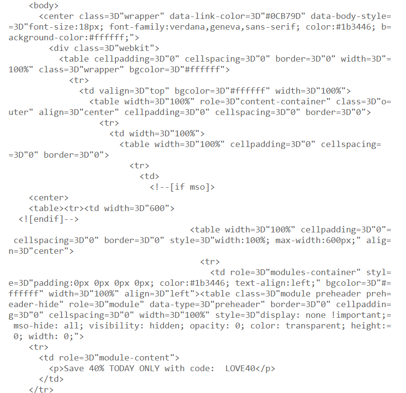
promo email code
A piece of code from a promotional email with a discount

Each email client has its own rendering engine, which means that the same email, opened via different email clients, can have a totally different appearance.

Here is a list of the most popular email clients worldwide. Obviously, your recipients use one or even a bunch of them to open the emails you send.

Email client market share
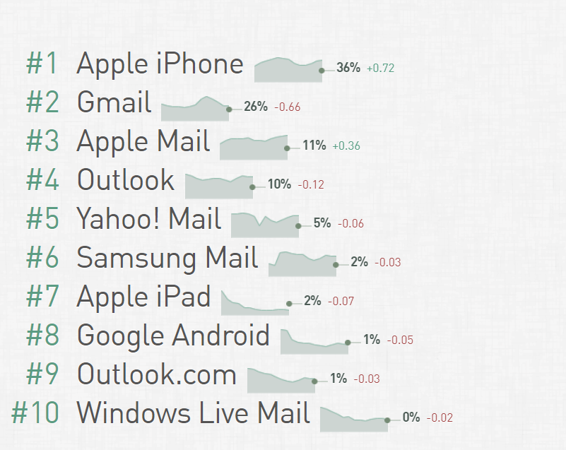
email client market share
Calculated from 996 million opens tracked by Litmus in September 2020; source: Email Client Market Share

All of these email clients have some peculiarities that you should take into account when HTML email coding.

For example, Apple Mail for iOS doesn’t support:

  • inline-size CSS property;
  • @media (orientation)media query;
  • anchor links;
  • HDR, PPM, and SVG image formats, and more.

Gmail supports various CSS properties and media queries apart from:

  • box-shadow, text-shadow, and some other CSS properties;
  • @media (prefers-color-scheme) media query, and more.

Common email coding mistakes and how to avoid them

The best general advice on avoiding email coding mistakes is to limit your inventory to code supported by most email clients, no matter how old their versions are. In simple words, to step back and code as if it were 1999. For instance, it’s widely recommended to use:

  • CSS2 instead of CSS3,
  • HTML4 instead of HTML5,
  • color instead of background images,
  • table-layout instead of <div>,
  • inline CSS instead of style sets or <style> blocks.

This approach is believed to prevent most problems with displaying emails. But let’s take a closer look at some particular coding mistakes which can ruin your email and try to find solutions to them.

No plain text version

Potential problems. Some email clients, such as Outlook and Gmail, can define your email as spam if it doesn’t have a plain text version. Moreover, sometimes email clients have problems with rendering HTML code. Because of this, HTML emails can be displayed incorrectly, while plain text emails always look the same.

Prevention. Add a plain text version into your email. Luckily, most email service providers add it automatically.

plain text email
A plain text version of an email

You can implement plain text emails into your email marketing strategy. First of all, such emails look more personal and thus can level up your communication with subscribers. Moreover, some people prefer getting straight to the point of the email, and a colorful layout puts them off.

Using JavaScript, ActiveX, Flash, and more of the kind

Potential problems. Most email clients don’t support these languages, frameworks, and plugins, so a part of your email won’t be rendered, and your subscribers will see nothing but a blank space. Moreover, the email may be banned by anti-virus software.

Prevention. Keep the languages you use to code emails to HTML and CSS. If you need to add some video or audio, upload it to a website, and give a link to it.

Get an eyeful of how NiftyImages presents new product features: the company chose a sequence of images though it could be an explanatory video.

email example
An email from NiftyImages

Too many redirects

Potential problems. Redirects, though needed for analytics, can do more harm than good to your email. For example, they make the loading time of a web page significantly longer. Then, there is the possibility that a user’s browser blocks redirects — thus, the URL will be inaccessible.

Prevention. Try to avoid redirects. But if you still have to use them, check out how much time the loading of a destination URL takes — test your email before launching the whole campaign. Consider your subscribers’ experience: whether they are willing to wait for the URL loading or not.

Potential problems. Shortened links put your emails at risk of ending up in the spam folder. The thing is that in shortened links, the destination URL is unclear. In simple words, it could lead anywhere. Naturally, hackers and spammers take advantage of that.

Prevention. Do not use shortened links. If your aim is to make your email look neat, without long URLs, you’d better use the following HTML tag: <a href="URL">...</a>. You can insert any URL here, no matter how long it is.

long link
A complete link successfully hidden in a Sephora email

If you are still eager for shortened links, shorten your own URLs instead of using third-party tools. At least scan the blacklists of link shorteners in advance.

Large email body file size

Potential problems. Both email clients and email service providers have email body size limits as they are designed to transfer relatively small volumes of information. If you don’t fit those limits, your email may be clipped — its ending will be hidden.

Take a look at a newsletter from a music label. When opened via Gmail, it’s clipped.

clipped email example
A clipped email in Gmail

To see its full version, the subscriber needs to tap a link.

full version of a clipped email
The full version of a clipped email in Gmail

A large email body file size can also cause problems with deliverability. Moreover, because of the big size, the email may be considered a security threat by the user’s anti-virus software.

Prevention. Check out the email body size limits of your email service provider and of the email clients which your subscribers use. For example, Google claims an email body size limit of 200 KB. But it’s widely recommended to limit your emails to 100 KB in order to meet the requirements of most email clients. Actually, the email from the example above has a size of 136 KB.

Too many fonts and colors

Potential problems. Because of the differences between email clients, not all the fonts and colors can be displayed correctly. Moreover, not all fonts and colors combine well with each other — so you risk creating a weak-sauce email design.

You should also keep in mind that your subscribers’ devices have different screen settings — such as brightness, for instance. And while you’re trying to make your email more vivid, users may suffer from this riot of color.

This is a questionable example of email design: each block has its own colors; this plenty distracts the user from the most important information.

distracting email
Overly colorful emails can look distracting

Prevention. Choose email-friendly fonts, such as Arial, Comic Sans MS, Courier New, Times New Roman, or Verdana: they are supported by most popular email clients. The size of your text font should be no less than 12-13 px; otherwise, a user will have to zoom in on your email or strain their eyes.

As for colors, you shouldn’t use more than two: one for the general text block, and another to highlight important things, as well as for links and buttons. Make sure that the colors you’ve chosen match the background and look good if a user switches to a dark mode.

Copying email template HTML code from a text editor or website

Potential problems. If you use Microsoft Word or something of the kind to create text for your email and then just copy it, you risk catching some unnecessary formatting, which can spoil your email layout. And if you copy images or some parts of text from a website, JavaScript or Flash elements may be added to your email.

Prevention. To code an email, use text editors that don’t add their own formatting, such as Notepad for Windows or TextEdit for Mac. There are also some online tools that can clean up your formatting, such as TextCleanr. You can also use an HTML Cleaner tool, which allows you to create an email in a user-friendly editor and check the code at the same time.

Using HTML Cleaner

Using three-digit HEX color codes

Potential problems. Though three and six-digit color formats should be equivalent, sometimes email clients render a three-digit format in a slightly different way. For example, with Gmail, you risk getting purple instead of the black you planned: color: #000 turns into color: #500050.

color display issues in email
An example of issues with colors in emails

Prevention. As a rule of thumb, stick to the six-digit color format and make sure you use it throughout the whole email.

Attachments

Potential problems. Usually, spammers and hackers attach some files to their emails. If you add an attachment, it may be considered a security threat.

Prevention. Give a link to a file loading page instead of adding the file right to the email.

Here is an example of how you can grant users access to the file you’ve promised. Pay attention to how the link is designated: it should be a clickable piece of comprehensible text so that the user knows what’s going to happen when they tap the link.

download link in email
An example of a link to a file in an email

Missing alt text

Potential problems. Some users disable downloading images in their browser. If they receive an email, including images without alt text, they will only see blank spaces instead of images and won’t understand the point of the email.

It works the same when someone’s internet connection is too low to download the images quickly enough. Alt text helps solve this problem in a way: when downloading of the images goes wrong, a user can see a text instead.

Prevention. Add an alt attribute to all the images you use. Make sure you do it correctly — by adding it to an img tag: <img alt="text">. Limit the alt text to 125 characters, including spaces. Usually it’s enough to add just a couple of words that describe the image precisely. If you have some room left, you can add some context to this description.

Take a look at an excerpt of an email from Sephora.

sephora email
An excerpt from Sephora’s email

If you check out the code of this email, you can find a CTA as the alt text for the image. Even if users don’t see the image, they will still understand what the brand is offering.

cta alt text
An example of alt text

Image-only layout

Potential problems. If your email only consists of images and doesn’t have any text, you can run into problems with deliverability, displaying, and more. For example, if a user blocks image downloading, they will see literally nothing in your email. Second, plenty of images makes the email body size bigger, and email clients are likely to clip it. Third, a user won’t be able to find your email in a folder via search by word.

Prevention. When creating an email, combine text and images. Don’t forget to add a plain text version of the email and alt text for images; take into account the other advice we’ve given above.

Take a look at this email from Ecwid. It has a responsive design that includes the table layout and media queries, such as max-width: 570px. The email combines different types of content: a colorful, captivating image and text. The six-digit color format is used, for example, color:#979797 or color:#4A4A4A. There are not many images in the email, so its body size is not too big. What’s more, find neither shortened links nor redirects in the email. Overall, this email meets most of the recommendations given above.

balanced email
An example of a well-balanced email from Ecwid

So, we’ve had a glance at the most common HTML email coding mistakes. Apply our advice, and don’t forget to test your emails before sending: use at least three popular email clients to open your email; if possible, check it via different devices as well. Emulators will also come in handy.

One more way to avoid email coding mistakes

There is one truth: you won’t make HTML coding mistakes if you don’t code. Luckily, no-code email designing is waiting for you with SendPulse.

With our intuitive drag and drop editor, we’ve already prevented you from making email coding mistakes. Just add images, text, or video to your email set the fonts and colors to match your brand style, and add links to your social media pages.

To make the whole thing even simpler, you can choose from our free email templates. All the emails created with SendPulse are responsive, so they will look good no matter which device a user chooses to open them.

Checklist for avoiding common HTML email coding mistakes

Below you’ll find the main rules on how to avoid common HTML email coding mistakes. Following these rules, you can avoid problems with deliverability and displaying your emails.

  • Add a plain text version to your emails.
  • Do not use JavaScript, ActiveX, Flash, or more of the kind. If you need to add some video or audio, upload it to a website, and give a link to it.
  • Try to avoid redirects not to increase the loading time of a web page.
  • Do not use shortened links — transform a piece of text or an image into a link using HTML.
  • Try to limit your email body size to 100 KB — or at least check out the limits of your sending provider and the email clients your subscribers use most.
  • Choose email-friendly fonts, such as Arial, Comic Sans MS, Courier New, Times New Roman, or Verdana.
  • Try not to combine more than two colors in one email — otherwise, it will look distracting.
  • Do not copy text and images for your email from text editors like MS Word or websites: there’s a risk of catching some unnecessary formatting.
  • Use a six-digit color format.
  • Do not attach files — give a link to a file loading page instead.
  • Do not forget to add alt text to images.
  • Do not make emails of images only — always add some text.
  • Do not forget to test an email before starting a campaign. Use at least three email clients and different devices.

And to not have to think about all of that — start using SendPulse for free!

Date of publication:

October 27, 2020
Irina Silyanova

Dealing with texts as an author, editor, and content marketer for more than five years.

1 Star2 Stars3 Stars4 Stars5 Stars
Loading...
Average Rating: 5/5
Total Votes: 35

Share:

Facebook Twitter