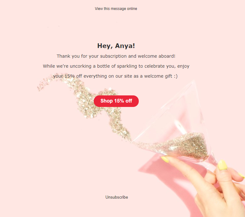
While creating your email copy, you might consider email background images an element of little importance, but you’d better not. In email marketing reality, background images matter a lot for email readability and overall layout success. In this article, we’ll dwell on the tricks of creating background images and try to prove why you should actually add them.
What is an email background image?
A background image is an image which is placed in the background of an email or its element. Such images are usually complementary to other content in the email, which means you can layer additional images, text, and calls-to-action on them.
Take a look at how an email with a background image looks:
 An email with a background image
And here’s the same email without a background image, but with a background color only.
 An email without a background image
Some email marketers may use a wholesome image which already contains text and pics for an email template. Yet if the recipient’s email client blocks images, such an email won’t be displayed, so the users won’t see your message at all. Meanwhile, adding a background image, you may be sure your message will be visible even if the background image gets blocked.
However, adding a background image to your email copy might also turn out to be a pain in the neck — according to Litmus, not all email clients support background images.
 Background image support in email clients. Source: Litmus
What if using background images in email is important for your campaign? We’ve gathered some essentials for you to consider while constructing a template with a background image.
How to apply background images in email
We recommend sticking to the following rules to play a safe background image game.
Follow design rules
Following some design standards is paramount for choosing a background image. You need to plan the overall look of your template — its content, fonts, text size, CTA’s location — and see whether they correlate with the background image you’ve chosen.
- Size: choose an image > 600px high and >1200 px wide. This way, the actual image size won’t exceed the sizes of the user’s browser and your template.
- Location: place the background image in the center of the template.
- Fonts: make sure you use readable fonts that don’t get lost among other background images.
- Colors: choose three main colors in your background image and make sure they play together with the rest of the template pallette.
- Content keep in mind the 40 to 60 image-to-text ratio. In case your background is too showy, add minimum text or vice versa.
Take a look at Urban Decay’s email. The company has chosen cool background, so they kept the rest of their design in a minimalistic way. The colors of the preheader, the CTA, and the fonts all play together with the background image to make the whole email look balanced and legible.
 Email with a background image from Urban Decay
Set fallback colors
Another precaution is choosing a background color. In cases when the background image fails to display, a default color will display. While creating your template, set a backup color in the settings so that it correlates with the overall color pallette of your email.
Add ALT text
As we’ve mentioned above, some web clients block background images by default. Be forearmed: make sure you have a plan B for such cases. Provide an ALT text in the settings of the image so that the users will still see what you’ve sent them.
To be on the safe side, you need to include the background color attribute or background color property to contrast the HTML content and make sure your message is readable.
How to set a background image in SendPulse
SendPulse allows you to add a background image to your email template. First of all, go to the Email Templates menu in your SendPulse account and click “Add a template.”
 Adding a template in SendPulse
Then choose a way to create your template — in Layout Template Editor, in HTML Editor, or through Template import. To add a background image to a premade template, choose the first option and then any of the appealing template options in the drop-down menu.
Ways to create an email template in SendPulse
Fill in your template with the necessary content, preview and send a test email before you launch your campaign.
Adding a background image to the template
Stick to all design requirements we’ve mentioned before and remember to indicate the background color in case the actual image gets blocked by the email client.
In the drag-and-drop email editor, use a color picker tool to choose the color which matches your original background image and the email in general.
 Adding a background color to the email in the SendPulse email editor
Now that you’re packed with some bulletproof tips on how to create an email template with a no-fail background image, namely choosing the right image size, email fonts, and colors, including an alternative text and the plan-B background color, do not hesitate to rely on SendPulse to deliver your emails at ease!