Pop-ups have been getting a bad rep lately due to the intrusive or straight-up manipulative practices some marketers use. But what if we told you that eCommerce pop-ups can, in fact, enhance user experience instead of ruining it?
Let’s dive into this topic and discuss the best eCommerce pop-up practices and why pop-ups are here to stay. After reading this, you’ll know what to consider when creating your next pop-up campaign and how to ensure its success.
What is an eCommerce pop-up?
An eCommerce pop-up, also known as a contact form or lead capture form, is a small window that appears on a website when a visitor performs a specific action or after a certain period of time. These pop-ups are designed to capture the attention of the website’s visitors and prompt them to interact with the brand, usually either by subscribing to a newsletter or receiving a discount code.
The main purpose of eCommerce pop-ups is to engage online store visitors, gather valuable data about them, and increase conversions. Businesses use them to initiate contact with their audience and grow their mailing lists.
What are the most common types of eCommerce pop-ups out there?
By using various types of pop-ups for eCommerce, you can achieve diverse marketing and sales goals. Let’s go through some of the most popular ones.
Email capture pop-ups
Email capture pop-ups ask visitors to subscribe to the website’s newsletter and start receiving announcements, exclusive offers, and educational content from the brand. They typically feature incentives, such as a promo code or freebie, to encourage users to provide their contact info.
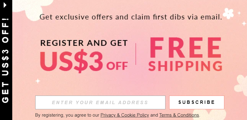 A lead capture pop-up example
These forms are excellent for capturing first-time visitors’ data and turning them into loyal subscribers or even customers. Lead capture pop-ups can also be used for gathering phone numbers for SMS marketing.
Exit intent pop-ups
Exit intent pop-ups are triggered when a user’s mouse cursor shows signs of leaving the website, such as moving toward the browser’s close button or back button. They aim to retain the visitor’s attention and prevent them from leaving by offering a last-minute deal or special offer. This pop-up type is less intrusive as it appears only after a certain amount of time, so there’s a higher chance that your users will express interest in it.
Discount pop-ups
These forms present users with a discount code or special promotion when they visit the site or during the checkout process. They encourage cautious users to overcome their doubts and make a desired purchase.
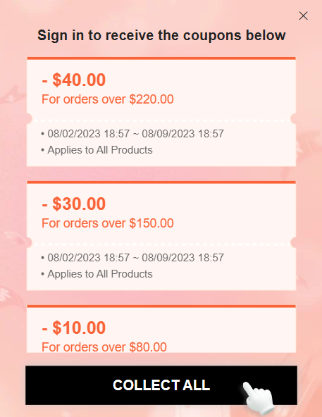 A discount pop-up example
Discount pop-ups for eCommerce allow you to feature multiple seasonal or one-time offers, like in the example above. It’s also common to turn them into multi-step forms for a smoother user experience.
Upsell or cross-sell pop-ups
These pop-ups appear when a user adds an item to their shopping cart or during checkout. They suggest additional products related to the ones already selected, aiming to increase the order value and give the customer a chance to try out different products.
Social proof pop-ups
Social proof pop-ups display real-time information about recent purchases, customer reviews, or the number of people currently viewing a particular product. They create a sense of urgency, demonstrate high demand, and show credibility, encouraging potential customers to place an order without hesitation.
Live chat pop-ups
Live chat pop-ups are interactive widgets that appear on a website, offering real-time communication between website visitors and human or virtual agents. These pop-ups prompt users with a live chat invitation, inviting them to ask questions and get professional guidance.
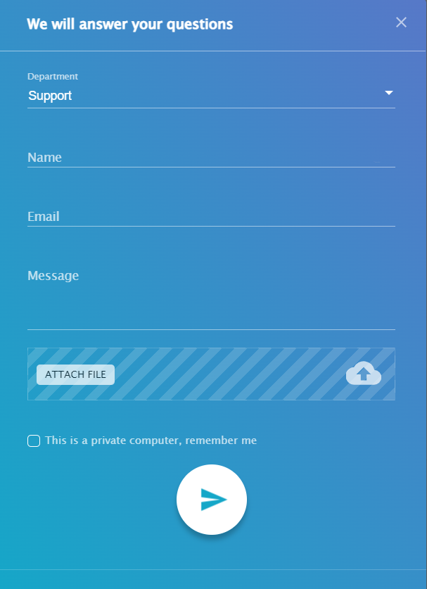 A live chat pop-up powered by SendPulse
Live chat widgets are a valuable customer support tool, enabling businesses to provide instant help, address queries, and resolve issues, ultimately enhancing the overall user experience and increasing customer satisfaction.
What are the benefits of eCommerce pop-ups?
Now that we’ve looked at different pop-up types, it’s time to sum up their advantages:
- Increased conversions. By displaying relevant and targeted offers, eCommerce pop-ups can motivate visitors to take action right away before their interest in the website fades away. The sense of urgency created by pop-ups can also encourage users to complete their transactions promptly.
- Lead generation. Email subscription pop-ups are incredibly useful for mailing list building. By offering incentives like discounts or freebies, pop-ups can entice visitors to share their email addresses, allowing the store to engage with them through email marketing campaigns.
- Reduced cart abandonment. Exit intent pop-ups can help combat cart abandonment. When users show signs of leaving the website without completing their purchase, these pop-ups can offer them a last-minute discount or special deal to encourage them to complete their order.
- Upselling and cross-selling opportunities. Upsell and cross-sell pop-ups present additional products or upgrades that complement the items already in a user’s cart. This can lead to increased order values and additional sales.
- Enhanced user experience. When used consciously and in a personalized manner, pop-ups can provide visitors with valuable information, such as product recommendations, customer reviews, or limited time offers, which they otherwise might miss.
- Customer engagement. eCommerce pop-ups can be used to engage customers with interactive elements, like quizzes or surveys, helping to gather valuable insights into their preferences and needs.
- Promoting special offers. Pop-ups are an effective way to promote time-sensitive deals, flash sales, or seasonal offers, driving more traffic and sales during specific periods.
- Building trust with customers. Social proof pop-ups display real-time data on recent purchases or customer reviews, instilling confidence in potential buyers and demonstrating the legitimacy and popularity of your online store.
All in all, eCommerce pop-ups allow businesses to be proactive and establish connections with potential customers early on. In turn, customers can use contact form pop-ups to learn more about the brand and stay informed about its latest products.
The unwritten laws of using eCommerce pop-ups
Using eCommerce pop-ups in an elegant, non-intrusive manner is essential if you want your users to react positively to them. Here are some best practices to ensure your pop-ups are well-received by visitors.
Timing is everything
Display pop-ups at appropriate moments when your visitors are the most curious and open to new information and interactions. Avoid immediate pop-ups upon page load — instead, let them look at a product or two first. Use exit-intent triggers to show pop-ups when users show signs of leaving the site, as this won’t disrupt their browsing experience. In our blog, you’ll find an in-depth post on pop-up timing and everything related to it.
Better too few than too many
Limit the number of pop-ups shown to each user during their visit. Displaying multiple pop-ups in a short time can irritate visitors and lead to a higher bounce rate. For the same reason, it’s better not to bombard them with live chat windows and push notifications — stick to one message at a time.
Value-first messaging helps
Offer something valuable and relevant to users in your pop-ups, such as exclusive discounts, helpful downloadable content, or other lead magnets. Ensure that the benefits outweigh the intrusion of the pop-up and that you offer something your visitors won’t easily find on their own.
Having a clear CTA is always a plus
Make the purpose of the pop-up evident with a clear and actionable CTA. Use straightforward language that tells users what they can expect after interacting with the pop-up — for example, “Sign Up,” “Get Discount,” or “Stay Updated.”
Inclusive design wins
Ensure that your pop-ups are mobile-friendly, easy to read, and display correctly on different devices. Mobile traffic makes up around 50% of all online sales, and a poorly optimized pop-up can be an instant turn-off for experienced buyers.
Pop-up placement is crucial
The placement of your pop-ups matters — it defines how much attention they will attract and how. Avoid covering essential content or navigation menus. Opt for non-obtrusive positions that don’t interfere with the overall user experience.
 A horizontal pop-up
For instance, a horizontal hovering bar is great for promoting short-lived deals that are about to expire. An overlay pop-up is useful for special announcements. Floating pop-ups, in turn, are perfect for email capture forms because of how non-intrusive they are.
Easy exit prevents user annoyance
Always include a visible and easy-to-find close button, allowing users to dismiss the pop-up if they choose not to engage with it. Avoid making it difficult for users to close the pop-up, as this can lead to frustration, rage clicks, and higher bounce rates.
A/B testing and tracking are non-negotiable
Continuously test different pop-up designs, triggers, and content to see what resonates best with your audience and what to avoid. Pop-up A/B testing allows you to optimize forms for better performance and user satisfaction.
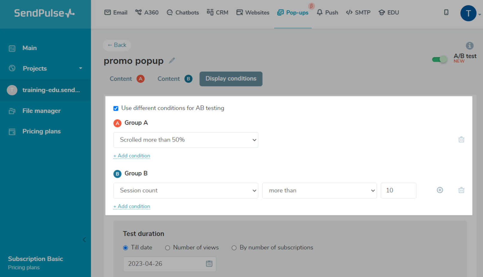 Pop-up A/B testing
Keep an eye on pop-up analytics to assess their performance and impact on your website. Pay attention to conversion rates, bounce rates, and user feedback to make informed decisions.
Repeat visitors deserve respect
Once a user has already engaged with a specific pop-up (e.g., subscribed to your newsletter), avoid showing the same pop-up repeatedly. Instead, show a different relevant offer or no pop-up at all to give them a break from distractions.
Audience segmentation leads to more relevant pop-ups
Utilize segmentation to target specific pop-ups to specific user segments based on their browsing behavior, location, traffic source, or time spent on a particular page. This ensures that users only see offers and promotions that speak to them.
Scarcity tactics work when nothing else does
Add a countdown timer or some other scarcity signifier to your pop-up to make your visitors act here and now instead of automatically closing your message or postponing a purchase.
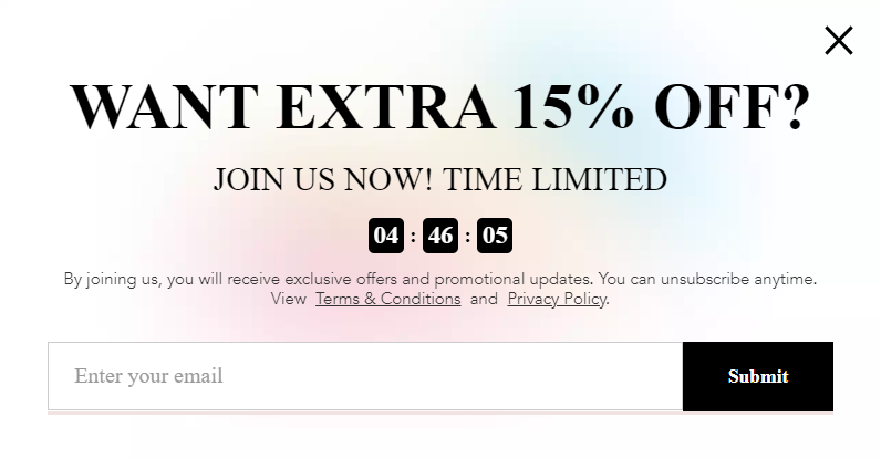 A pop-up with a countdown timer
Don’t forget to link to your privacy policy if you collect your users’ email addresses, as they certainly would like to know where their sensitive information lands.
How to create a smart pop-up for eCommerce with SendPulse
Unleash the power of our user-friendly pop-up builder, designed to craft smart pop-ups in minutes. Engage your website visitors with personalized messages that correspond with their goals and interests.
Start by signing up or logging into your SendPulse account — no credit card is required for the free plan.
Navigate to the “Pop-ups” tab, where you can create, monitor, and optimize your campaigns. With our basic plan, you can create up to three projects and reach up to 10,000 unique visitors at no cost. The second cheapest plan starts at $7 a month.
Click “Create project” to create a new space for your campaigns. You can associate each project with one of your websites. A single project can also be used for multiple related websites — this doesn’t affect how your pop-ups are shown.
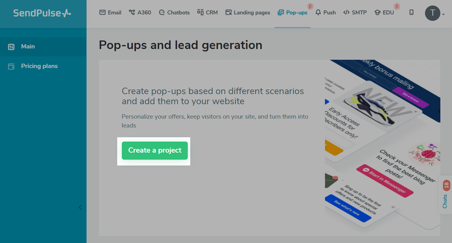 Creating a project in SendPulse
Click on your project to open it. Then, click on “Create pop-up” to start working on your first campaign. This will open a template library. All of our templates are customizable. You can organize them by theme, CTA, or placement on the page. Pick a template and click on it to start editing. At this stage, you can bring in your images, text, and CTA.
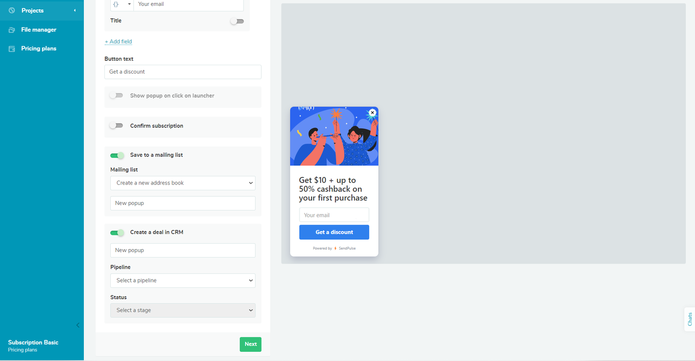 Editing a pop-up in SendPulse
If you want to simplify your eCommerce operations, activate automated CRM deal creation. You’ll be able to access your deals in the “CRM” tab, without leaving SendPulse. Toggle the “Save to a mailing list” button if you aim to grow your mailing list.
Click “Next” and move on to “Display conditions.” Here, you can fine-tune your pop-up timing. For adding a delay, choose “Time on site” or “Time on current page.” Use “Pages visited” to target users who show a prolonged interest in your brand. You can add several conditions and apply all or at least one of them.
Once you’re done with editing and settings, save and publish your campaign. Then, open it to see what it looks like live and whether all the fields capture information correctly. You’ll always be able to make changes later if needed.
You can track your campaign’s performance using built-in SendPulse tools and Google Analytics.
Refer to our knowledge base for step-by-step guidance on this subject and other how-tos.
Use SendPulse for eCommerce pop-ups, email campaigns, and deal tracking
Unlock the potential of pop-up marketing with our comprehensive sales and marketing automation toolkit. Seamlessly plan and execute omnichannel campaigns relying on our pop-up builder, CRM, website builder, chatbots, email automation service, and more. Effortlessly communicate with customers and manage deals in a stress-free fashion.
Our free plan allows you to explore various features of our platform without any risks. Moreover, we offer 24/7 support with real human agents, should you run into problems. Create your account today to see SendPulse in action!