Nowadays, a robust online presence is essential for businesses of all types, and restaurants are no different. While word-of-mouth and walk-ins are still essential, many potential customers turn to the internet to discover new locations, read reviews, and make reservations. A well-crafted restaurant website can offer far more than just basic information.
In this post, we’ll explore why every restaurant should have its own website and highlight key factors for making it effective.
10 essential features of a successful restaurant website
A restaurant website serves as a digital front door, offering potential customers a first impression and essential information about the dining experience. If you want to create a restaurant website, there are some crucial elements that you should include in it:
- Menu. A detailed and up-to-date menu with prices and descriptions is one of the most important sections of a restaurant website. Including information on allergens or special menus can help customers decide if your restaurant meets their dietary needs.
- Contact information. Essential contact details like phone number, email address, and physical address with a map are crucial for a restaurant website. If you have multiple locations, clearly separate the information for each one.
- Hours of operation. Clearly listing opening and closing times is a must. Additionally, ensure you specify any changes to business hours on weekends or holidays.
- Online reservations. Many people visit a restaurant’s website to book a table, so having a straightforward, user-friendly booking system right on your landing page is a smart move. It makes the process hassle-free for your customers and can boost your reservations.
- Ordering system. Adding an option for online orders and delivery on your website is a great way to cater to the growing demand for food delivery services. Make it easy for customers to enjoy your food from the comfort of their homes.
- High-quality visuals. Featuring professional images and videos of your dishes, interior, and ambiance on your website can make a big difference in attracting customers and setting your restaurant apart from the competition.
- Specials and events. If you host any entertainment programs like live music, stand-up shows, make sure to announce them on an event landing page. You can also keep customers updated on current promotions and seasonal menus.
- “About Us” page. In this section, you can share the story behind your restaurant, introduce your chef and team, and highlight what makes your place unique.
- Customer reviews. Social proof is a powerful way to boost any business’s credibility, and a restaurant website is no exception. Consider adding customer testimonials and ratings to your website to build trust with potential customers.
- Blog or news section. Another good practice for a restaurant website is to share articles, recipes, and news related to your business to keep your customers engaged and coming back for more.
The elements mentioned are standard for most websites for restaurants, but the specifics can vary based on your restaurant’s concept, cuisine, and location. Tailoring your website to fit these unique aspects will make it more relevant and appealing to your customers.
Restaurant website design tips
Designing a restaurant website may be more challenging than it sounds. The process involves capturing the essence of the dining experience while presenting essential information clearly and attractively. Below are several tips on how to design a restaurant website that will look eye-catching and perform well at the same time.
- Brand consistency. Keep your website’s look in sync with your restaurant’s interior. Use matching brand colors, fonts, and logos to create a cohesive experience that reflects your restaurant’s unique identity.
- Visual hierarchy. Arrange elements on your page to naturally guide visitors’ attention. Use size, color, and contrast to highlight key information, and leverage whitespace and spacing to make important details stand out.
- Professional imagery. Attract visitors with high-quality, professional photos of your dishes and dining area. Make sure the images are well-lit and showcase your restaurant’s best features. Update them regularly to reflect any menu or décor changes.
- Clear navigation. When designing a restaurant website, make sure your visitors can easily find essential information like your menu, location, hours, and contact details. Use intuitive navigation menus and ensure all links work smoothly.
- Mobile optimization. Since many customers will access your site from their phones, ensure your mobile landing page is user-friendly and readable on smaller screens.
- Prominent CTA buttons. Use visually appealing buttons for actions for key actions like booking a table, viewing the menu, or signing up for newsletters. Ensure they’re easy to find and click.
By focusing on these website design tips, you can build a website for a restaurant that’s both visually appealing and easy to use, encouraging visitors to engage with your establishment. While elements like color scheme and visual hierarchy should align with your restaurant’s concept, the key is to ensure your site is user-friendly and simple to navigate.
Restaurant website copywriting tips
While eye-catching visuals are great for grabbing attention on a restaurant website, compelling copywriting is just as crucial. Effective copy not only highlights menu items and promotes special events but also creates an inviting atmosphere that visuals alone can’t achieve. Here are some best practices to keep in mind when crafting your website copy:
- Authenticity. Match your website’s tone to your restaurant’s unique style. Whether your vibe is chic and elegant or casual and fun, make sure your writing reflects your brand personality.
- Mouth-watering adjectives. Spice up your descriptions with vivid adjectives. Instead of just saying “apple pie,” try “homemade golden-crust apple pie” to make it irresistible.
- Storytelling. Share the story behind your restaurant and its dishes. Talk about what inspired a particular dish or how you source local ingredients. This adds a personal touch and helps your restaurant stand out.
- A sense of urgency. Create a bit of FOMO by mentioning limited-time offers or seasonal specials. Phrases like “only available this summer” can encourage customers to visit sooner.
- Action. Encourage visitors to take action with phrases like “Book your table today,” “Explore our menu,” or “Join us this weekend.” Clear calls to action make it easy for customers to engage.
By following these tips, you can craft captivating website copy that truly connects with your visitors. Ultimately, combining engaging visuals with persuasive copywriting is key to drawing in and retaining your restaurant’s customers.
Inspiring restaurant website examples
Restaurant website examples can be incredibly helpful when creating your own website, as they provide design inspiration, different ways of menu presentations, and so on. In this section, we’ll take a closer look at some selected examples and explain what makes them stand out.
Noma
Noma is a famous Copenhagen-based restaurant known for its innovative approach to Nordic cuisine and focus on foraging and rediscovering local ingredients. This restaurant’s website mirrors this creativity through compelling storytelling, sharing the restaurant’s origins and the people behind it. Website visitors can easily book a table or join a waiting list via email if reservations are full. A unique feature on Noma’s website is its dynamic content, which displays the current weather and adjusts the imagery accordingly.
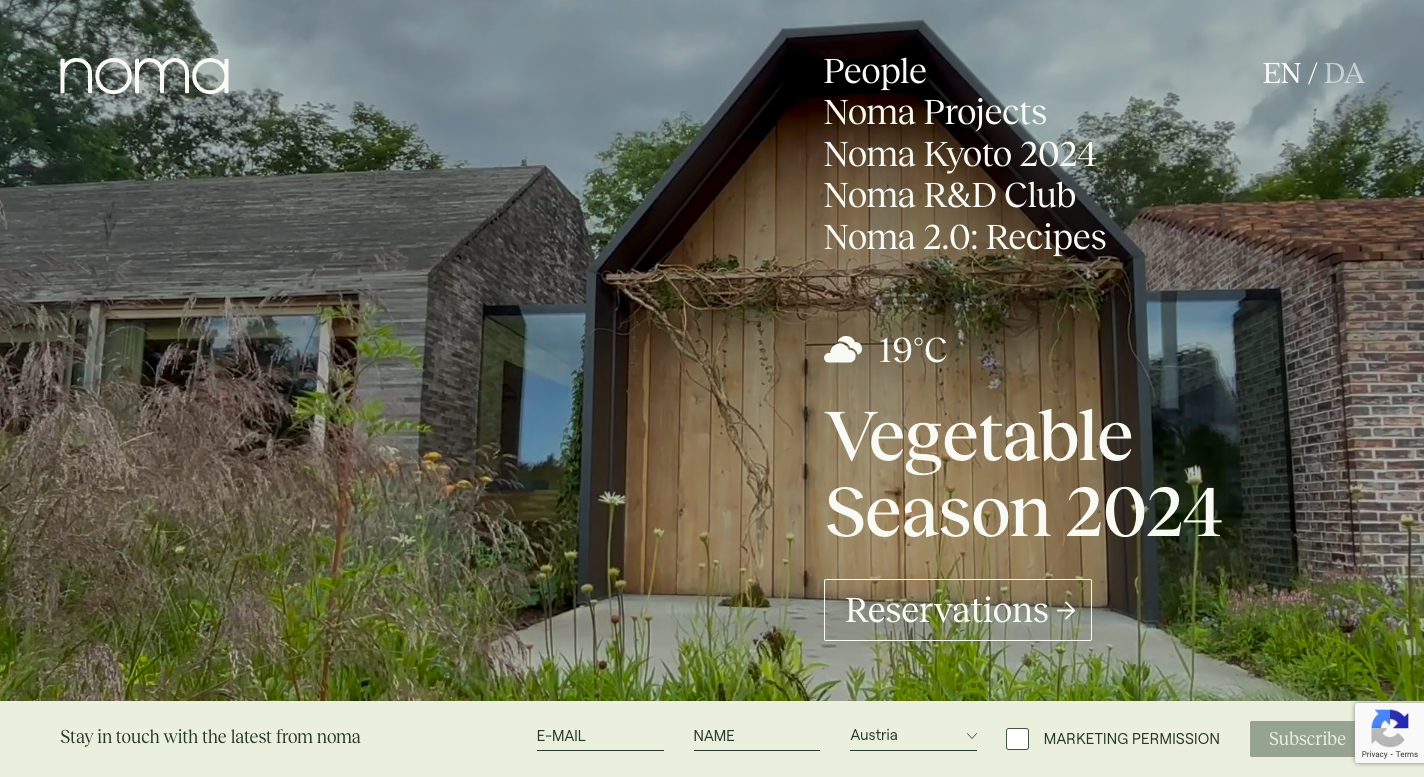 A restaurant website example
Noma doesn’t just offer a dining experience; they also provide new products and flavors that you can buy directly from their website. Plus, they share recipes featuring each product in their online store. What really makes their restaurant website stand out is the option for annual memberships, allowing customers to engage in discussions with the team and even join in on foraging adventures.
Here’s what makes this restaurant website example so unique:
- captivating storytelling;
- clean design and eye-catching visuals;
- online store with their own products;
- dynamic content;
- annual membership for closer customer engagement.
Eleven Madison Park
Eleven Madison Park is an acclaimed restaurant located in New York City that is known for its innovative and refined cuisine. Their restaurant website highlights the sleek and sophisticated design with clean typography and a minimalist layout. Upon landing on the website, a user sees a red button to book a table, which makes it very straightforward. Visitors can easily find other information about the restaurant in the drop-down menu. This restaurant website example is rich with professional photographs of the interior, dishes, and staff at work.
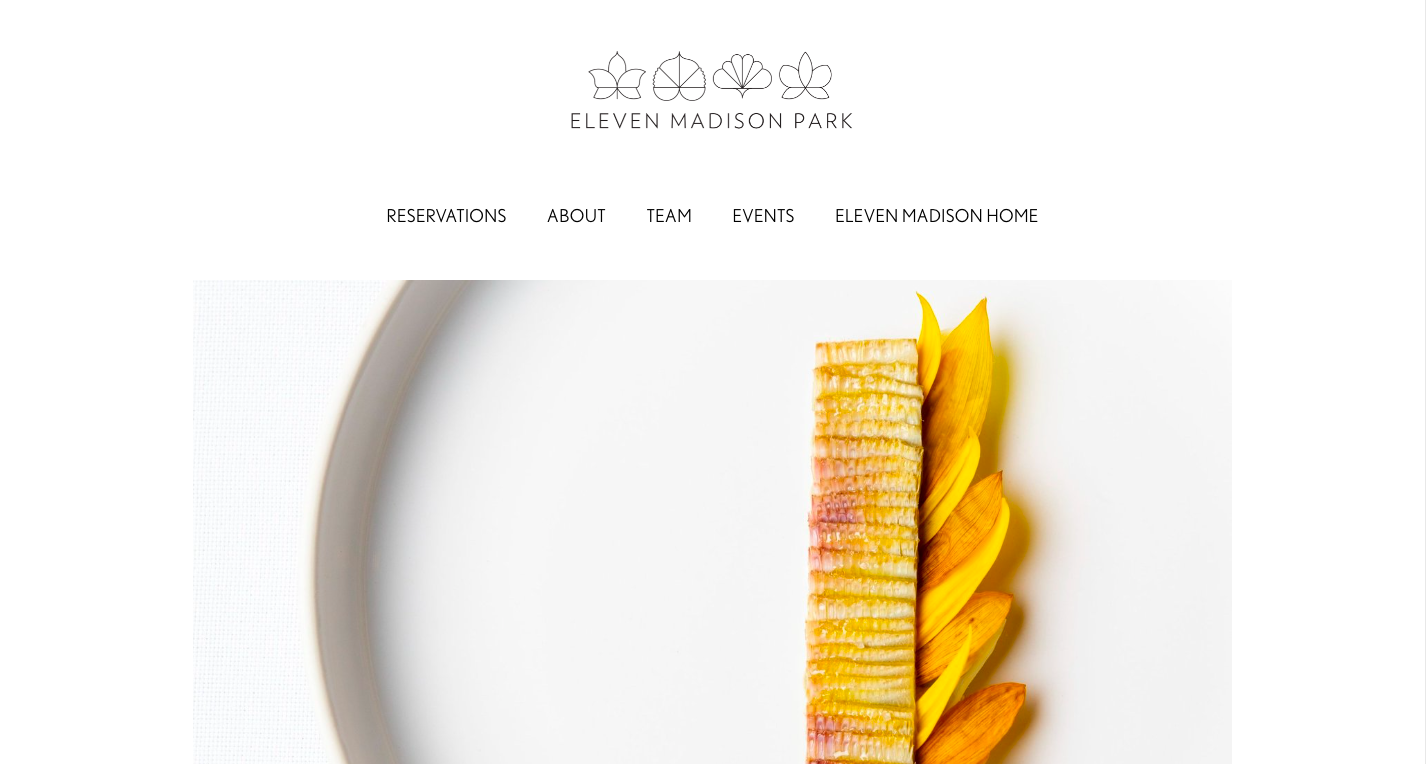 Minimalist restaurant website design
Another unique feature of the Eleven Madison Park restaurant website is the use of a pop-up overlay to collect email addresses. Notably, this overlay blends seamlessly with the landing page design, making it less intrusive. By gathering emails of their website visitors, Eleven Madison Park can stay in touch with their customers and build longer-lasting relationships.
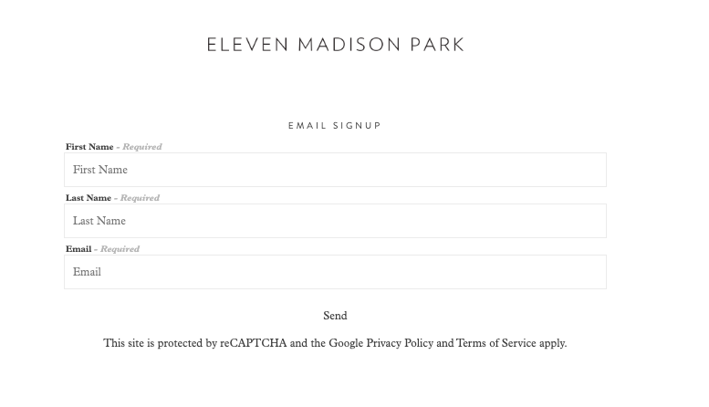 A pop-up overlay on the restaurant website
Here’s what makes this restaurant website example special:
- minimalist design with enough whitespace;
- elegant typography;
- professional visuals;
- easy navigation with a drop-down menu;
- overlay pop-ups that gather visitors information.
Momofuku Noodle Bar
Momofuku Noodle Bar is a restaurant known for its creative approach to Asian cuisine, particularly ramen and other noodle dishes. The restaurant’s website is kept simple, featuring high-quality images and an intuitive design. Essential information, such as addresses and opening hours, is displayed prominently at the top of the site. A drop-down menu allows visitors to easily access the menu or book a table.
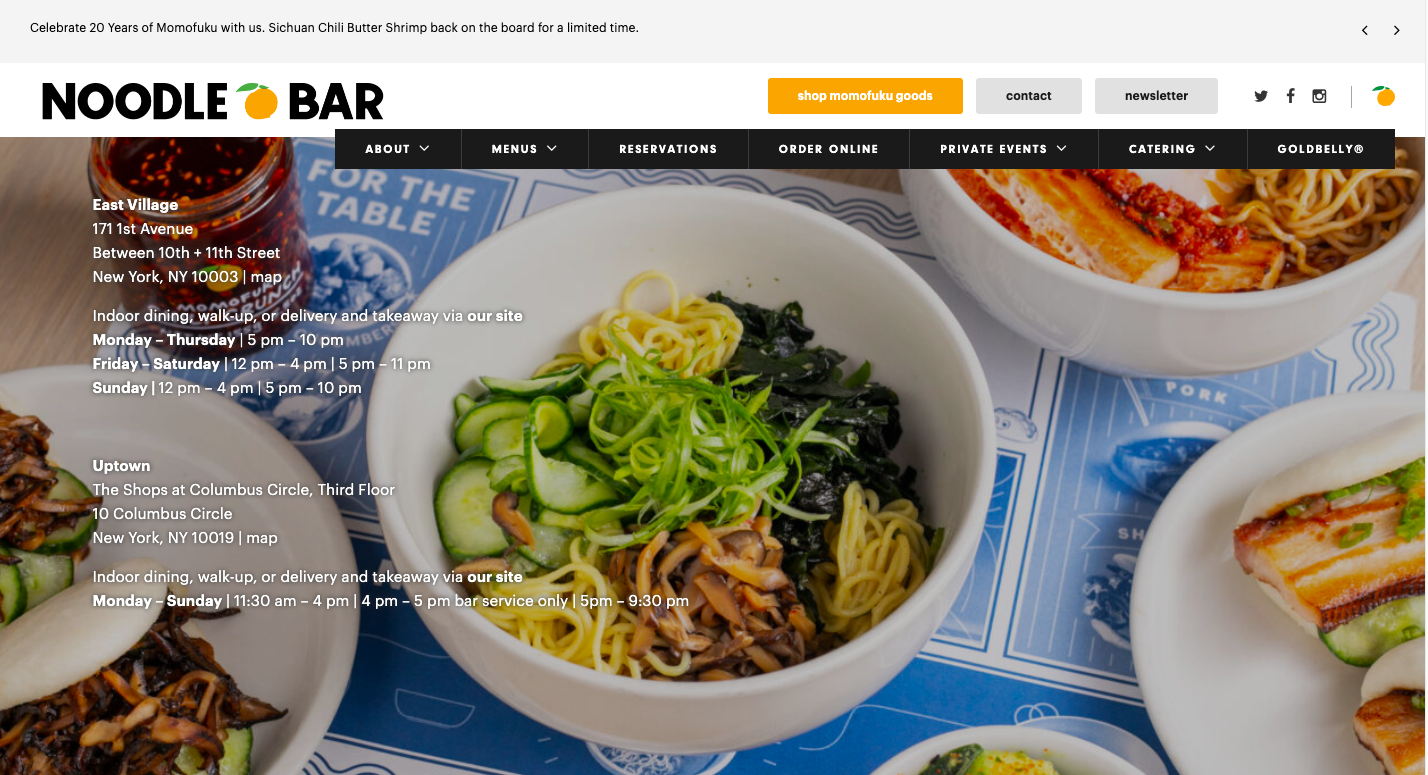 A restaurant website example
Besides, visitors of this restaurant’s website can see a floating bar at the top displaying news related to events, dishes, and more. Upon clicking, users are redirected to a blog article with detailed information.
Here’s what makes this restaurant website example unique:
- casual yet sleek website design;
- high-quality photos of dishes;
- relevant information right at the top of the web page;
- use of a floating bar for notifications.
The Attendant
The Attendant is known for its unique concept, with one of their cafés situated in a converted Victorian-era public restroom. The restaurant’s website primarily sells various products including coffee, brewing tools, drinkware, and gift cards. A hello bar at the top of the website indicates that no reservations are needed, and tables at their location are allocated on a ‘first come, first served’ basis.
Visitors can also use a chatbot on the restaurant’s website to get answers to FAQs about the locations or to track orders placed in their online shop.
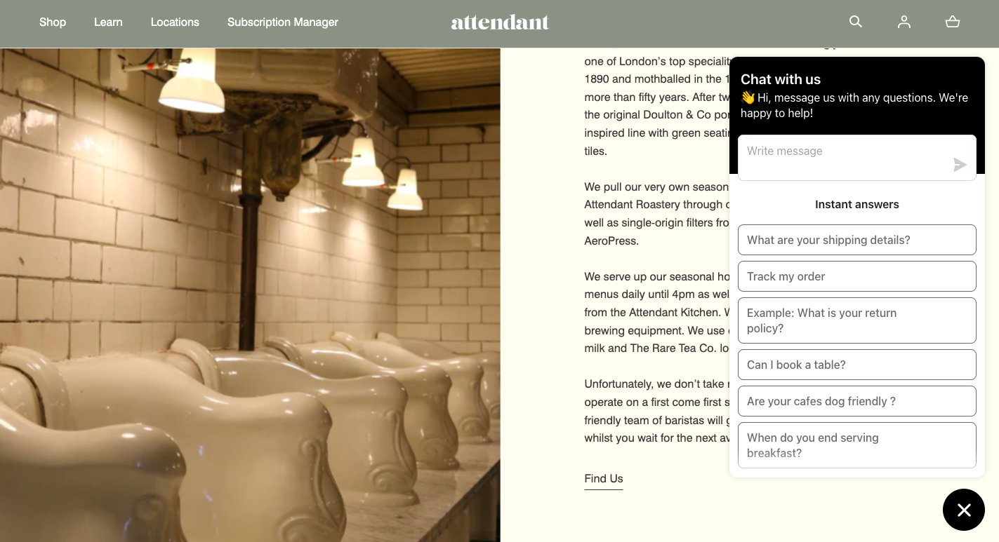 Utilizing a chatbot on a restaurant website
This restaurant’s website design is kept modern with earthy shades to reflect the coffee shop atmosphere. The Attendant also uses images for each café that reflect their unique identities, such as the former restroom.
Here’s what sets this restaurant website example apart:
- modern website design;
- earthy color palette that goes well with the offerings;
- easy navigation to dedicated tabs for different locations;
- integrated online shop;
- hello bars and a chatbot for enhanced user experience.
Honi Poke
Honi Poke is a restaurant chain specializing in Hawaiian poke bowls. Their website, designed in lively colors, perfectly reflects the vibrant mix of ingredients found in their bowls. It features high-quality images of their food, effectively showcasing their offerings and attracting visitors. Animations and video content throughout the site further enhance viewer engagement.
This restaurant’s website features two prominent buttons – one for regular delivery and another for click-and-collect orders. The menu is conveniently located on the landing page. Other tabs provide information on catering services, restaurant locations, and further details about the restaurant concept.
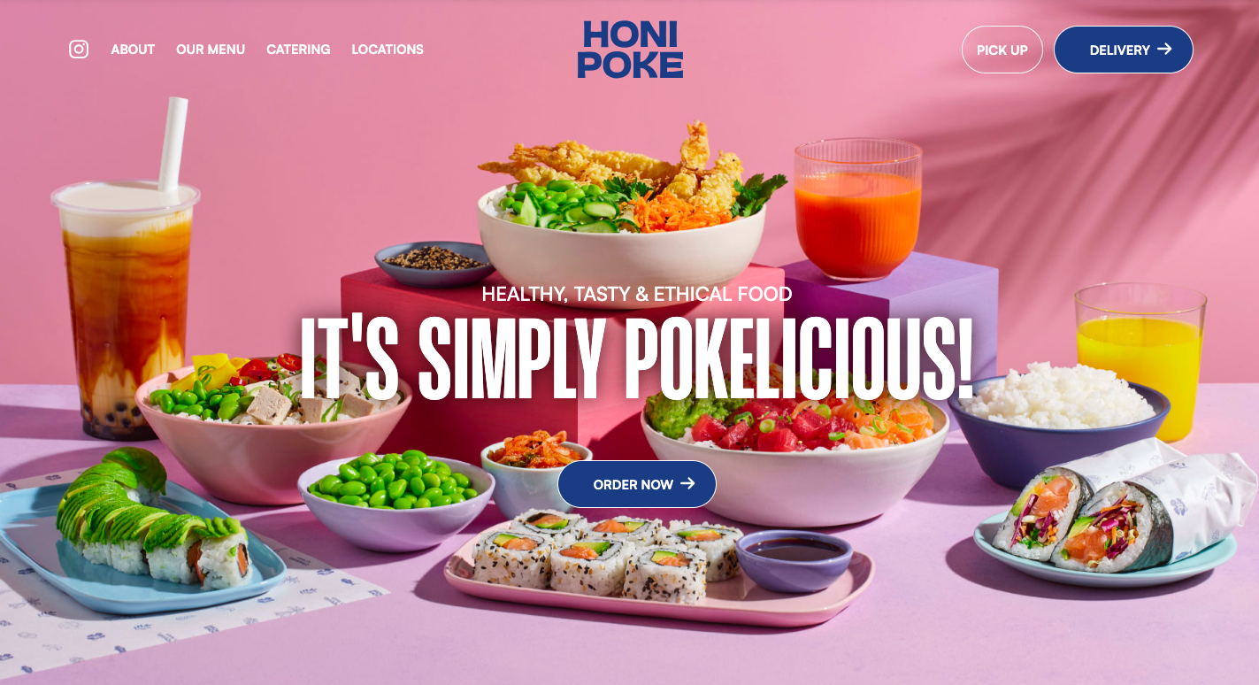 Bright restaurant website design
Here’s what differentiates this restaurant website example:
- colorful and simple design;
- animations and video elements;
- prominent buttons for delivery and click-and-collect;
- convenient menu separated into categories.
Schaller’s Stube
Schaller’s Stube is a well-known German-style restaurant in New York City that offers a variety of tradition-inspired foods. Their restaurant website features an appealing dark design with professional visuals. The menu is prominently displayed, designed to resemble a real menu one might find on a table, with different fonts used for each dish or drink.
Schaller’s Stube has incorporated eye-catching details into their restaurant website design, such as an illustration of a bear with a sausage to highlight German traditions and striking red buttons with CTAs. The navigation tabs are conveniently displayed at the top of the page, though users can also scroll down to view them.
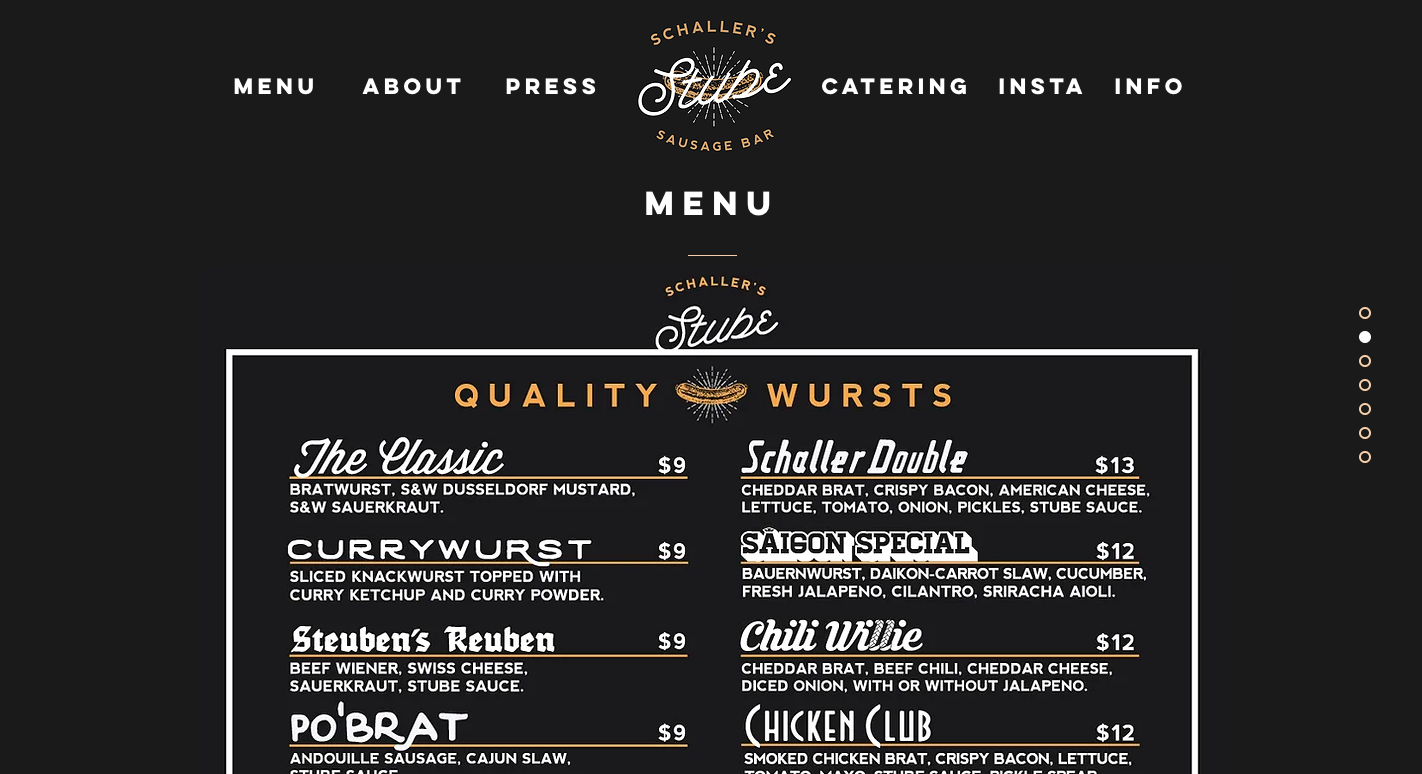 A dark restaurant website theme
Here’s what sets this restaurant website example apart:
- dark website theme;
- a mixture of modern and traditional design elements;
- different fonts in the menu;
- prominent CTA buttons against a dark background;
- a single-page website with anchor links for better UX.
Loro
Loro is a renowned Asian smokehouse and bar that offers a fusion of Asian-inspired dishes and Texas barbecue. Their restaurant website is designed with a clean, intuitive layout, making it easy for users to find information about the menu, locations, and other details. Additionally, two clickable buttons for delivery and takeout appear as a hello bar at the top in the site’s mobile version. Navigation tabs and clickable links within the text provide quick access to different sections.
What makes this restaurant website example unique is its use of mixed media, blending photography with graphic animation to create visually engaging and dynamic content. Loro also uses different fonts for titles to grab attention and descriptive adjectives to highlight their offerings. Another standout feature is the detailed information about the restaurant’s concept and the chefs, which helps cultivate a deeper connection with your customers.
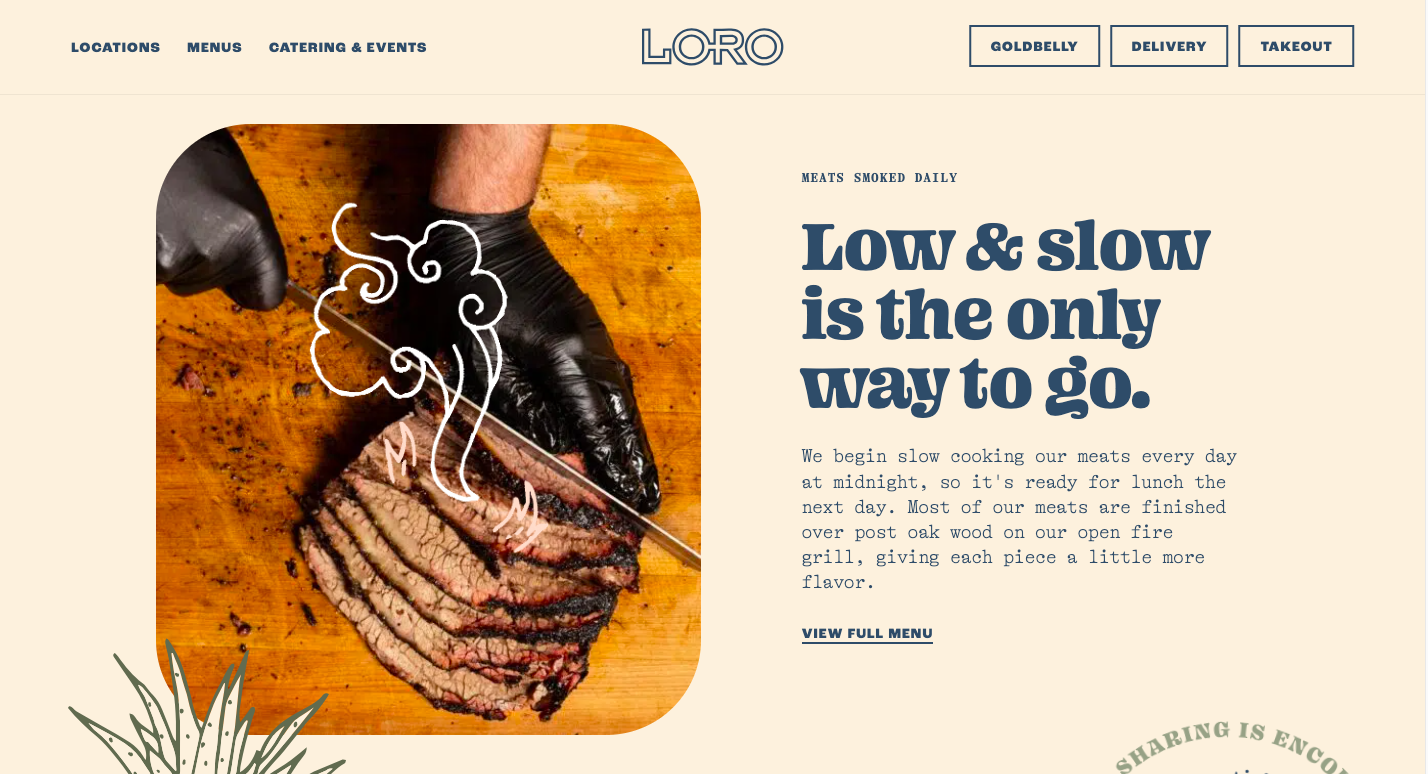 Restaurant website design with graphic elements
Here’s what distinguishes this restaurant website example:
Fat Choy
Fat Choy is a restaurant specializing in Chinese cuisine that offers a variety of traditional and vegan dishes. The restaurant’s website strikes a balance between neat and eye-catching with its charming hand-drawn design. The black elements against a white background create a striking contrast that draws attention. An interesting design feature is the photos of dishes, which appear as if they’re taped onto the site, adding a splash of color and making them pop.
The menu is prominently displayed and easy-to-navigate tabs include sections for the menu and press. Even though the restaurant is currently closed, its website design remains a fantastic example of creativity and simplicity.
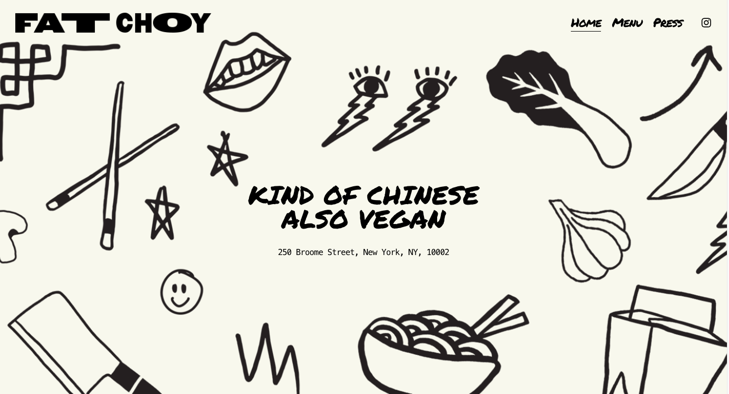 An example of hand drawn restaurant website design
Here’s what makes this restaurant website example special:
- laconic restaurant website design;
- black elements against a white background;
- charming hand-drawn illustrations;
- visual accents with colorful photos.
Rose Foods
Rose Foods is a restaurant renowned for its bagels, smoked fish, and other related delicacies. Their restaurant website immediately catches the eye with its retro aesthetic, featuring a yellow-framed design that looks like a classic poster or banner. The fonts, while varied from line to line, fit perfectly with the nostalgic theme.
Their landing page offers a snapshot of what’s on the menu, along with details on opening hours and the restaurant’s address. Navigation is straightforward, with tabs for wholesale information, the menu, online ordering, catering services, and a merchandise shop. The design remains consistent across all tabs, maintaining the same retro style and fonts.
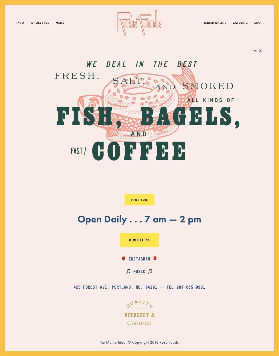 A restaurant website example in retro style
Here’s what makes this restaurant website example stand out:
- retro aesthetic that extends across each tab;
- varied fonts that complement the nostalgic theme;
- key information displayed prominently on the landing page;
- built-in online shop.
Federalist Pig
Federalist Pig is a barbecue restaurant known for its savory smoked meats and classic Southern-style barbecue. Their restaurant website is very vibrant, dominated by a bright yellow color. Even with the bright backdrop, the dark, rich-colored photos keep the site from feeling overwhelming. Black headlines and text also pop against the yellow, making everything easy to read.
This restaurant uses pop-ups to provide an additional incentive to customers. This way, the website visitors are likely to subscribe to the newsletters and receive $25 off their next visit.
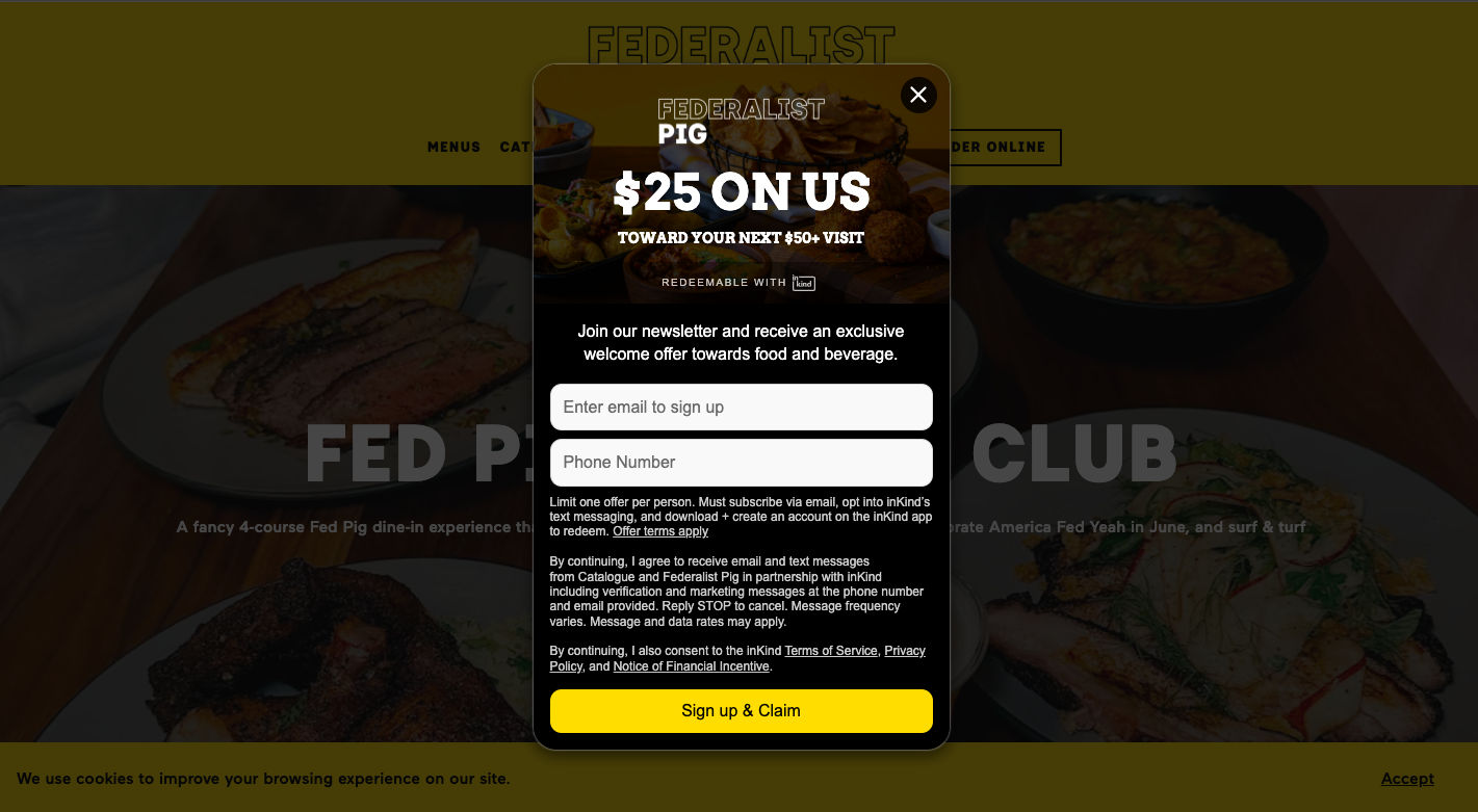 Displaying a pop-up with a discount on the restaurant website
Navigating the website is very easy. All the tabs are conveniently located at the top of the page, so users can easily access the menu and explore additional services like catering and loyalty programs. Plus, the menu uses tempting, descriptive language paired with detailed photos, creating a mouth-watering effect that’s hard to resist.
Here’s what sets this restaurant website example apart:
- vibrant design that grabs attention;
- dark or intense-colored visuals;
- tempting descriptive language in the menu;
- easy navigation with tabs right at the top;
- pop-ups offering discounts for your next in-person visit.
How to create a restaurant website with SendPulse
If you’d like to design a restaurant website without any technical skills, consider using the SendPulse website builder as your go-to platform. With this software, you can create a single-page or multi-page website and enhance it with additional features like online payments, subscriptions, live chats, and more. Let’s take a closer look!
Create your website canvas
Begin by creating a new website or selecting one of our pre-made templates. Choose a style that suits your restaurant’s theme — you can modify later as needed.
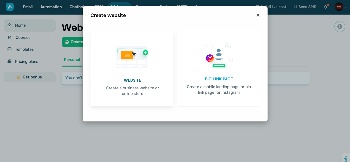 Creating a restaurant website with SendPulse
Add website elements
After setting up your website, you can establish its structure using various blocks, sections, and columns. Enhance its design with widgets, a navigation menu, buttons, and text. SendPulse allows you to customize fonts, sizes, heights, and even generate website copy using AI. You can also embed images or videos to design your restaurant website in a more dynamic and engaging way.
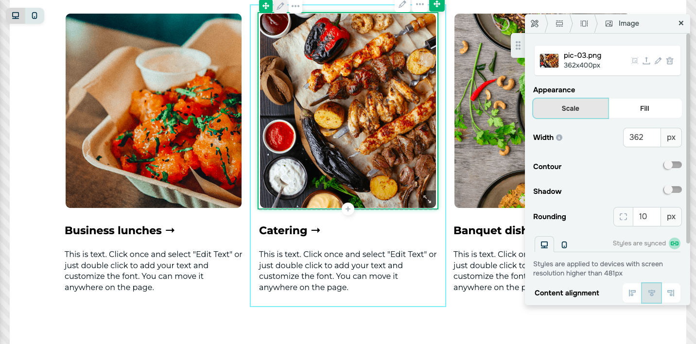 Customizing elements on a restaurant website
Take advantage of additional features that can be seamlessly integrated into your website such as live chats, pop-ups, and more. For advanced customization, you can add extra elements using custom code.
Publish your website
And just like that, your restaurant website is ready. Before publishing, preview your site to ensure everything looks and functions as intended. After that, you can publish your website. You can view website statistics directly from your SendPulse account.
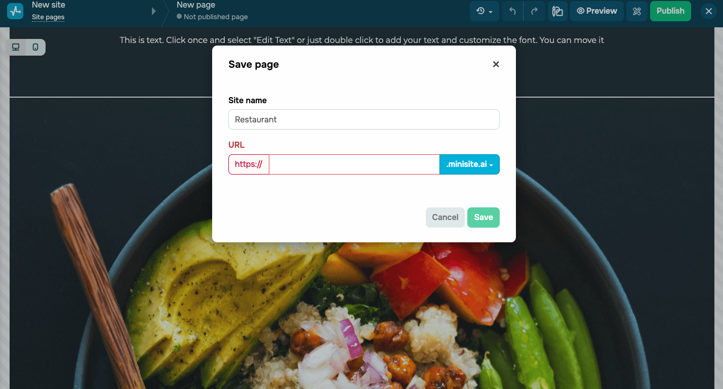 Publishing a new website for a restaurant
The bottom line
Having a website for a restaurant is a must these days because it’s a powerful way to promote your establishment and connect with your customers more effectively. With countless design options out there, picking the right website builder is crucial.
Consider using SendPulse for your restaurant website, as it not only lets you build a stunning website, but also enhance it with extra features like chatbots, pop-ups, surveys, and more. The best part? You can access all these tools for free. Give SendPulse a try now to attract more diners to your restaurant with a stunning website!