Whenever H&M announces its new collaboration with another obscure or avant-garde designer, it quickly becomes a viral sensation long before it hits the shelves. Fashionistas are ready to queue outside for hours on end just to get a chance to enter the store, even though they have no idea what they will find inside.
This is a perfect example of how powerful anticipation can be in guiding consumers and shaping their choices. The unknown stimulates our curiosity, and the sense of exclusivity makes us crave the mysterious product in question even more.
By generating buzz and creating a veil of mystery around your upcoming product, you can tease your customers and achieve unprecedented pre-sales, ultimately paving the way for a successful launch.
Whether you’re announcing a new feature, project, service, event, partnership, or collection, you need to know how to utilize coming soon pages to your advantage. This post will give you practical tips as well as long-lasting coming soon landing page design inspiration.
What is a coming soon landing page?
A coming soon landing page is a stand-alone or website page that is designed to provide information and generate interest about an upcoming product, service, event, or website. Think of it as a temporary placeholder or teaser before the official release.
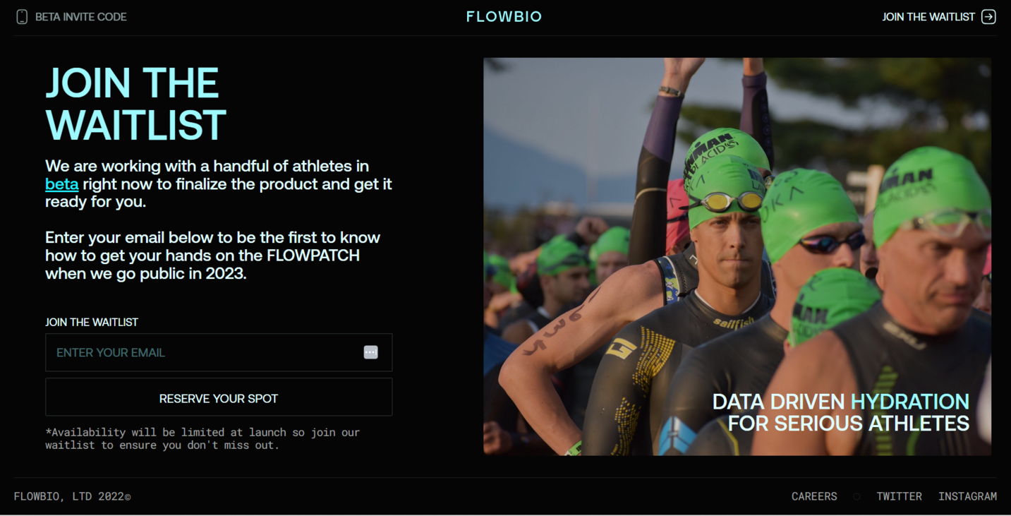 A coming soon page example
There are a few ways to make a big announcement using landing pages:
- Coming soon. This is a great way to announce a new product, website version, feature, or delivery region.
- Launching soon. These pages usually present new apps, tools, or services.
- Opening soon. You can use these if you’re about to open a brick-and-mortar shop or dealership.
- New drop soon. These pages are useful for promoting limited-edition items, garments, or collectibles.
The purpose of a coming soon landing page is to capture the attention of potential customers and start building anticipation and excitement around the upcoming offering. It often includes key details such as the name or title of the product or service, a brief description or tagline, and a call to action inviting users to join the waitlist and sign up for email or SMS updates.
In addition to the basic elements, a coming soon landing page can also feature social media links for following updates, expert testimonials, or even a sneak peek of what to expect.
What are coming soon pages for?
Coming soon landing pages are designed to build excitement and anticipation among potential customers or users. They create a sense of curiosity, encouraging visitors to stay engaged and eagerly follow updates.
They can be used to communicate important details about the upcoming offering, such as the launch date, features, benefits, and pricing. This helps set expectations and prepares potential customers for when the product becomes available.
In addition, coming soon pages are perfect for capturing leads and growing mailing lists, which can be nurtured and engaged with future marketing campaigns.
By launching a coming soon landing page, you can gauge interest and validate the market demand for your offering before it goes live. The number of sign-ups or inquiries received can provide valuable insights into potential customer interest.
They also enable you to showcase your brand personality and wit.
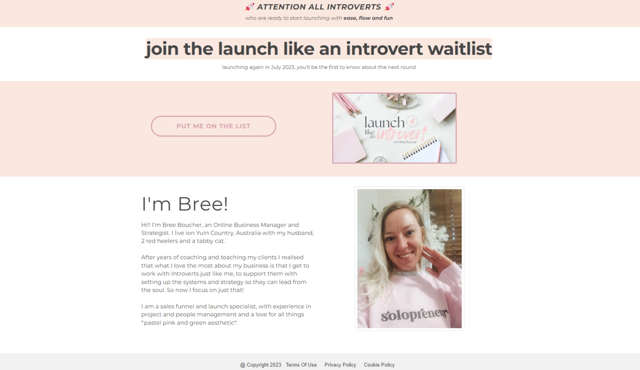 An informative coming soon page example
But most important of all, coming soon pages help spread awareness and properly introduce a new brand or product to the market. You get to present your new concepts in a creative way and reveal just enough without spoiling the surprise.
Coming soon page best practices
Coming soon pages are easy to create, and they’re pretty straightforward, too. You don’t need to worry about hierarchy or usability much as it’s a temporary page. Having said that, there are some ways to make your coming soon page more powerful and catchy.
Start with a catchy headline
Come up with a bold, captivating line or call to action and place it on top of your page. The goal here is to catch the user’s eye and instantly trigger some sort of emotional response.
Add a countdown timer
A ticking timer will automatically make your visitors experience the Fear of Missing Out (FOMO). The timer can display the days, hours, minutes, and seconds remaining until the launch, building excitement among your audience. It’ll also make your page less abstract.
Don’t reveal too much
Craft a compelling narrative around your offering and shed some light on its unique features without saying too much. Avoid sharing any in-depth overviews or technical details — save them for your main product pages. There should be some wow effect when you finally pull back the curtain, revealing what you’ve been working on.
Give your visitors something to act on
Include a prominent and compelling call to action that encourages visitors to take a specific action, such as joining your waitlist, subscribing to a newsletter, or following you on social media.
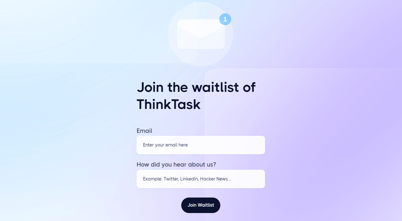 A coming soon page with a CTA
Make sure the CTA stands out and clearly communicates the value or benefit of taking that action. Without it, your visitors may get confused, not knowing when your new offer finally hits the market or how to get their hands on it.
Make it visually captivating
Incorporate visually striking elements such as high-quality images, videos, or animations that align with your brand and create an immersive experience for visitors. Use visuals that evoke emotions and capture the essence of what makes your offering unique and appealing.
If you don’t want to show your product as a whole yet, consider showing close-ups of the high-quality textures or interface details to give your user an overall idea of what’s to come.
Breathtaking coming soon landing page examples
We’ve gathered a few impressive examples from different brands to provide you with the coming soon landing page design inspiration.
Nike
This page is a perfect example of how skillful storytelling can turn an otherwise boring landing page into a work of art. Here, we see a beautiful buildup to another Nike’s successful release of an all-rounder shoe.
This landing page may look simple, but there’s a lot going on. It features a hard-to-miss headline along with a compelling brand story, a new, stylized version of the iconic swoosh, and a CTA. The copy captures the soul of the brand and makes the reader aware of what Nike stands for.
Cherry-Pick
This stunning coming soon page from an online vintage reseller may look simple at first, but don’t let the looks fool you. Each time you move your cursor, another item from their assortment appears along with its price tag, name, and size.
A coming soon page from Cherry-Pick
Each item is linked to the page where you can purchase it. This is a brilliant idea for a new drop announcement as it allows consumers to get a glimpse of the new arrivals without revealing too much.
Code Resolution
This beautiful page serves as a placeholder for the company’s new website, and it does its job perfectly, immersing the user into the new aesthetic. There’s barely any info about the new website, but the stunning visuals and typography help build anticipation.
Notice how the functional header of the website remains untouched — the coming soon placeholder doesn’t stop the user from contacting the company or learning more about its services.
One Mad Lab
This minimalist yet creative coming soon page includes an analog-clock countdown timer, which is a clever solution if you want to stand out. The only downside of this example is that it doesn’t have a sign-up form, although it does feature the company’s email address.
Overall, this is a colorful and intriguing landing page, and you can safely follow this example to announce an upcoming change using few words.
Habit and Co.
Here’s a stunning coming soon page with highly personal and relatable testimonials reinforcing its value proposition. Another advantage of this page is that it mentions that the company treats its users’ data with respect and doesn’t spam.
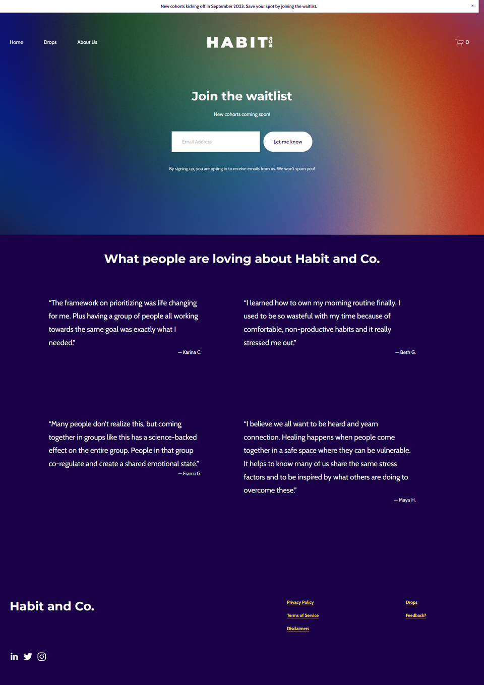 A coming soon page from Habit and Co.
If your brand is still young and gaining recognition, using testimonials is necessary to ensure customer trust. Sharing those reviews will help you prove that dozens of people have already changed their lives for the better with your product or service.
Omed Health
We’ve mentioned how a coming soon page should be more of a teaser than an educational page. This one is an exception as it presents a medical device helping consumers get a better understanding of their gut health. The page is highly visual and informative — we can see exactly how the new device looks, how it works, and what it shows.
A coming soon page from Omed Health
In cases like this, you do need to explain the importance of your product and how impactful it can be for certain individuals. Hiding too many details may cause confusion and prevent customers from placing a pre-order.
Luma
Up next is a gorgeous, sleek, monochromatic landing page announcing a smart water bottle with a built-in water filter and purifier. The images demonstrate the concept bottle from different angles and are likely to attract tech gadget fans.
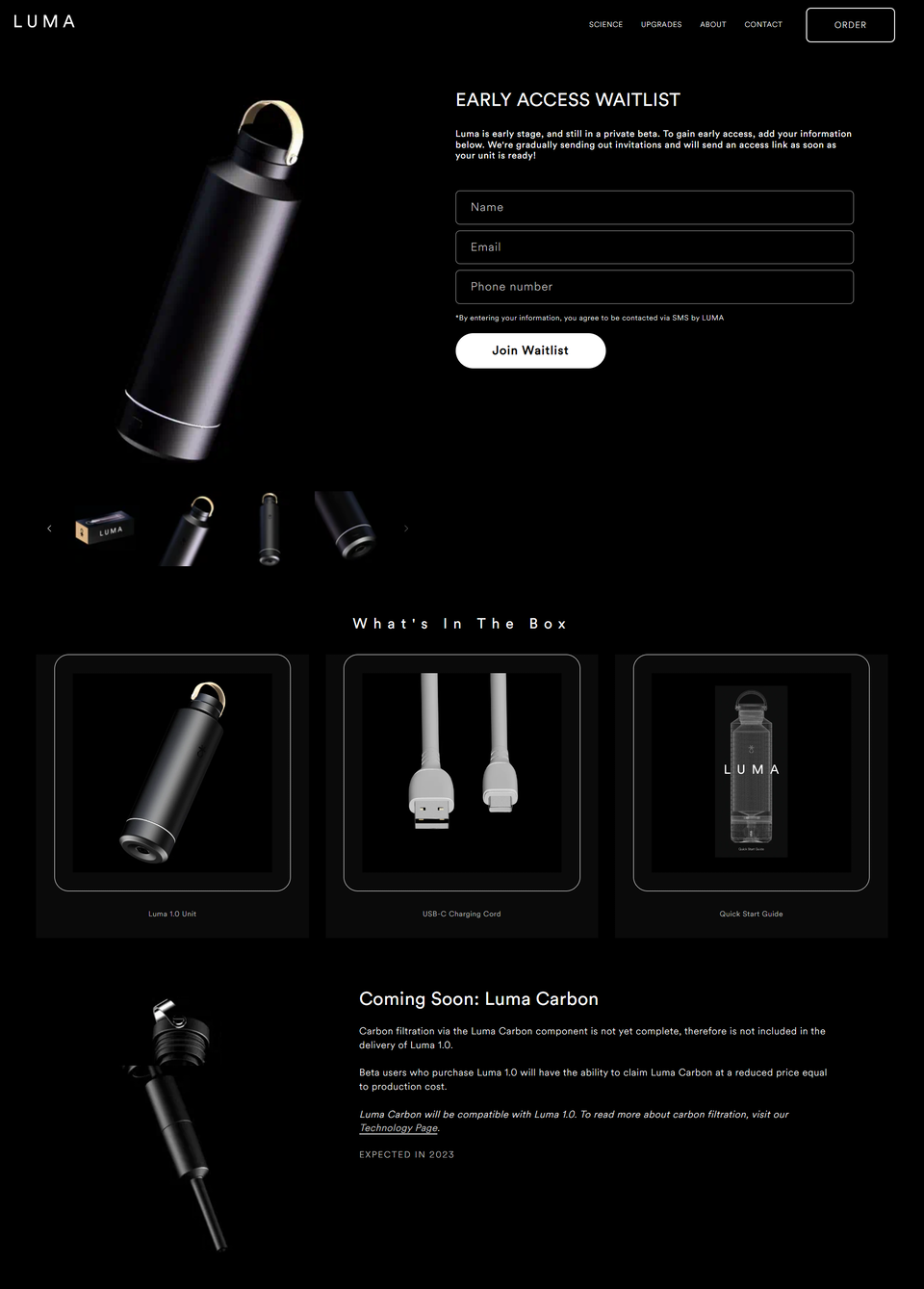 A coming soon page from Luma
In this example, the brand also captures users’ phone numbers to send them personalized SMS campaigns once the bottle is available for sale.
Chaos Club
Our final example is this coming soon landing page, with its nice bubblegum colors and enticing copy. The image demonstrates the variety of new exclusive accessories and instantly grabs the user’s attention.
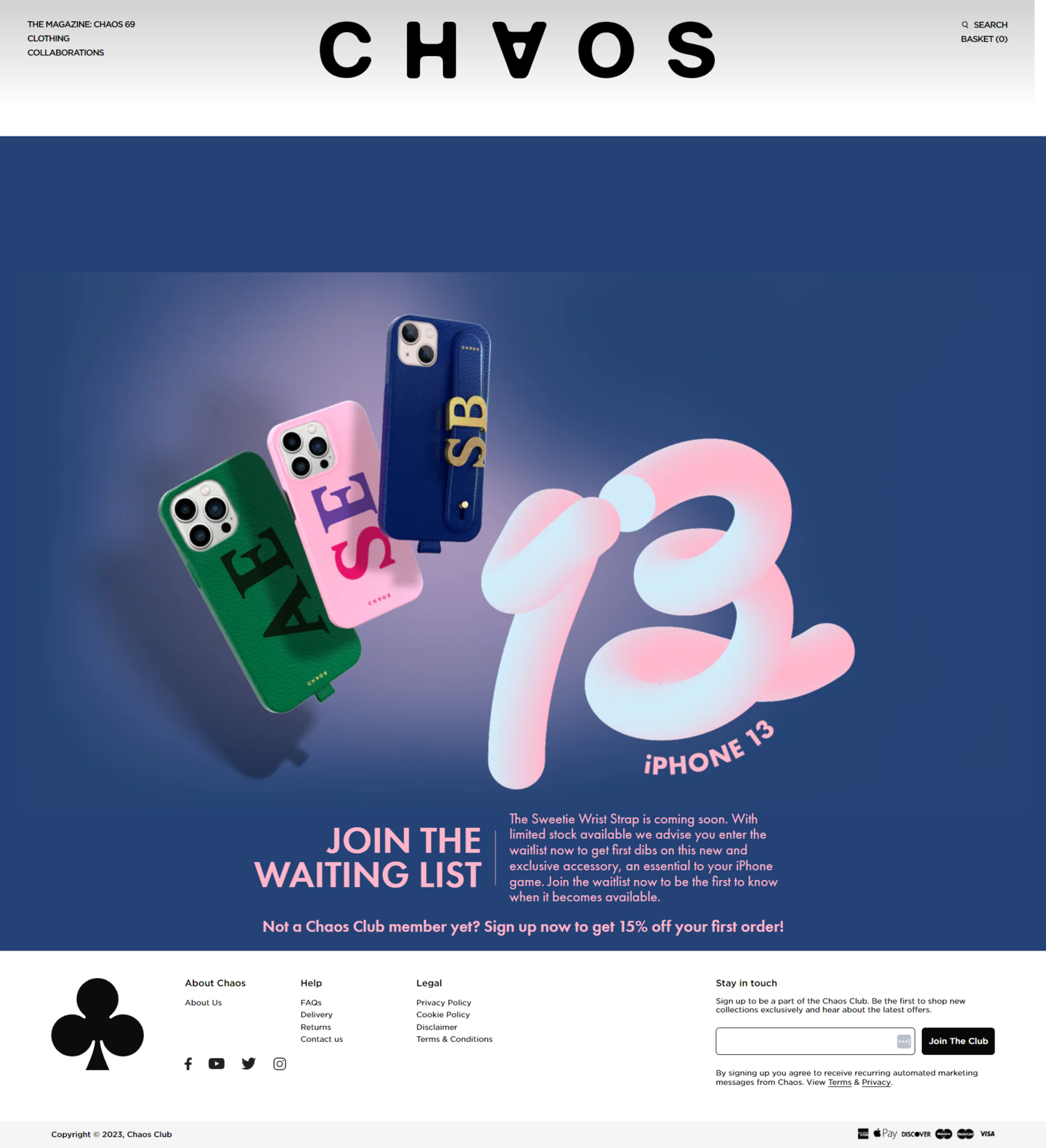 A coming soon page from Chaos Club
We especially love how this page mentions a discount to motivate visitors to join the Chaos Club and leave their contact data.
How to create a coming soon landing page with SendPulse
Did you know that SendPulse offers an easy-to-use website builder for landing pages, link pages, and everything in between? Our builder is made with busy marketers and small business owners in mind, allowing them to create pixel-perfect pages in minutes.
Here’s how it works. Firstly, you need to sign in to your SendPulse account or create a new one if you haven’t already. Once you’re logged in, open the “Websites” tab. Here, you can create personal, commercial, or educational websites.
Then, click on “Create website.” You’ll be taken to our template collection with 20+ customizable designs. You can sort them by theme and language.
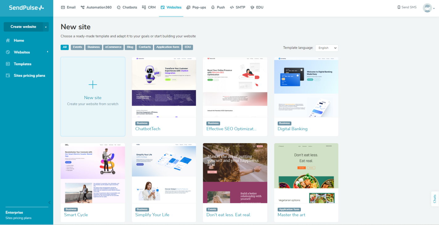 A website template collection available in the SendPulse page builder
Browse through the available templates and select the one that best suits your style and desired layout. You can preview the templates by simply clicking on them. Open the one you like and click “Edit.”
Customize the template to match your branding and content. You can modify your website structure, text, colors, fonts, and images. Click on the element you want to edit, and you’ll see a panel with different settings. You can also drag and drop individual blocks.
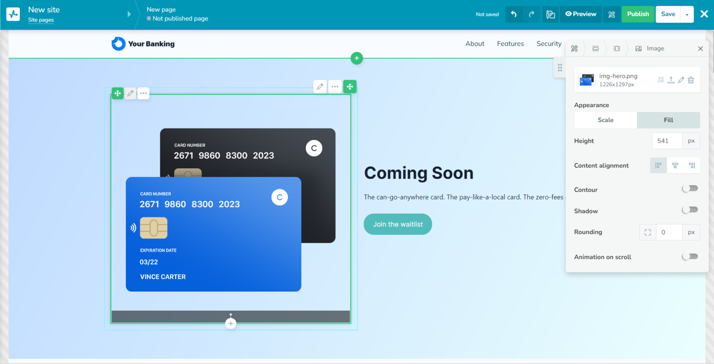 Customizing a website template in SendPulse
Add your coming soon messaging, including a compelling headline, an intriguing description, and any other key details you want to share. You can also add a countdown timer or any other widget by clicking on the plus sign between the existing blocks.
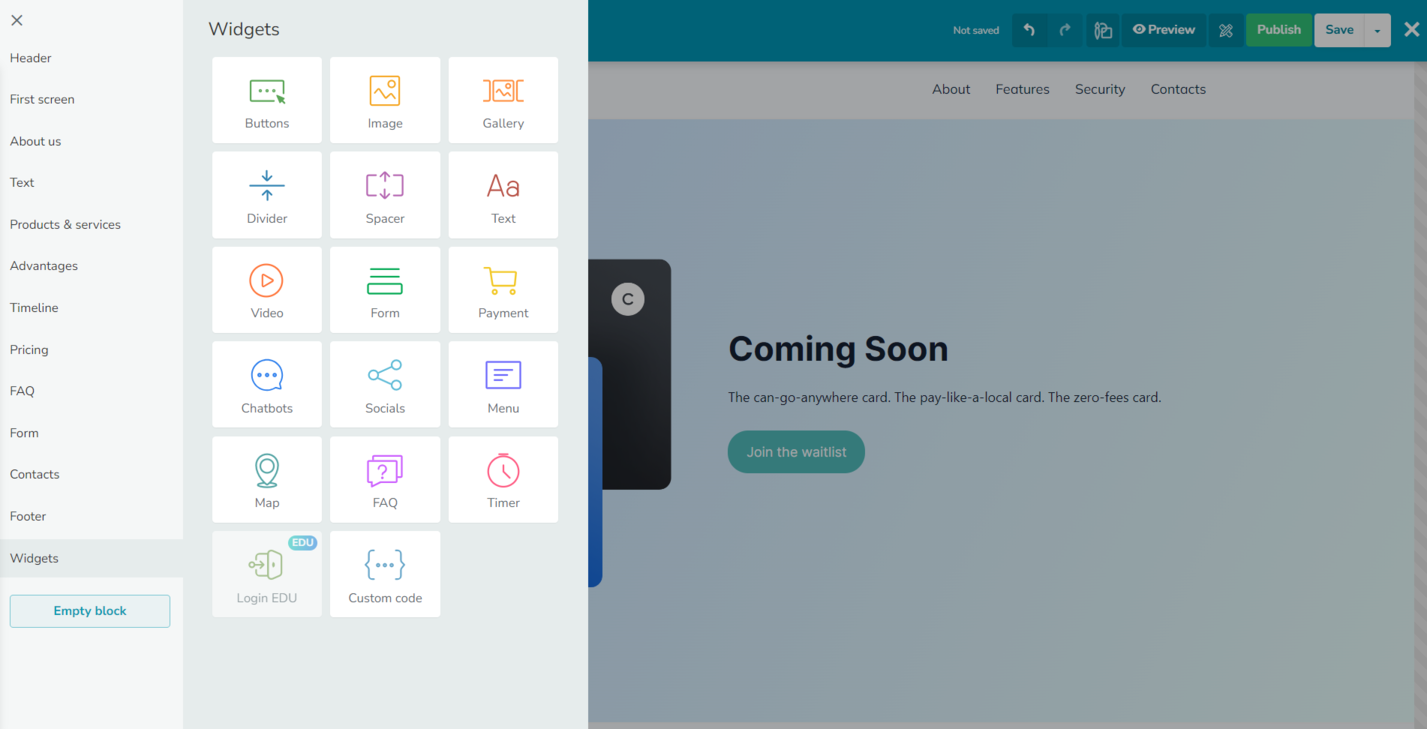 Adding widgets to a coming soon page
If you want to capture leads, consider adding a newsletter sign-up form to your page. SendPulse provides a built-in form block that you can customize and connect to your CRM.
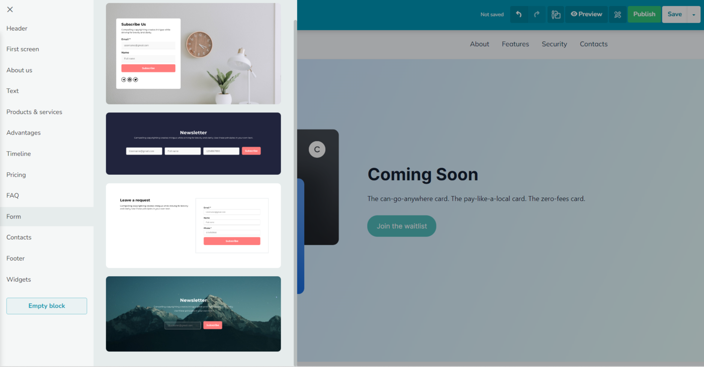 Adding a lead capture form in SendPulse
After that, add and populate other relevant sections like Pricing, FAQ, About Us, or Advantages. Make sure to click “Save” after every major change.
Once you’re satisfied with the design and hierarchy of your coming soon page, click on the “Preview” button in the top-right corner. If everything looks smooth and there are no mistakes, click “Publish.”
In the settings panel, you can customize the page URL and title. Add SEO metadata, specify your target keywords, and even add a preview image for your website.
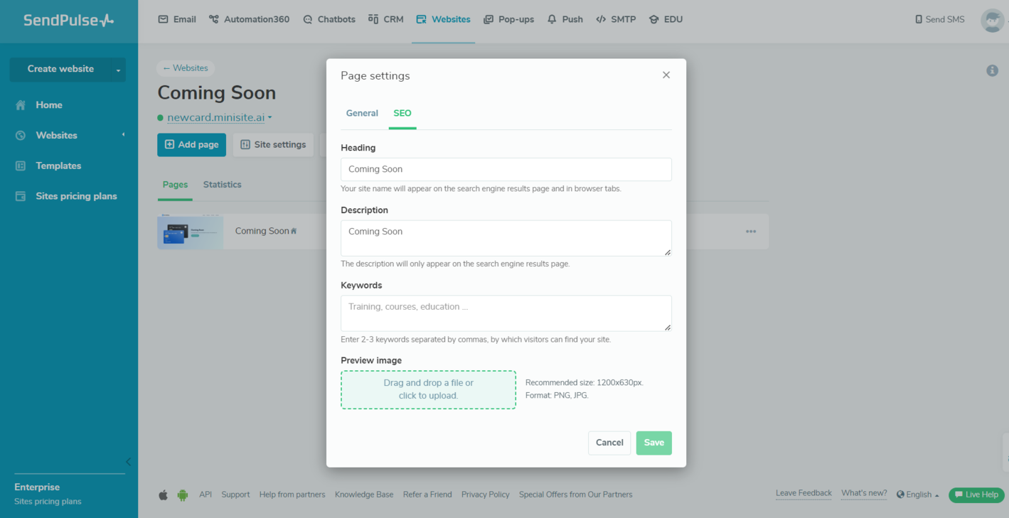 Adding SEO data to a website created with SendPulse
You can access your website statistics from the same tab. There, you’ll be able to see how daily visits your Coming Soon page receives. Dive into our knowledge base to learn how to track your website’s performance with Google Analytics and Facebook Pixel.
Automate your sales and marketing processes with SendPulse
Uncover a whole new level of efficiency by streamlining your marketing campaigns and sales tasks. SendPulse is an all-in-one solution enabling you to build websites, email campaigns, pop-ups, chatbots, and SMS campaigns with ease.
With SendPulse, you can also keep track of your deals, create educational products, and send push notifications to your users. We offer comprehensive guides and 24/7 support with real humans on the other end. Create your free account and check it out!