
In this article, we are going to tell you about the features of building HTML email templates — what the main problems of coding them are, how to work with multimedia, fonts and responsiveness — and provide the examples of codes.
Most popular email clients
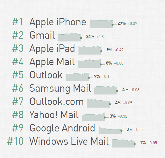
Developers of the Email Client Market Share monitor the statistics of email client usage worldwide. For a specific company, distribution of the users of various clients and programs may be different, but it would be great to understand their position in the market in general. According to data from April 2018, the most popular platforms are iPhone and Gmail:
Common email coding problems
If a company decides not to use the existing tools for creating email templates, its designers will have to face the problem of coding — in the case of emails, it may appear more complicated than building a web page.
You may have difficulties from the start — email clients use various rendering engines:
- Apple Mail, Outlook for Mac, Android Mail and iOS Mail use WebKit.
- Outlook 2000, 2002 and 2003 use Internet Explorer.
- Outlook 2007, 2010 and 2013 use Microsoft Word (Yes, Word!).
- Web clients, respectively, use browser engines — for example, Safari uses WebKit, whereas Chrome uses Blink.
Email clients apply their own default styles on top of those that were initially chosen by the email developer. For example, Gmail sets its own value for all
fonts. Besides, Google Mail supports embedded CSS and media queries.
There are many email clients and rendering engines, so it is important to find a universal approach. In particular, this means that instead of using
it is better to apply a table-layout. To be more specific, email designers use:
tableinstead ofdiv,#FFFFFFinstead of#FFF,paddinginstead ofmargin,- CSS2 instead of CSS3,
- HTML4 instead of HTML5,
background-colorinstead ofbackground; it is worth using extended properties, likepadding-top; padding-left;, and others,- color instead of images as a background, and visual elements through the
<img />,tag, - HTML-attributes instead of CSS,
- inline CSS instead of style sets or style blocks.
Fonts
The simplest and the most reliable decision is to use safe fonts — default fonts found in multiple operating systems and devices. However, if you want to add a creative touch to your email typography, you can use font embedding services like Google Fonts.
If you don’t want Outlook to bypass your web fonts, use the following media query for WebKit:
‹style›@import url(http://fonts.googleapis.com/css?family=Pacifico);

/* Type styles for all clients */
h1 {...}

/* Type styles for WebKit clients */
@media screen and (-webkit-min-device-pixel-ratio:0) {
	h1 {...}
}
It is crucial to specify the font family, font size and color for each ‹td›
cell in a table; otherwise, an email client may ignore your chosen font. You should also follow this rule for any block-level elements that contain text, such as ‹p›, ‹h1›…‹h5›, ‹div›
Images and media
Another challenge you may face when coding an email template is how to work with images and other media files.
Some email clients show pictures by default, while others block them, which, among other things, affects the possibility of collecting statistics. As a rule, small transparent images called tracking pixels are used for this purpose. Meaning that if an email client blocks images, it becomes impossible to understand whether a user has opened the message.
Each email client has its own settings regarding displaying or blocking images:
- Outlook blocks image-rendering by default,
- Mail Apple doesn’t,
- Gmail doesn’t.
Remember to include alt-text for all of your images — this will help the recipients understand what value this or that image adds to your message even if it cannot be displayed. Moreover, you can add style rules to the text for the <img /> tag, for example, color or font-family, which will be applied to the alt-text.
As for the GIFs, though the majority of email clients support them, Outlook from 2007 to 2013 doesn’t — it shows only the first shot.
Responsive templates
- About half of all emails are read on mobile devices, and this number is growing steadily.
- Statistics show that the iPhone email client leads the market share with 29%, followed by Gmail at 24%, and Apple IPad at 9%, which in total makes more than 60%, to say nothing of Windows Mobile and other OSs.
- Research has found out that the number of unique clicks in responsive emails on mobile devices has recently grown from 2.7 to 3.1%, representing the increase in click rate by 15%.
These numbers show that it is necessary to pay particular attention to how emails are displayed on various mobile devices. The web designer Massimo Cassandro published a useful guide for creating responsive emails at SitePoint. Here are the main recommendations from it.
There are two main types of mobile-friendly emails: single column and multicolumn ones. In the first case, there are no particular difficulties to make content responsive as there is no need to reorganize the email elements. It is only necessary to adjust the width of the layout to match different screen sizes.
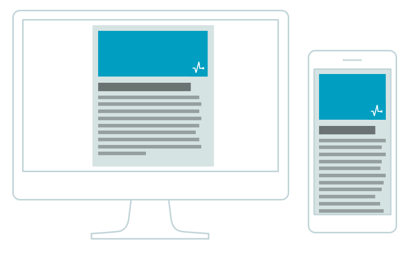
Single column layout on the desktop and smartphone
To resize the email correctly, adjust the table width:
‹table cellspacing="0" cellpadding="0" border="0" width="600"›
	‹!-- email text --›
‹/table›
@media screen and (max-width:480px) {
	table {
		width: 100%!important;
	}
}
One more thing — you should resize images and font-size — and that’s all.
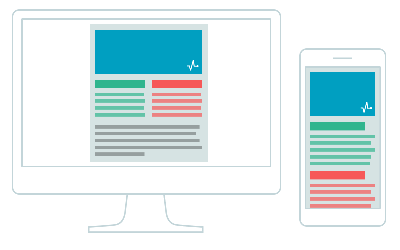
Working with multicolumn layouts is far more difficult as the columns that are displayed horizontally on desktop should be aligned vertically for mobile devices. Here we will discuss two ways to do this.
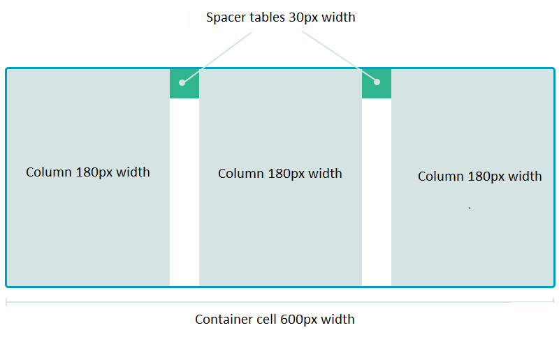
You can create multicolumn layouts with the help of nested tables. This approach is considered a more reliable way to ensure compatibility with various email clients. The main trick here is the use of the align="left" attribute to arrange the tables horizontally. Each element should have a specific width, and their total should be equal to their container width:
With the decrease of the screen width, it is necessary to resize the container and ensure the 100% width of tables and columns:
table[class="body_table"] {
	width: 600px;
}
table[class="column_table"] {
	width: 180px;
}
table[class="spacer_table"] {
	width: 30px;
	height:30px;
}
@media only screen and (max-width: 480px) {
	table[class="body_table"] {
		width: 420px!important;
	}
table[class="column_table"] {
		width: 100%!important;
	}
}
Massimo Cassandro has uploaded this code on Codepen — a developer ‘playground’ where you can run and test your code.
This technique ensures compatibility with the majority of email clients. Perhaps you have noticed the odd formatting of сlass selectors [class="body_table"] instead of usual .body_table — this is special code to work with Yahoo Mail. The thing is that the latter works incorrectly with CSS media queries, while the former allows you to ignore these styles.
For building HTML emails, you can use any code editor, for example, Atom or Sublime Text.
The second option to create a multicolumn layouts is to use the display property. This method consists of changing the default displayproperty for table cells when the width of the device screen decreases:
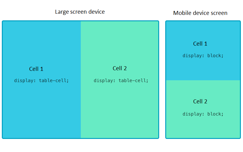
table[class="body_table"] {
	width: 600px;
}
table td[class="column"] {
	height:100px;
	width:200px;
}
@media only screen and (max-width: 480px) {
	table[class="body_table"] {
		width: 440px!important;
	}
table td[class="column"] {
		width:100%!important;
		display: block!important;
	}
}
Here you can play with the example code on Codepen.
For mobile variants, in the above-described methods, we change the initially set width of tables and cells turning them into block elements. In that case, the layout isn’t really fluid — we simply specify the necessary style rules for certain display resolutions. What’s more, this method won’t work for mobile email clients, such as the Android Gmail app, Android Yahoo! Mail app, Windows Phone 8, and some others, because they don’t support media queries.
Fluid layouts
You can do this by applying a maximum width max-width to the div element. Note that Outlook doesn’t support this rule, so here you should use a wrapper table, which is included inside Outlook specific comments.
‹!--[if mso | IE] --›
	‹table border="0" cellpadding="0" cellspacing="0" width="640" align="center" style="width:640px;"›
		‹tr›
			‹td›
‹!--[endif]--›
‹div style="margin:0 auto; max-width:640px;"›
	‹table cellpadding="0" cellspacing="0" style="width:100%;" align="center" border="0"›
		‹tr›
			‹td›…‹/td›
		‹/tr›
	‹/table›
‹/div›
‹!--[if mso | IE]--›
			‹/td›
		‹/tr›
	‹/table›
‹!--[endif]--›
Here is a detailed example of this code.
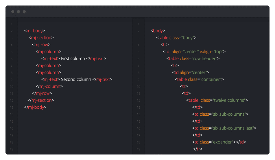
It is quite challenging to create and edit multicolumn layouts with Outlook comments; however, you can simplify this process by using email coding frameworks, for example, MJML.
An MJML template is a set of markup tags that will be converted into a typical table layout after compilation:
‹mj-container›
	‹mj-section›
		‹mj-column›
			‹mj-text›Hello World!‹/mj-text›
		‹/mj-column›
	‹/mj-section›
‹/mj-container›
Responsive images
Creation of responsive images is a specific topic. Here you may just use the classic responsive technique img {max-width: 100%;}.
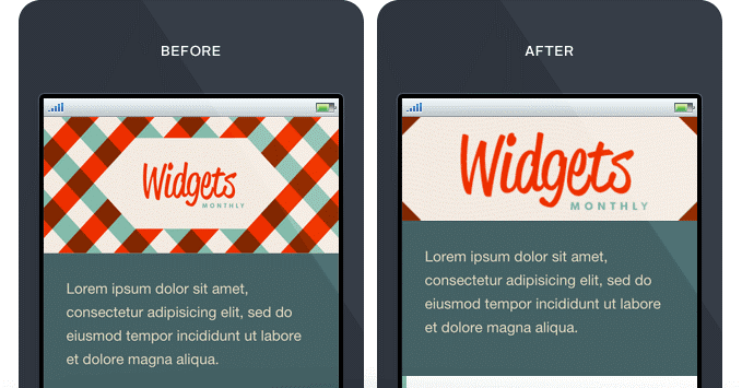
Big banners designed for the full width display on a desktop screen can become unreadable on mobile devices. In that case, you can use media queries to hide the original image and show another as a background image instead:
@media only screen and (max-device-width: 480px) {
	img[class= " original_img "] {
		display: none;
	}
	[class="substitute_image"] {
		background-image: url(background_image.png;
		width: 440px !important;
		height: 240px !important
	}
}
The example is taken from the Guide to Responsive Email Design.
Important details
Finally, enjoy some more tips on how to create a quality email campaign.
Plain text version
The majority of the emails sent to users are so-called MIME messages that combine HTML and plain text versions of an email. An email client receives both and then decides which one to use depending on a user’s settings. Therefore, when sending emails, it is crucial to include both versions.
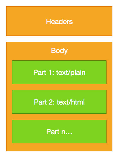
Note that some email clients display plain-text emails as HTML. For example, Gmail automatically adds more styles and turns URLs into links.
Preheader text
When creating emails, designers often forget about so-called preview text, or preheaders. This is a small snippet of text that is borrowed from an email body (first lines as a rule); it is usually displayed next to or under the from name and email subject. You can also add a custom preheader.
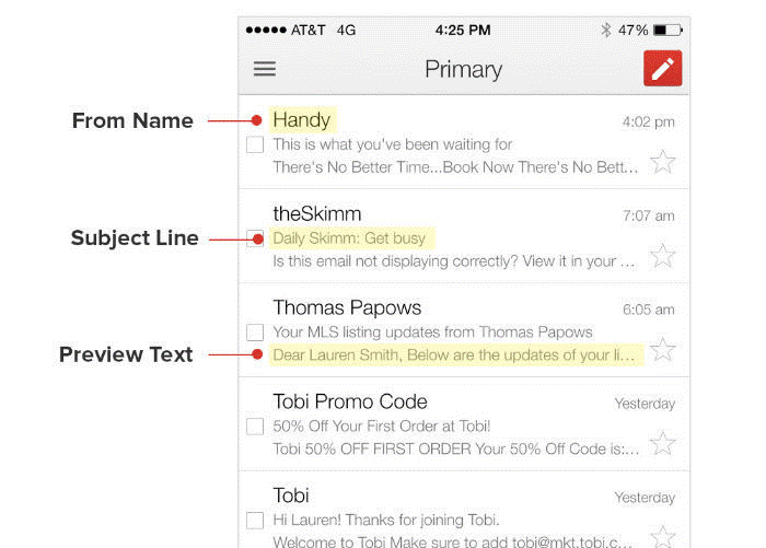
This element is used to add detail the subject line and encourage a subscriber to open an email. It can be either displayed or hidden in the body of your email with the help of a simple code.
Sometimes icons from social networks, calls to action, or phrases like “View this email in web browser” may get into the preheader. Try to avoid such mistakes and use your preheader with reason.

To test and preview your preheader text, you can use a dedicated tool by Austin Woodall.
Follow these tips and tricks, and you will be able to create a quality email template without making widespread mistakes — even if it is your first email. Happy coding!


 Loading...
