Once your eCommerce store starts to generate traffic, the next stage you’ll surely want to focus on is converting this traffic into actual sales. Even the top-ranking positions in SERP and millions of visits per month cannot always guarantee high conversion rates for a store. However, some great things can significantly improve the conversion rate of your business, and one of those is reducing cart abandonment rates.
According to Baymard Institute, nearly 70% of online shopping carts are abandoned, meaning 70 out of 100 potential customers will leave your site without purchasing. It’s also worth mentioning that 17% of shoppers name the complicated checkout process as the main reason for abandoning carts. This covers registration requirements, slow checkout process, hidden costs (shipping, packing, taxes, etc.), and general lack of trust in the store.
Good news: we know how to fix that by implementing some final touches to your checkout page. With this said, in this guide, you’ll discover what a checkout page is, why it’s so important, and what advancements can help you streamline the checkout process and improve the current conversion rate of your eCommerce store.
What is a checkout page, and why is it so important?
A checkout page refers to a page that contains payment, shipping, and billing details on an eCommerce store.
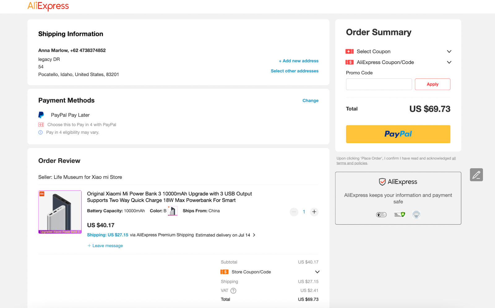 Checkout page on AliExpress with all the required information
Basically, it gives customers a simple and secure environment to enter payment details and complete their orders. As a rule, the checkout process of any online business includes:
- customer’s shipping address;
- billing details;
- shipping and payment methods;
- order confirmation and submission.
By continually optimizing a checkout page, business owners can create a convenient, smooth, functional buying experience for potential customers. At the same time, it allows eCommerce stores to effectively target different audiences, hooking their visitors and converting them into shoppers. Needless to explain, the better your checkout page design is, the more sales it will generate.
Check out our recent post on the chatbot for sales features that can empower you to start selling more!
To prove the efficiency of a checkout page, let’s look at a quick example. Assuming that your eCommerce store is currently generating $20,000/mo in revenue, reducing your checkout abandonment rates from 75% to 50% can give you an extra $20,000 each month!
According to Forbes, checkout is the key to success in digital commerce, as it is the final point in the purchasing process that helps either encourage a purchase or give up this decision.
What are the types of checkout pages?
To create an effective checkout process for eCommerce, it’s essential to consider the page’s structure to the slightest details: from content to checkout page design. Depending on the interaction intent, online stores utilize one-page or multi-page checkouts.
Check our post on eCommerce landing page creation tips and get inspired by top examples.
One-page checkout
One-page checkouts are designed to include all the checkout information within one page, making them extremely popular among many eCommerce stores. Its simplicity and convenience for end-users also explain why the one-step module generates a 21.8% difference in conversion rates compared to the multi-page option.
Under Armour has a great one-page checkout process with a simple and easy-to-navigate interface. Here’s what it looks like:
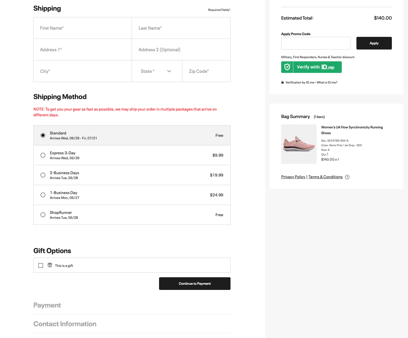 Under Armour one-page checkout
This type of checkout page can significantly improve your user experience since customers are not required to complete the checkout process step-by-step: all the information needed is located within a single page. Moreover, its performance scores are better on the mobile front too. Knowing that mobile eCommerce gained absolute market leadership and occupied 72.9% market share, one-page checkouts are the winning option for most online stores.
However, the beneficial design of one-page checkout options is also its main disadvantage. Business owners need to ensure the potential shopper won’t get overwhelmed by all the information required and avoid its messy layout. A vast amount of information within a single page also takes longer to load and seems confusing for a potential customer, which immediately increases bounce rates. Additionally, it’s hard to adjust the data in a one-page layout: you’ll need to spend more resources and effort to identify what changes directly affect your sales.
Multi-page checkout
A multi-page checkout model is the option in which the checkout information is divided into different steps, each located on a new page. For instance, the multi-page layout can have the following structure: Checkout Start Page > Customer Info > Shipping > Payment > Order Confirmation.
Here’s an example of a multi-page checkout process on Massimo Zanetti’s website:
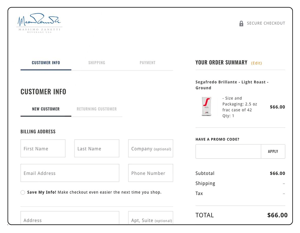 Multi-page checkout on Massimo Zanetti
Although this type of checkout page seems less user-friendly, it has some advantages. First, it facilitates the data collection process by dividing the long-form checkout into short and easy steps. Also, it features more opportunities for a personalized experience, offering customers to paint their own orders. Finally, the speed of multi-page checkout pages is faster compared to the one-page alternative.
Nevertheless, this is a less attractive alternative for eCommerce today: consumer behavior studies show that over 50% of shoppers are less likely to complete the transaction if the checkout process takes longer than 30 seconds.
Four key elements of the best checkout pages
Once you’ve discovered different types of checkout pages, the next aspect that is surely worth considering is what makes that page really engaging. After all, the quality of a checkout layout can make or break a purchase! So, perfecting each element will help you provide a convenient payment experience and turn a one-time buyer into a loyal customer.
So, here are the four main elements that make the best checkout pages successful.
Checkout UX
The first thing to consider when creating an effective checkout page is the user experience (UX). An excellent UX design of the entire site encourages customers to keep going, and it becomes even more critical in the final stage of a conversion funnel when they’re making a transaction on a checkout page. The confusing or obnoxious structure of the checkout flow is more likely to turn shoppers away, leaving their carts abandoned.
When purchasing any product or service online, shoppers always prefer a fast and easy checkout process. However, consistent performance issues, errors, crashes, and creepy mobile layout could take too much time and effort to follow, making users more likely to close the checkout page.
To make the checkout process convenient, ensure your page is loading fast and has a simple, intuitive design with key elements above the fold. Consider trimming down information fields, leaving only the essential ones, and implementing mobile optimization recommendations to improve your eCommerce store’s user experience and technical performance.
Additionally, make sure to cover all the necessary information users need: products or services they’re purchasing, the final price to pay (with VAT distinction where applicable), and all the payment methods available with an option to change or add local currencies.
Here’s an example of a mobile-optimized checkout page on Etsy that has only essential fields:
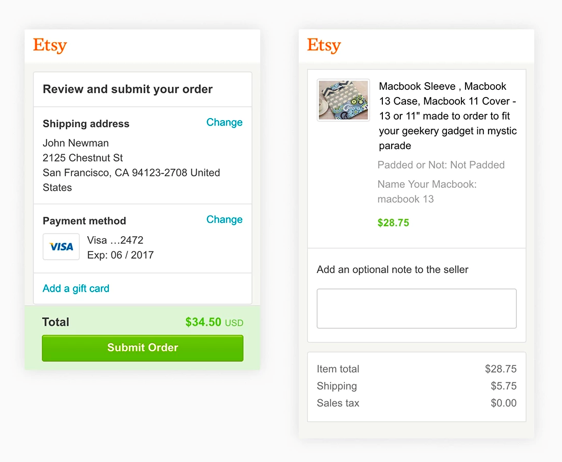 Mobile-optimized checkout page on Etsy; source: Agentestudio
Payment method
The number of people shopping online is continually growing: in 2021, the number of digital buyers was at 2.14 billion, which is 27.6% of the entire world’s population. Needless to say, in the future, these numbers will only increase.
Such an impressive demand for online shopping has stimulated many eCommerce stores to compete for their audience, offering more attractive and convenient shopping experiences; one of such is implementing various payment options.
Apart from traditional Visa and MasterCard, business owners should also consider implementing PayPay, Apple, and Google Pay, or even an option for interest-free credit lending. Consider your buyer experience and the specifics of your business to decide which of the APMs should be implemented and which of those can bring you the most profit.
Discover 20+ actionable tips on how to promote your online store!
Currency localization
Once your eCommerce site enters the global market, it’s essential to give your customers options to change or add local currencies on the payment page, as it is also one of the most common reasons for cart abandonment.
Shoppers should clearly see the option of paying in their local currency, and the product pricing in their usual currency. There are psychological reasons for this — users are more comfortable estimating the price-value ratio — and more practical reasons too — prospects know the exact cost they’ll pay for the product in their currency and don’t need to leave to do the exchange rate calculations.
Here’s what the currency switcher can look like on your optimized checkout page:
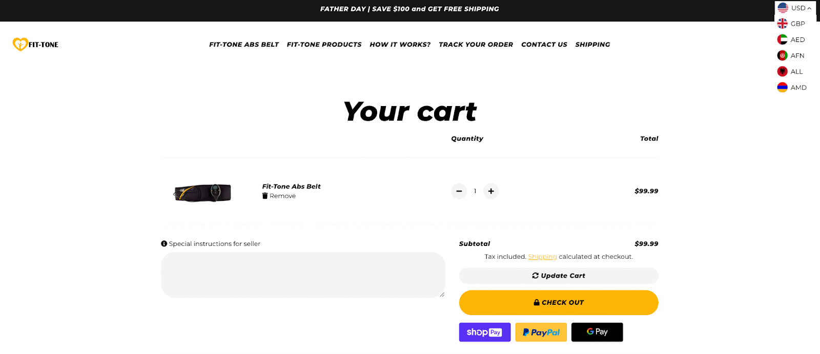 Example of the currency switcher design on the checkout page
So, adjusting your eCommerce checkout page to the local currency is an excellent way to reduce bounce rates and cart abandonment.
Authorization optimization
Finally, while the previous aspects can be classified as customer-centric factors, this one completely depends on what occurs behind the scenes in the sales process and before the payment is completed.
For your shoppers to have an excellent checkout experience and not end up declining the transaction, ensure the authorization doesn’t require too much information and time to complete, is bug-free, and doesn’t interfere with the payment process. You can also consider using OAuth — the standard that allows third-party websites to access and retrieve select pieces of information from these big websites to authenticate users within just a few clicks.
Learn top eCommerce marketing strategies to leverage in 2023.
Five tips for optimizing your checkout page
Having learned vital aspects that make this type of eCommerce page great, it’s time to uncover some best practices for checkout experience optimization based on several checkout page examples from different stores.
Trim down the form fields
The quicker a customer can complete the checkout process, the better. No one is willing to spend hours filling in an endless form asking for random information that will never be used. Instead, focus on the information that might be useful for you and easy for the customers.
Recent research by the Baymard Institute has shown that 17% of shoppers can abandon their cart if the checkout process is too long or complicated.
For example, the Asos shoe store is an excellent checkout page example, covering only essential information required to complete the transaction.
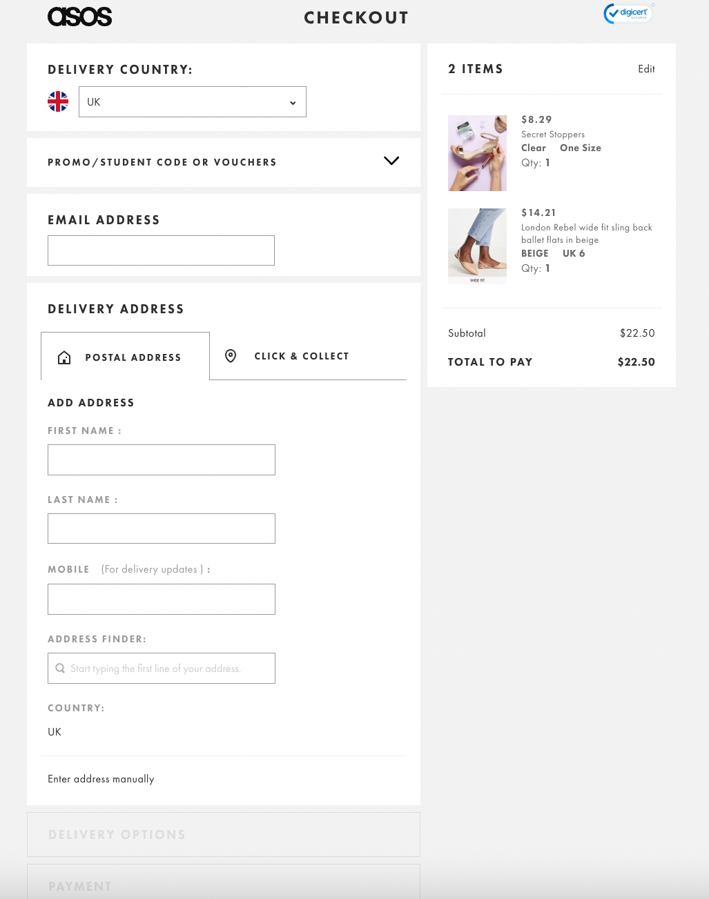 Checkout page design that has only needed form fields
Provide guest checkout or social sign-in
73% of users identify their reason for not submitting their email as part of a form as a dislike for receiving marketing communication. However, providing simple and hassle-free alternatives, like guest sign-in or sign-in through social media accounts, can surely come in handy.
Below you’ll find a great checkout page example from Field Notes:
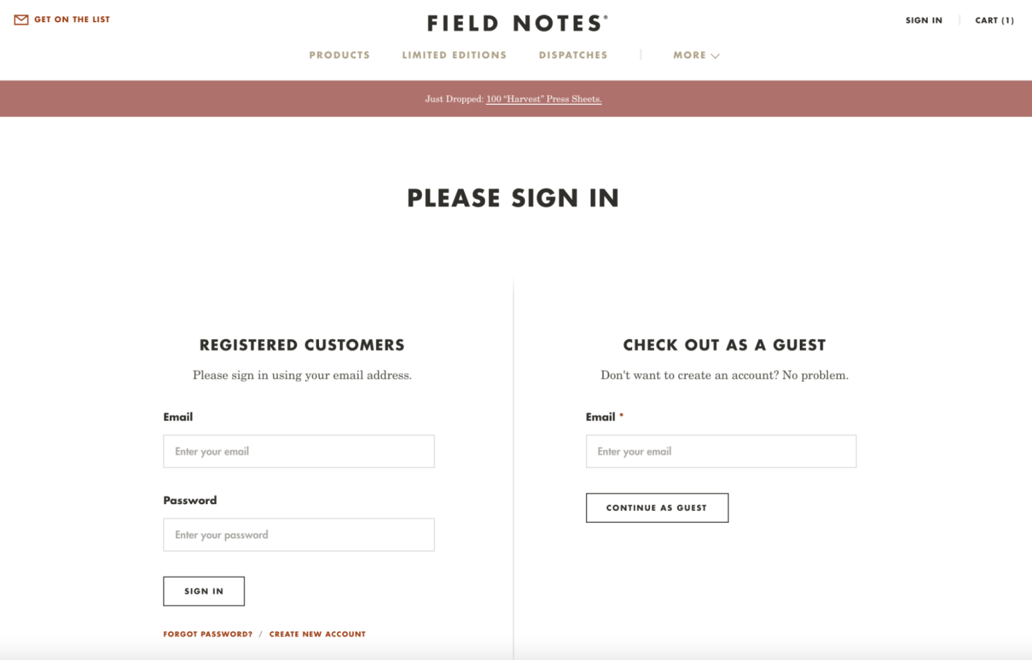 Checkout page design with a guest login; source: LinkedIn
Target international shoppers
To make your eCommerce store more flexible and accessible, it’s also good to provide a personalized approach for your customers. One of the core aspects to start with is translating the checkout page based on the local currency of international shoppers.
Here’s what it looks like on some websites:
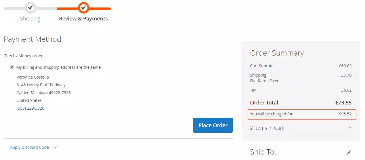 Checkout page design well-optimized for international shoppers; source: Bsscommerce
Instill a sense of safety
Authority is the basic focus of any eCommerce store today: the more trust you’re getting from your audience, the more sales it’ll bring you. In fact, trust signals are essential for checkout pages, where customers share the most sensitive information, including personal details and financial data.
To increase a sense of security in your potential customers, share the trust signals like safety badges, credit card logos, and a clear privacy policy that clearly explains what you do with their data and why your eCommerce store is reliable.
Below is a great example of a trust signal from Brosa:
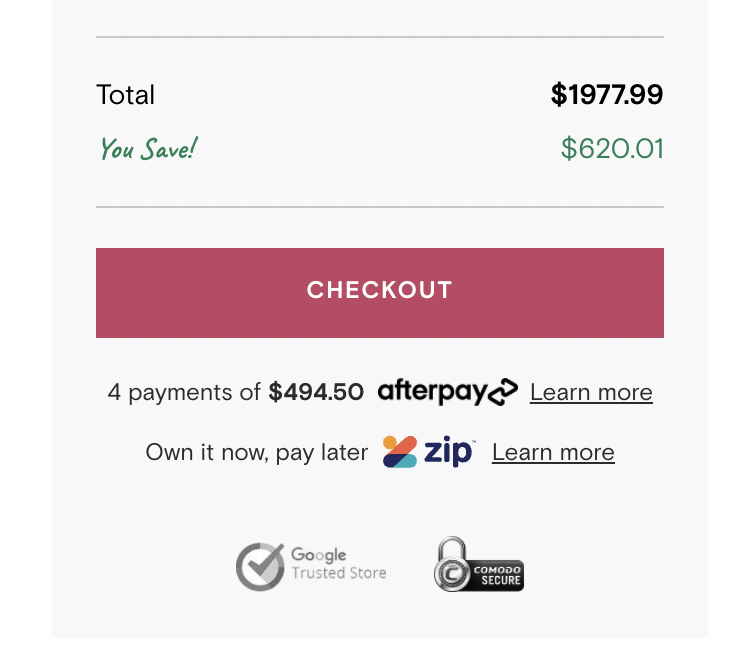 Checkout page design with trust badges that instill a sense of safety; source: LinkedIn
Automate and show the progress
Users always expect websites to receive an effortless transaction checkout that requires minimum time and effort to complete. To prevent them from filling in the same information over and over again, business owners have started using various automated tools that simplify the checkout process and reduce misprints while entering personal information, such as email, postal address, contact details, and more.
Additionally, showing the customer checkout path can notably decrease bounce rates, as users are more aware of the steps required to complete their transaction.
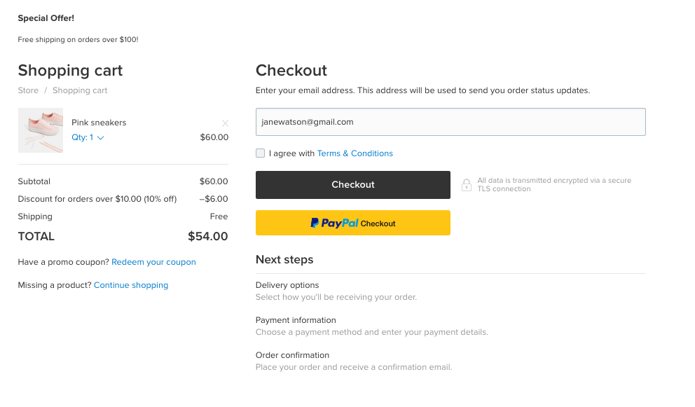 Checkout page design that shows the whole checkout process; source: Ecwid
Wrapping up
Optimizing your checkout page experience is one of the easiest and most helpful procedures that can significantly increase conversions. In this guide, we’ve uncovered the basics of the checkout page, reviewed its essential elements, and some great checkout page examples. The only thing left is to put those tips into practice so you can enhance the sales performance of your eCommerce.
In this guide, we’ve uncovered the checkout page basics, reviewed its essential elements, as well as some great checkout page examples. The only thing left is to put those tips into practice so you can enhance the sales performance of your eCommerce.
If you are looking for a modern and easy-to-use CRM that would optimize the work of your sales department, consider using our free CRM tool with all the required features to streamline sales and offer you a unified view into all processes.