Let’s be frank: a decent-looking startup website has never been easier to ship. Drag-and-drop builders, AI-generated copy, and a library of sleek templates mean you can have something live before lunch. But a polished aesthetic alone isn’t fooling anyone — experts spot inauthenticity fast, and a pretty page that says nothing substantive won’t hold anyone’s attention past the first scroll.
The harder question is what to put on the said website, and why. What does an investor want to see when they land on your page at 11 pm, doing quiet due diligence? What signals to a potential hire that your company is worth betting their next two years on? What makes a partner go “these people know what they’re doing” rather than clicking back to Google?
In 2026, you can make your startup website do active work: qualifying leads, building credibility, and increasingly, showing up in AI-generated answers rather than just traditional search results. In this guide, we break down the essential elements every startup website needs, along with real examples of founders who got it right. The best part is that you’ll also learn how to recreate that magic for your resource — with the help of SendPulse.
TL;DR
In 2026, a pretty startup website isn’t enough — it needs to qualify leads, build credibility, and show up in AI-generated answers.
This guide covers the essential components leading startups are using on their websites (think ROI calculators, dedicated comparison pages, and FAQ sections written for ChatGPT), 10 tips for design and copy that actually convert, and teardowns of 7 standout examples. Then we show you how to build a website for your own startup business with SendPulse, step by step.
What is a startup website in 2026 — and what is it actually for?
A startup website used to be treated like a brochure or a business card — a generic placeholder, an afterthought — while the real work and communication happened elsewhere. The expectations have since shifted. A modern resource can and should speak to several different audiences at once and move each of them closer to a decision.
Those audiences have different needs. A seed investor landing on your page wants to understand the market opportunity and whether your team can execute. A talent wants to know if your mission is legit and whether the culture is somewhere they’d thrive. A prospective customer wants to know if the product solves their specific problem — and how far you’re from hitting the market.
In practice, this means a modern startup website is doing several jobs simultaneously:
- Communicating your mission and value proposition — clearly enough that a first-time visitor understands what you do and why it matters within seconds.
- Demonstrating that the product is real, whether through live prototypes, demos, screenshots, or early results.
- Showing where you are in the journey — your milestones, roadmap, backers, and traction — so visitors can adjust their confidence in you.
- Addressing the doubts and questions that naturally arise, before they become reasons to leave.
- Presenting your company as a place where people want to work, not just a product people might buy.
- Establishing authority in your space through the expertise and perspective you share.
- Guiding every visitor toward a specific next step via strategic CTAs — whether that’s booking a demo, joining a waitlist, reaching out to invest, or simply reading more.
- Supporting fundraising, not just by making a good impression, but by giving investors the information they need to move forward.
What’s changed in 2026 is the context these websites operate in. AI search has particularly raised the floor on content quality, and value statements are expected to be backed by real-world metrics, badges, awards, and testimonials, which we will demonstrate in the following sections.
What are the benefits of having a startup website?
If tech magazines and bloggers are talking about your startup, that’s all that matters, right? Not quite. Due to unpredictable algorithms, any article can get buried or lose reach overnight, leaving you in the darkness. A journalist’s profile of your company, a viral LinkedIn post, even your own social media presence — all of it exists on someone else’s platform, on someone else’s terms.
Your website is the one place that doesn’t work that way. It’s your primary source of record — the URL you control, update, and shape without editorial interference or feed-ranking games. When journalists research your company, when investors do a first pass, when a candidate wants to understand what you actually do, they’ll end up there eventually. What they find is entirely up to you.
That control translates into real business value in several ways:
- It builds credibility and lays the groundwork. A clear, well-structured resource signals that the team behind it thinks clearly, too. For early-stage startups, where brand recognition is zero, the website often makes the first impression, and that impression works as a quiet litmus test.
- It qualifies leads for more fruitful communication. A good website does a lot of the pre-sales work: explaining what you do, who it’s for, and why it matters. Visitors who reach out after reading it already understand your product and have decided they’re interested — that’s a fundamentally different conversation than one that starts from scratch.
- It’s your best answer to frequently asked questions. This is your chance to clarify how your pricing works, what integrations you support, and whether this is built for enterprise or SMBs. Addressing those questions directly on your site removes friction from the buyer journey and frees your team from repeating the same explanations over email.
- It shapes how people perceive you as an employer. Hiring is competitive, and candidates research companies before applying just as carefully as companies research candidates. A website that communicates your mission, your team, and what it’s actually like to work there gives you an edge, especially when you’re up against better-known names.
- It establishes your expertise over time. A startup website can include a blog, a resource library, or a collection of case studies, which builds authority in your space in a way that a LinkedIn post simply can’t. It compounds, it’s searchable, and it stays yours.
- It makes you visible in multiple dimensions of search. In 2026, showing up in AI-generated answers (ChatGPT, Perplexity, or Google’s AI Overviews) matters as much as traditional SEO rankings. These systems pull from structured, credible, well-written web content. A website that’s clear about what your company does, who it serves, and what results it delivers is exactly the kind of source they surface.
- It gives investors something to send around. Early-stage investors rarely make decisions alone. When someone champions your company internally, your website is what gets shared in Slack threads and forwarded to peers. A site that articulates your vision, traction, and differentiation clearly already does some pitching for you.
What’s even better is that none of this requires a large budget or a dedicated web team. It’s more important to think strategically about what your website is actually for and build it accordingly.
Essential components of a startup website
To find out what sets top performers apart, we analyzed the websites of some of the highest-ranking startups in 2026. One thing became clear quickly: exaggerated mission statements and rigid contact forms don’t cut it anymore.
The devil is in the details that no standard Wix or Squarespace template will hand you by default. But once you know what to look for — or what to ask the SendPulse AI builder to generate — it’s all within reach. Here’s what actually works in 2026.
Value calculator
Abstract promises (“save time,” “reduce costs,” “scale faster”) are the background noise of every startup website and achieve little when it comes to convincing experienced, cautious visitors to pay attention to your product.
A value calculator cuts through the skepticism, letting the user input their own numbers and see the impact themselves. How many hours does their team spend on this problem per week? How large is the team? What’s their average hourly cost? This way, the benefit suddenly becomes a conclusion they’ve reached on their own.
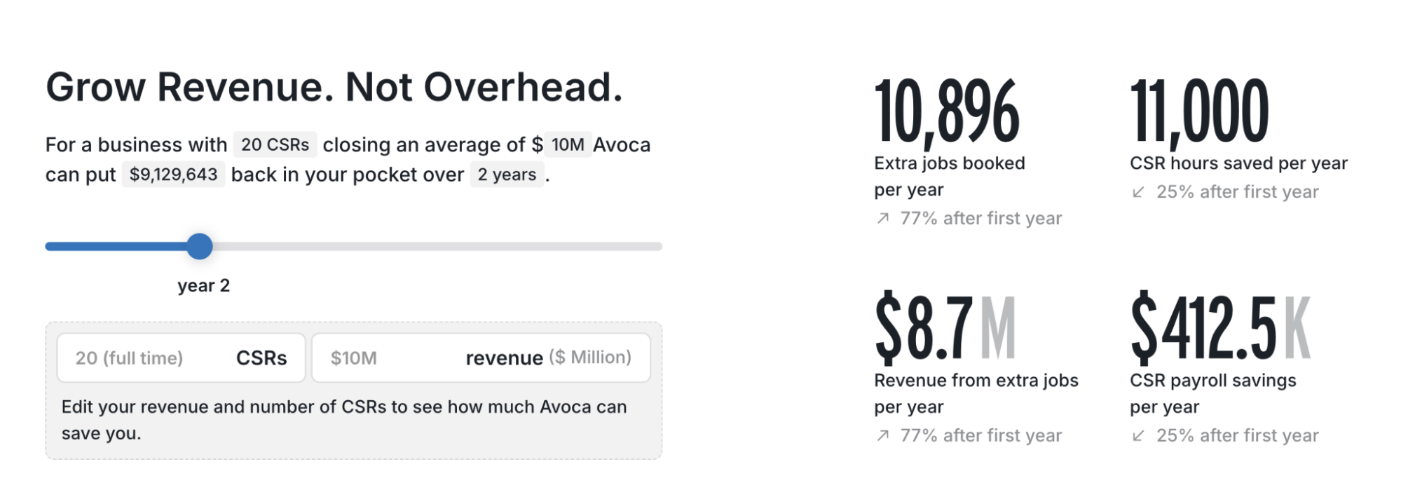 A savings calculator from a workforce automation startup website
This approach appeals to operation leads and founders who have been burned by overpromised software and are extremely mindful of their budget. A well-designed ROI calculator acknowledges their context and expertise — and turns them from passive browsers into active participants.
Badges and credentials
Trust is hardest to establish at the very top of the page, when a visitor knows nothing about you yet. Industry awards, certifications, patents, security compliance marks, and notable press mentions are one of the fastest ways to borrow it.
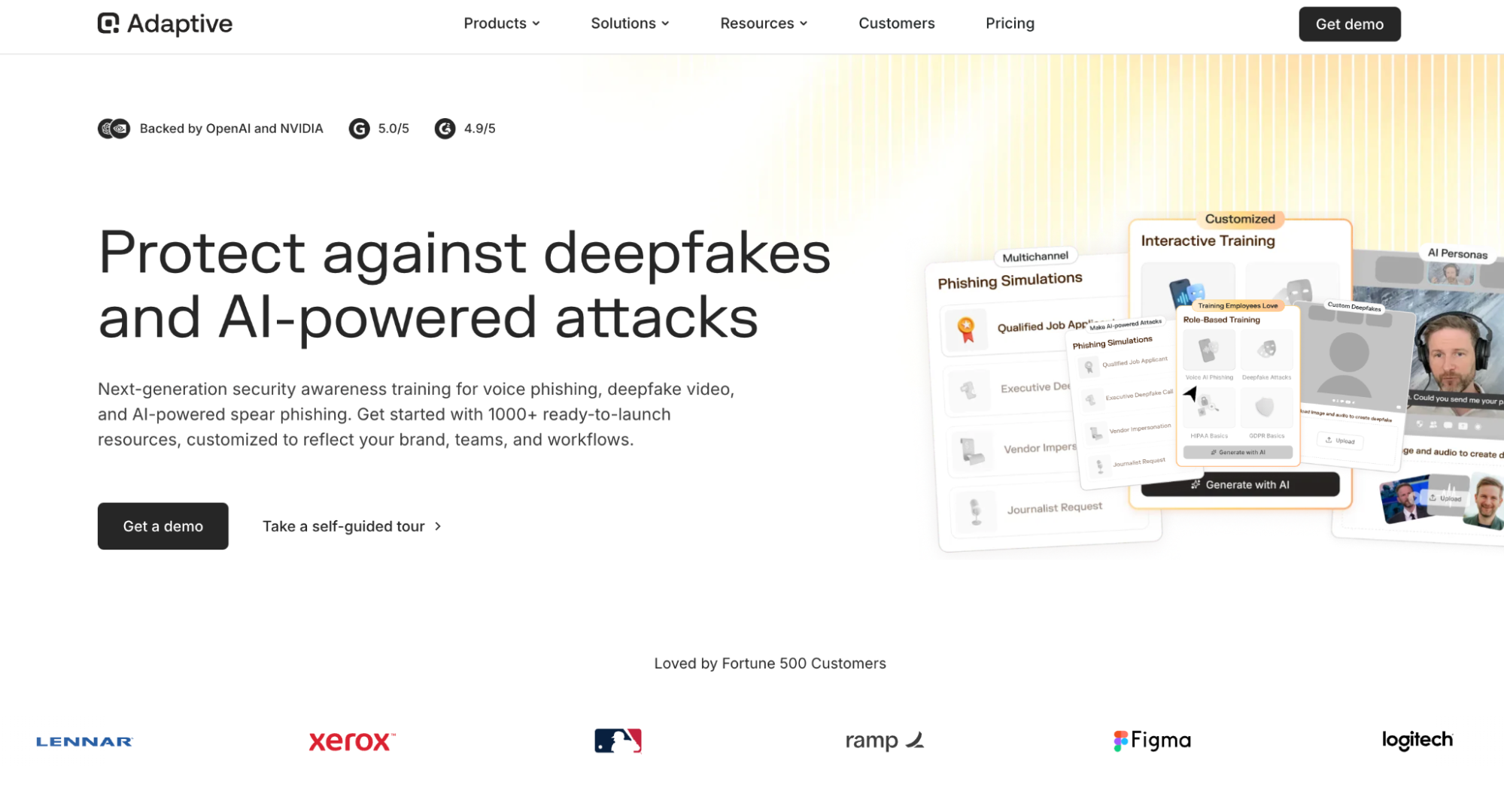 Credentials on a security training startup website
Some of the best startup websites tend to position these elements above the fold or right below the hero section to instantly let the visitor know this is a vetted, third-party verified company. Whether it’s an FDA approval, a Forbes 30 Under 30 mention, or an ISO certification, even a single badge can signal legitimacy, given that it’s current and recognizable.
Use cases
Your website visitors don’t have to guess whether your product is a good fit for them based on verbose feature descriptions, and they rarely have time or motivation to do so. You have to tell them — through vivid, specific real-world use cases. If your product serves multiple personas or industries, give each one its own use case rather than merging them.
 Specific use cases mentioned on an AI customer research platform website
When a visitor reads a use case and recognizes their own problem, the rest of the page becomes a lot easier to sell. The best use cases are written from the user’s perspective, not the product’s, as this makes the storytelling more resonant and the transition to your solution smoother.
Customer stories
Instead of surface-level endorsements, the best startup websites often lead with outcomes told in the form of detailed, emotional customer success stories. This is yet another way to establish trust while avoiding aggressive marketing speak. Videos or podcasts usually work best as they capture that raw human sentiment that makes even neutral visitors tune in.
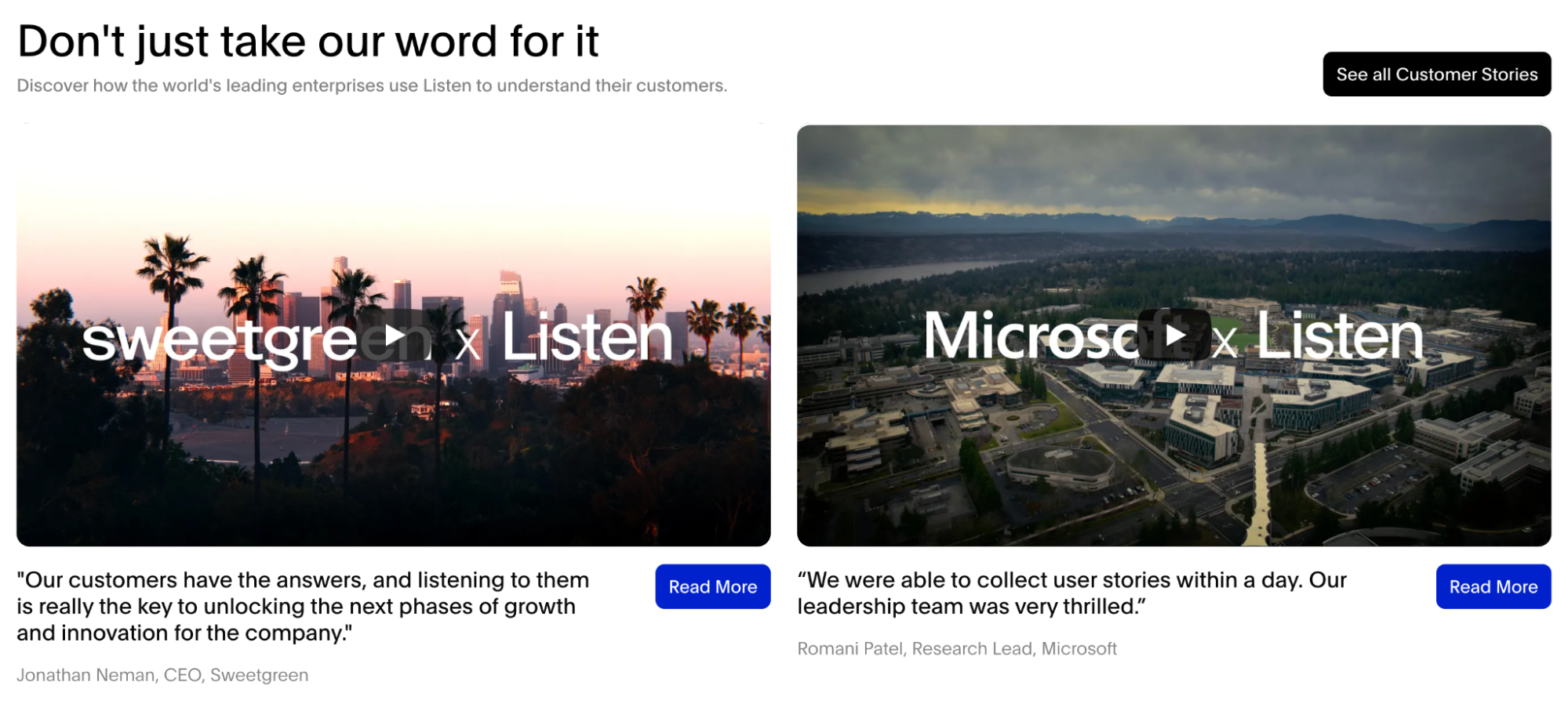 Success stories as seen on an AI customer research startup website
Production value can be beneficial, but ultimately, it’s specificity that makes a customer story believable. Firstly, the customer’s role and company type should be recognizable to your target audience. Secondly, the problem they describe should be one your visitors have felt themselves. And, finally, the result should be measurable, whether it’s a number, a timeline, or a before-and-after visual.
To create a brand story that truly resonates, make customers the hero of the story that you're telling. Reframe your messaging from what you do to what the customer will achieve by choosing you.
SourceJon Bailey
Director of Marketing at Xecunet
Backing
The names of your supporters carry certain weight, so dedicating a homepage section or a standalone page to them is rarely wasted space. When a recognized firm or a respected angel investor has written a check, they’ve done diligence, which signals to every subsequent visitor that your startup has already passed a test of scrutiny.
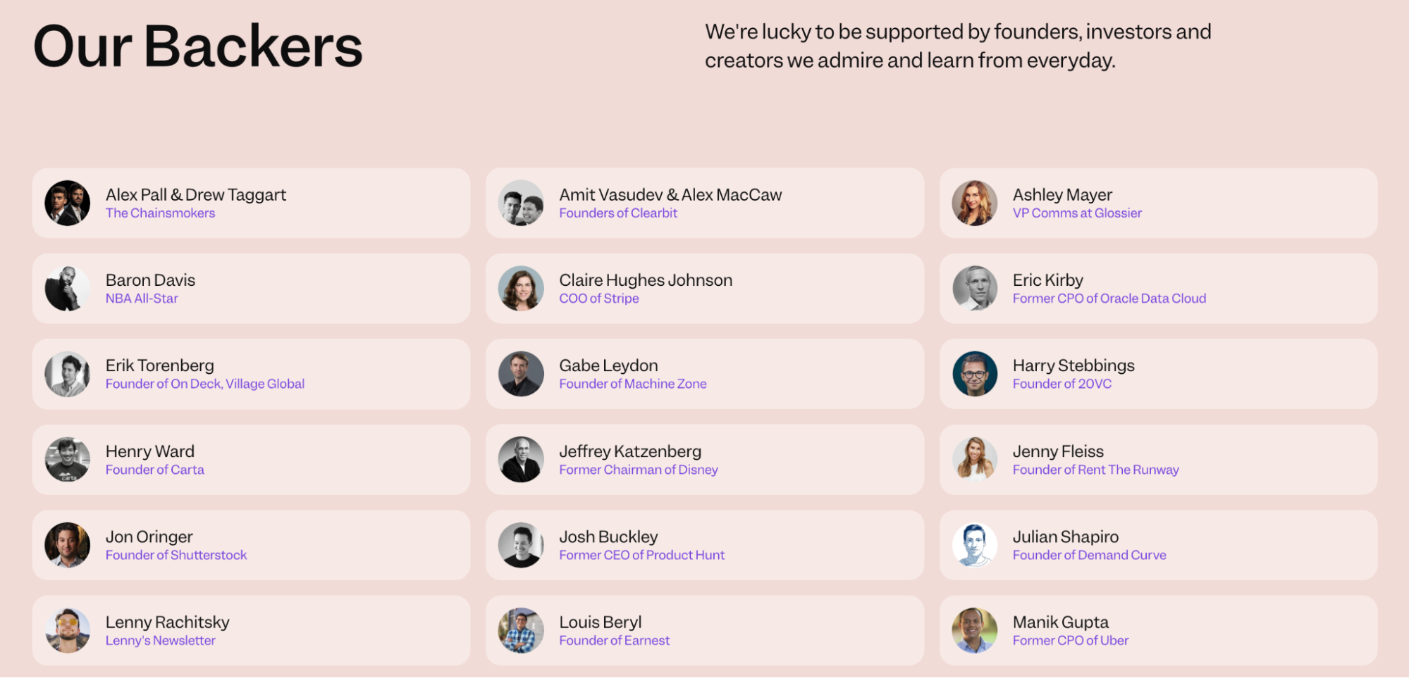 An example of a backers section from a startup website
For first-time visitors who don’t know your company yet, a familiar investor logo shifts the burden of proof and potentially even triggers FOMO if the backer is someone they’ve heard of. In case your startup is still in its infancy, mentioning notable advisors, accelerator affiliations, or institutional partnerships may help achieve a similar effect.
News
A startup website that hasn’t published anything in eight months raises questions and suspicions. A news section, when done well, eliminates that problem, demonstrating that the lights are on and that work is being done.
To show that your startup is moving, you can publish product updates and feature releases, milestone announcements, funding news, press mentions, and the occasional piece of expert opinion or industry commentary from someone on the team.
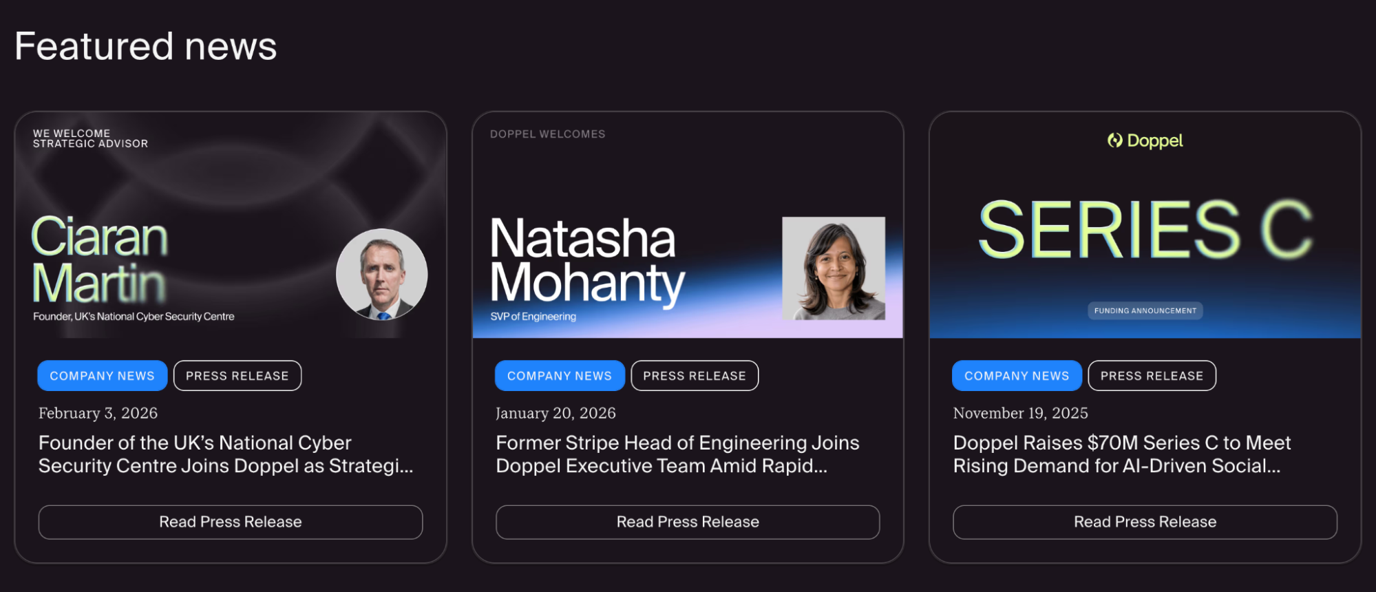 A news feed example from a startup website
The format can be as simple as a clean reverse-chronological feed with a title, a date, a category tag, and a short description. As a rule of thumb, a news section with three entries from the last 90 days signals health. On the other hand, a feed with the latest entries from 2022 is better removed entirely than left to gather dust.
How we compare
Every visitor with a real buying intent is already making comparisons, with your closest competitor, with the tool they’re currently using, or with the old way of doing things. You can meet them halfway by preparing a dedicated comparison section.
A company that’s confident enough to put itself side by side with the alternatives is implicitly saying: we’ve done this comparison ourselves, and we are happy where we land.
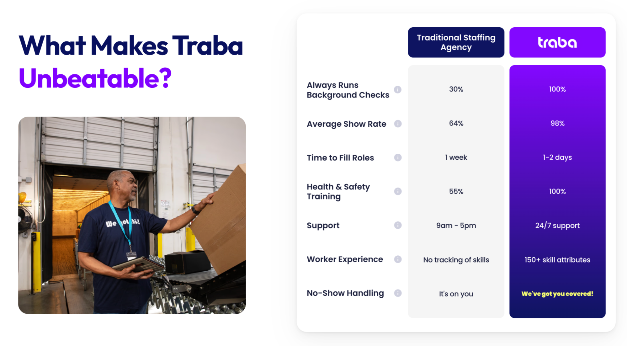 A comparison section on a staffing startup website
If you’re entering a crowded market with established players, a feature-by-feature table (us vs. them) works well — it lets visitors quickly locate the gaps and see where you win. If your product is more disruptive, it may help to juxtapose your approach against the traditional solution (the old way vs. the new way).
The latter format is especially effective for products that are genuinely new, because it educates and converts at the same time. In particular, it helps visitors understand what issues they’ve been tolerating and why they no longer have to.
Chat widget
An interactive chat widget, especially the one that pairs human intelligence with trained AI, serves a multitude of purposes. Firstly, it’s one of the cleanest ways to pack multiple CTAs into a single entry point. Instead of cluttering your startup website with buttons, a well-configured assistant can surface the right next step based on what the visitor actually asks.
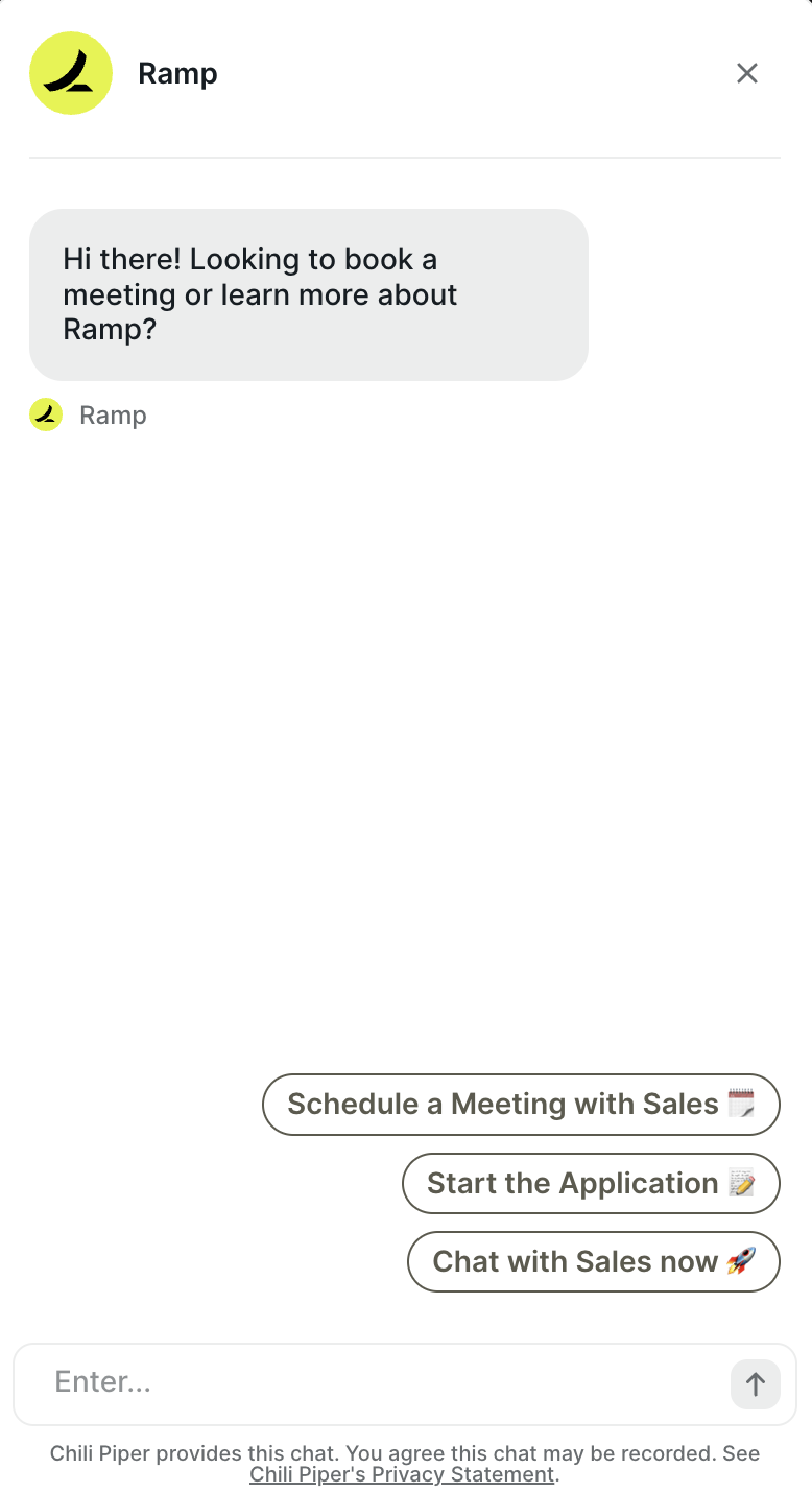 An example of a startup website chat widget
It also automates lead qualification and makes the subsequent exchanges more intentional. Before a prospect ever speaks to anyone on your team, the AI assistant can establish who they are, what they’re evaluating, how large their team is, and what problem they’re trying to solve.
Most importantly, the chat widget is available around the clock and can supply your visitors with information they need right when they need it, without clunky forms, stiff emails, or callback requests. A prospect who lands on your site at midnight with a specific question about your enterprise pricing doesn’t have to bookmark it and come back later — they get an instant answer, and their interest is preserved.
FAQs
The FAQ section has been a staple of web design long enough, but in 2026, it’s quietly become one of the most strategically valuable elements of a startup website. Naturally, it removes friction, answering popular questions, and keeps visitors on the page longer. But the more compelling reason to invest in a well-written FAQ section is for visibility in AI search.
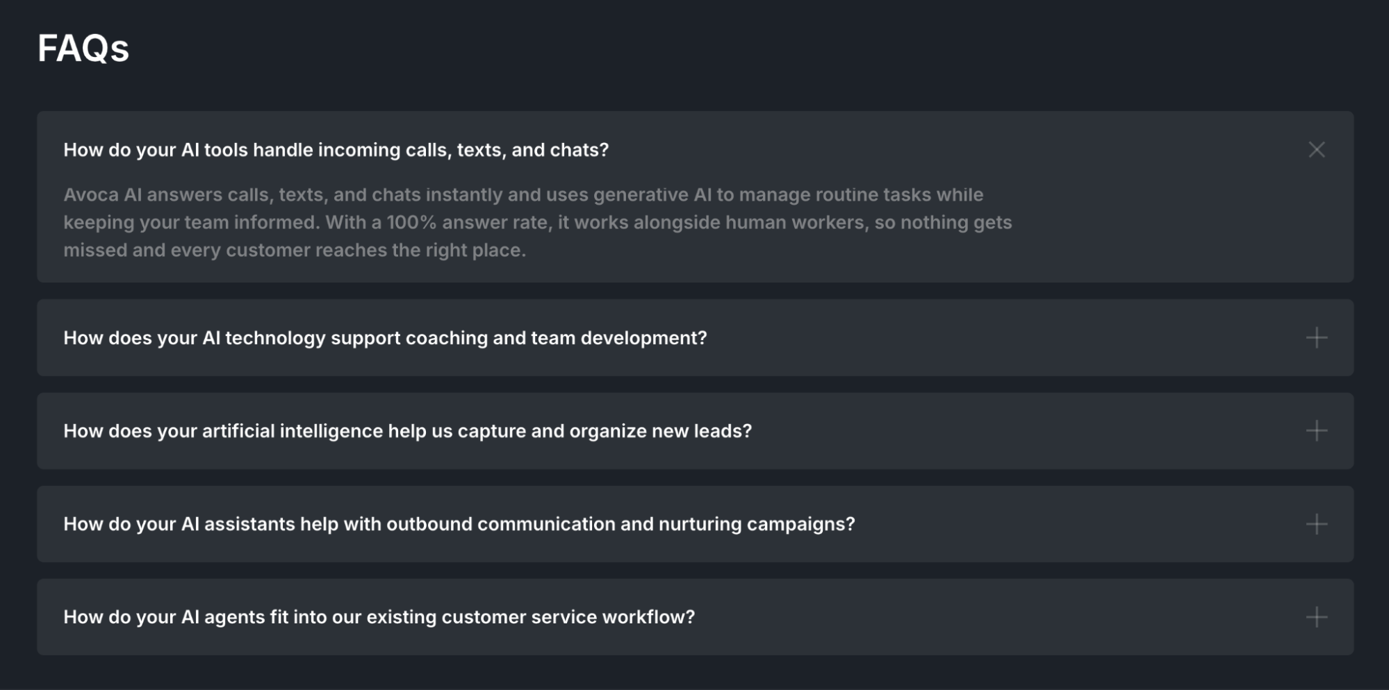 A FAQ section from an AI startup website
The way people prompt AI tools like ChatGPT or Perplexity is similar to the way they phrase a FAQ question. “Does [product] integrate with Salesforce?” “What’s the difference between the Pro and Enterprise plans?”
AI systems pulling together answers from across the web prioritize content that is clear, specific, and directly responsive to a question. Whether you use an accordion layout, a dedicated page, or a simple Q&A list, what counts for AI is that your FAQ section actually answers the questions your buyers are asking.
Call to action
All the aforementioned startup website components build toward a moment when the user’s interest transforms into intent. Well-placed CTAs act as clear-cut options of what to do with the information they just consumed.
 A clear CTA architecture example
When it comes to the CTA placement, there are multiple opportunities: after a use case that a visitor recognized themselves in, after a customer story that brought the product to life, or after a pricing section where the value calculation has just clicked.
The best CTAs are specific enough to feel natural rather than a generic sales prompt, and varied enough to meet visitors wherever they are in their decision-making process. Not every visitor is ready to buy, and a good CTA architecture acknowledges that. Offering both “See a free demo” and “Talk to sales” gives every visitor a viable next step.
Startup website design and copywriting tips
Out-of-the-box startup website templates often already contain some good guiding elements, but even the most polished template is built for everyone, which means it’s not optimized for you yet. Here are a few tips on how to design a startup website that delivers an impeccable first impression with each section:
- Never leave a template as-is. Generic layouts are a solid starting point, but you don’t want yours to be recognized as such. Visitors have seen enough startup websites to spot a popular Wix template at a glance, and it implies that the same level of effort went into the product. The copy, the structure, the visual hierarchy, and especially pricing and social proof have to be authentic.
- Write in the second person, in active voice. “You get full visibility into your pipeline” instead of “Users are provided with pipeline visibility.” The active, direct tone closes the distance between your product and the reader and makes the copy feel like a conversation rather than a brochure.
- Every link and button should go somewhere. This is a common pain with multi-page, ready-to-go templates full of placeholders. An empty anchor tag or a CTA that leads to a 404 page can frustrate visitors and make them question your company’s legitimacy. Audit your site thoroughly before it goes live and hide or remove elements that have no destination yet. Some popular website builders flag such elements by default.
- Make your legal pages easy to find. A privacy policy, terms of service, a code of ethics, and cookie disclosures aren’t pure formalities — they act as trust signals, particularly for enterprise buyers and anyone handling sensitive data. Burying them or making them hard to locate raises flags for exactly the type of visitors you want to retain.
- Match your copy to your audience’s language. The way your team talks about the product internally is rarely the way your customers describe the problem it solves. Use the language from your customer interviews, your support tickets, and your sales calls — the words your buyers actually use are almost always more persuasive than the technical speak.
- Design for the impatient visitor first. Most people will never read your website — they’ll skim it. Headlines, subheadings, captions, and button labels need to tell a coherent story on their own, without requiring anyone to read a single full paragraph. If the scan path doesn’t communicate your value proposition, the copy below it won’t, either.
- Use white space as a design tool, not an afterthought. Crowded pages imply that your company hasn’t made hard decisions about what matters most. Additional context can always be delivered via drop-downs, tooltips, secondary pages, and slide-outs if needed.
- Enforce visual consistency. Most modern website builders allow you to define a custom design theme or brand kit that sets your fonts, colors, logos, button styles, and spacing in one place. Once configured, these settings apply consistently across every page, making future updates effortless.
- Don’t hide your pricing out of caution. The instinct to keep it off the site may work against you — visitors who can’t find pricing won’t bother to request it if there’s a better-known alternative. Even a rough indication of price range or a “starting from” figure reduces the uncertainty that causes drop-off.
- Test your entire site on mobile before you launch. Over 60% of your visitors will see your website on a phone first and make up their mind from there. A layout that looks polished both on desktop and mobile solidifies that positive first impression.
Knowing this, you can safely proceed to build your startup website — but not before having looked at some stellar examples of how it’s done.
7 best startup website examples in 2026
What the best examples have in common cannot be boiled down to something as primitive as a shared aesthetic or a single formula. Rather, it’s a shared purpose and intentionality — every section doing a specific job, every element earning its keep.
We reviewed over 30 startup websites across SaaS, consumer products, edtech, and enterprise tech, filtering for those that combine strong design with measurable traction (notable funding rounds, industry awards, or high user ratings). Here are seven startup website examples that stood out.
Harvey
Harvey is an AI for legal teams — a technically complex product that feels immediately tangible due to its skillful presentation. The moment you land on the page, a built-in platform demo walks you through a real legal workflow, prompting complex tasks, specifying sources, and automating repetitive document review.
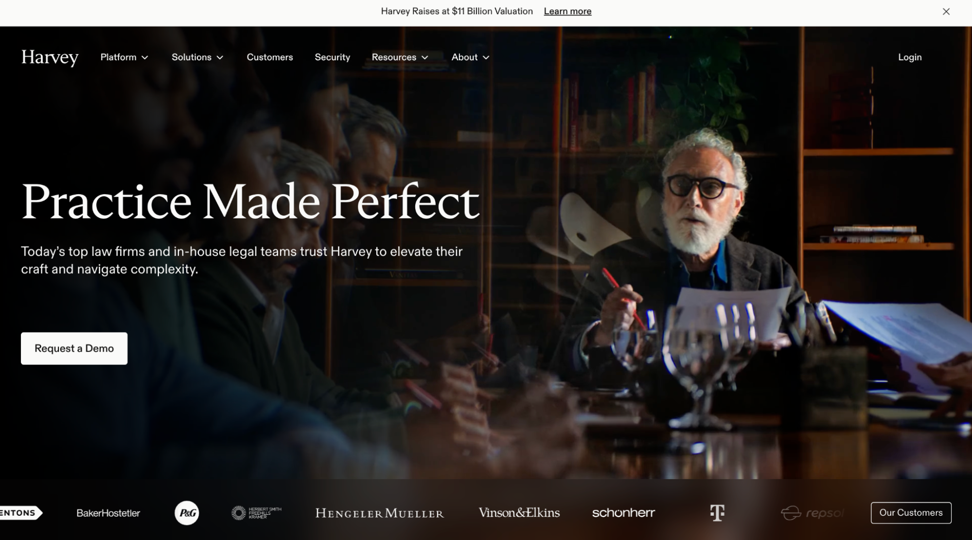 Harvey’s homepage
The product is shown in the context that a lawyer or legal ops lead would instantly recognize, and the social proof is handled with equal care. Harvey uses cinematic, documentary-style video stories from international clients — this level of production exudes seriousness and trust.
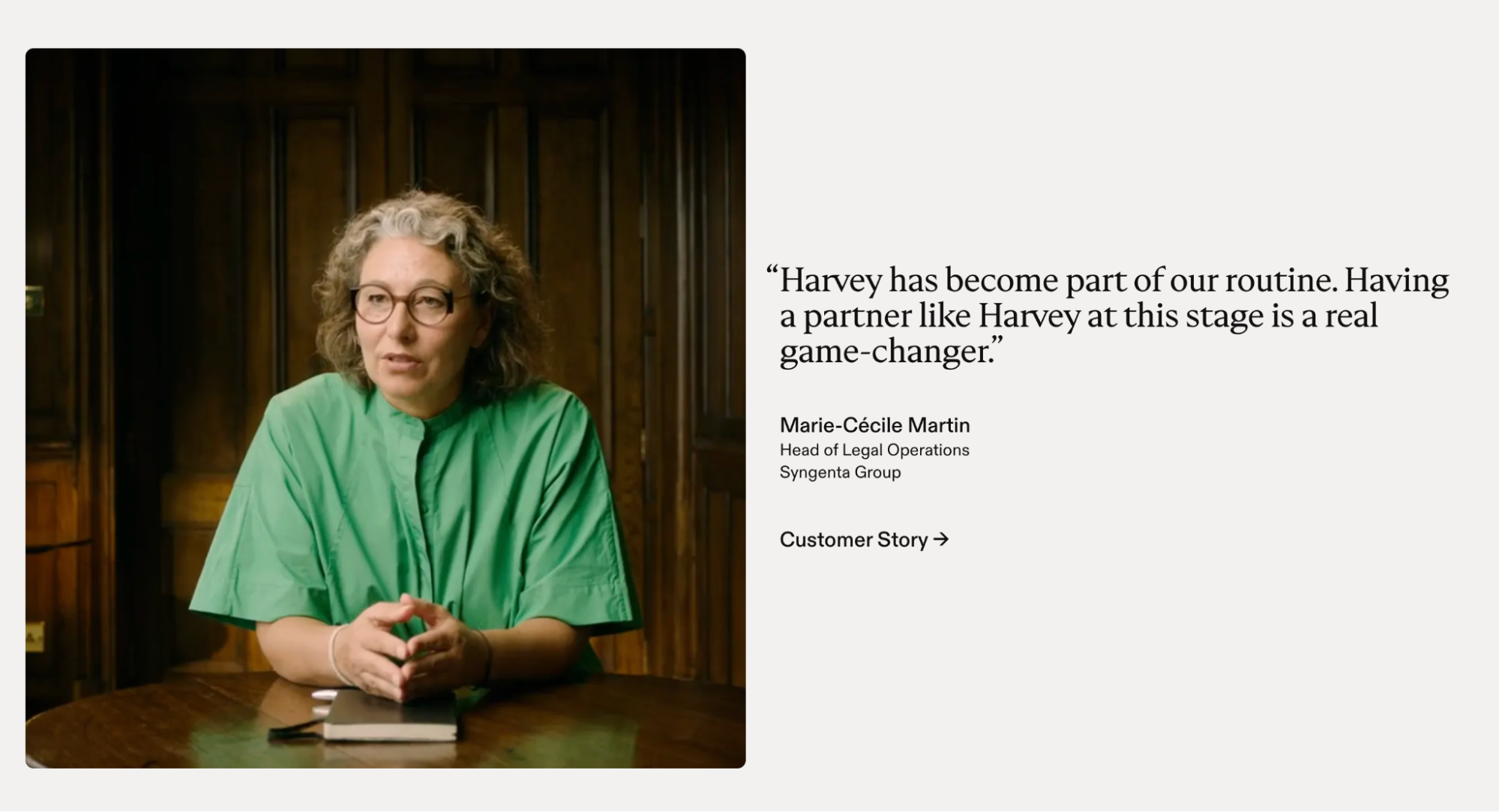 Customer stories on Harvey’s website
As a value promise, Harvey uses verifiable metrics, like the total number of users, average hours saved per month, countries used in, etc. For enterprise buyers, for whom security compliance can be a dealbreaker, Harvey surfaces its credentials clearly: SOC 2 Type II, CCPA, ISO 27001, and GDPR compliance.
Lokalise
Lokalise is a translation and localization platform built for tech teams — and a good example of an incredibly intuitive yet value-packed startup website. The initial trust is established by G2 and Capterra badges, which sit above the fold, as well as endorsements from industry leaders.
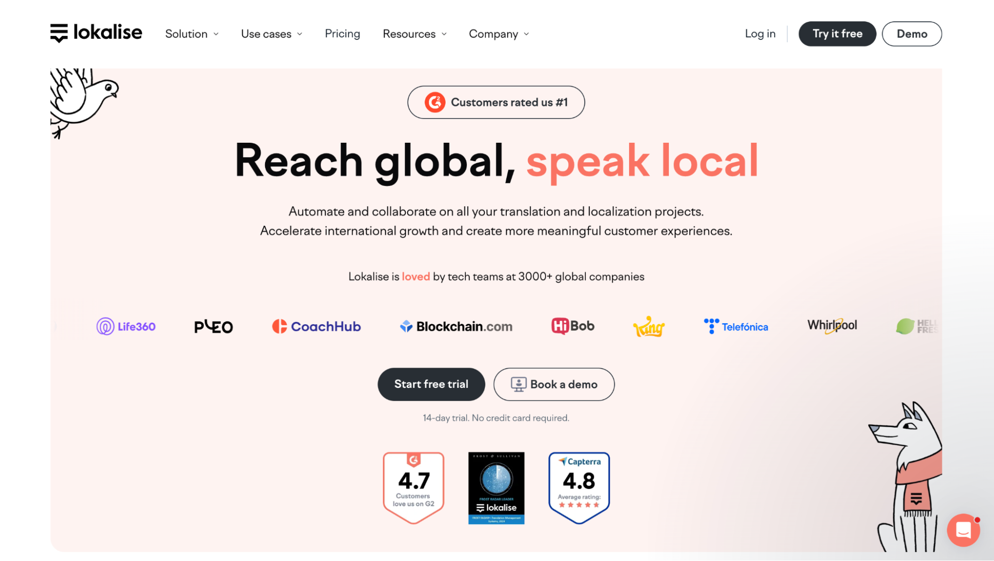 Lokalise’s homepage
The pop-up chat widget makes the page more interactive and takes conversations way past the basic “talk to us” prompt. Firstly, it provides a real-time system status, so tech-savvy visitors can see the platform’s health before they commit to a demo. Then, the AI chatbot takes care of any product questions. Finally, the widget links to a self-service knowledge base for the visitors who’d rather read than chat. There are two additional “Chat with sales” text-based channels, like WhatsApp, which offer unusual flexibility and spontaneity.
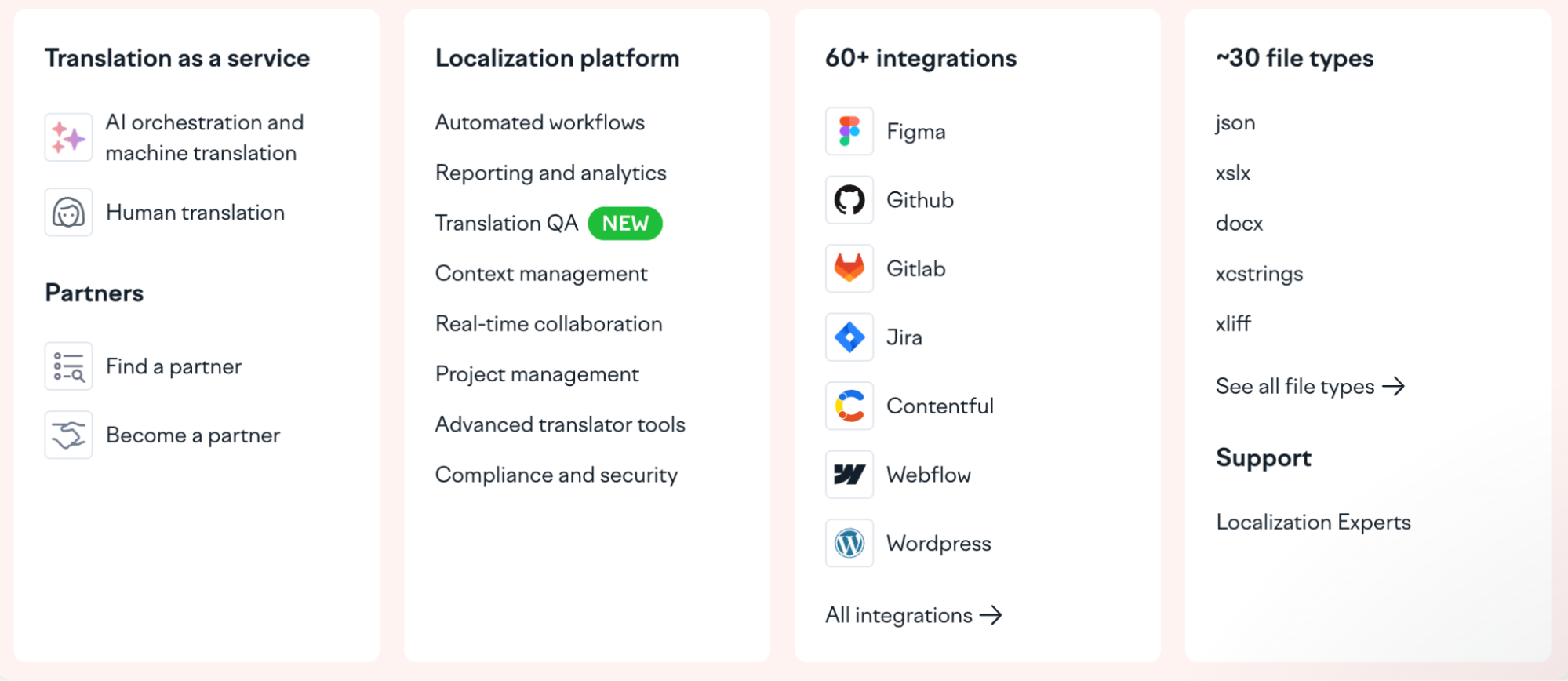 Lokalise’s intuitive navigation panel
From the hero headline down to the feature descriptions, the tone is consistently direct and second-person, keeping the reader at the center of the story. Lokalise’s site is a textbook example of anticipating user needs — even the use cases are broken down by role, content type, and industry to remove any guesswork.
Island
Island is an enterprise platform that includes a browser, AI, and scalable network services. On its website, the startup manages to present this niche, technically dense product category in an accessible way — and with a dash of aesthetic.
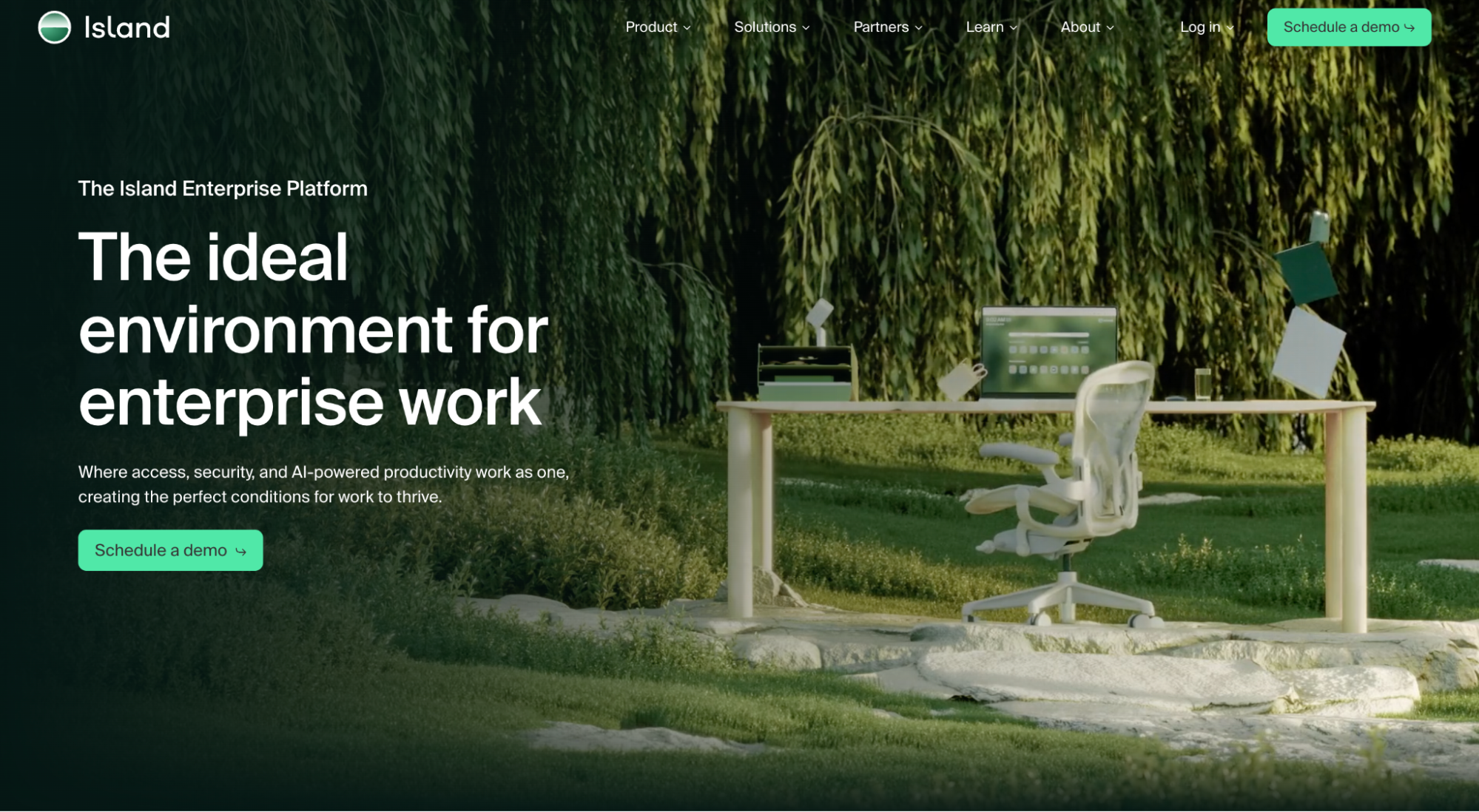 Island’s homepage
The visuals are dreamy and slightly surreal, which feels refreshing in comparison to default dark corporate interfaces and threat-map animations. The site itself is free of clutter and only carries high-priority statements, a single primary CTA, and a client logo bar that does most of the credibility work.
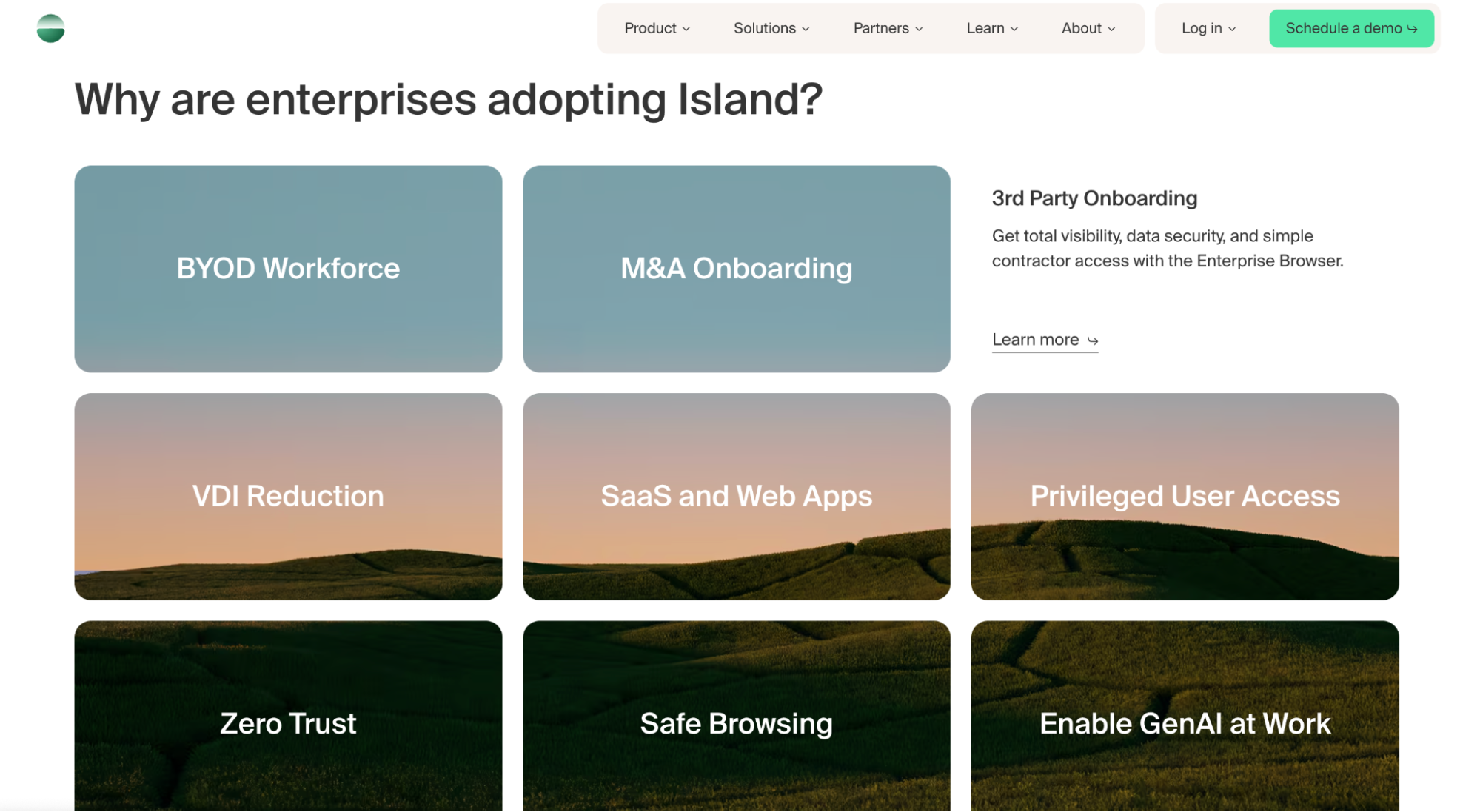 Reasons why enterprise clients choose Island
For buyers earlier in their research, Island offers a downloadable buyer’s guide — a resource that demonstrates expertise, provides genuine value, and keeps the brand in the conversation long after the visitor is gone. Finally, the reasons-to-choose section earns its place by addressing real-world concerns of enterprise buyers.
Atomo Coffee
Atomo is selling a controversial product, namely bean-less coffee, and its website knows exactly how to handle that. The homepage opens with the benefits that any coffee drinker immediately cares about: no jitter, low acidity, prebiotics, and great taste.
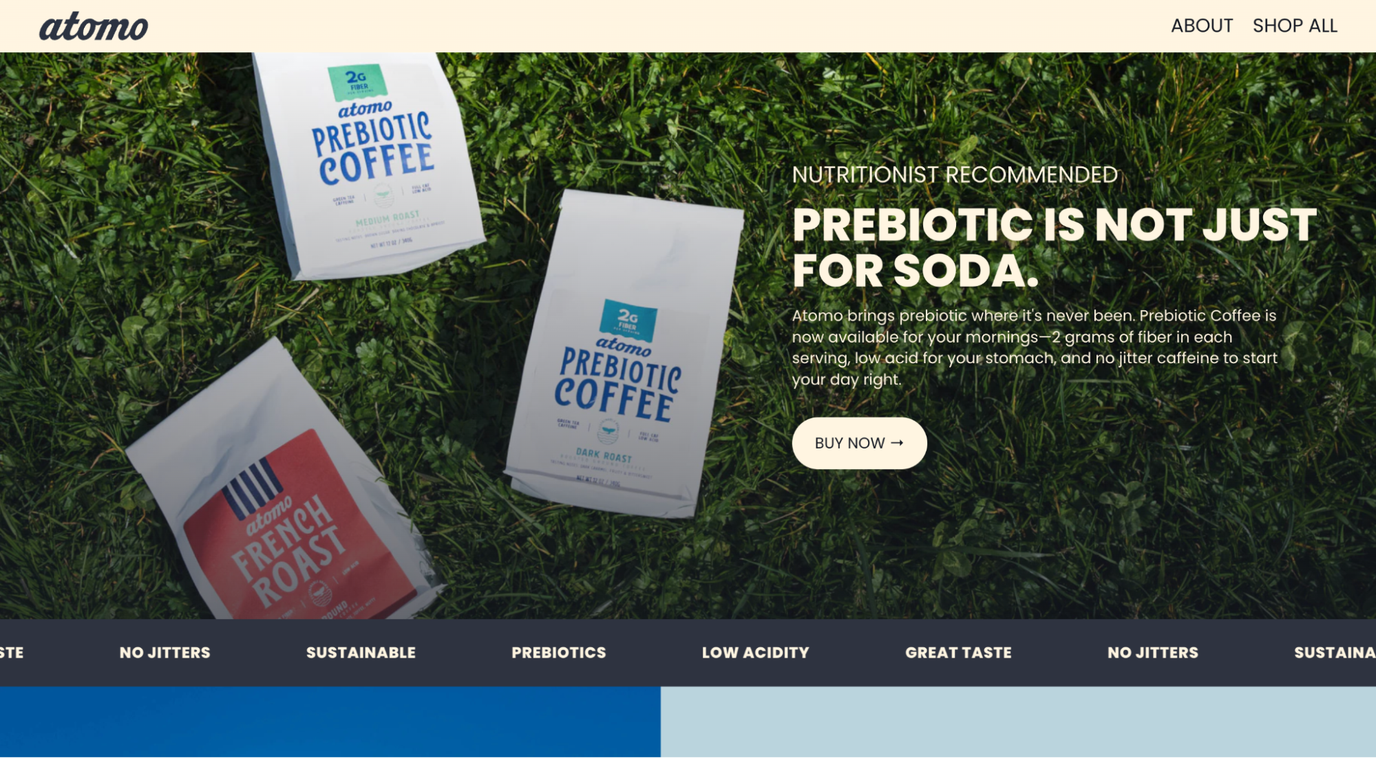 Atomo’s homepage
The founder’s self-deprecating introduction injects charisma into the page and shows that the people behind this product aren’t taking themselves too seriously. However, Atomo quickly earns credibility due to its ultimate transparency when it comes to the ingredients and the manufacturing.
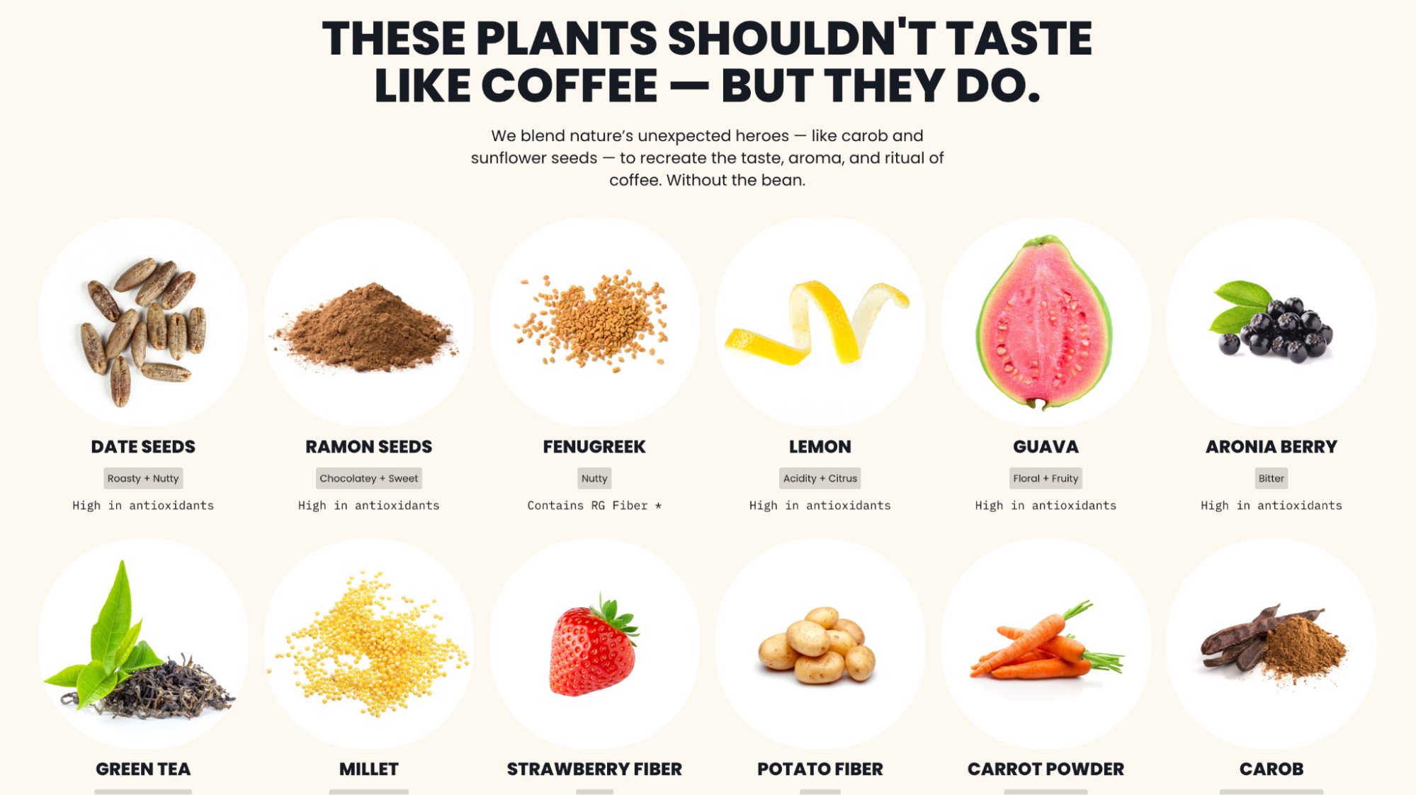 Atomo’s in-depth ingredient breakdown
Facility photos and assembly line videos let visitors see each step of the process — this level of openness is rare in a market full of wellness brands with opaque supply chains. The ingredient breakdown is just as detailed and visualized. Instead of vague “natural” labels, the user gets an honest science-based look at what’s in the product and why.
Bounce
Bounce is a worldwide luggage storage network, presenting a sleek alternative to conventional train station lockers. This is one of those startup website examples that tick all the boxes, from interactivity to usability.
The first thing a visitor sees is a search interface. Location, date, number of bags — the booking flow starts seamlessly, demonstrating the convenience of using Bounce. What follows is a clear, illustrated step-by-step breakdown of the process.
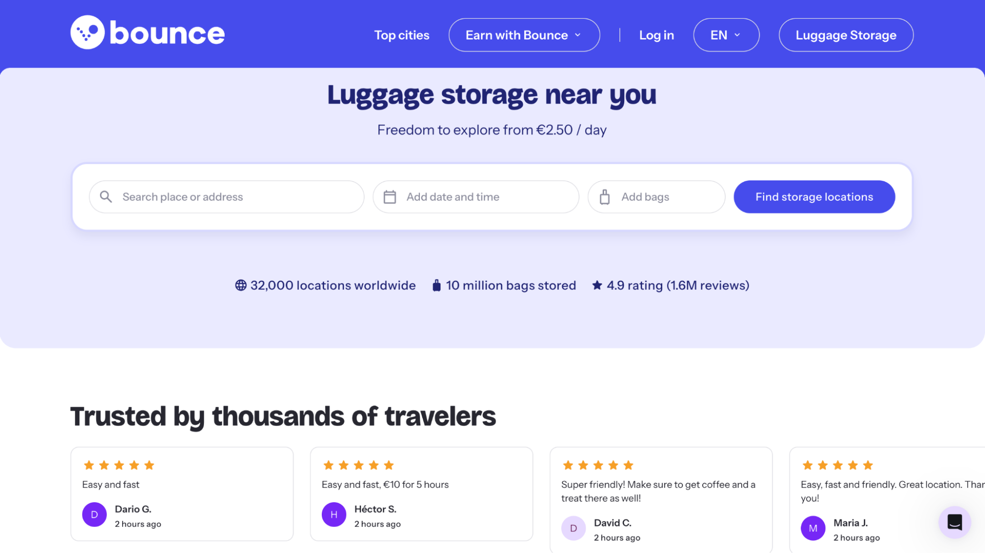 Bounce’s homepage
The comparison table points out the practical differences between using Bounce vs. relying on outdated, unpredictable lockers. The FAQ section is presented in the format of short TikTok-like conversational videos, which suits a consumer travel product better.
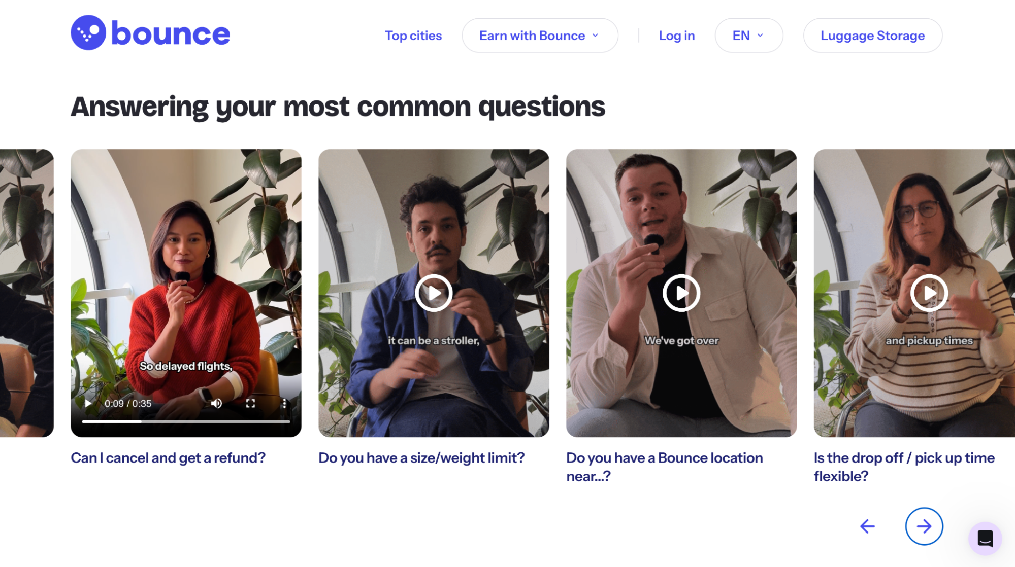 Bounce’s FAQ videos
For curious visitors, there’s also a chat widget with quick access to self-help articles, AI assistance, and human support agents.
Cuemath
Cuemath is a live online math tutoring platform for kids, and its website faces the common edtech challenge of convincing a skeptical parent that this isn’t just another Zoom lesson with a clueless stranger.
The proof starts with the short hero section videos of the kids themselves. For a parent who has watched their child zone out through a passive lesson, seeing a student leaning in and paying attention is immediately persuasive.
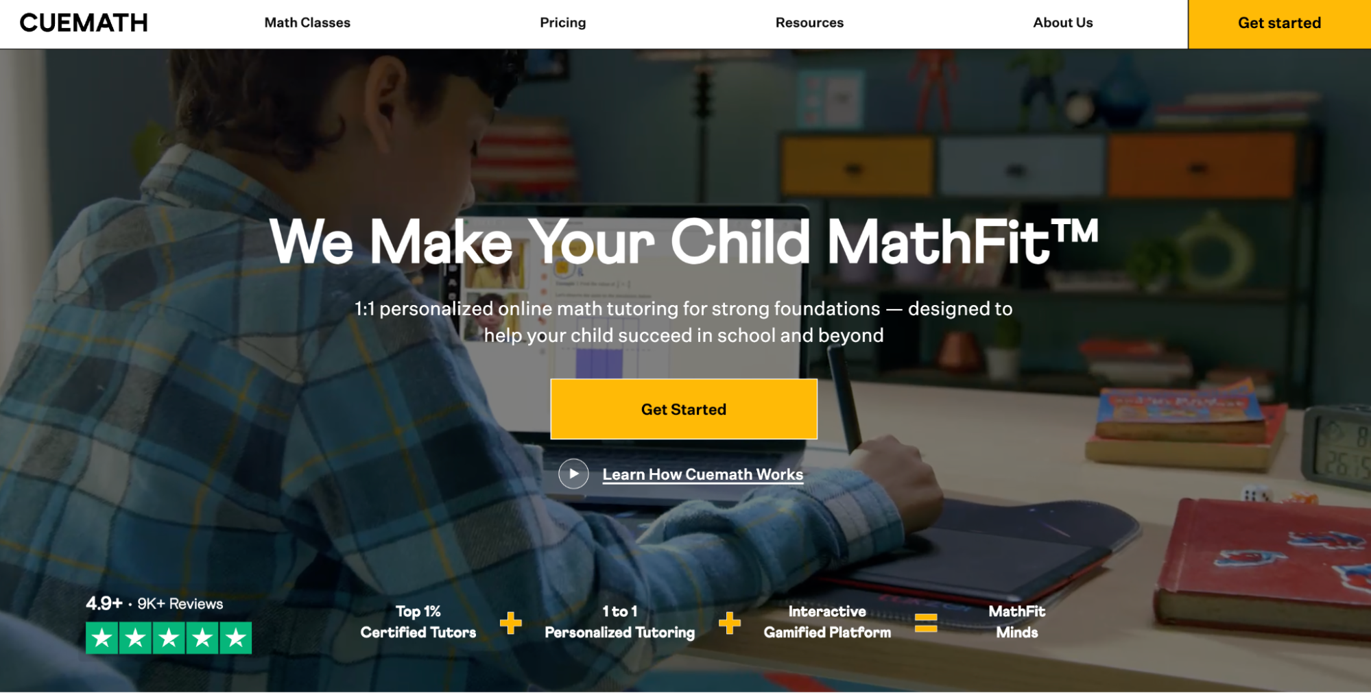 Cuemath’s homepage
In the testimonials, nothing is staged — parents speak about tangible improvements like grades or competition results. The genuine images of kids holding certificates, prize letters, and medals turn abstract claims into real-life success.
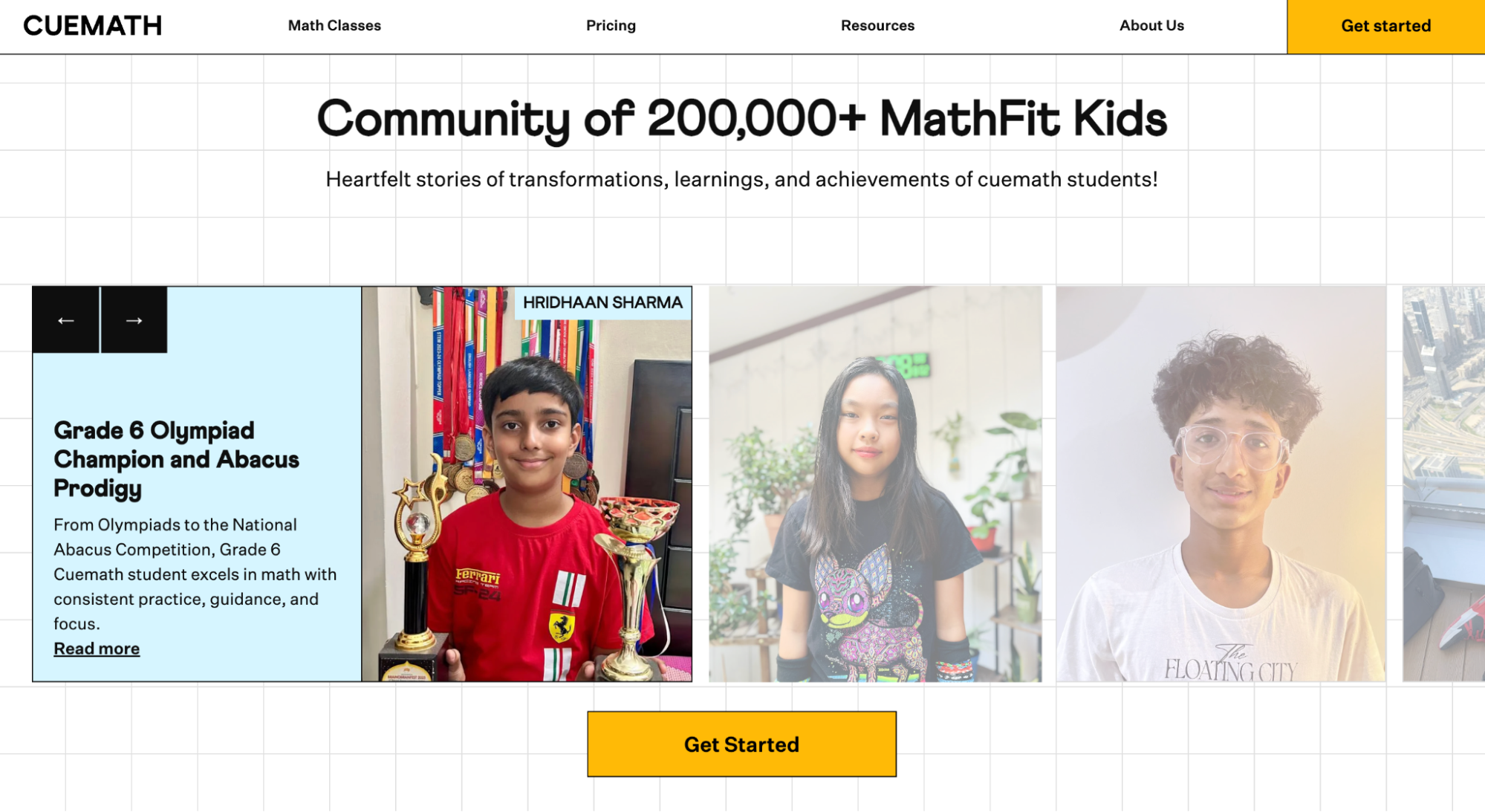 Cuemath’s social proof section
What makes this startup website example special is Cuemath’s clever positioning. The differentiation from conventional online tutoring is made explicit through copy and visuals: passive instruction vs. active engagement, generic content vs. structured curriculum, anonymous tutors vs. rigorously vetted specialists.
Hex
Hex is an AI analytics platform built for data teams and businesses behind them. The startup website’s design intentionally steers away from the typical all-black interfaces, neon syntax highlighting, and terminal aesthetics. Instead, Hex utilizes elegant typography, considered whitespace, and gentle accents.
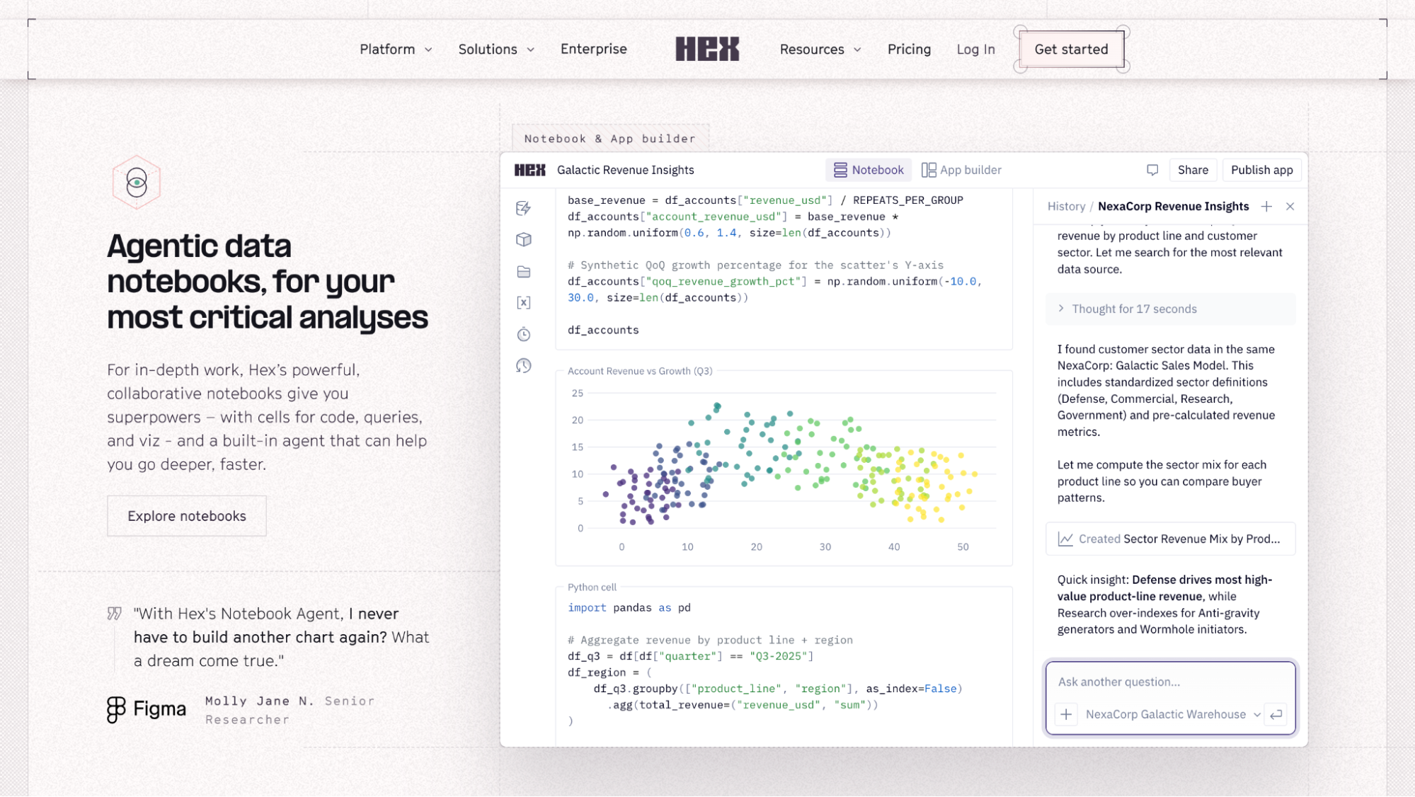 Hex’s feature descriptions
The social proof is unusually well-targeted and feature-specific. Rather than stacking a single testimonials section at the bottom of the page, Hex positions endorsements from real developers and researchers directly beneath each feature section. As a result, the reader can immediately tell whether that person’s context matches their own.
Testimonials are something you should keep gathering and reusing — whether in a graphic, a social media reel, or a blog post. They help establish your credibility, position you as an expert, and build trust by showing that others have had great experiences with your brand.
SourceKati Noakes
Founder KN Comms Social Media
The screenshots are detailed and literal — the startup shows actual interfaces with real workflows instead of vague mockups. Hex’s customer stories are anchored in numbers, revealing real figures and traceable outcomes.
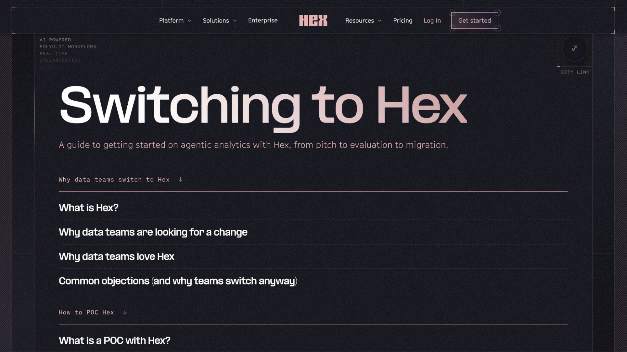 Hex’s dedicated migration page
Perhaps the most thoughtful element is the dedicated migration page. Switching analytics tools can be costly and painful, so Hex addresses this with an entire guide devoted to making the switch feel manageable, answering questions like why, how, and what the process looks like.
How to create a startup website with SendPulse
SendPulse’s website builder gives startups a full-stack toolkit in one place: drag-and-drop design, a free subdomain with an automatic SSL certificate, built-in analytics, a live chat widget, and a CRM system. You can ship version one today and iterate on it weekly — all from the same dashboard.
To get started, create a SendPulse account or log in to an existing one. The website builder is available on the free-forever plan — no credit card required.
Step 1. Create your homepage
Open the “Websites” tab, click “Create website,” and explore our template collection. Once you’ve found a layout that matches your vision, click “Edit.”
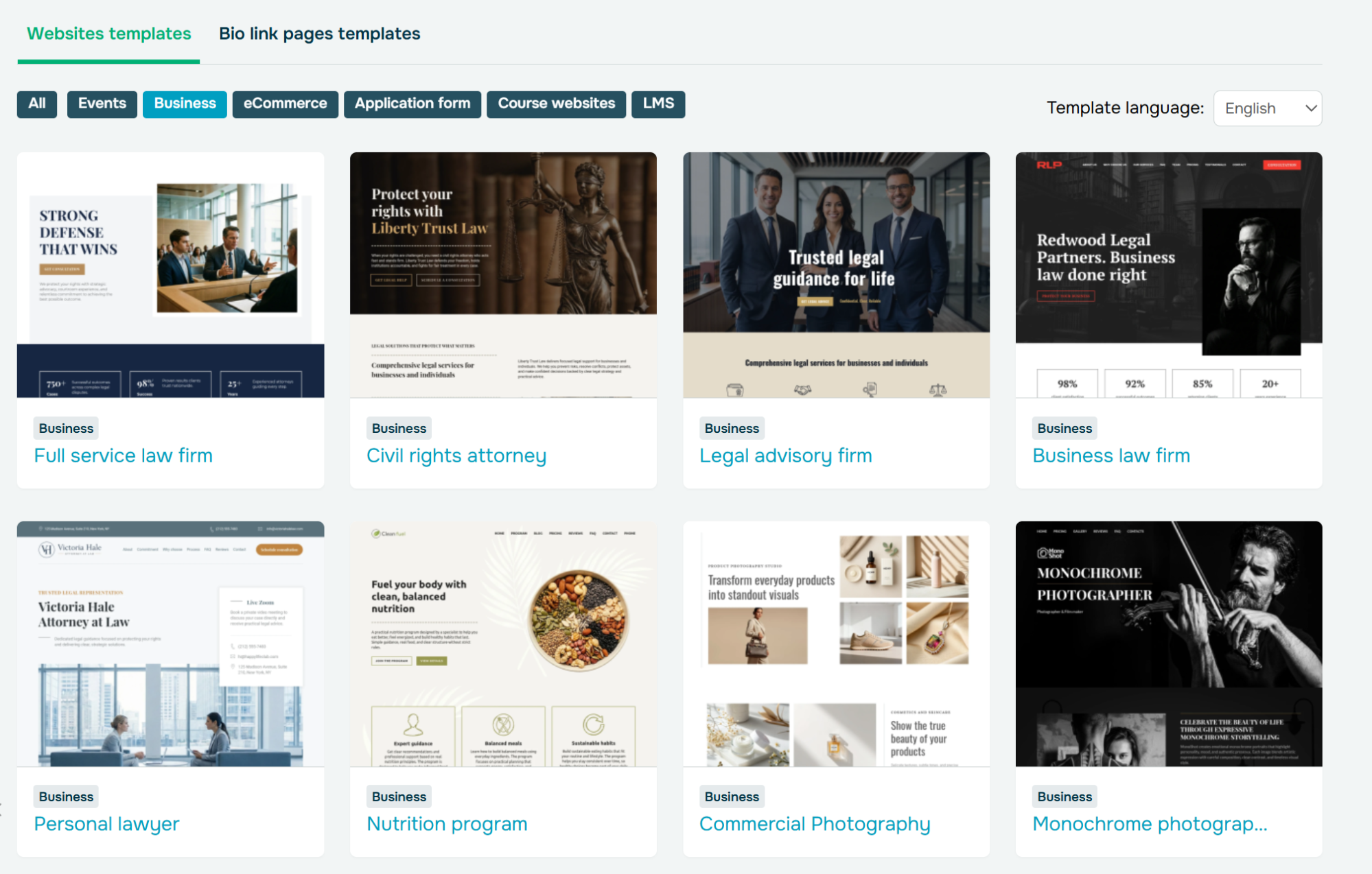 Browsing customizable website templates for startups
If none of them meet your needs, click on “New site,” and you’ll be able to select all the layout elements for your page from scratch.
For this article, we’ll proceed with a pre-made startup website template.
Step 2. Customize the template
In our drag-and-drop editor, you can add, rearrange, and customize any of your website elements, including images, fonts, spacing, rounding, alignment, and more. In the top right corner, you can also set your overall site style that should be applied to all blocks.
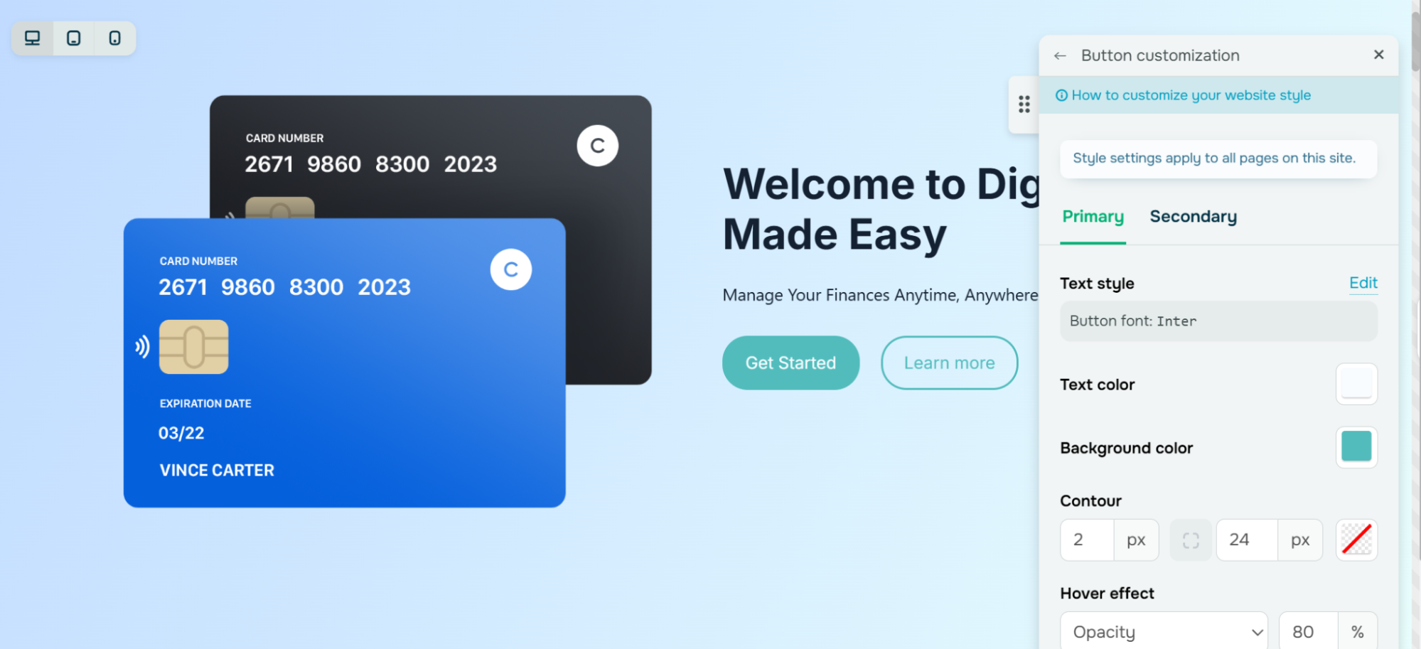 Customizing a primary button style for a startup website template
You can also use the built-in AI assistant to generate blocks – describe what you need, say “a three-column pricing section for a SaaS starter plan,” and the AI builds a ready-to-edit layout. The assistant can also draft or rewrite your website copy as well as translate it.
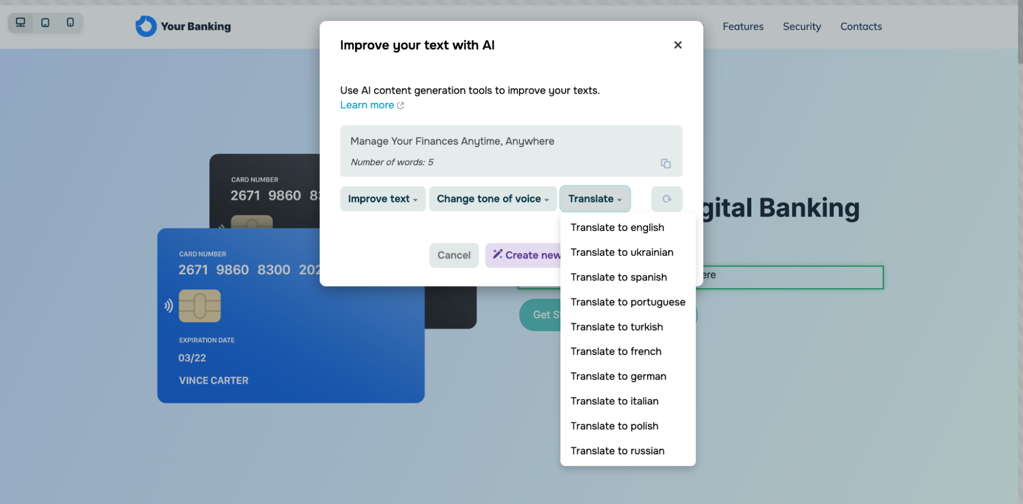 Using AI writing assistance for website copy creation
Our startup website templates are mobile-friendly by default and support dynamic content. Click the plus icon anywhere you like to open the block gallery. It contains diverse pre-designed blocks like headers, hero sections, galleries, timelines, FAQs, contact forms, and interactive widgets like payment buttons, videos, chatbots, and other startup website essentials.
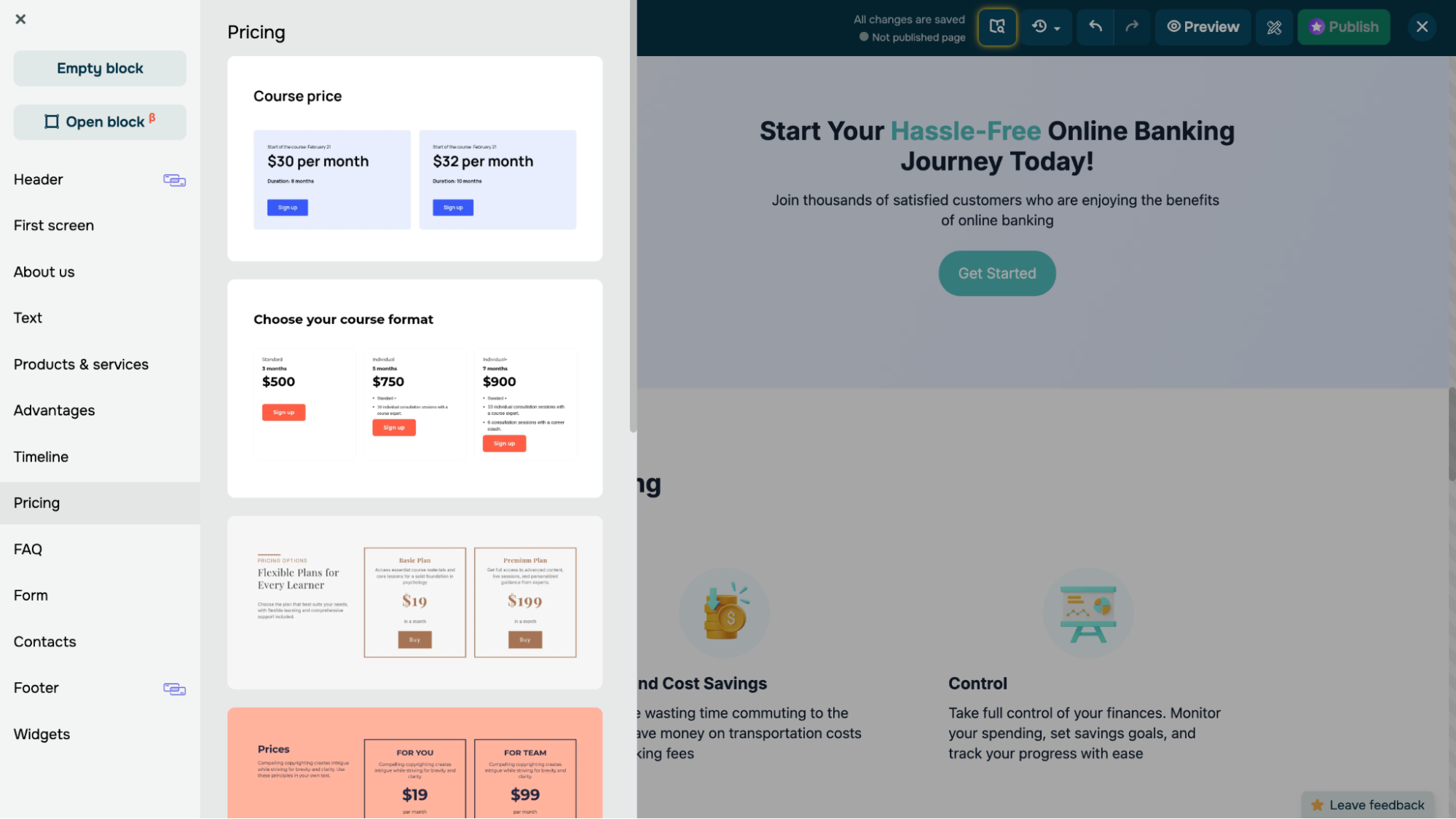 Navigating SendPulse’s pre-designed website block collection
Step 3. Add more pages and interactivity
After you’ve finished creating your homepage, access your website structure (top left corner), and click “Add page.” Essential startup website pages include “About us,” “Features,” “Resources,” or “Customer Stories” — the block library has flexible templates for each.
SendPulse also allows you to install a live chat widget by simply choosing your SendPulse-powered website from the drop-down menu. Then you can connect a chatbot to answer FAQs, qualify leads, and create or update CRM deals 24/7. The same widget can unify chats from WhatsApp, Instagram, and other messaging apps, so a solo founder never misses a message after hours.
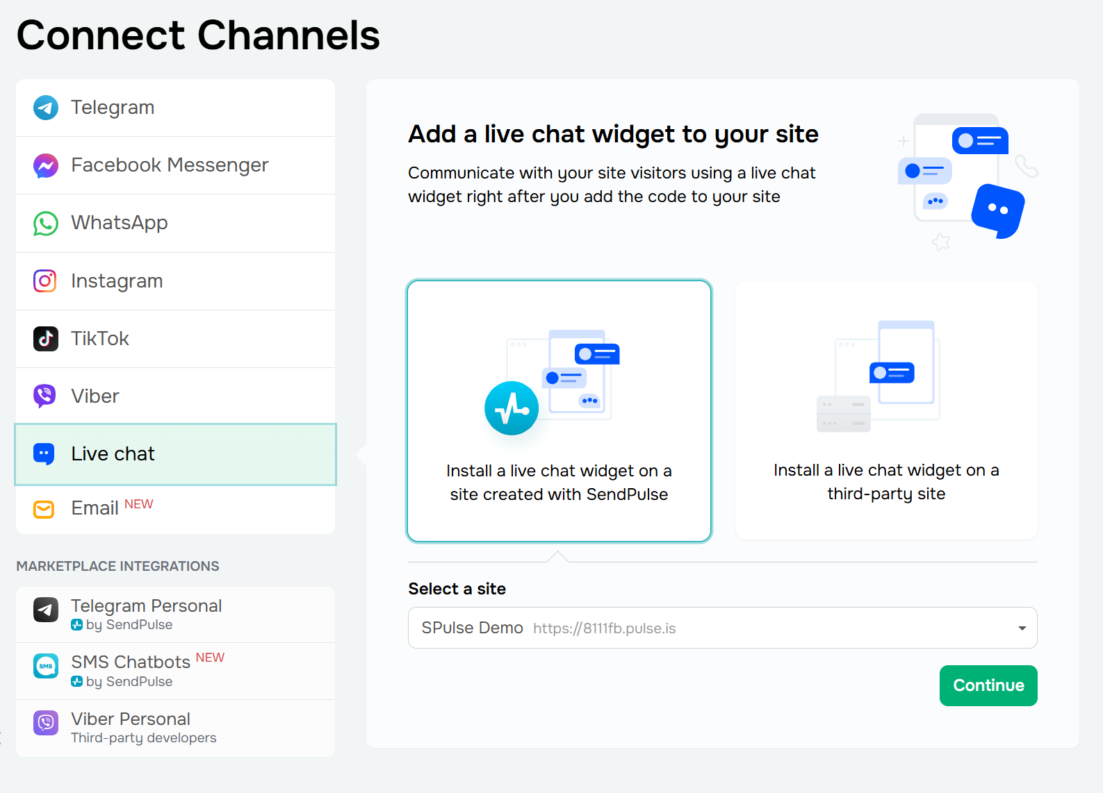 Connecting a live chat widget to a startup website
Step 4. Configure your site settings
Before you click “Publish,” complete three quick tasks in the “Websites” tab under “Site settings.” Each one only takes a few minutes, but skipping them can mean the difference between a site that ranks and one that doesn’t.
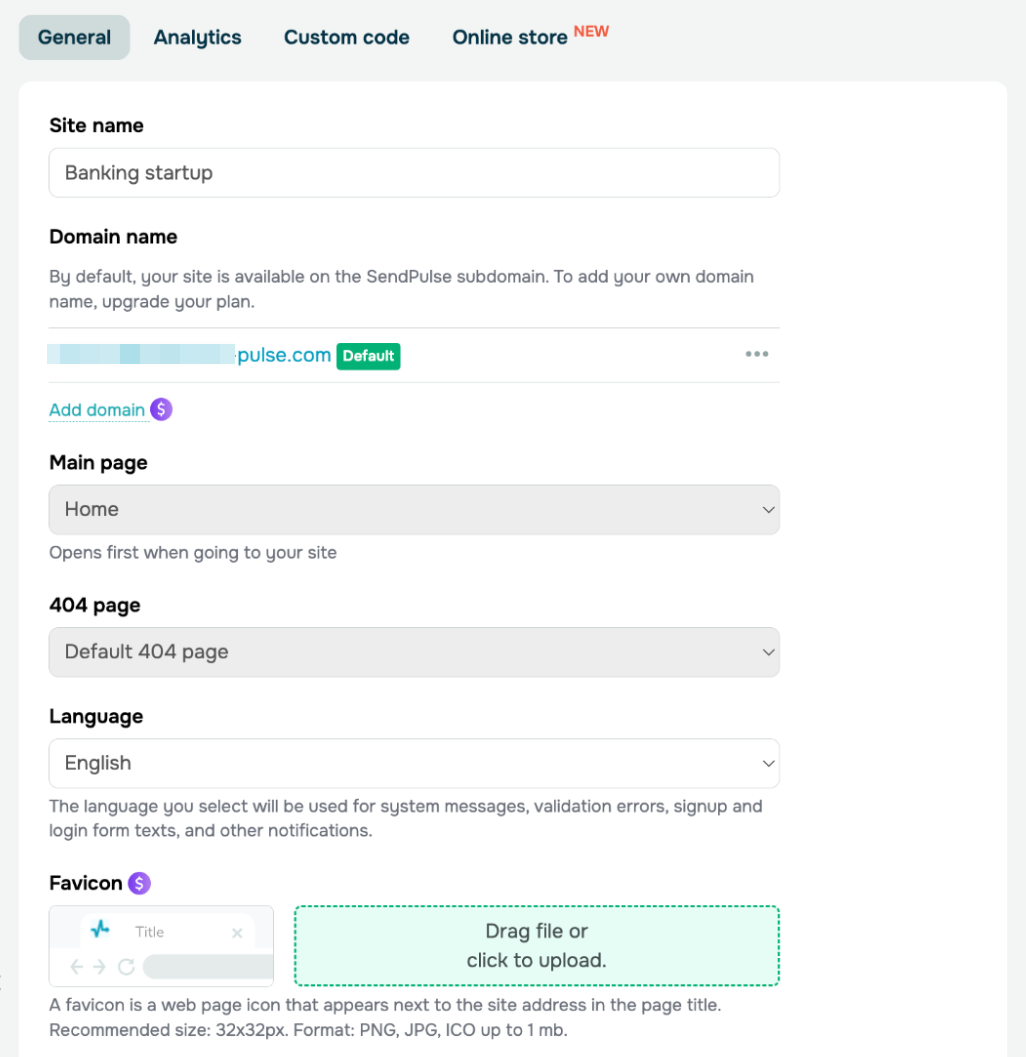 Managing a site’s settings in SendPulse
Connect a custom domain or use the free one
If you already have a domain, connect it by adding an A record at your registrar, like GoDaddy or Namecheap. SendPulse will create your SSL certificate for you, so you don’t need to set up Cloudflare or handle certificates yourself. If you don’t have a domain yet, you’ll get a free subdomain as soon as you publish.
You can connect up to two domains to the same site. This is helpful if you want both a .com and a .io, or if you’re rebranding and need both URLs to work.
Set up SEO metadata
For each page, add a title, description, keywords, and a preview image. Turn on “Index the site in search engines” unless you want to keep your site private for now. SendPulse creates the sitemap and robots.txt for you, so you don’t need to upload them.
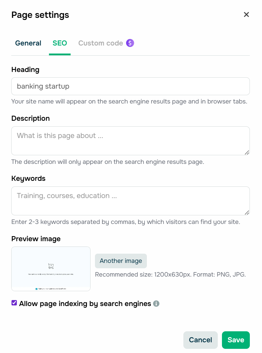 Filling in per-page SEO metadata for a startup website
Connect analytics and tracking pixels
Go to the “Analytics” tab and enter your Google Analytics Measurement ID, Meta (Facebook) Pixel ID, or Google Tag Manager container. Once you connect these, widgets like “Subscription form,” “Payment,” and “Button” can send conversions as events and goals to both platforms, so ad attribution and funnel tracking work right away.
SendPulse also offers built-in analytics. You can see sessions, subscriptions, payments, traffic sources, and visitor locations without using any other tools. This is helpful when you just want a quick overview.
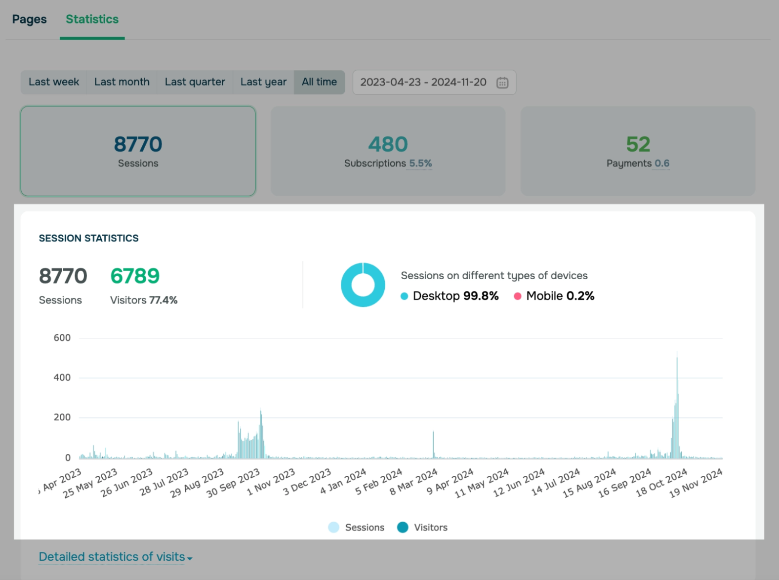 Viewing website statistics
Preview and publish
Preview your site on both mobile and desktop before you go live. Fix any overflow, spacing, or image crop issues you notice. Then click “Publish,” and your site will be live in seconds.
Wrapping up
Designing an appealing startup website is just the tip of the iceberg. In 2026, users move past the surface quickly. What keeps someone on the page, and ultimately moves them to act, is the feeling that a website truly understands who they are and what they came to find out.
SendPulse is an omnichannel platform that lets you build exactly the kind of startup business website our examples demonstrate — and enhance them with AI chatbots, smart pop-ups, CRM automation, email campaigns, and more.
Try it for free and see for yourself!
Startup website FAQs
How do I launch a website for my startup?
Choose a platform, define your core pages, and make sure the site is built to convert visitors. Start with a clear homepage that communicates your value proposition immediately, then build out supporting pages for your product, pricing, use cases, and social proof. For the fastest path from idea to live, try no-code website-building platforms.
What is the best website builder for a startup?
Finding the best website builder for a startup depends on your goals and budget. For early-stage founders who need speed without a hefty price tag, SendPulse ticks all the boxes. For design-forward templates, you can try Squarespace, while Shopify is best for eCommerce startups.