No matter how good your email campaign is, you should be always ready for unsubscribes and spam reports. Believe me, you will face them anyway. Another thing is that the fallouts can be minimized. How? Well, by keeping your subscribers interested. I already know the next question: How? Read the article and you will find the answer.
1. Email segmentation
Don’t send people content that is potentially humdrum for them. You’ll fritter away time and resources, yet recipients will be minded to unsubscribe from a useless newsletter. To solve this problem, select content that provides value to the particular part of your audience. One way to do this is to segment your mailing list.
Stats prove the efficiency of email segmentation in the best way.
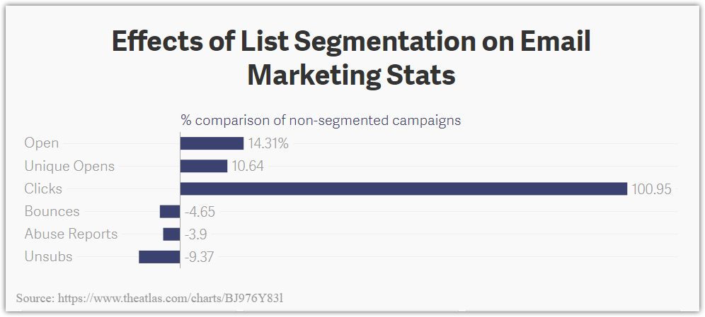
Segmentation criteria may depend on peculiarities of your business and marketing strategy. Still, there are some basic factors such as the date when subscribers join your list, lead’s category, sex, age, location etc. You can also create a separate list of sleepy subscribers and awaken them with bonuses and discounts.
Learn more about email segmentation in one of our articles.
2. Personalization
According to Experian, only 30% of marketers provide subscribers with an opportunity to choose the email frequency. And what about the rest 70%? They still think they can rain people down with their messages — and make the biggest mistake. Let your subscribers take control over the frequency and type of the content they receive.
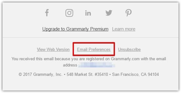
A good idea is to create a landing page for content personalization and include the link to it in every email, like Grammarly does. Look how they care about personalization: the email contains a footer with an option for a subscriber to set up email preferences.
Choosing this option leads a subscriber to Grammarly’s specialized page where they can mark what email content they would like to receive. There is also an option to unsubscribe.
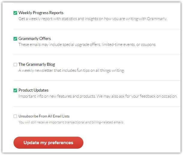
Such landing page not only helps to create relevant emails. This is a matter of marketing ethics as well
3. Dollar off instead of percentage off
Discounts captivate. Stats collected by Access Development in 2017 show to what extent.
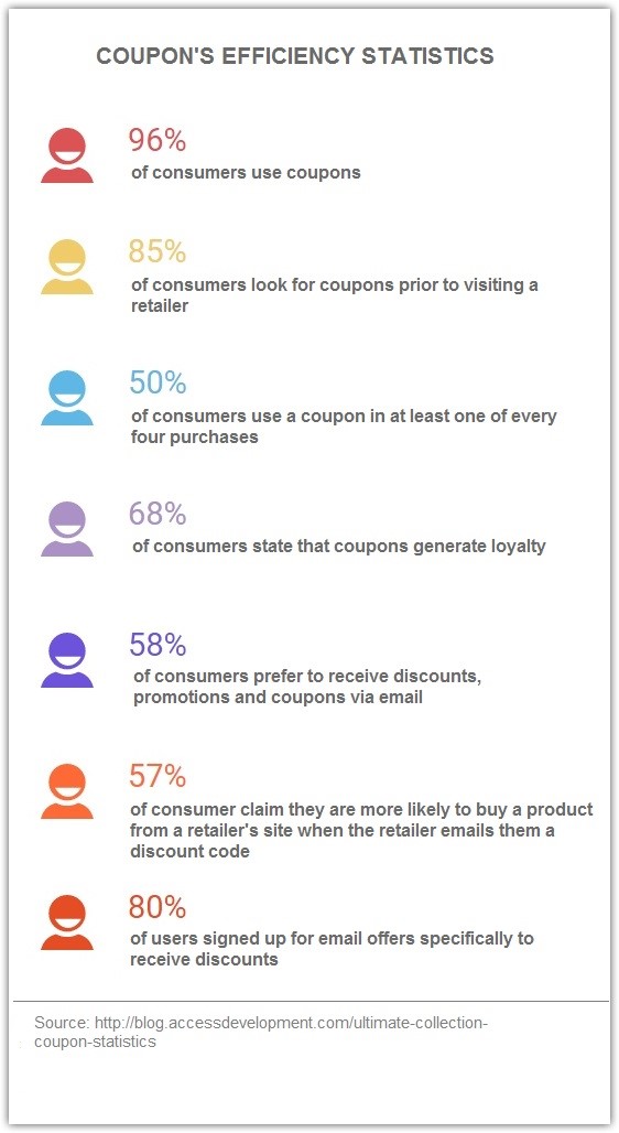
According to Experian Report, emails with coupons boost open rate, CTR and revenue.
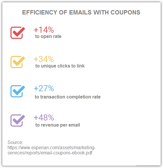
What is more, the research shows that emails which offer coupons with dollar off appear to convert 1.7 times more than those with percentage off proposals. In other words, emailing about a product which costs $100, you have 1.7 more chances to convince a person by a $10 rather than a 10% discount.
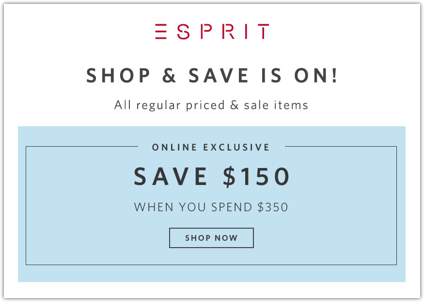
See how dollar signs work with Esprit. The company offers their subscribers to save $150 for every purchase over $350. Sounds attractive, doesn’t it?
4. Respect and reward
Send emails related to holidays or anniversaries: birthday, 6 months or a year of subscription. Show people that you appreciate not only their personality but also their brand loyalty. You can offer such incentives as a discount, free product, Ebook or free course depending on the specifics of your business as well as the recipient’s position in the sales funnel.
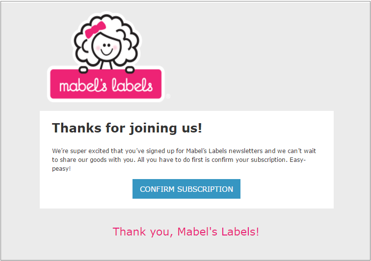
Demonstrate respect to subscribers in thank-you emails after subscription, purchase or reposts of any information about your brand in social media. See how Mabel’s Labels thanks newcomers for subscription and asks to confirm the email.
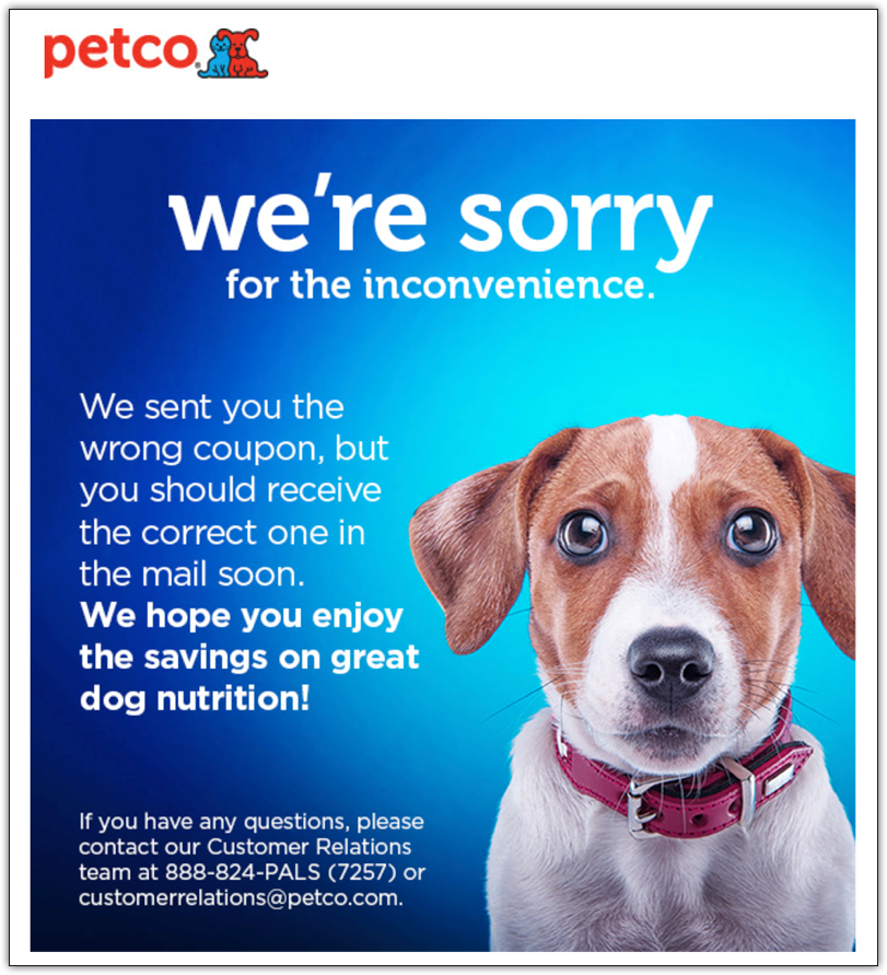
Apologize if something went wrong. For instance, Petco sent the wrong coupon link to subscribers followed by the apology email with a guilty-looking dog.
5. Interactive content
From time time, send special newsletters with interactive games, tests, constructors, quizzes, video or surveys. The more a user interacts with a brand, the higher their engagement is.
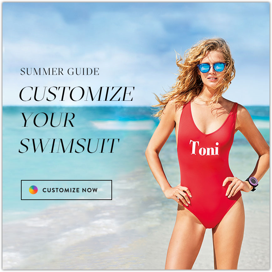
For example, Calzedonia invites its subscribers to customize the swimsuit in a few clicks. The email is interactive, but still market-oriented.
Free People entertains audience with the quiz that helps to choose a suitable dressing style.

Bonobos in its turn provides the subscribers with a useful guide to wearing corduroy.

6. Elaborate design
A person needs only 3 seconds to make a decision whether to read an email or delete it. That’s why you need to ensure that the main information comes to the fore and the email itself is easily scannable.
How to improve the emails’ readability?
- Use the headline which represents the essence of your message
- Use subheadings for visual division of the text
- Write short sentences and divide the text into paragraphs
- Present information subdivided into logical sections by means of images, dividers and white spaces
- Choose quiet colors which do not divert attention from the core information
- Make CTA button prominent
- Do not overload email with too many links.
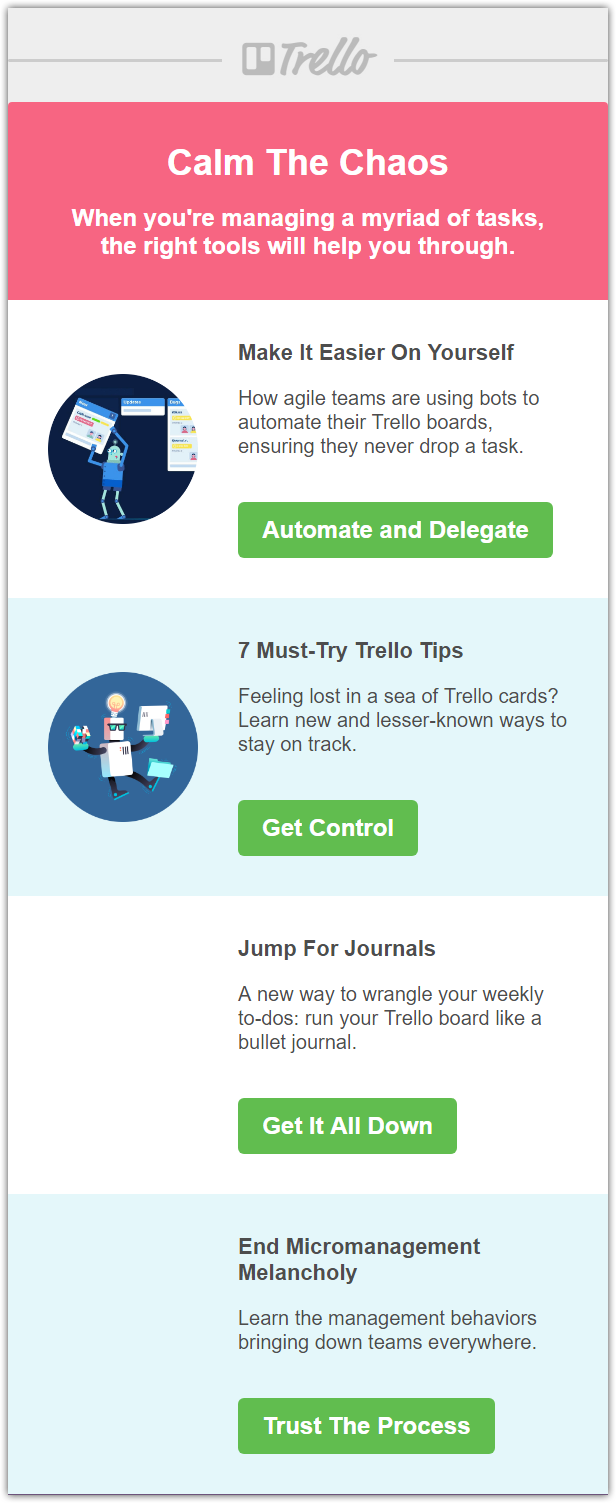
Here is the email from Trello with a minimum amount of images. The text is divided into clear blocks, headings and subheadings are bolded, and each block contains a separate CTA button.
7. Mobile version
Statistics show that more and more users purchase with mobile devices:
- Mobile conversion rate has increased by 70%
- 20% of email-generated revenue ows to sales from mobile
- 40% of all email clicks are done on mobile devices
- Mobile click-to-open rate has increased by 20% over a year
Use responsive design to ensure that your emails look awesome on any device.
What are the basics of a mobile-friendly email?
- Responsive template
- Short subject lines (Mobile devices show only 25-30 characters)
- Small text blocks (Divide content into concise blocks, create bulleted lists, write short sentences and paragraphs)
- Visible CTA (Place CTA at the top of the screen. Users won’t have to scroll the email for too long to see the CTA button. Optimal CTA size for the mobile version is 44 x 44 pixels)
- Space for clicks (Remain enough space around CTA. Don’t forget that subscribers use their fingers to click on the links)
Register in SendPulse, and you will find many templates designed for making personalized and catching emails that will convert.
Still not sure whether all these recommendations work? Just follow them. You will enjoy to see how fresh and interesting your email campaigns become for the subscribers, and the metrics will please your eye day after day.