Email marketing is a great way to sell something online. To boost your brand’s revenue with it, you need to master interacting with subscribers. Only well-balanced communication will turn readers into customers, and it depends on the types of emails you’re sending. Read on to learn more about the must-send email types for every business.
- Why do you need to use different types of emails?
- Marketing emails
- Welcome email
- Newsletter
- Announcement email
- Lead nurturing email
- Special offer email
- Birthday email
- Re-engagement email
- Abandoned cart email
- Transactional emails
- Subscription confirmation email
- Free trial expiration email
- Premium subscription confirmation email
- Subscription cancellation email
- Order confirmation email
- Order and shipping status emails
- Key takeaways
Why do you need to use different types of emails?
When we say “email marketing,” we often think about messages that only drive sales. However, readers swiftly get tired of brands bombarding them with special offers. To keep clients interested, every business needs different types of emails in their strategy. Some of these messages should sell or provoke interest in your product, others should create an exceptional user experience. Mainly, there are two groups of emails leveraging these goals — marketing and transactional.
Marketing emails
The cornerstone of this category of emails is promotional emails. Any campaign aimed at motivating a subscriber to make a purchase or try a service is a marketing or promotional email. Apart from this, marketing emails are essential for building relationships with customers, nurturing leads, educating clients, and more. Let’s look at the types of marketing emails you may encounter.
Welcome email
A welcome email is the gateway to your brand for a new subscriber. Often, the open rates of these emails are the highest of any type of marketing email, so your goal is to benefit from the increased attention, and introduce your brand to new customers.
Make your branding, key features, and mission clear to your subscribers. You can also give them a short guide to using your product in text, video, a link to the knowledge base, or even by booking a consultation with your manager.
Redbubble nailed it with their lovable welcome email. The company builds an atmosphere of fun and creativity right from the beginning. Apart from greeting new subscribers, the message briefly instructs newbies on how to use the service, encourages artists to sell their work on the platform, and invites subscribers to browse through popular categories on the website.
Visually, this email is well-produced. Especially the main photo, which instantly provokes a smile. The copy works well with a friendly and jolly tone of voice, simple sentences, and subtle jokes in the right places.
Newsletter
A newsletter is a perfect option for companies that promote their services and products via content marketing. Multi-topic emails aggregate the best articles, videos, or podcasts and regularly deliver them to subscribers’ inboxes.
The primary goals of newsletter email campaigns are maintaining regular contact with clients and enhancing website or blog traffic. To meet these goals, make your newsletter interesting, well-structured, good-looking, and personalized. Let’s get some inspiration from Medium’s daily digest.
When subscribing, future readers can choose what topics interest them. Medium sends its subscribers articles based on the categories they selected, their reading history, and the editor’s choice. The different recommendation sources are distinguished well, and the email’s structure is simple, making the newsletter convenient to browse through.
Visually, the newsletter is appealing due to the eye-catching images that accompany each part of the email. To save time composing the digest, Medium uses article headers from their website to introduce each article instead of writing a new description for every article in every digest.
Announcement email
Announcement emails introduce a company’s new products and services, updates, or tell customers about upcoming events. The goal of announcement emails is to provoke interest in something new from your brand.
To create an effective announcement email, clearly state what it is about in the subject line and at the top of the email. Describe the benefits of whatever your brand is announcing. Finish the message with a crystal clear call to action. One last thing, be sure that you choose your recipients carefully — they should have an interest in your proposal. Otherwise, you’ll get tons of unsubscribe requests instead of new customers.
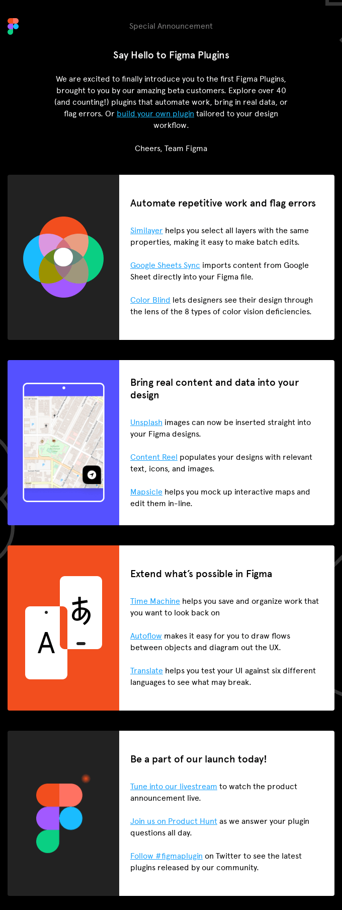
The example email below shows Figma encouraging its clients to try some new plugins. The company targeted this campaign at their current customers only — they are familiar with the service and are more likely to use this feature.
With a sharp and minimalistic design, the email recreates the main website’s style. The copy briefly describes the functions of the new feature and accentuates its advantages for users. However, there is still room for improvement — the email could be more effective with a clear and strong call to action.
To get the most out of announcement email campaigns, you need to target different groups of subscribers. SendPulse’s mailing list segmentation feature will help you divide recipients into categories according to their gender, occupation, location, frequency of interaction with your emails, and more.
Lead nurturing email
Lead nurturing emails target those who haven’t decided to make a purchase from your brand yet. The main goal of these campaigns is to stay in touch with subscribers and inspire a purchase by showing them the benefits of your goods or service.
To nail this type of email, put recipients’ interests, needs, and pains first. By doing so, you can provide valuable content and get the maximum ROI from your campaign. Match the content of each email with the recipient’s place in the buyer’s journey. Make the first message relatable to your leads by mentioning information that is pertinent to their needs, then reinforce the selling component in the following email. Subscribers’ interest in making a purchase should grow with every message.
Below, we can see how the printing service, Artifact Uprising, nurtures leads. The brand offers guides on making appealing photo books, shares hacks, and inspirational ideas to excite recipients about the potential value they can gain from the brand. The email doesn’t include a word about making a purchase. Instead, it gently motivates the reader to learn more about the product. The copy may be concise, but Artifact Uprising lets the visual part speak to recipients. With a minimalistic design and pastel color palette, the design of this email is eye candy.
Special offer email
A special offer email is an email that promises an alluring discount or gift. These campaigns motivate readers to make a purchase as soon as possible.
Offer your subscribers an excellent bargain like a healthy discount or gift. To make it more appealing, add a time limitation to your offer. Don’t overdo the copy — keep it short but powerful. Segment your recipients and personalize the emails; if a cat owner receives a discount on dog food, they won’t buy it no matter how tempting the offer is.
In the example below, the cosmetics store, Look Fantastic, offers a one-day discount. The company puts everything into the visual side of their email, using a vibrant color palette, and adding attention-grabbing images. The copy stresses brands’ names, special treats, and discounts written in bold capital letters. That is exactly what this type of message needs.
Birthday email
Birthdays are a special day for everyone, and brands often use this occasion to connect with their customers and increase sales. This type of email may offer clients discounts, free treats, ideas for presents, or tips on preparing for a birthday party.
You can send this campaign not only on the subscriber’s special day but also one or two days in advance. To enhance the chances of purchase, resend a birthday email a few days later to remind the recipient of your offer. The content should emphasize a celebratory spirit both in the visual part and the copy.
The clothing brand, Topshop, offers subscribers a promo code for a 30-day discount on their birthday. The email starts with a beautiful collage in vivid colors to catch the recipients’ attention. This visual doesn’t feature cakes, candles, or other birthday clichés, which makes it so refreshing. However, the bright color palette and balloons still create a happy atmosphere. Though, with this background, the CTA-button is difficult to see.
The brand avoided excessive birthday wishes and got straight to the point — the discount. This move makes the copy both effective and time-saving for the reader.
Re-engagement email
If your subscribers haven’t reacted to your messages for three months already, it’s time to send them a re-engagement email. This type of email helps re-engage your subscribers with your brand and clears passive subscribers from your mailing list.
To make it work, try to find out why your subscribers haven’t been reading your emails. Offer them the option to change the frequency of emails they receive from your brand if the current frequency does not satisfy them. Add social media buttons for those who prefer this communication channel. Accentuate the importance of your relationships with customers via text or visual elements.
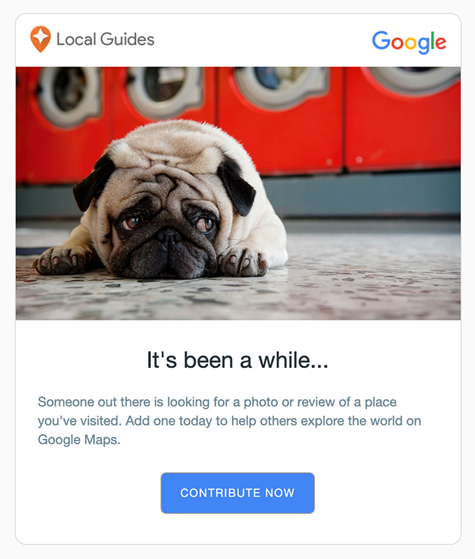
Google Maps emphasized their “sadness” from missing a user with a heart-wrenching image of a sad dog. This move is kind of trite but is wildly effective. The email design itself is brief and minimalistic.
With the copy, Google emphasizes community values and urges readers to contribute to their Local Guides platform. However, the service avoids being too pushy. Importantly, this email allows recipients to change their desired mailing frequency or unsubscribe.
Abandoned cart email
Sending abandoned cart emails is a great way to increase your company’s profit. The mission of these messages is to remind customers about a purchase they were about to make. To be the most effective, send these emails within 24 hours of the moment your client abandoned their cart. Otherwise, they could easily forget about their order.
Best practices for abandoned cart emails are to include the list of the goods in the user’s cart, show the total price and the price of each item, and add a discount. Remember, the email should fit your brand’s general tone of voice perfectly. Your style may be formal, concise, or witty, like BarkBox’s in the email below.
The monthly subscription service nails almost all of the best practices. The email lands in an inbox within an hour of a user abandoning their cart, describes the order, and features a money-back guarantee.
Starting with an animated image of a cute puppy, the message continues with a picture of the product, an eye-grabbing block with a money-back guarantee, and two prominent CTA buttons. The email is sea-themed with a calming blue color palette. The copy underpins the marine style by skillfully using idioms. The text is brief, yet handles all of the customers’ concerns and objections.
Transactional emails
Contrary to marketing emails, transactional emails do not aim to make a profit. Their primary purpose is to let users know about changes made to their account, the status of a purchase, shipping updates, and so on. Let’s discuss some of the best practices for this type of email.
Subscription confirmation email
The first email a subscriber receives should be a subscription confirmation email. Brands use these messages to eliminate incorrect email addresses or addresses entered by mistake. Sending confirmation emails helps you maintain a clean mailing list and reduce spam complaints.
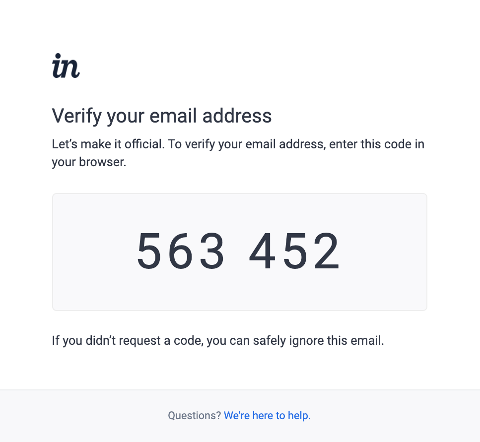
Subscription confirmation emails should be concise, keep the copy short, and don’t distract recipients from completing the subscription confirmation process. A reader can confirm their subscription by clicking on a link or button, or entering a unique code from the email on your website. InVision uses the latter approach in their subscription confirmation email.
The company made the code the most prominent part of the message and saved recipients the hassle of looking through the email to find the code. The design is plain while and recreates the main website’s look. The copy is simple, including just a call to action and information for those who received the email by mistake.
To incorporate subscription confirmation emails into your email strategy, use SendPulse’s form builder. Forms created with this tool use double opt-in by default — SendPulse automatically sends a confirmation email to your subscribers after their registration.
Free trial expiration email
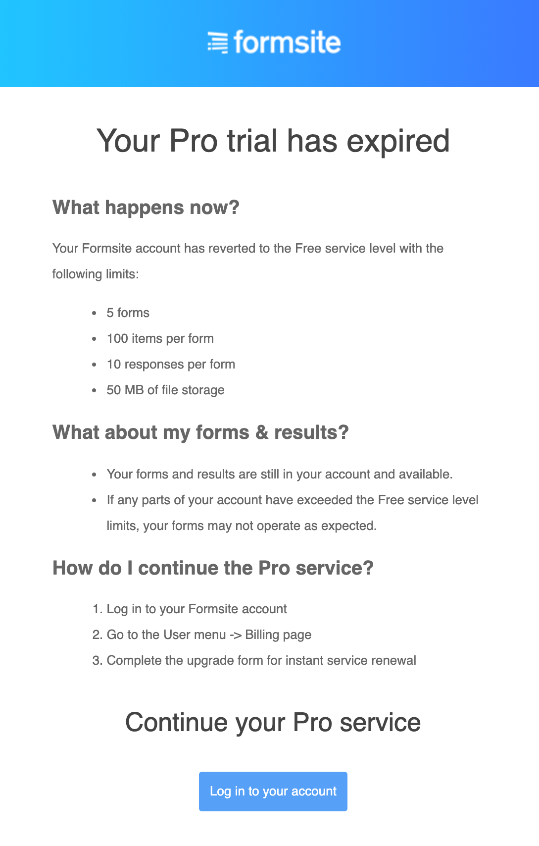
Notifying customers about their free trial ending before it actually ends is essential. Especially if the trial doesn’t include auto-renewal. That’s where free trial expiration emails, an email that will help you retain customers, come in. The formula is pretty simple, tell subscribers about the expiration of the trial, explain what it means, outline the options for paid plans, and instruct them on how to switch to a paid plan and keep using your service.
Here is an example of a clear and concise email from FormSite. The service went for a minimalistic design with an eye-catching CTA-button. The main emphasis is on the copy answering general questions about the free trial, using the service, and renewing a paid subscription.
Premium subscription confirmation email
Going from a free to premium plan also requires contact between a brand and its customers. Send confirmation emails right after a user opts-in for a paid subscription. Explain how subscriber’s opportunities have changed with obtaining a new paid plan, how to use any new functionality, and where to start.
Stitcher, a podcast service, not only welcomes new subscribers on board but also describes how to use the premium homepage and gives recommendations on choosing shows.
The design is well-produced, showing clean branding at the top of the email, followed by an appealing animated image, and a yellow CTA button, encouraging users to browse premium shows. Speaking of the copy, there is room for improvement — the wording could be simpler. However, the text still does a good job of explaining all the perks of premium access.
Subscription cancellation email
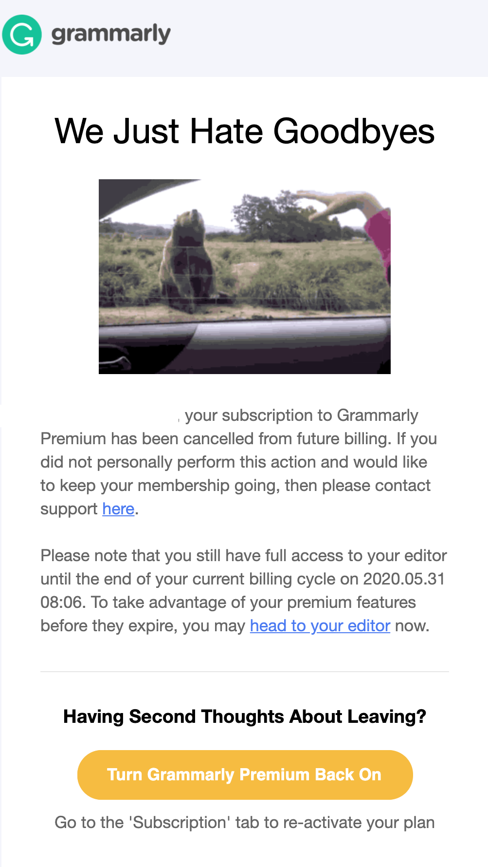
Subscription cancellation emails are another type of transactional emails, which help solve marketing tasks as well. Even after a user cancels their subscription, you can try to keep them. Your goal is to gently persuade a customer to stay, offer another pricing plan with a more robust set of features, and add a strong and prominent call to action.
You can recreate the Grammarly email below. The animated image of a bear waving goodbye makes the simple design touching and heartwarming. To provoke second thoughts about unsubscribing, the online writing app uses a bright yellow CTA button.
The text works well by both explaining the cancellation conditions and urging readers to stay without being too pushy. The heading of this email, “We just hate goodbyes,” resonates with the audience because most of us hate them too.
Order confirmation email
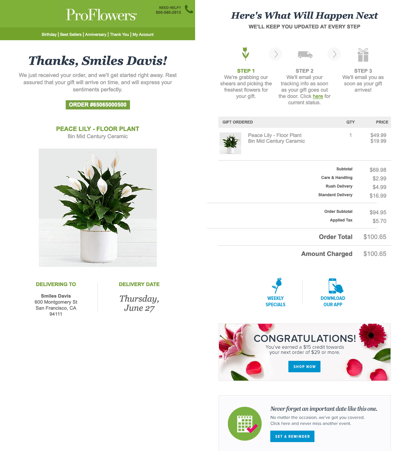
After a purchase, your duty is to assure a customer that everything is going smoothly. Send them an automated order confirmation email straight away. Apart from including the order number, tracking code, and detailed information about every item, consider including recommendations or discounts for future purchases.
Take a look at the example below from ProFlowers. The retailer informs clients about their order, provides delivery details, clarifies the next steps using beautiful infographics, offers discounts, and includes a reminder about when the flowers will be delivered.
The fresh and airy design is perfect for a flower delivery service. The key details — an image of the bouquet, delivery address and date, next steps, and special offer — stand out, which makes an email easy to look through. The copy is brief, which is exactly what you need in this case.
Order and shipping status emails
People crave information about what is happening with their order and when they will get it. Order and shipping status emails are a great chance to not only satisfy their curiosity but also to remind them about your business.
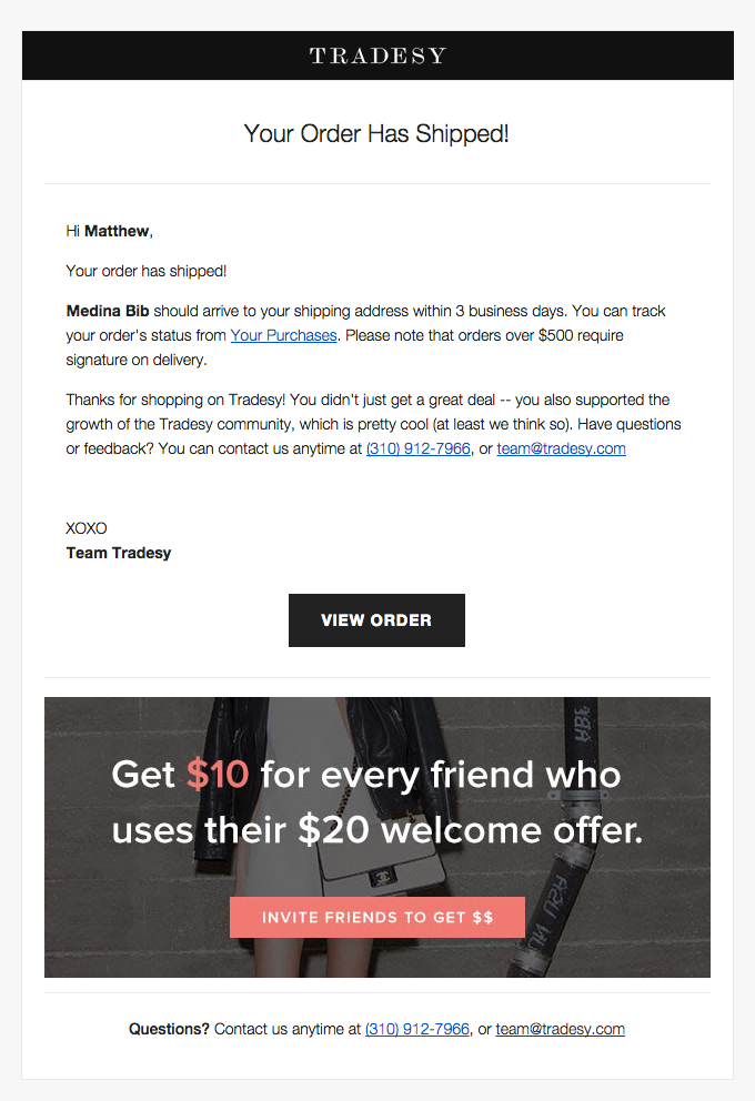
Send brief updates during the delivery process. Include all the necessary details, such as information about the order, tracking code, delivery conditions, and your contact information. Add discounts, gifts, or special offers for future purchases, as Tradesy does in the example below.
A bright orange CTA button makes the special offer the most prominent part of this email. However, the “view order” button is also visible and looks great in the black and white design of the email. The email’s copy contains all the essential information about the order — the arrival date, details, gratitude, and contact information — while being concise.
Apart from these types of emails, transactional emails may include information about billing, events, password reset, and more. For more types and examples, check our article on transactional emails.
Key takeaways
Email marketing can be a powerful tool to boost your ROI and create long-lasting quality relationships with customers. Whether email marketing makes or breaks your business, depends a lot on the types of emails you send. Let’s repeat how to apply them to your strategy.
- Use an abundant variety of email types in your email marketing efforts. You should not only sell through them but also inspire recipients, keep them engaged, and provide an exceptional customer experience.
- Send marketing emails to convince your readers to make a purchase or try your service. You can combine newsletters and lead nurturing emails with announcements, special offers, reactivation messages, and more.
- Improve user experience with your service by sending transactional emails, such as order and subscription confirmations, shipping status updates, free trial expirations, and so on. Take a chance to increase profits and retain customers by offering additional options in these messages.
Sign in with SendPulse and easily create and send different types of emails to motivate your users to take action and enjoy working with your business.
